Preview image. Unlock full-res
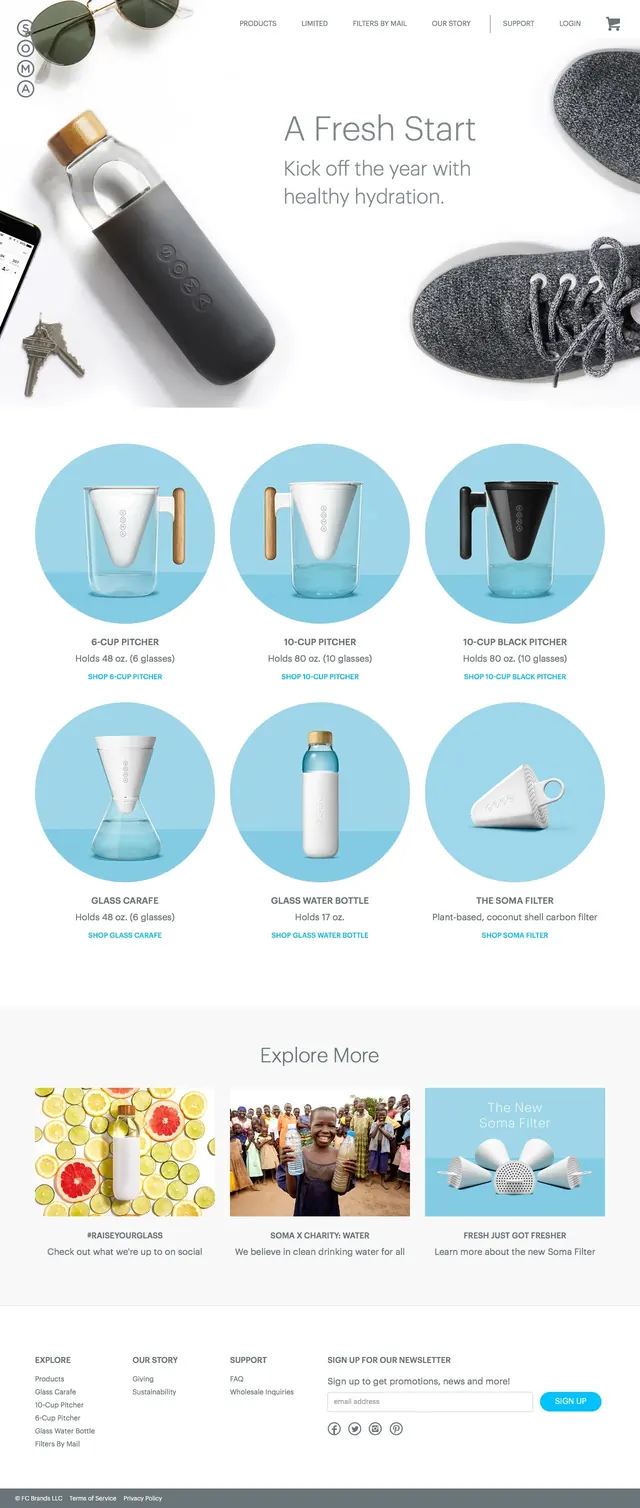
A clean ecommerce landing page for hydration products built around large product photography and airy white space.
Summary
A clean ecommerce landing page for hydration products built around large product photography and airy white space.
Visual description
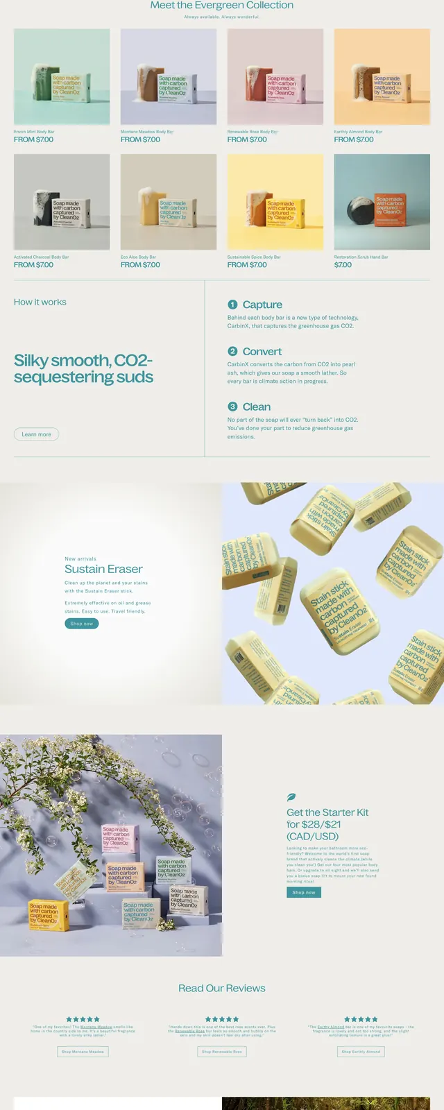
The page opens with a minimal hero on a white background, using a large lifestyle product photo and centered headline copy. Below it, multiple product tiles are arranged in a clean three-column grid with circular blue backdrops behind each item. Farther down, a secondary content row highlights three editorial promo cards before ending in a simple multi-column footer with newsletter signup. The overall composition relies on generous spacing, soft product imagery, and restrained navigation.
Key takeaway
The design uses spacious white space and consistent circular product framing to make a small catalog feel clean and premium. Its strongest pattern is the repeatable product-grid section, which can be reused for ecommerce landing pages focused on clarity and visual merchandising.
Reuse notes
Reuse the circular image treatment, light palette, and compact product captions for wellness or direct-to-consumer storefronts. The layout works best when the product count is modest and the brand wants a calm, modern presentation rather than a sales-heavy one.