Preview image. Unlock full-res
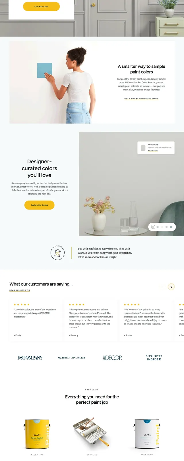
A clean ecommerce landing page for Clare that pairs a large lifestyle hero with soft editorial sections and product-led proof points.
Summary
A clean ecommerce landing page for Clare that pairs a large lifestyle hero with soft editorial sections and product-led proof points.
Visual description
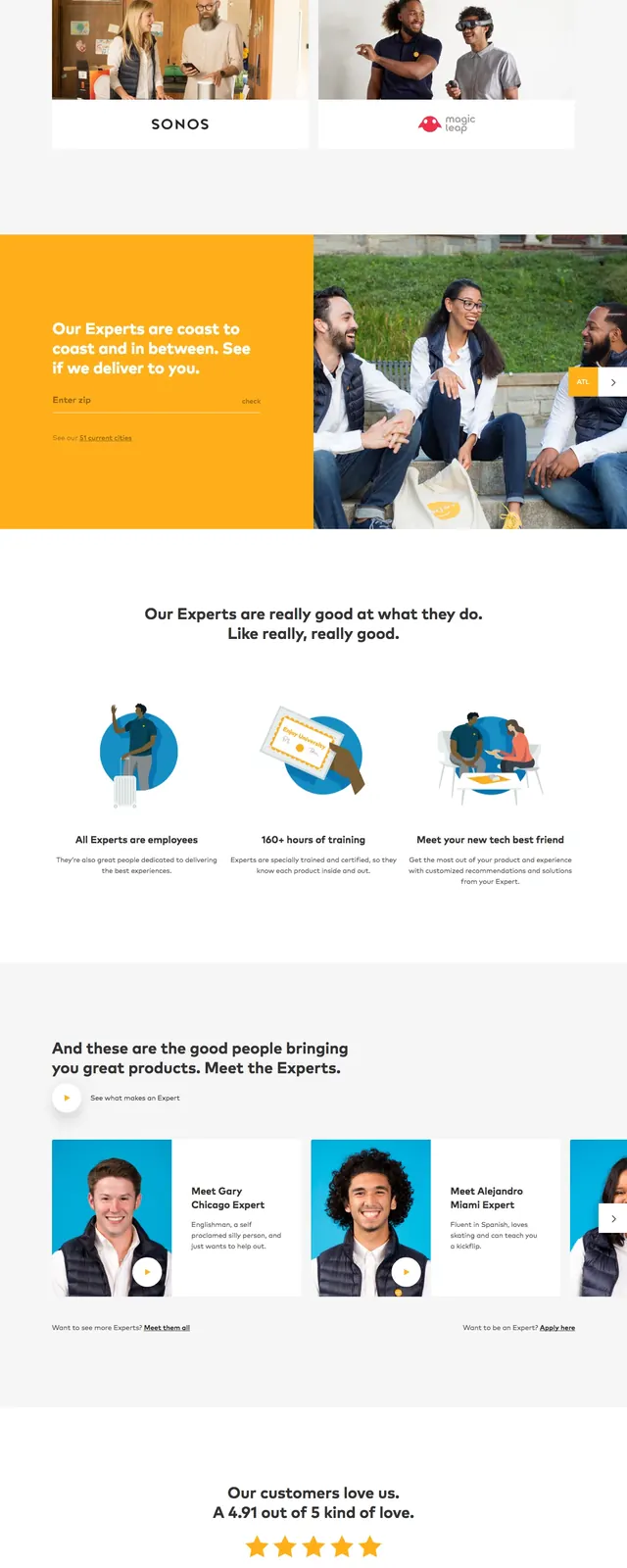
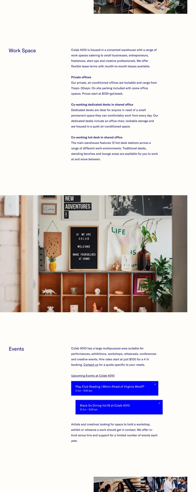
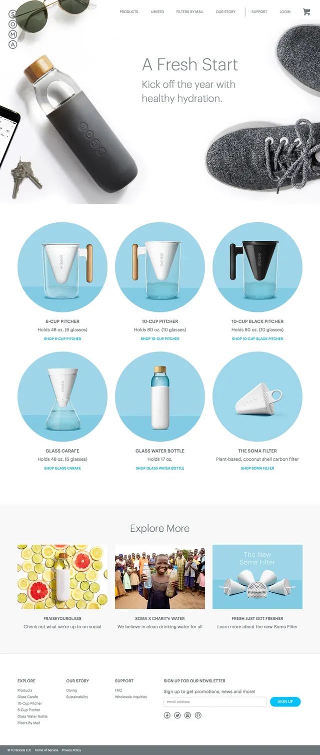
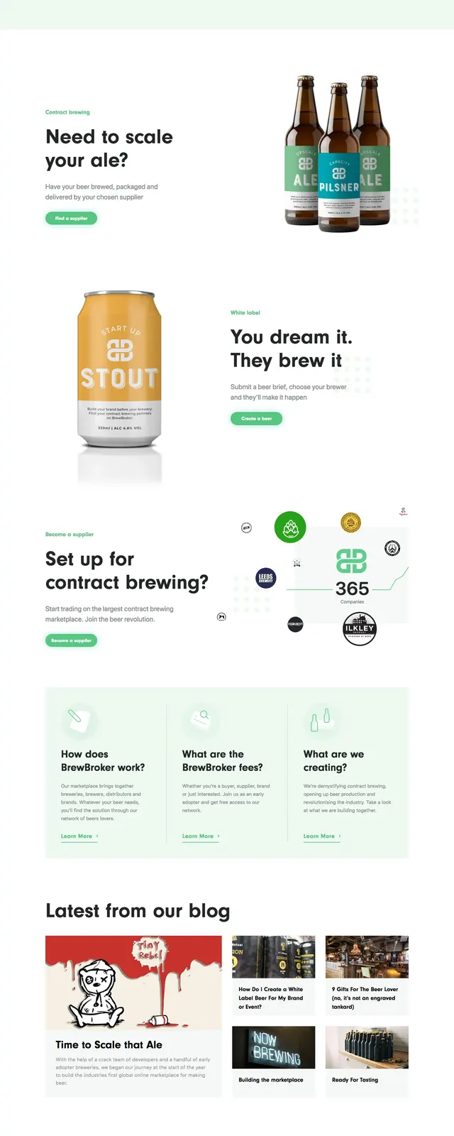
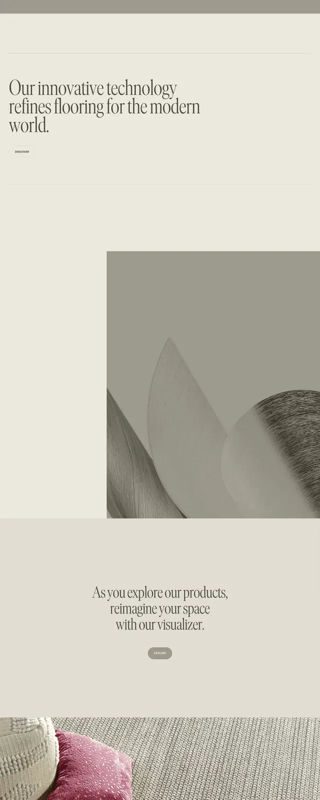
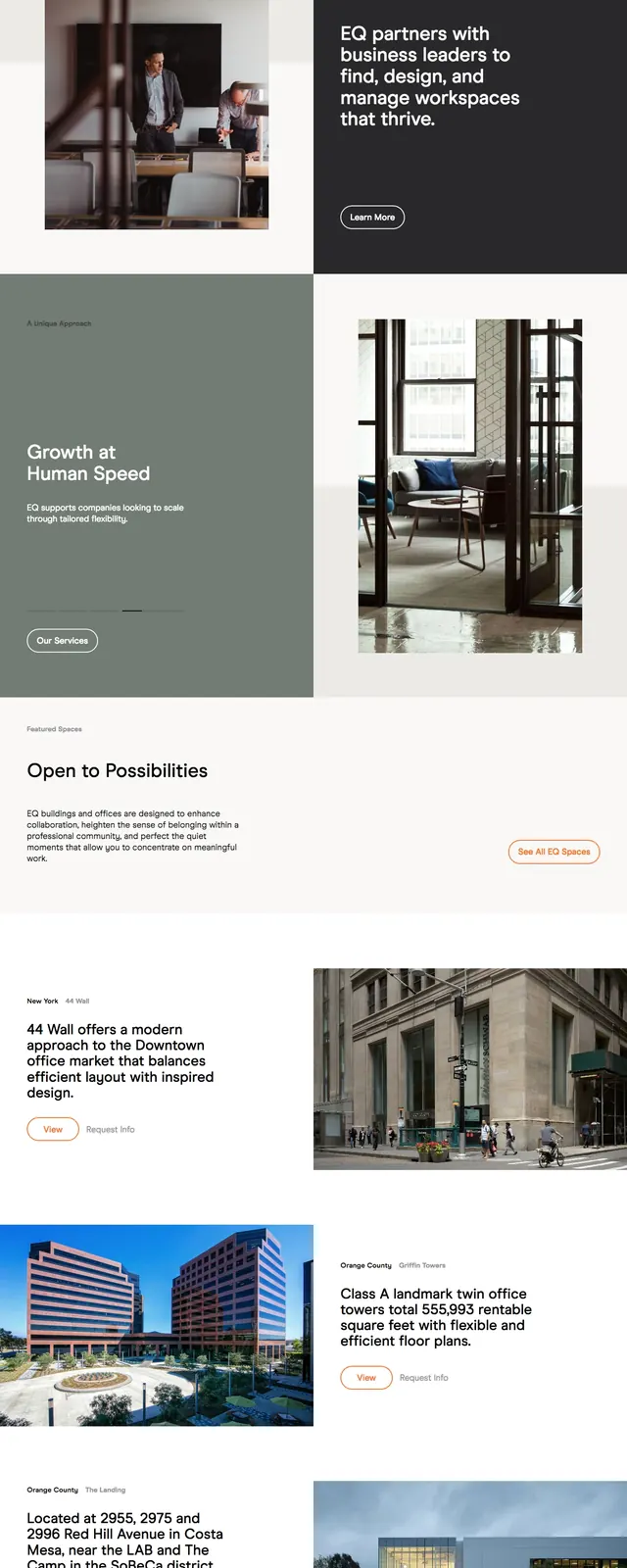
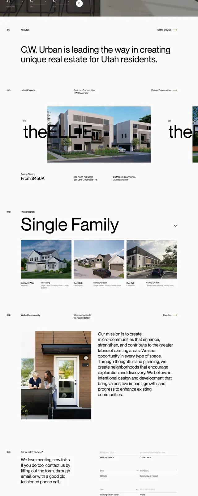
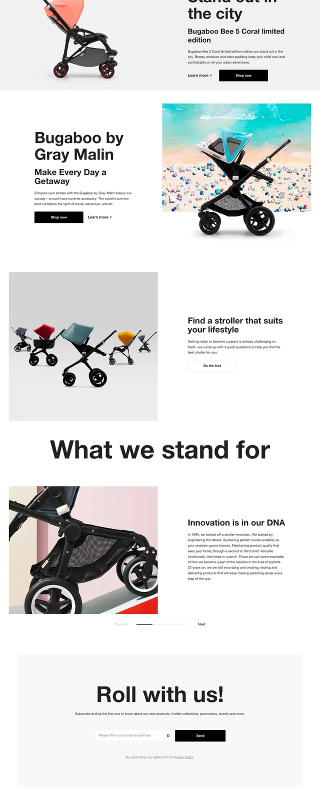
The page opens with a full-width photographic hero featuring a living room scene, centered headline, and a prominent yellow call-to-action button. Below, the layout shifts into airy editorial sections with large headlines, supporting copy, product imagery, testimonial cards, and a newsletter signup area. The page ends with a dark footer packed with multi-column navigation links and email capture. The overall design uses generous white space, soft neutrals, and repeated lifestyle photography to keep the shopping experience approachable.
Key takeaway
This layout works by combining a strong brand image with simple ecommerce navigation and reassuring copy. It is a good reference for premium consumer brands that want to feel curated rather than overly commercial.
Reuse notes
Reuse the oversized hero headline, centered CTA, and airy split-section rhythm for branded retail pages. The testimonial row and newsletter block are especially useful as reusable trust-building sections.