Preview image. Unlock full-res
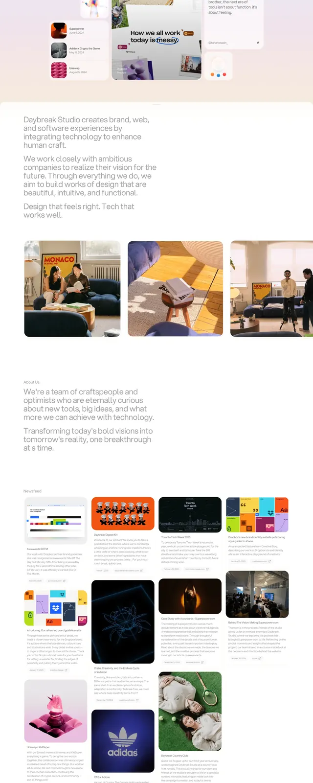
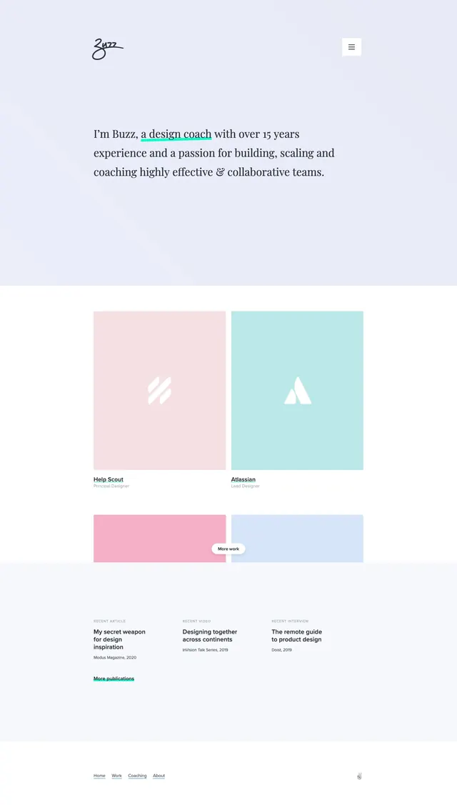
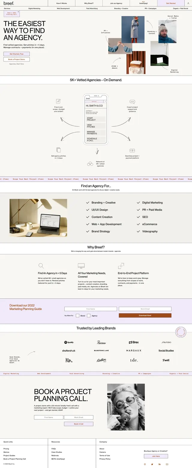
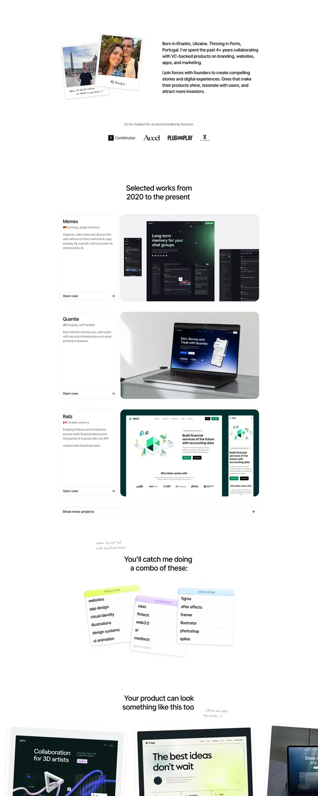
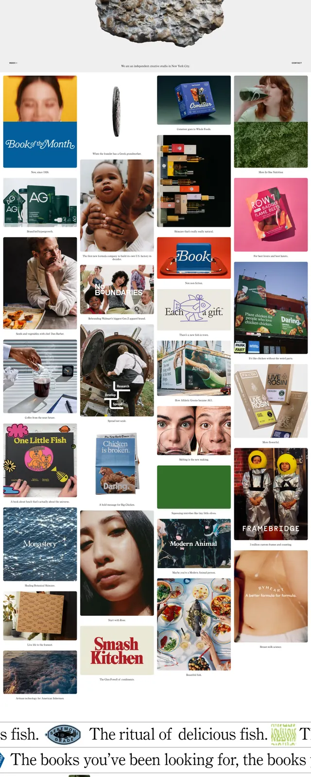
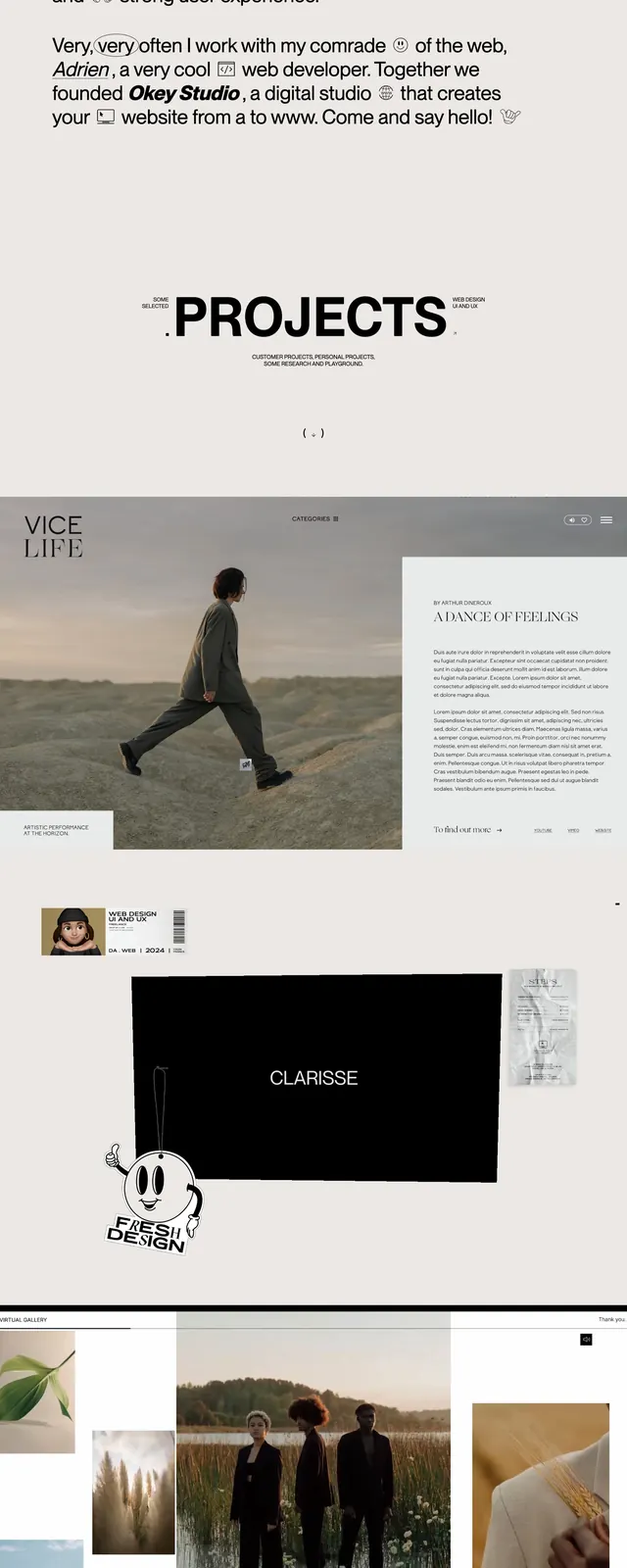
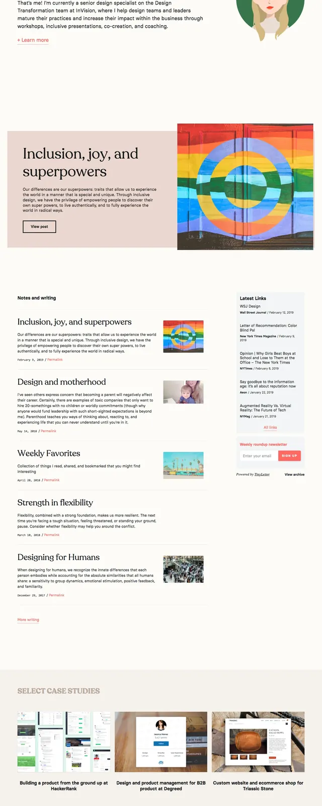
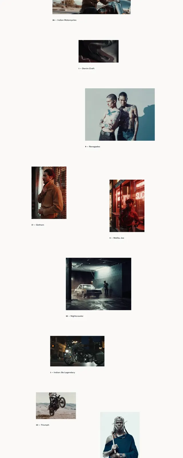
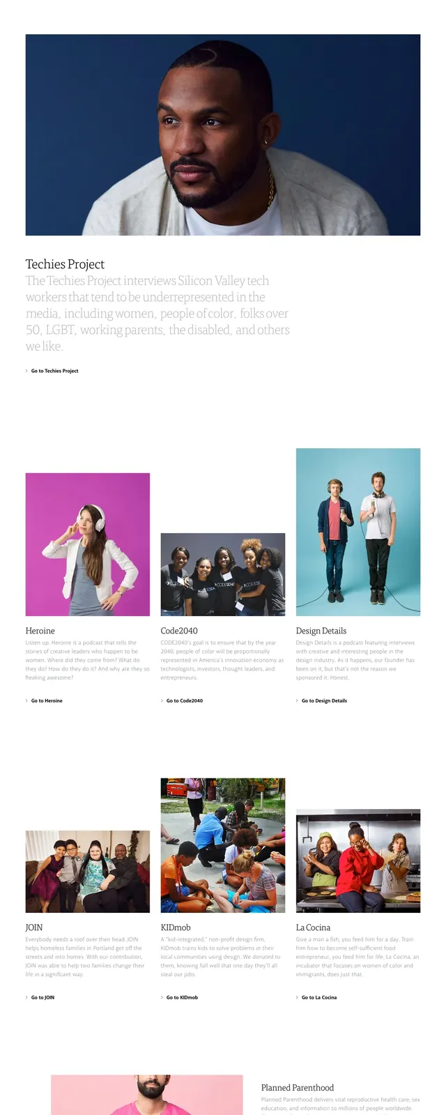
A minimalist editorial landing page with oversized serif headlines, airy whitespace, and bright photographic panels.
Summary
A minimalist editorial landing page with oversized serif headlines, airy whitespace, and bright photographic panels.
Visual description
The page opens with a sparse top navigation, a large serif title, and a pale subtitle on a white background. A wide hero image with a pink backdrop and a handoff scene anchors the first screen, followed by a three-column grid of project cards with photos, headings, and short descriptions. Lower on the page, a contact section pairs a simple form on the left with a bright floral product-style image on the right. The overall composition relies on generous spacing, thin rules, and soft, colorful photography.
Key takeaway
Use large serif headlines, minimal navigation, and strong image-led sections to create an airy editorial feel. The layout works best when each content block has room to breathe and the photography provides most of the visual energy.
Reuse notes
Good reference for agency or studio homepages that need a quiet, polished presentation. The card grid and split contact section are reusable patterns for project showcases and lead capture.