Preview image. Unlock full-res
A soft, editorial nonprofit-style landing page for Display Care with oversized typography, pastel accents, and illustrated storytelling.
Summary
A soft, editorial nonprofit-style landing page for Display Care with oversized typography, pastel accents, and illustrated storytelling.
Visual description
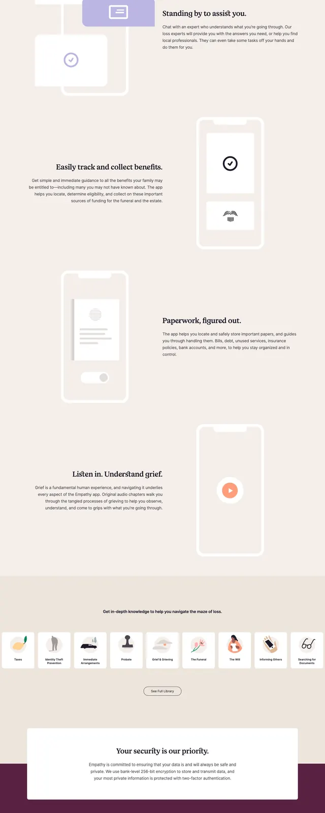
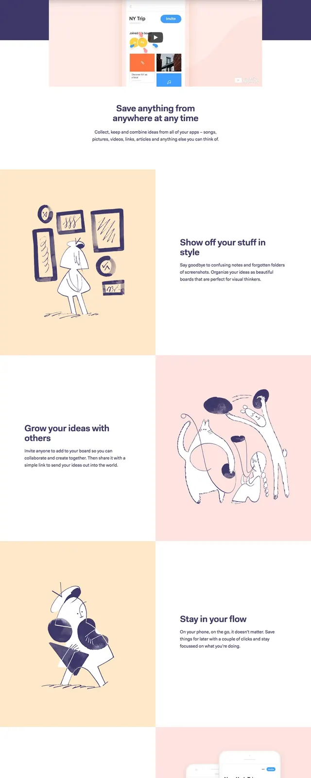
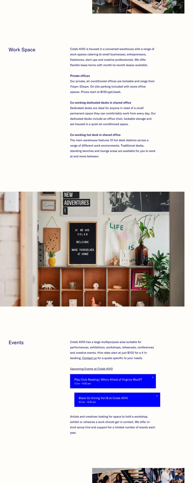
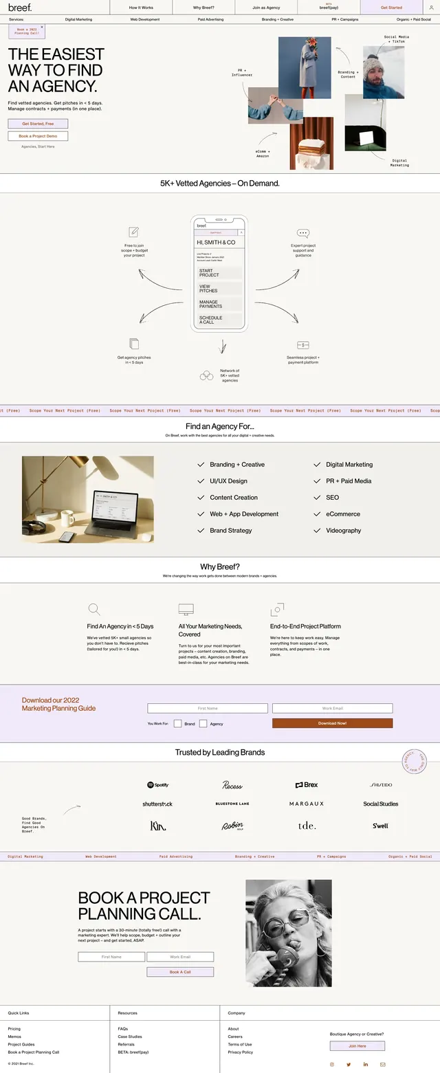
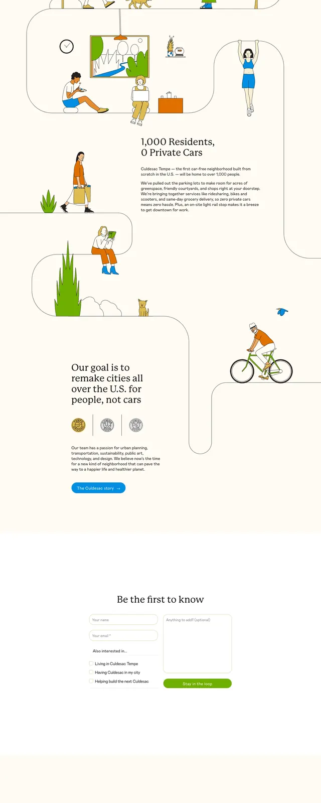
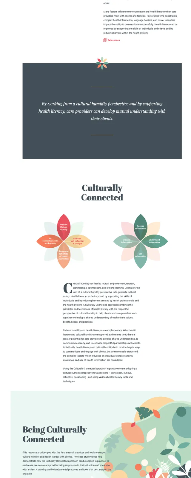
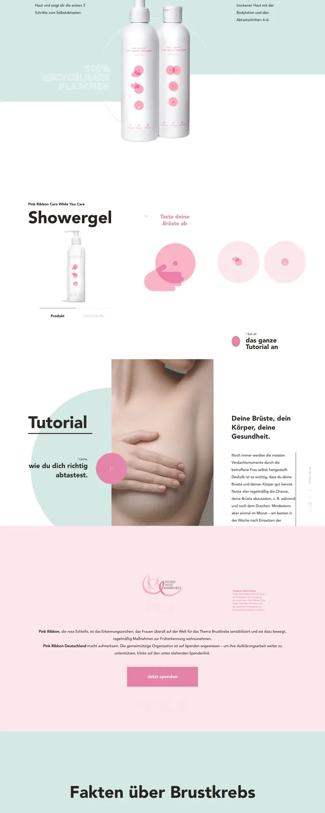
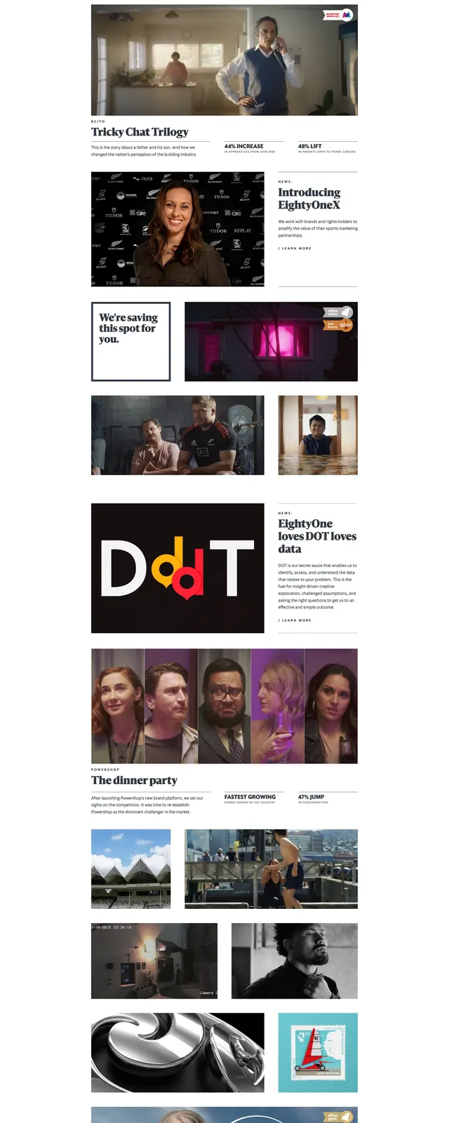
The page uses a cream background with strong vertical coral and pink side rails that anchor the layout. The hero features a large centered headline reading 'Shaping the Care Sector' with a small italic accent word, plus a compact top navigation and rounded CTA button. Lower sections include editorial blocks, illustrated figures, a quote-like statement, a large statistic callout, and a footer with contact details and social icons. The overall composition mixes generous whitespace, thin dividers, and hand-drawn-style illustrations.
Key takeaway
This design balances softness and authority through oversized type, pastel color blocking, and simple illustrated scenes. It is well suited to mission-driven brands that want to feel modern, human, and accessible.
Reuse notes
Reuse the vertical color bands and oversized hero typography to create a distinctive frame for content-heavy nonprofit or healthcare pages. The illustrated sections and statistic block can be adapted into reusable storytelling modules for impact narratives and service explanations.