Preview image. Unlock full-res
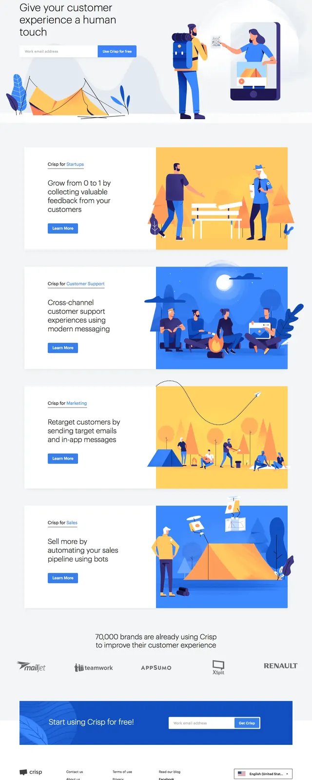
A clean SaaS landing page with a split hero, illustrated customer journey sections, social proof, and a strong demo-driven CTA flow.
Summary
A clean SaaS landing page with a split hero, illustrated customer journey sections, social proof, and a strong demo-driven CTA flow.
Visual description
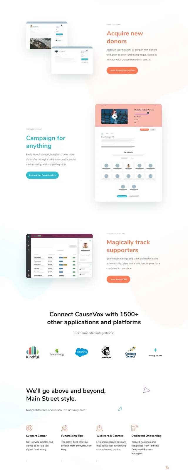
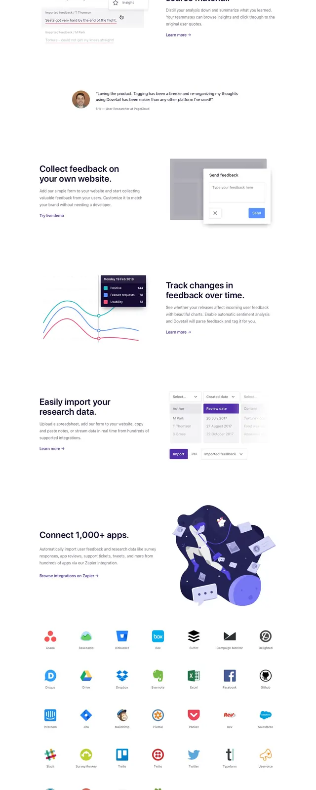
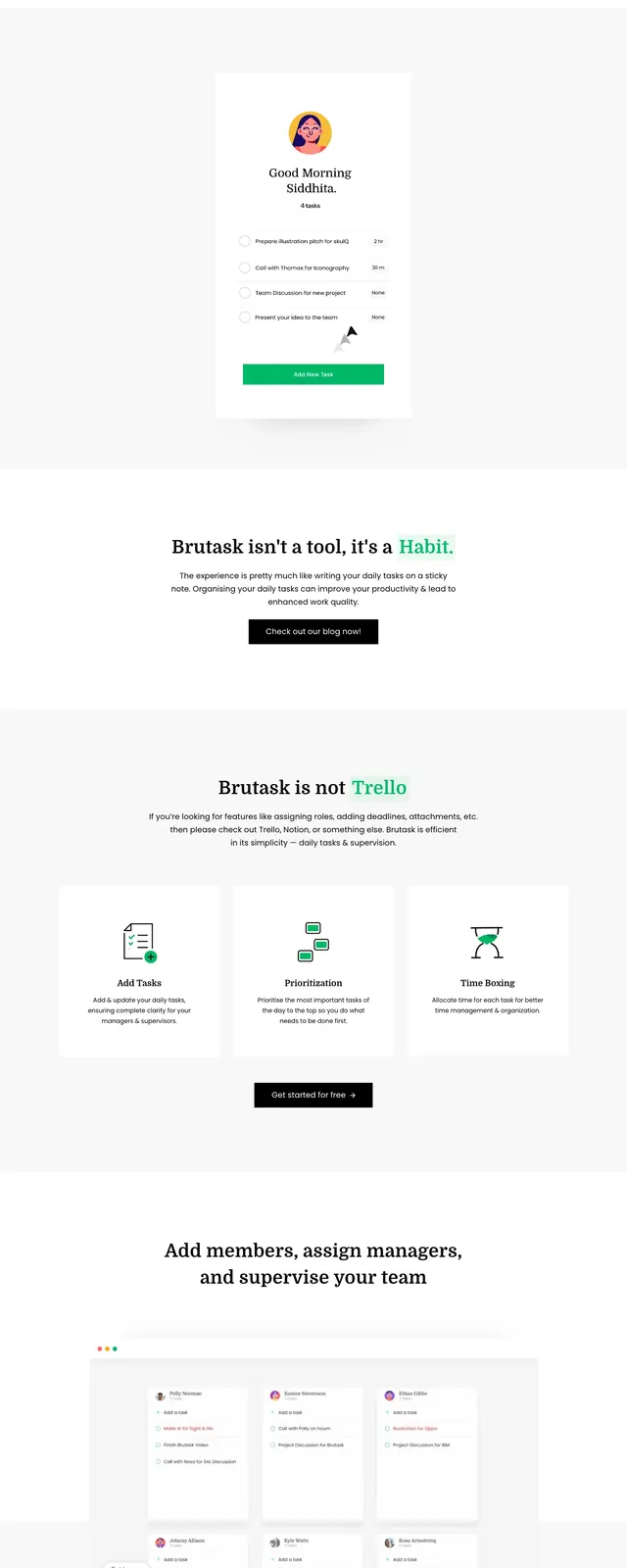
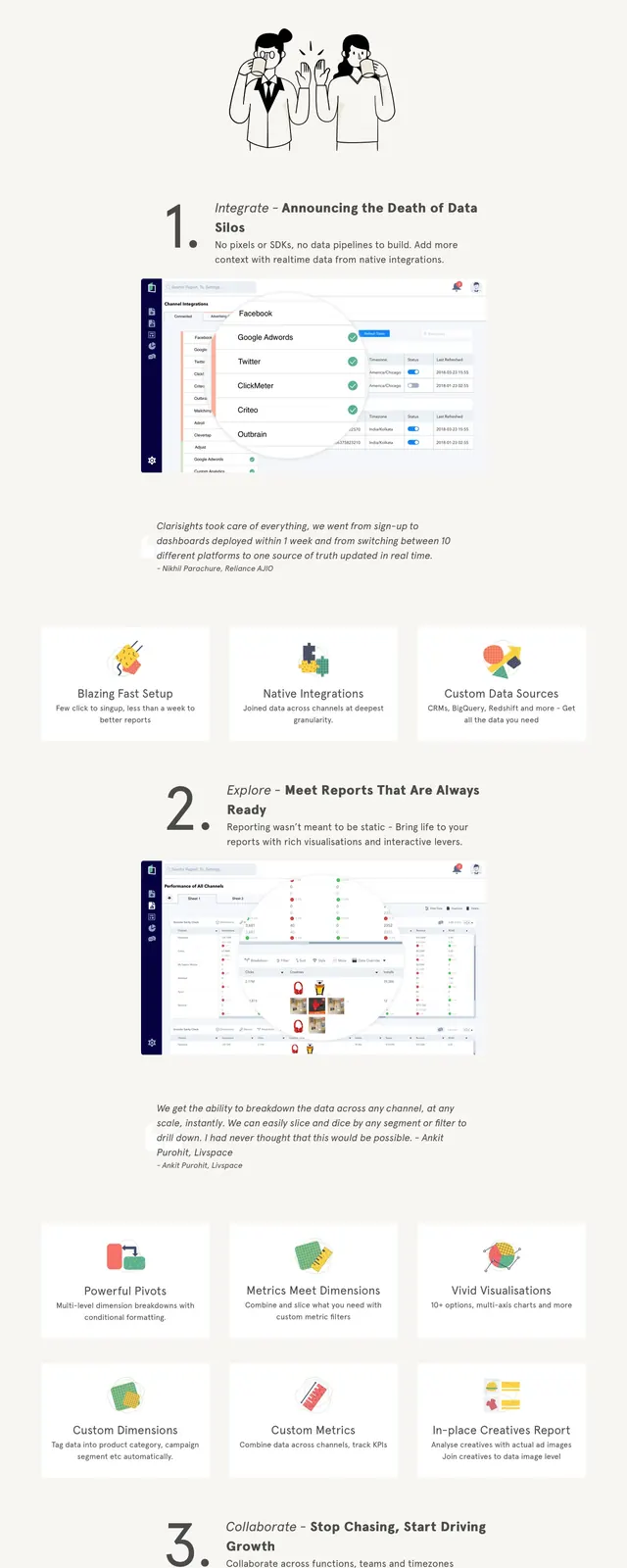
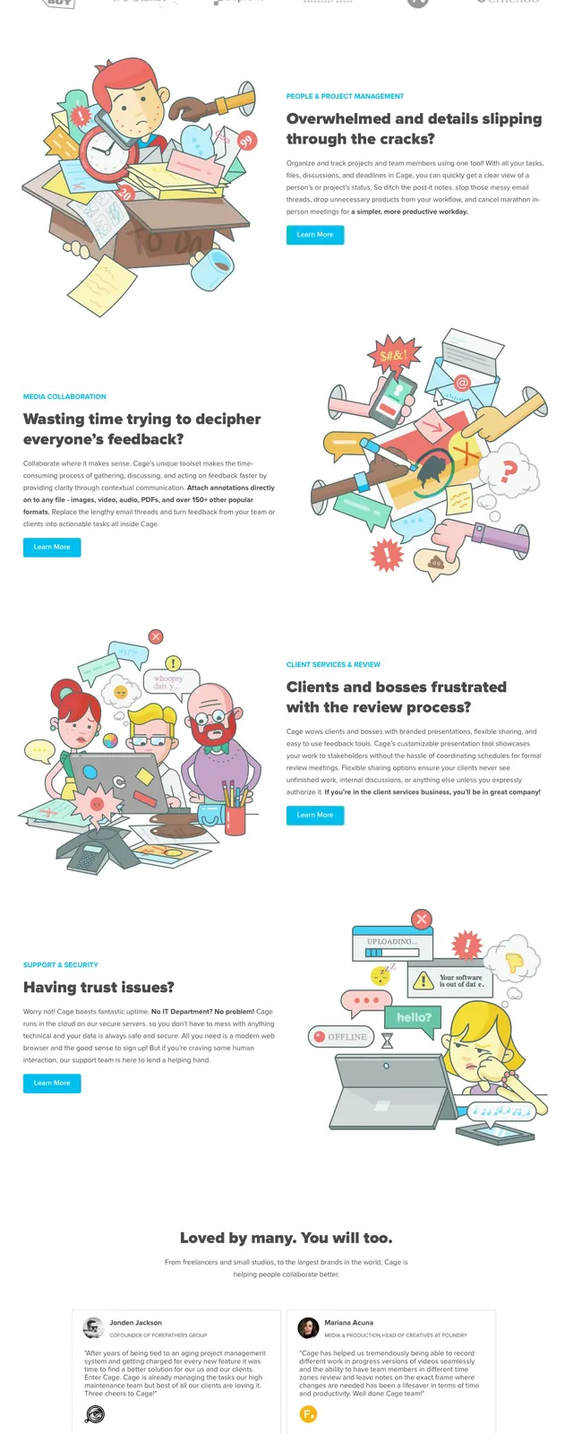
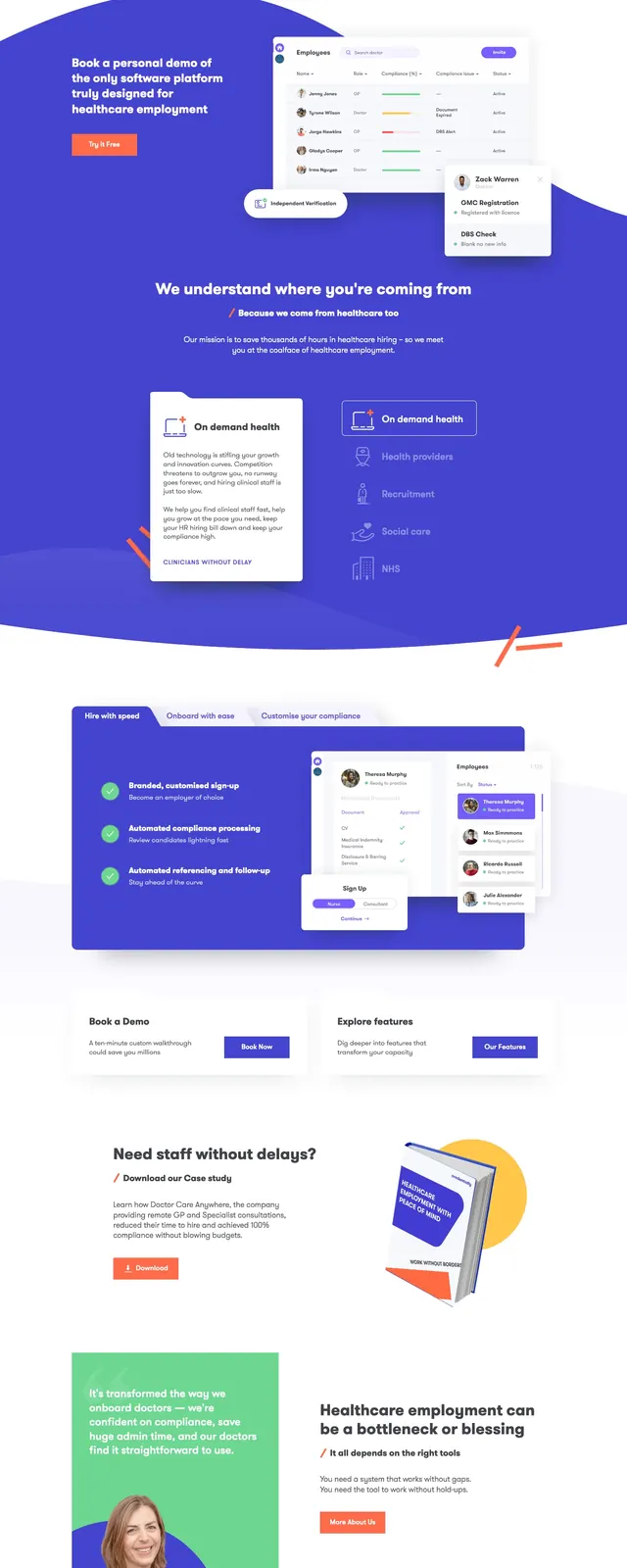
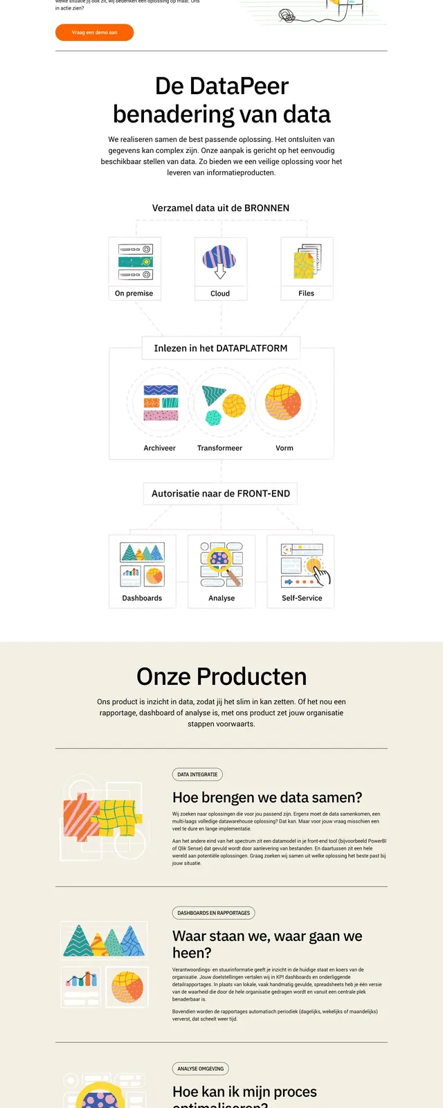
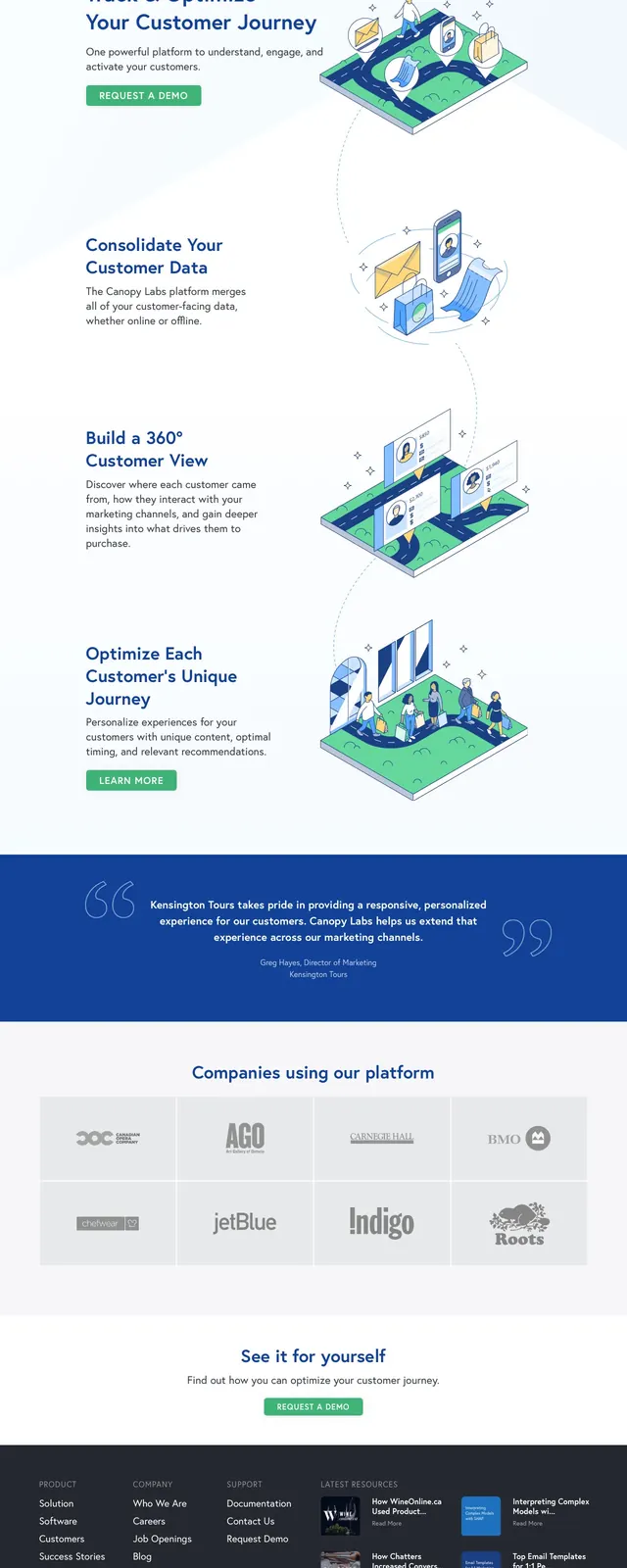
The page opens with a left-aligned hero message and a right-side illustrated platform scene, set on a pale blue-white background with lots of whitespace. Below, the layout continues as a vertical sequence of large illustrated feature moments connected by a dotted path, each paired with short explanatory copy. A bold blue testimonial band interrupts the flow, followed by a muted logo grid, a centered call-to-action block, and a dark multi-column footer. The overall presentation feels like a polished B2B SaaS marketing site built around customer journey storytelling.
Key takeaway
The design uses illustration-led storytelling to make a complex SaaS offering feel simple and approachable. Strong spacing, clear CTA buttons, and a structured section rhythm make it easy to scan and reuse.
Reuse notes
Reuse the hero structure for product pages that need quick clarity: headline, supporting copy, CTA, and a single strong illustration. The testimonial strip and logo wall are effective proof blocks for any B2B landing page.