Preview image. Unlock full-res
A clean agency-style landing page with a large hero, service blocks, team showcase, technology band, process cards, testimonial, and final CTA.
Summary
A clean agency-style landing page with a large hero, service blocks, team showcase, technology band, process cards, testimonial, and final CTA.
Visual description
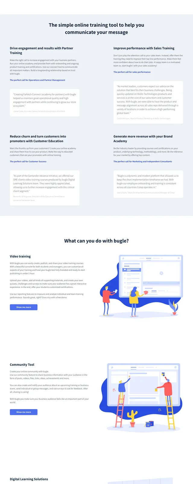
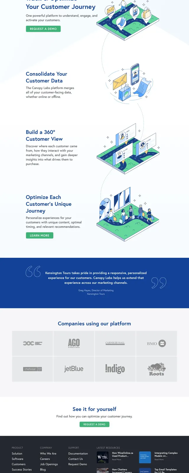
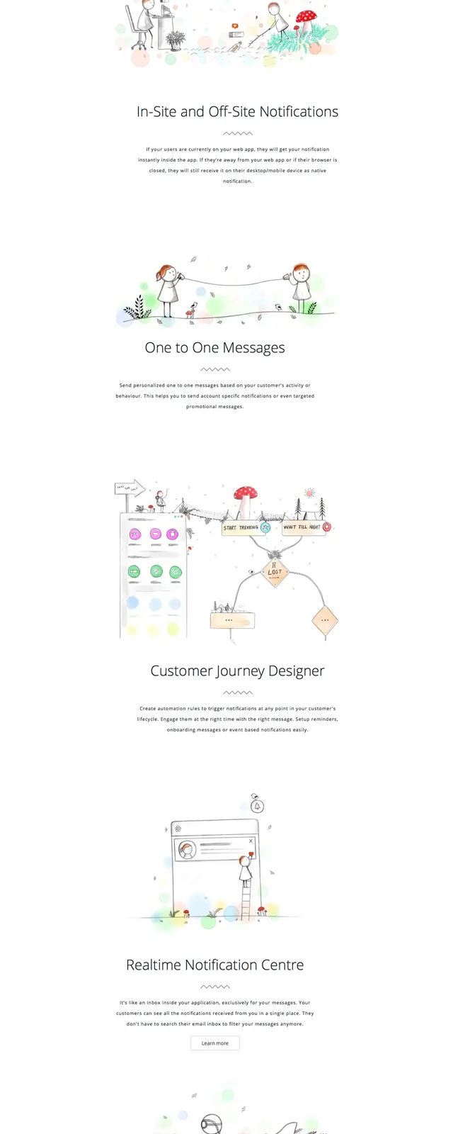
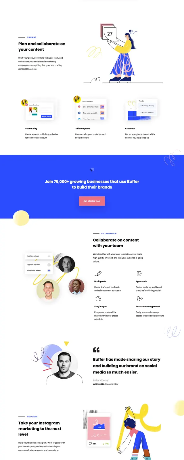
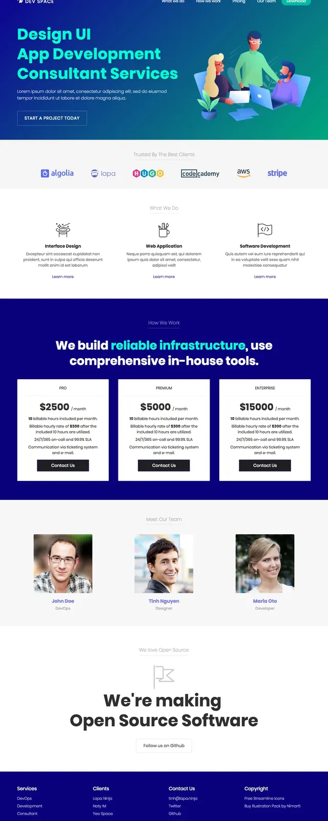
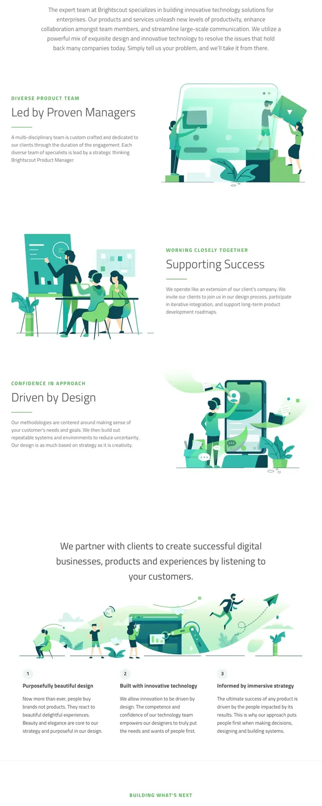
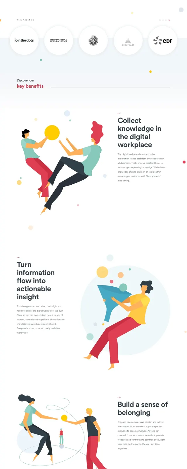
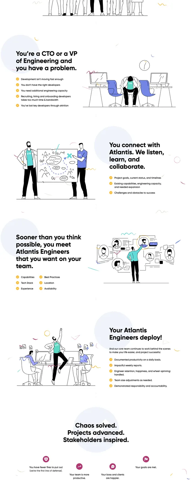
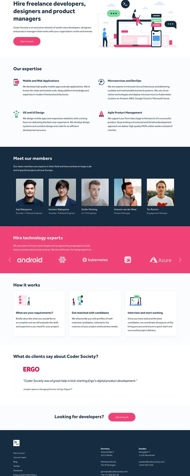
The page opens with a split hero: bold headline and short supporting copy on the left, with a colorful illustration of developers, devices, and messaging elements on the right. Below it are structured content sections with service cards, a dark team strip with portrait avatars, a bright logo band, three step process cards, a testimonial panel, and a simple closing call to action. The palette is mostly white with deep navy blocks and a strong pink accent used for buttons and highlighted sections. The overall visual language is airy, organized, and lightly illustrated rather than highly decorative.
Key takeaway
This layout is built to communicate credibility quickly through a clear value proposition, visible team proof, and simple conversion points. It works well as a reusable agency or developer-services landing page pattern.
Reuse notes
Reuse the hero + service grid + testimonial + CTA structure for B2B service sites that need trust-building above all else. The illustrated hero and pink accent can be swapped to match a brand without changing the underlying section hierarchy.