Preview image. Unlock full-res
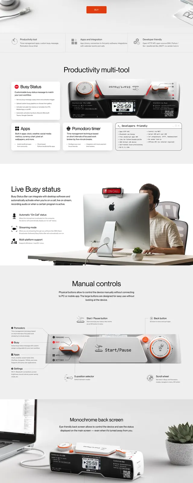
A clean hardware landing page for Busy Bar that combines a centered hero, feature strips, and large product photography on a white background.
Summary
A clean hardware landing page for Busy Bar that combines a centered hero, feature strips, and large product photography on a white background.
Visual description
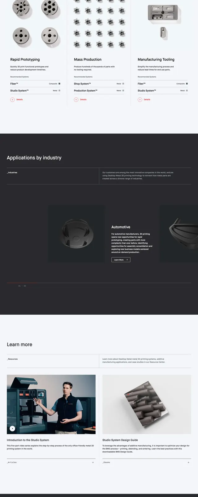
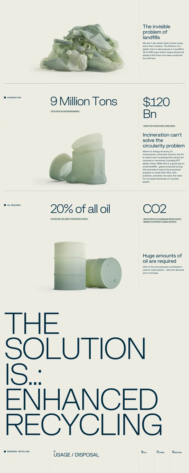
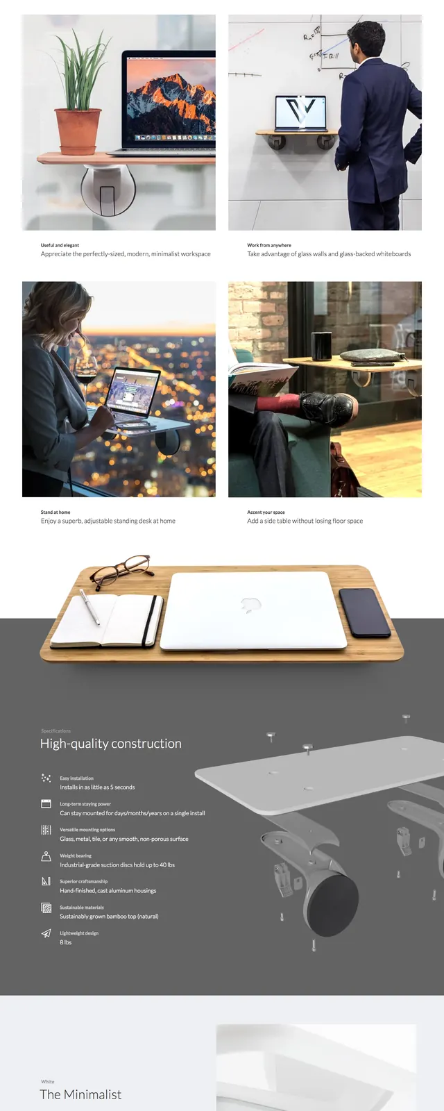
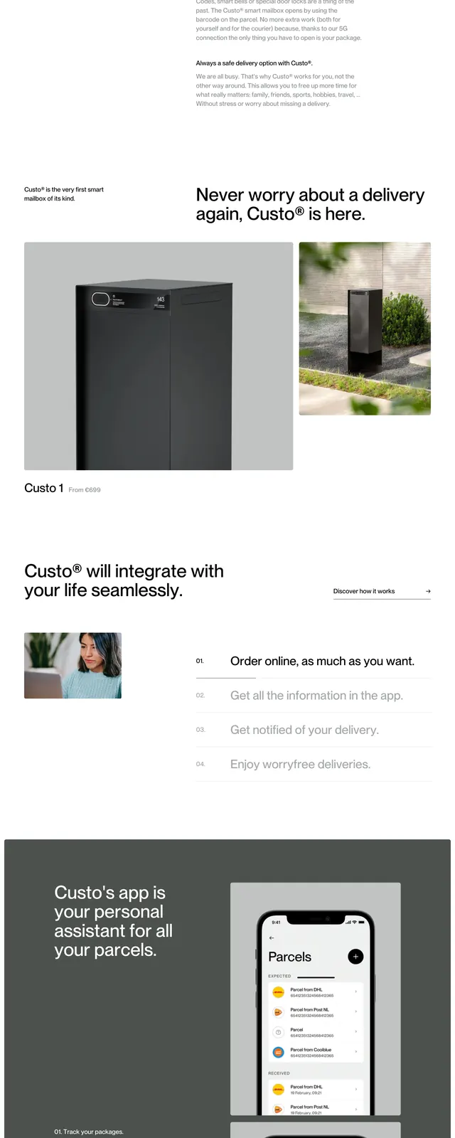
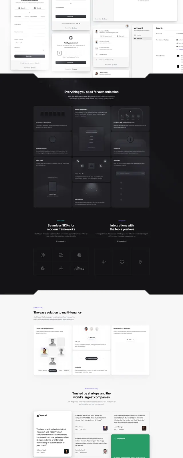
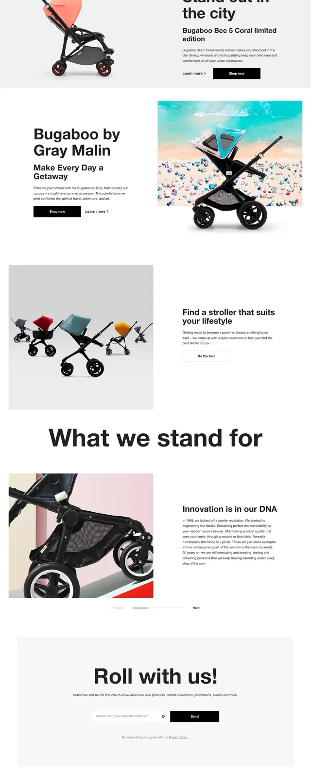
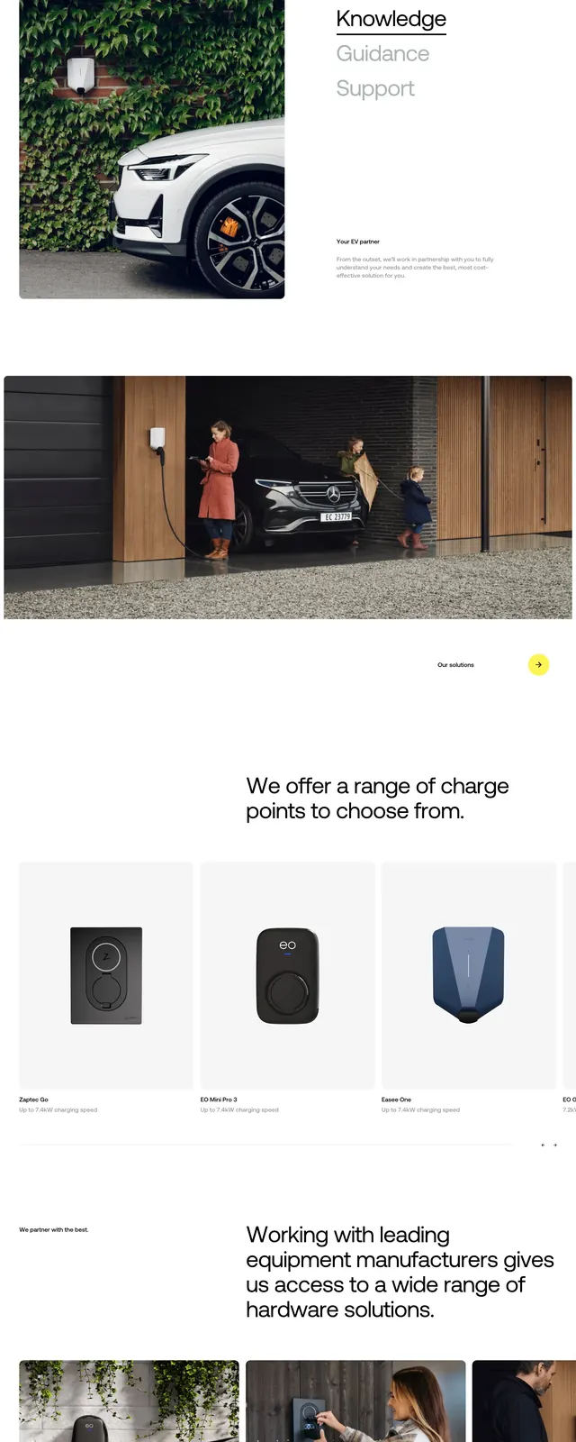
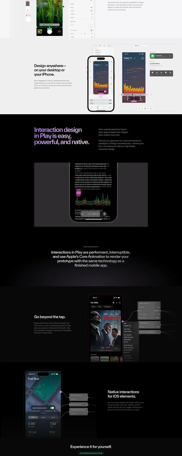
The page uses a bright white canvas with a small top navigation, a centered hero image of the device, and a short product description with a single orange buy button below. Lower sections are stacked vertically and alternate between feature summaries, product showcase panels, and a large lifestyle photo of a person using the device at a desk. The design relies on spacious layouts, thin dividers, small icon labels, and high-quality product renders rather than dense text blocks. A black footer closes the page with the brand mark, link columns, and social icons.
Key takeaway
The main reusable move is the editorial hardware landing page structure: a minimal hero, then alternating product-detail sections with strong photography and concise feature callouts. It feels premium by keeping the interface quiet and letting the device imagery do most of the work.
Reuse notes
Use this pattern for hardware, physical-product, or productivity-tool marketing pages where the product itself needs to stay visually central. It works best with crisp renders, ample whitespace, and a small number of clear CTAs.