Preview image. Unlock full-res
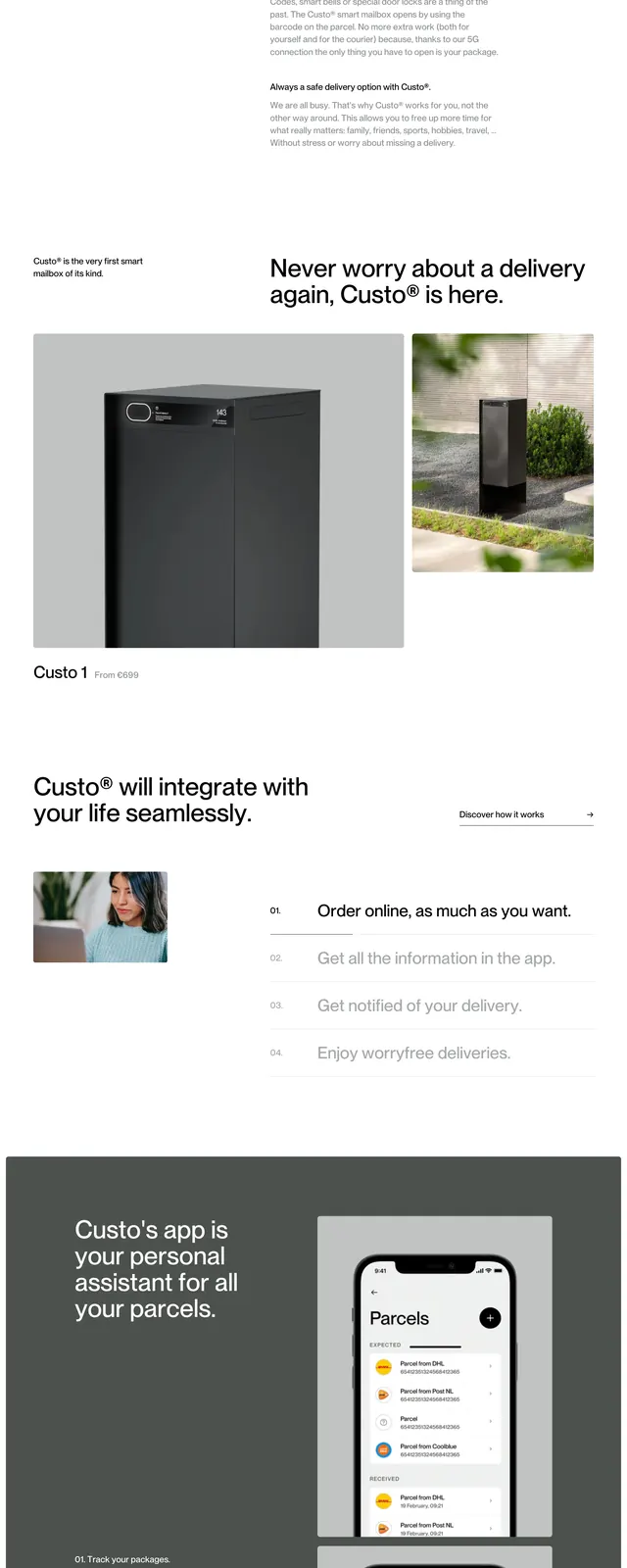
A minimalist product landing page for a smart mailbox brand with oversized hero typography, muted gray tones, and clean editorial spacing.
Summary
A minimalist product landing page for a smart mailbox brand with oversized hero typography, muted gray tones, and clean editorial spacing.
Visual description
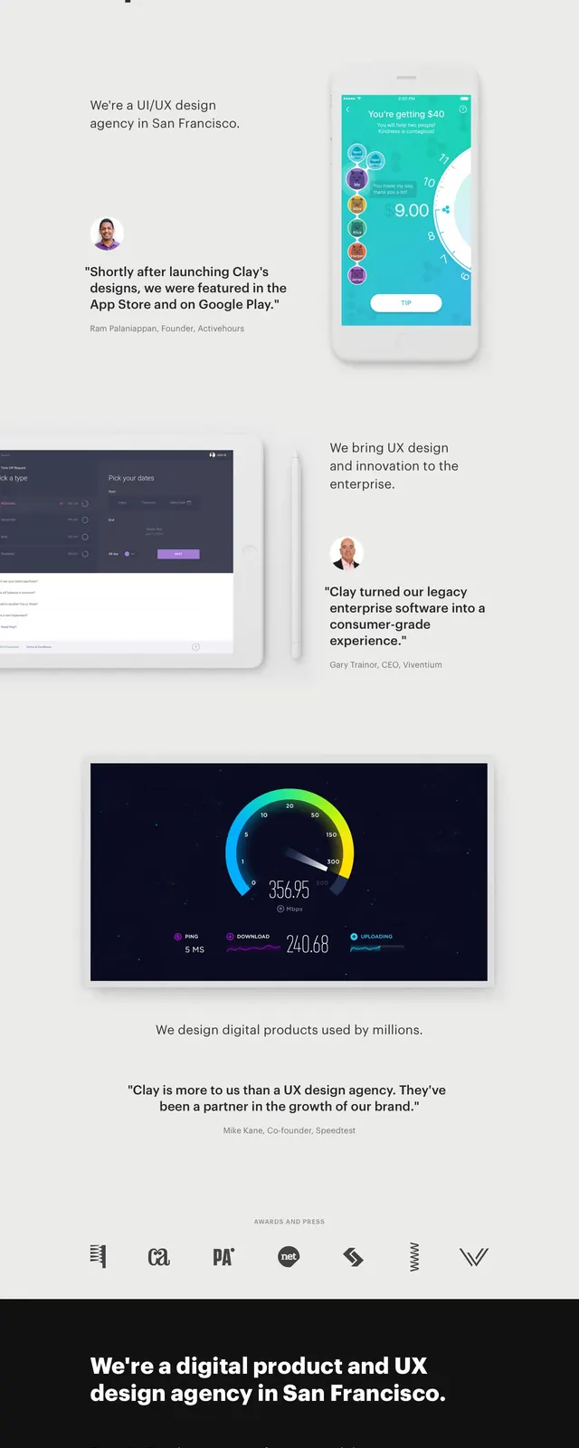
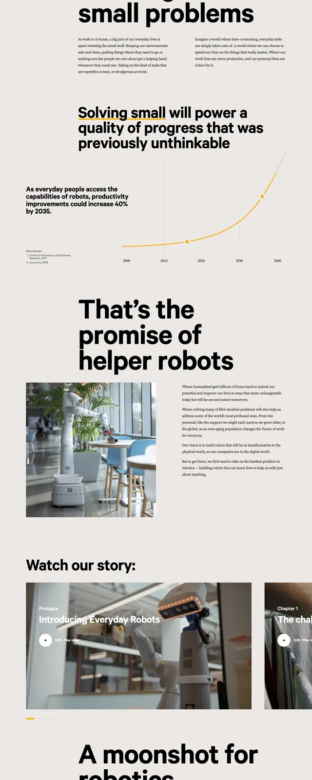
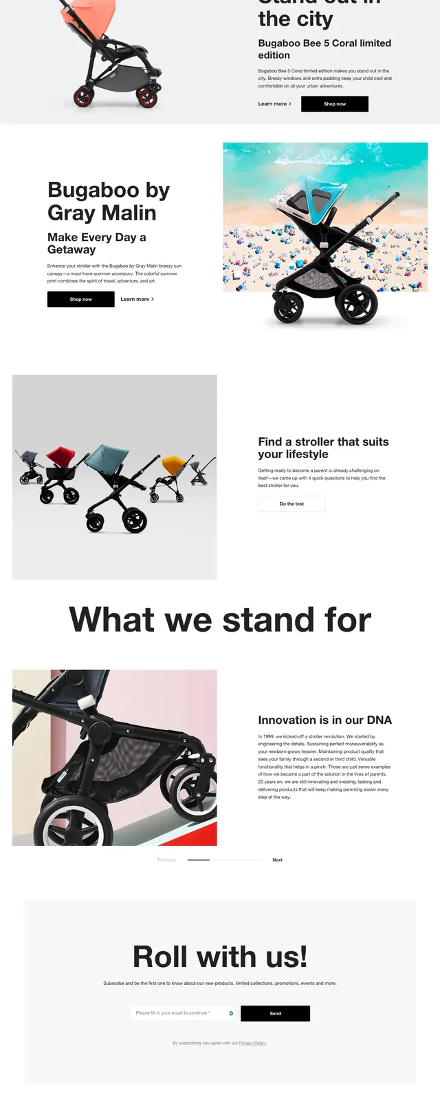
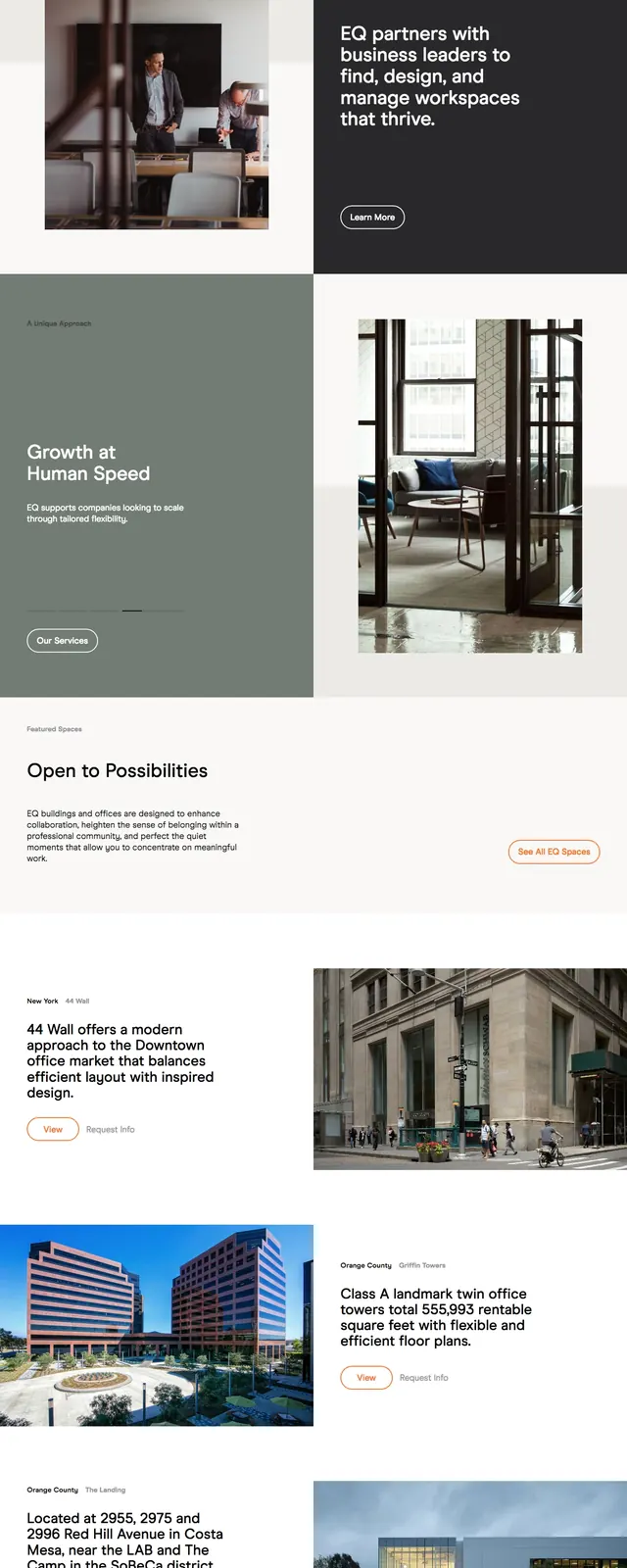
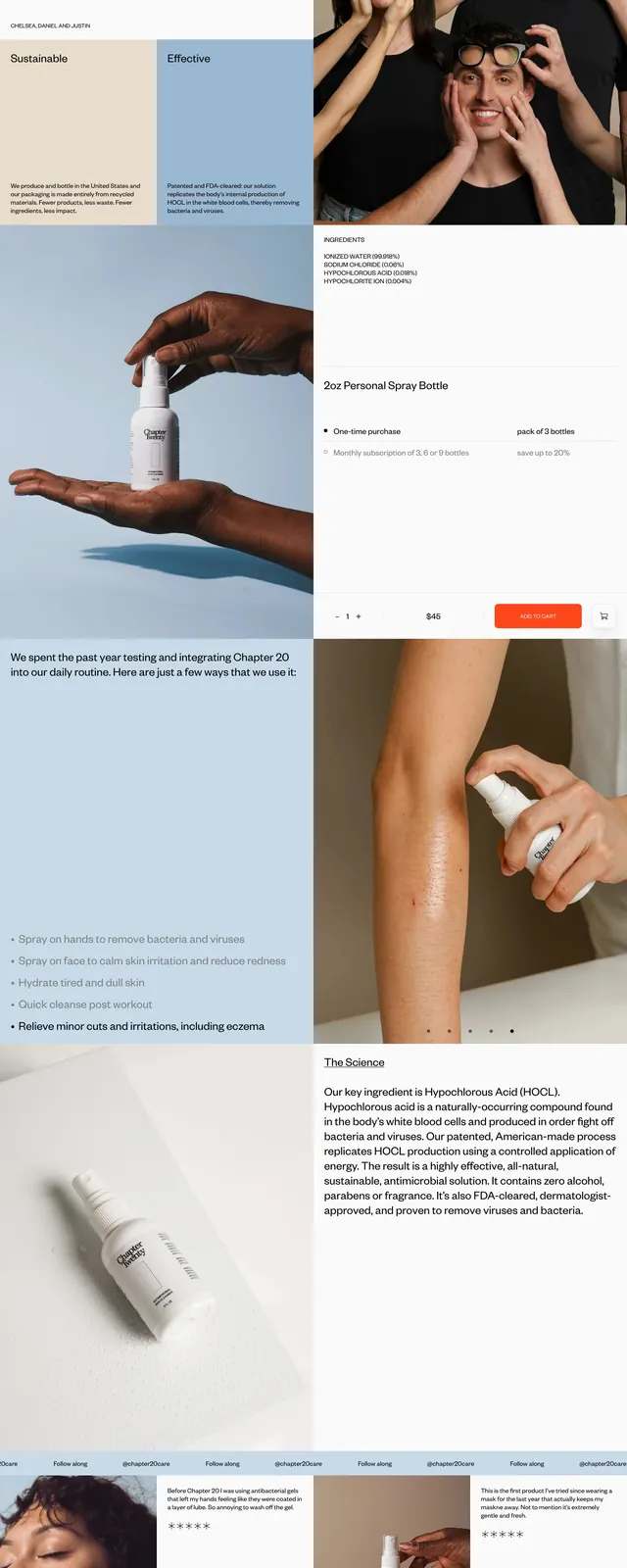
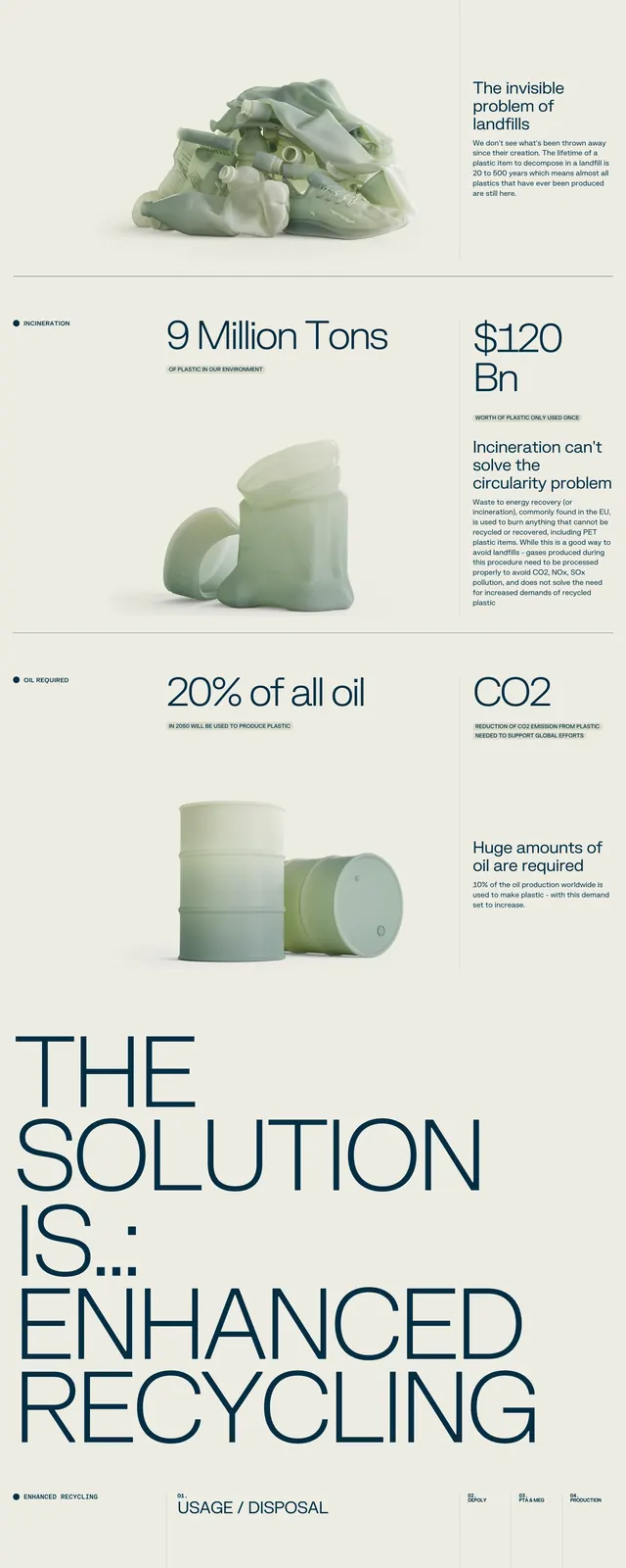
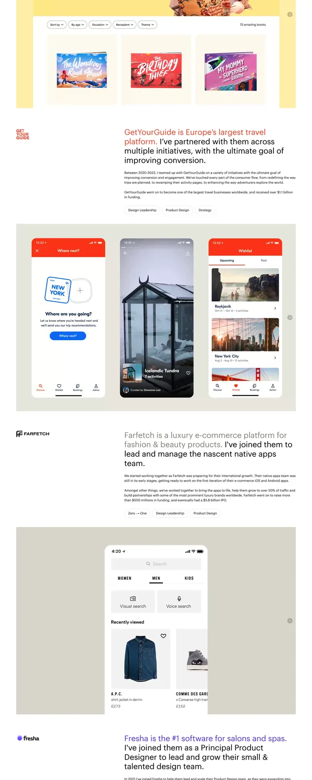
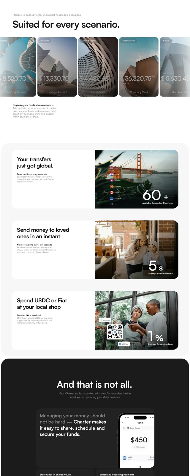
The page opens with a muted gray hero area, a slim top navigation, and a large product render of a black smart mailbox centered behind oversized branding text. Below, the layout shifts into clean white editorial sections with bold headline copy, product imagery, a simple feature list, and spaced content blocks. The page ends with a structured footer containing navigation links, language selection, social icons, and a newsletter signup field.
Key takeaway
The design relies on restraint: large type, generous whitespace, and a small palette to make the product feel premium and credible. It is a strong reference for hardware brands that want an editorial, design-forward landing page without visual clutter.
Reuse notes
Borrow the oversized hero wordmark, muted monochrome palette, and asymmetric section spacing for a similar premium feel. The split content blocks and simple footer make the structure easy to adapt for other consumer hardware products.