Preview image. Unlock full-res
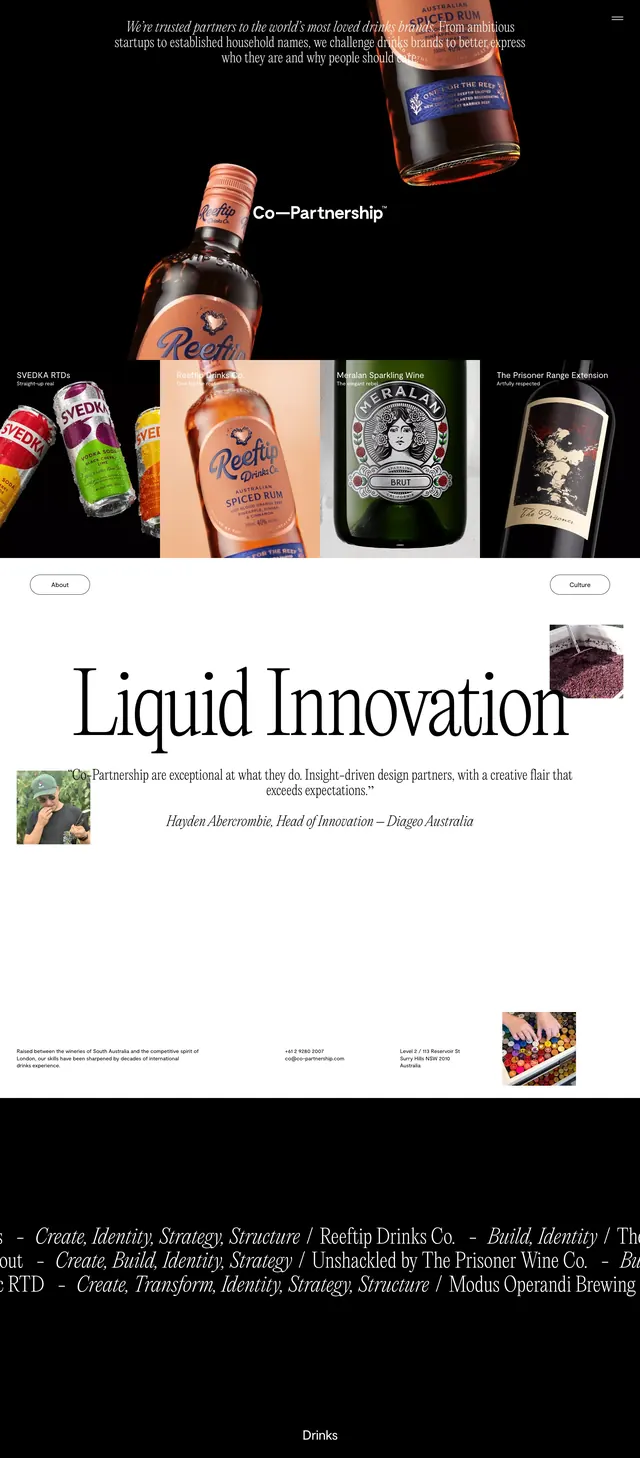
A high-contrast editorial portfolio landing page for a beverage branding studio with oversized serif typography, product photography, and sparse white-space sections.
Summary
A high-contrast editorial portfolio landing page for a beverage branding studio with oversized serif typography, product photography, and sparse white-space sections.
Visual description
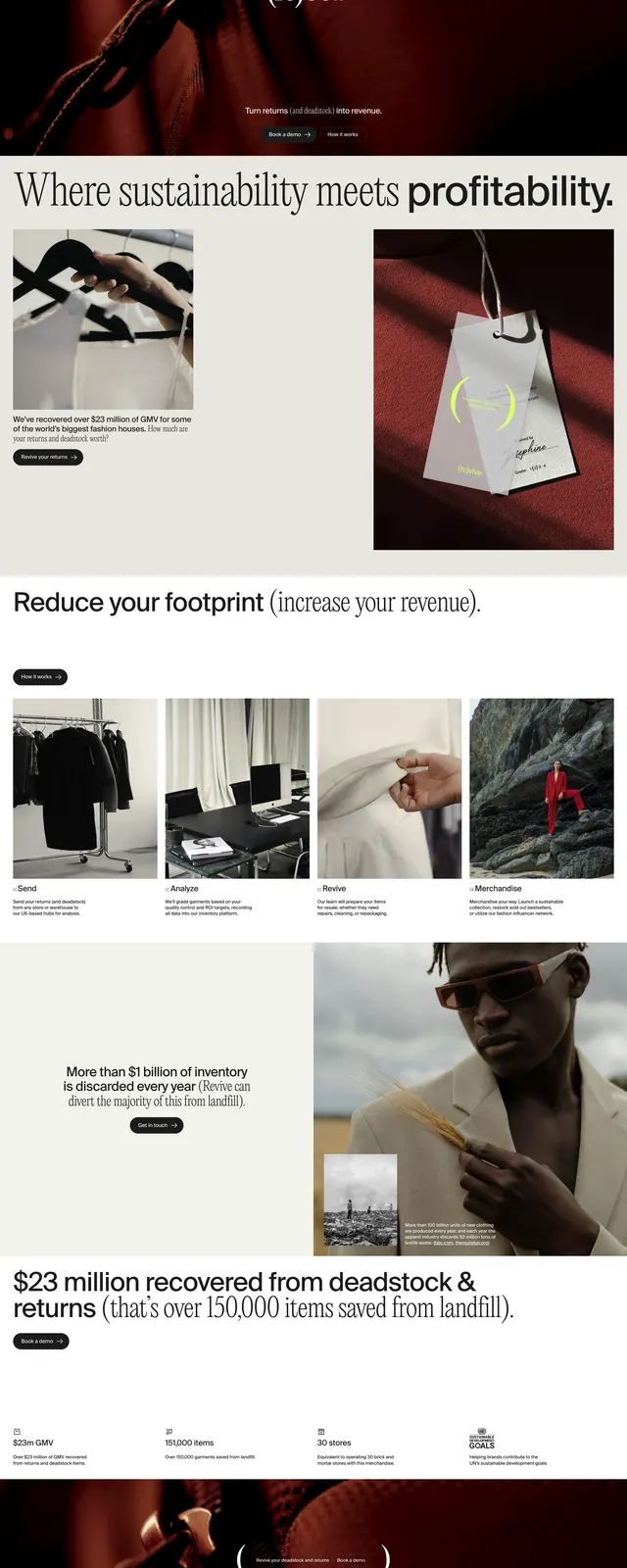
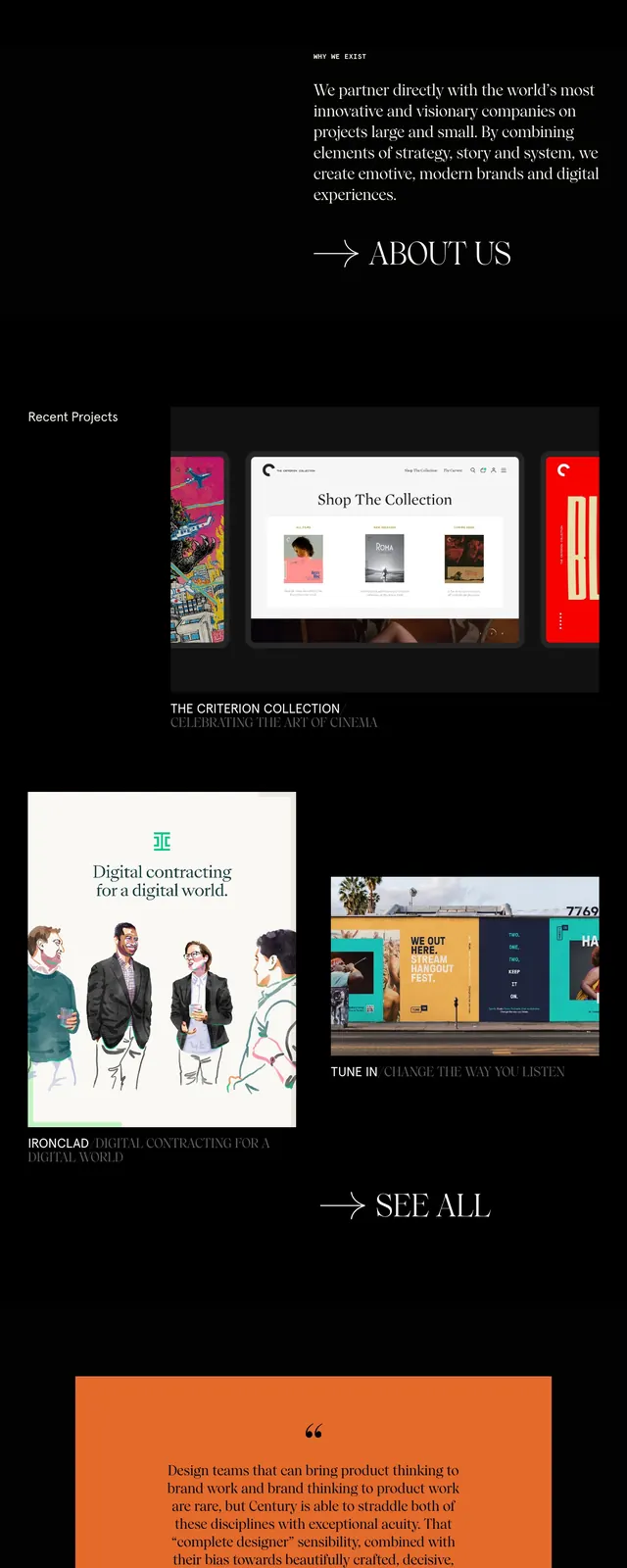
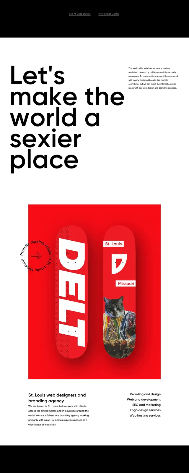
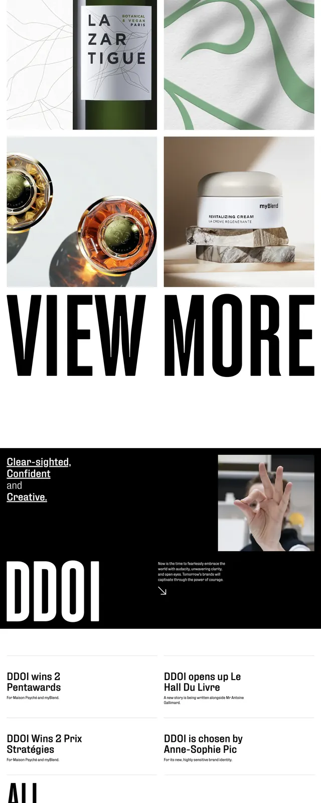
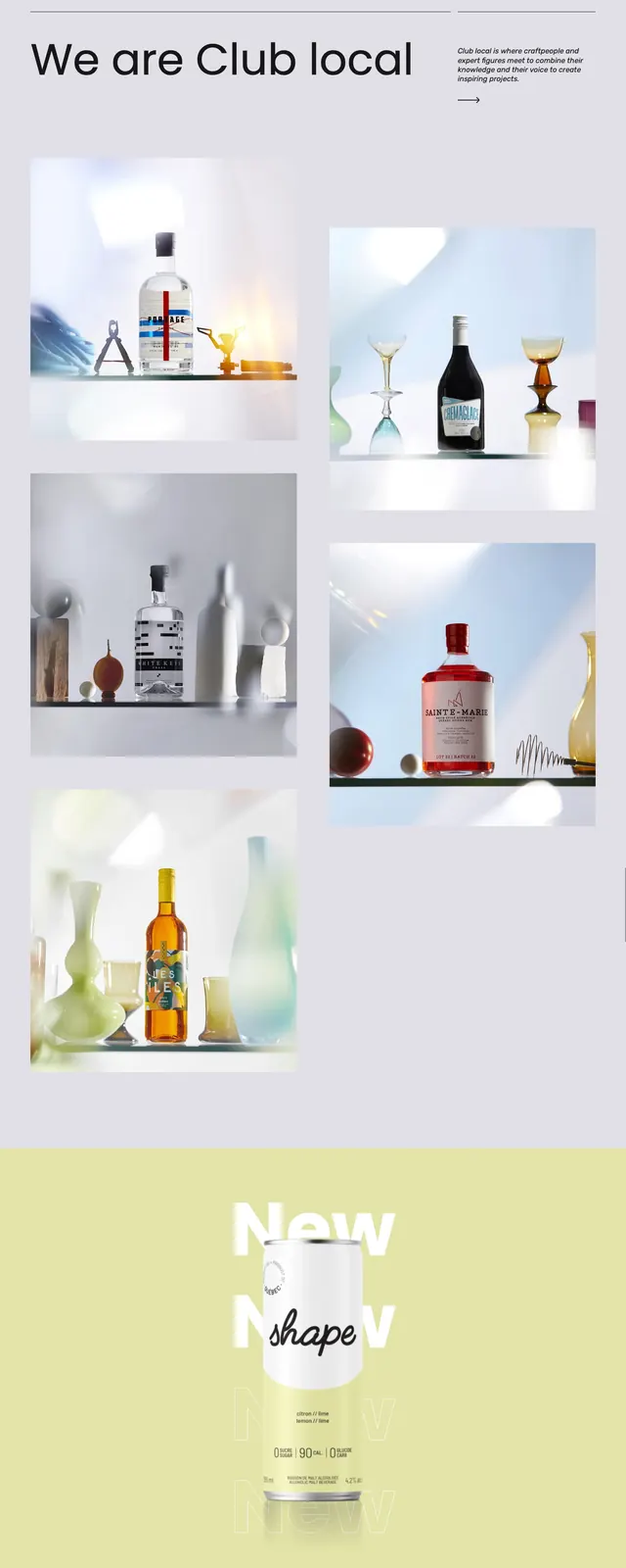
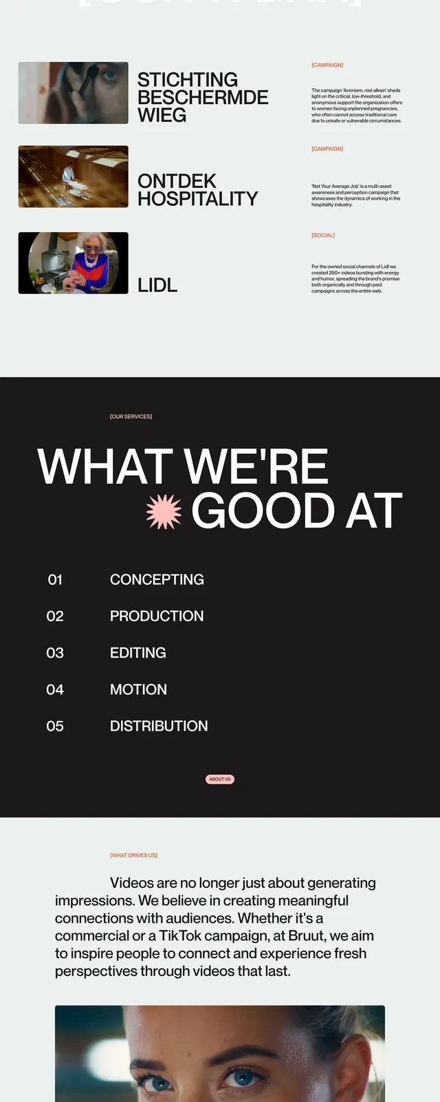
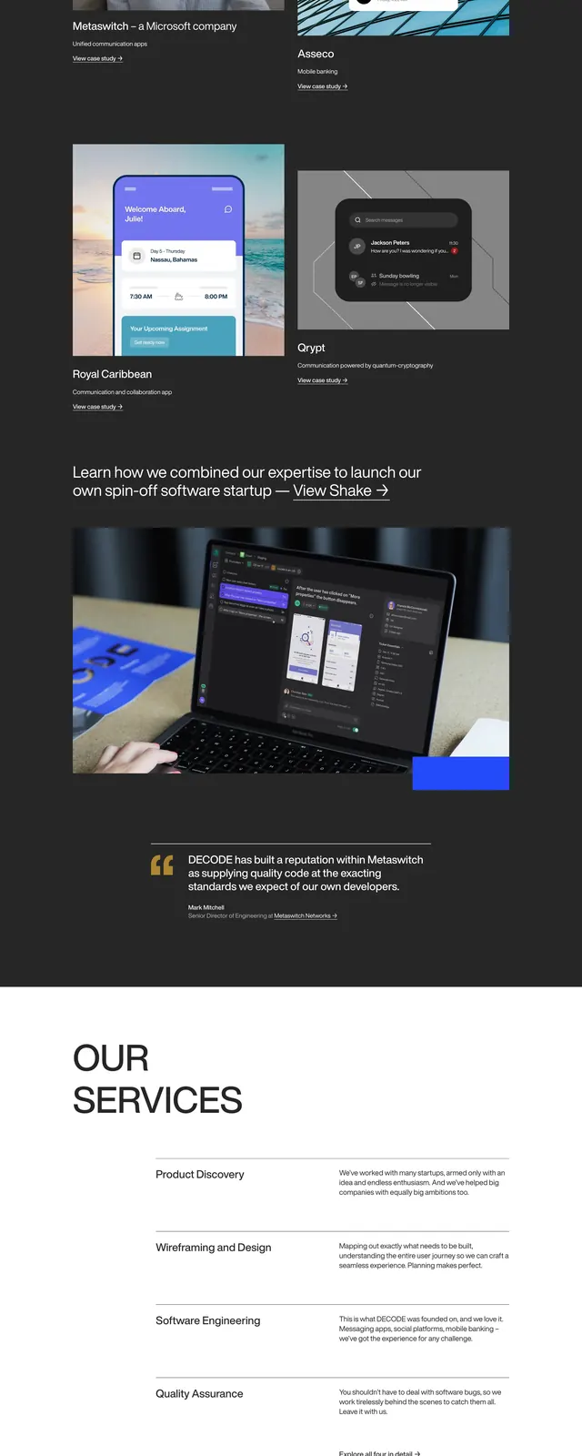
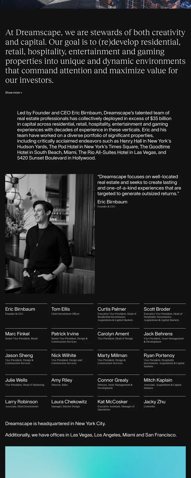
The page opens on a black full-bleed hero with floating liquor bottle photography, a centered studio name, and a small minimalist menu icon. Below, a horizontal strip of project thumbnails and case studies sits on a white background, followed by a giant serif headline, a testimonial quote, and sparse contact details. The lower portion returns to dark styling with an italic project list running across the width and a small category label at the bottom. The overall composition relies on strong contrast, editorial spacing, and premium product imagery.
Key takeaway
This layout works well for creative studios that want to feel premium, selective, and highly visual. The mix of oversized serif headlines and restrained navigation gives the page a gallery-like, brand-forward presence.
Reuse notes
Reuse the black-to-white section transitions, oversized typography, and image-led case study band for portfolio or agency sites. The design is especially effective when showcasing premium consumer products or identity work with strong photography.