Preview image. Unlock full-res
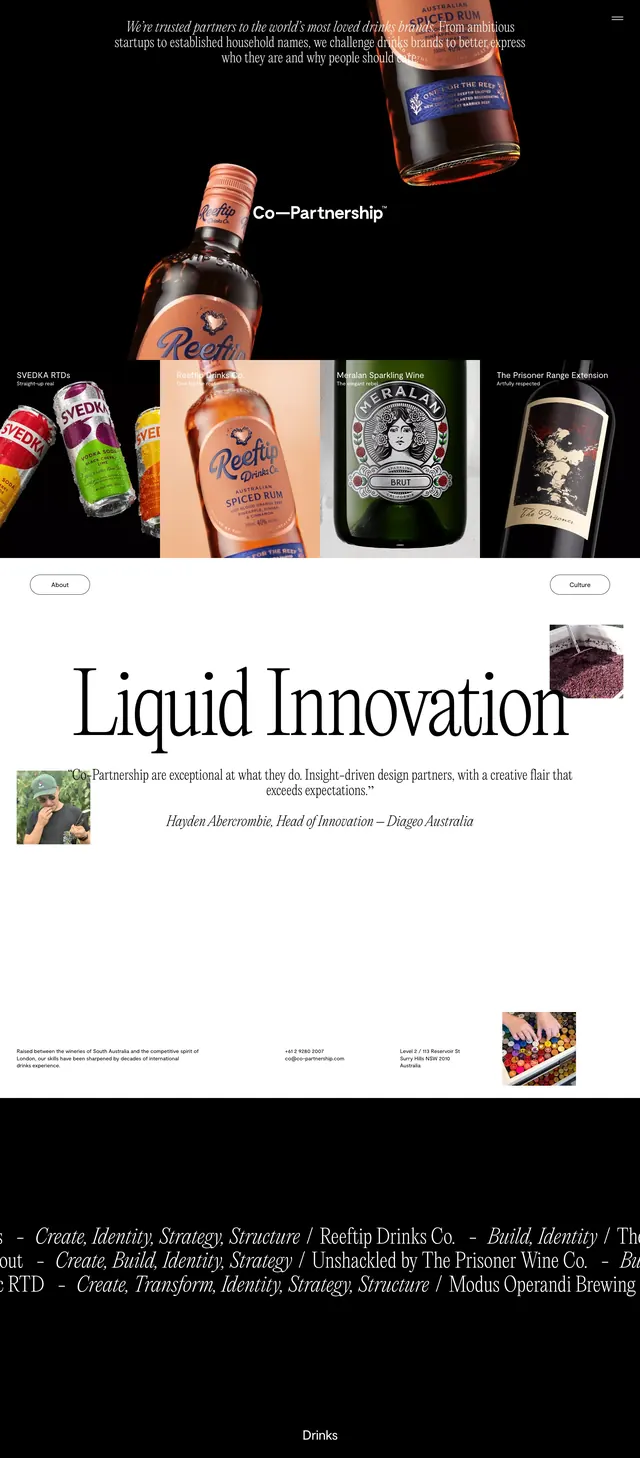
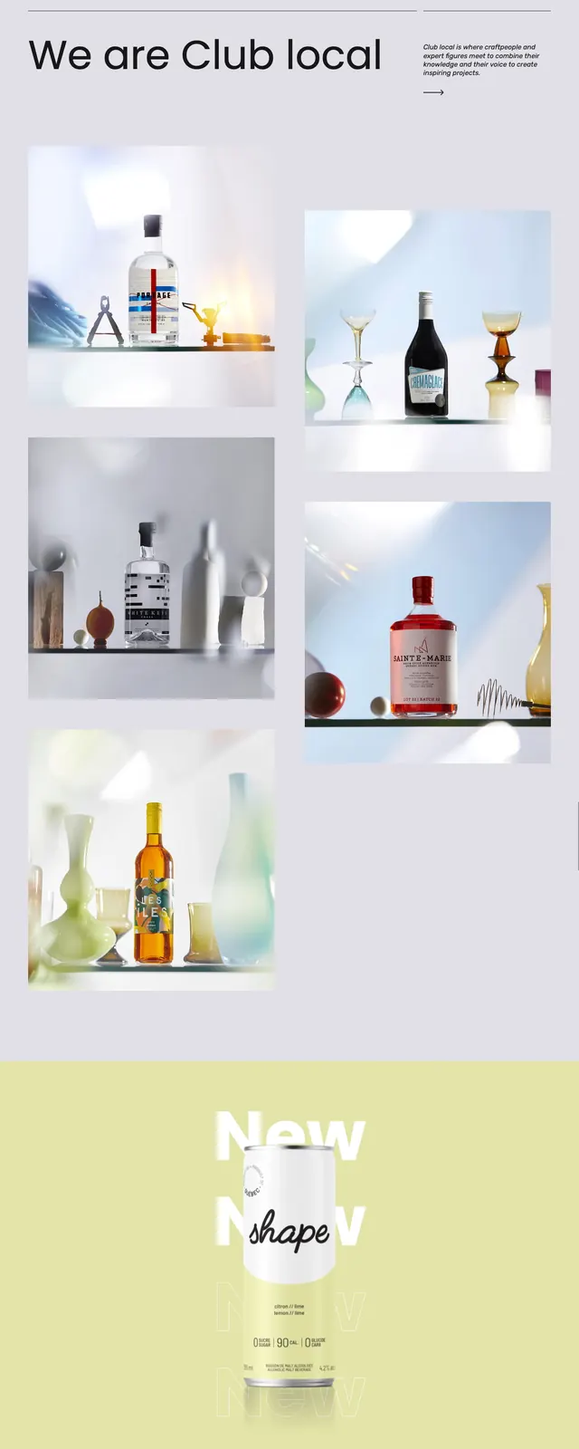
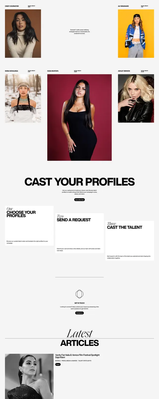
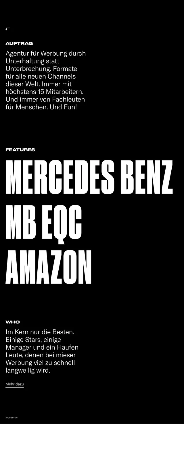
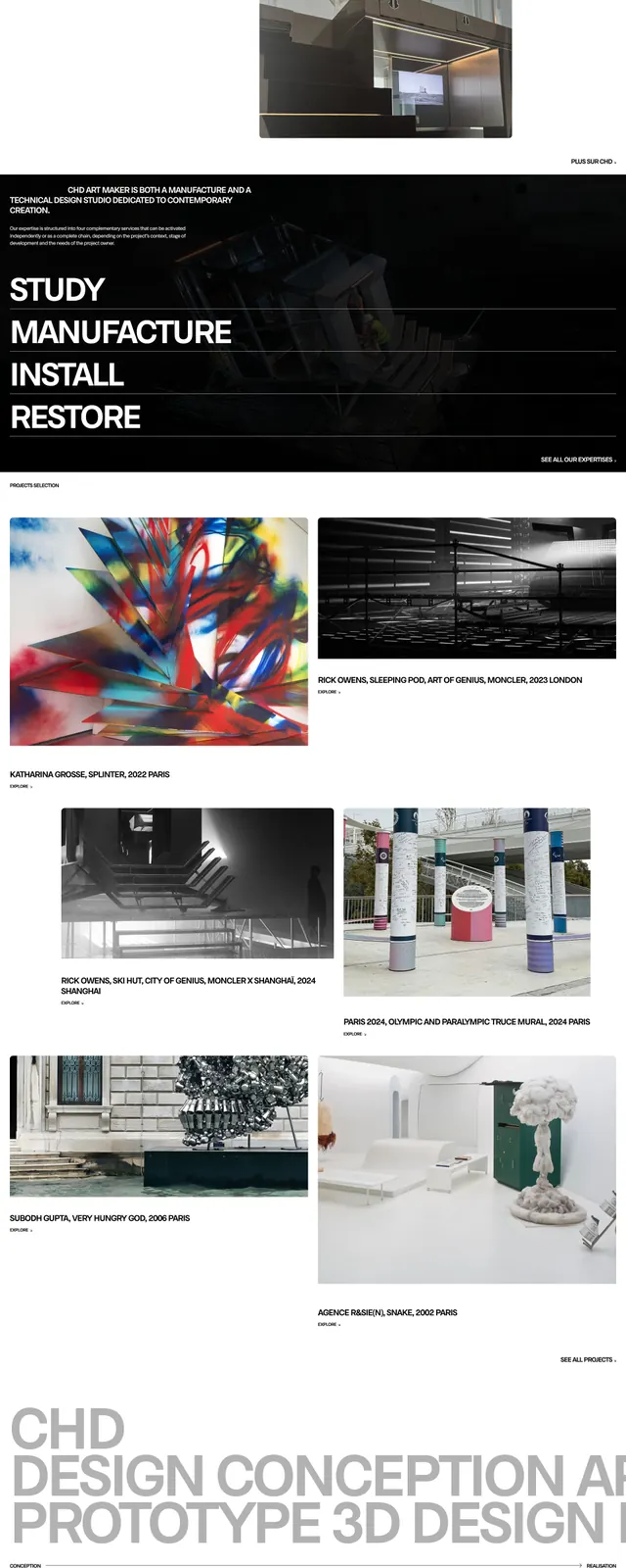
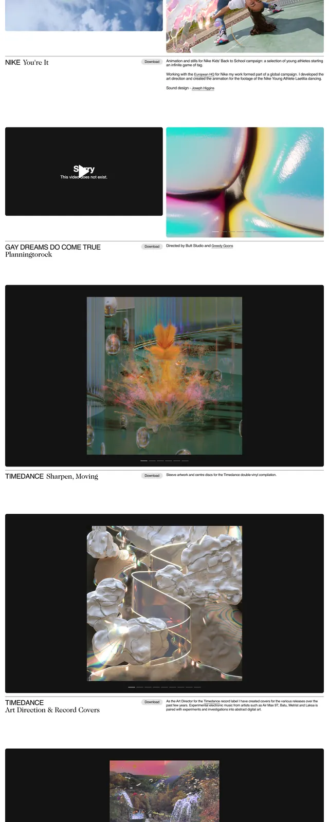
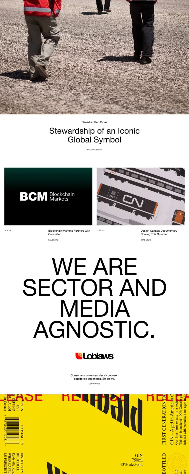
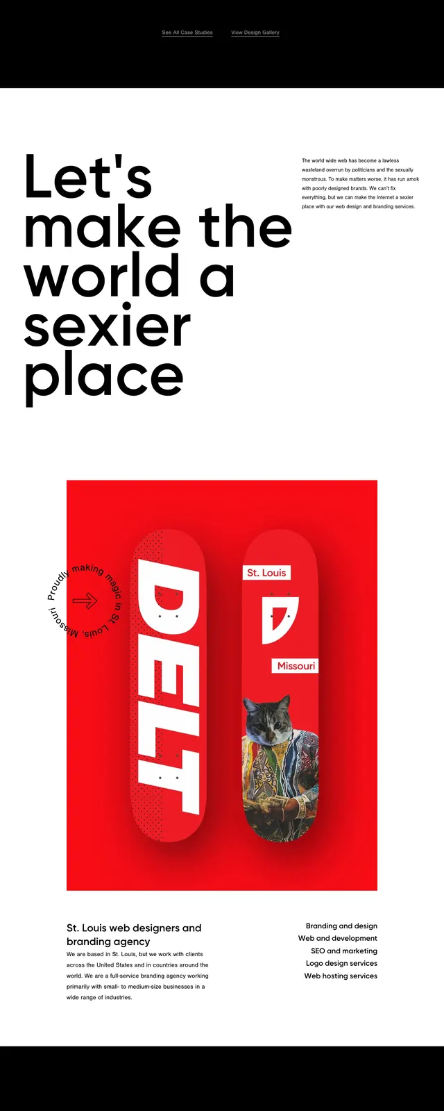
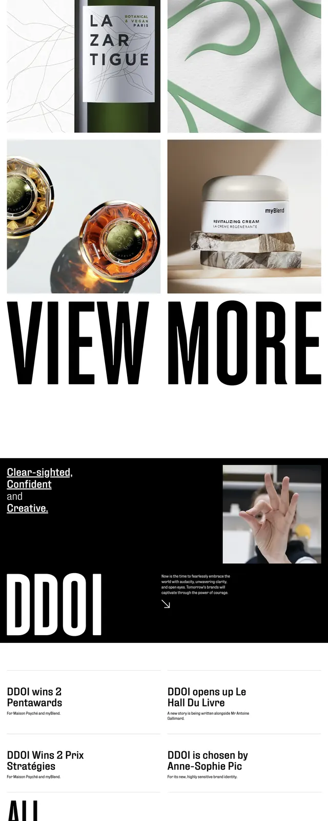
An editorial agency homepage with oversized condensed typography, luxury product photography, and stark black-and-white section breaks.
Summary
An editorial agency homepage with oversized condensed typography, luxury product photography, and stark black-and-white section breaks.
Visual description
The top section uses a split hero layout with a large typographic headline on the left and a tall product image on the right. Below it, the page stacks image tiles in a grid, then a massive full-width 'VIEW MORE' call-to-action. Farther down, black sections contrast sharply with white text, side images, and a large condensed wordmark-like headline.
Key takeaway
The design relies on scale contrast: huge condensed type paired with refined imagery and minimal navigation. It feels like an agency portfolio that wants to project confidence, taste, and editorial polish.
Reuse notes
Reuse the combination of oversized condensed headings, sparse nav, and luxury photography for a premium agency or brand studio landing page. The black-and-white interstitial sections and giant CTA are especially effective for creating rhythm in a long-scroll homepage.