Preview image. Unlock full-res
A light, editorial-style SaaS homepage with a split hero, customer logos, testimonial content, feature callouts, and a simple signup footer.
Summary
A light, editorial-style SaaS homepage with a split hero, customer logos, testimonial content, feature callouts, and a simple signup footer.
Visual description
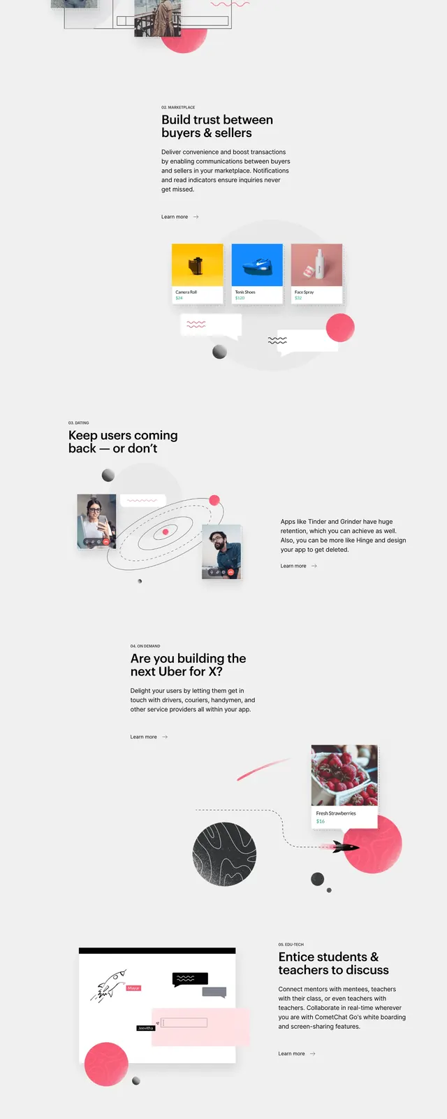
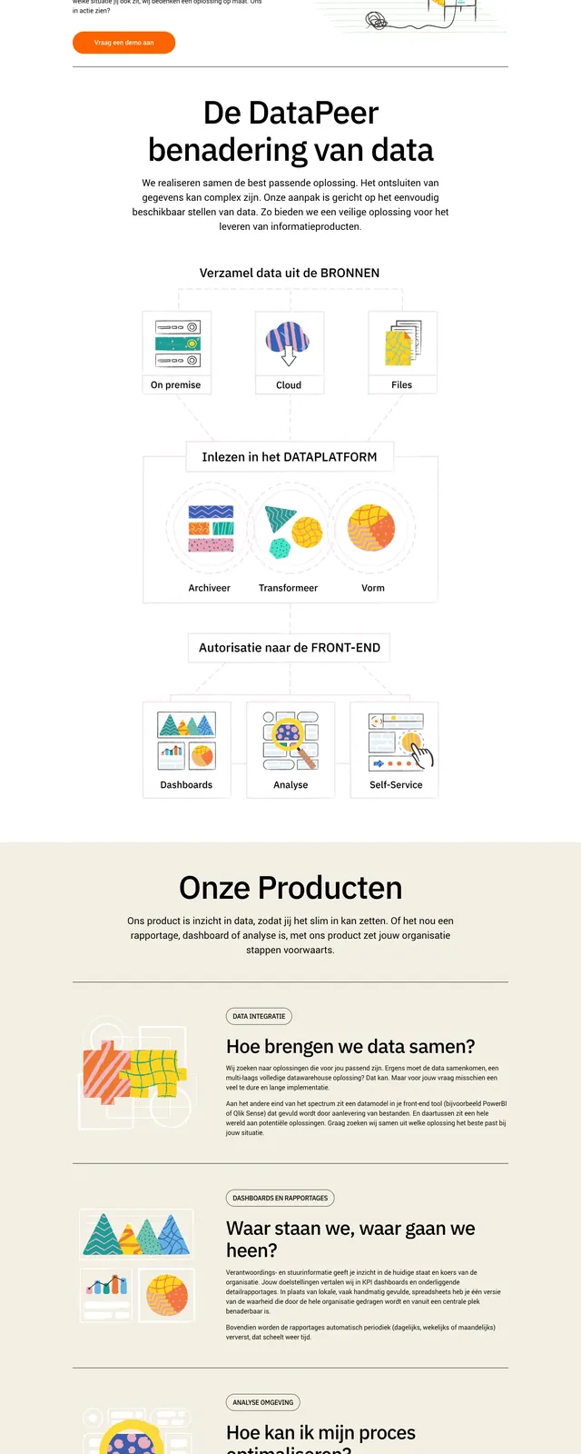
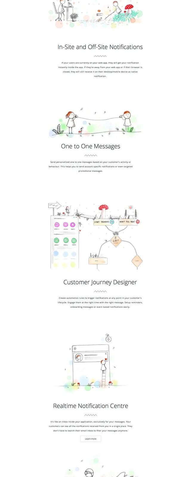
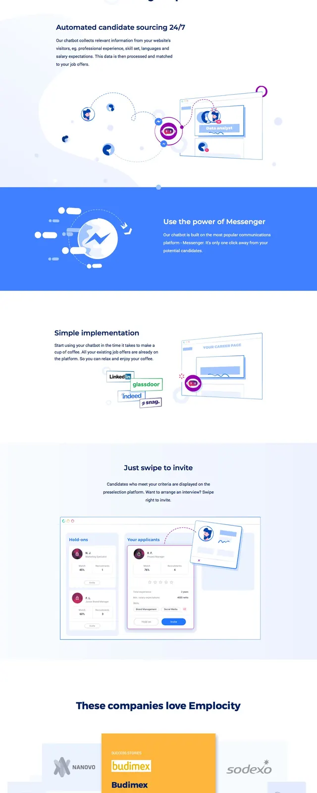
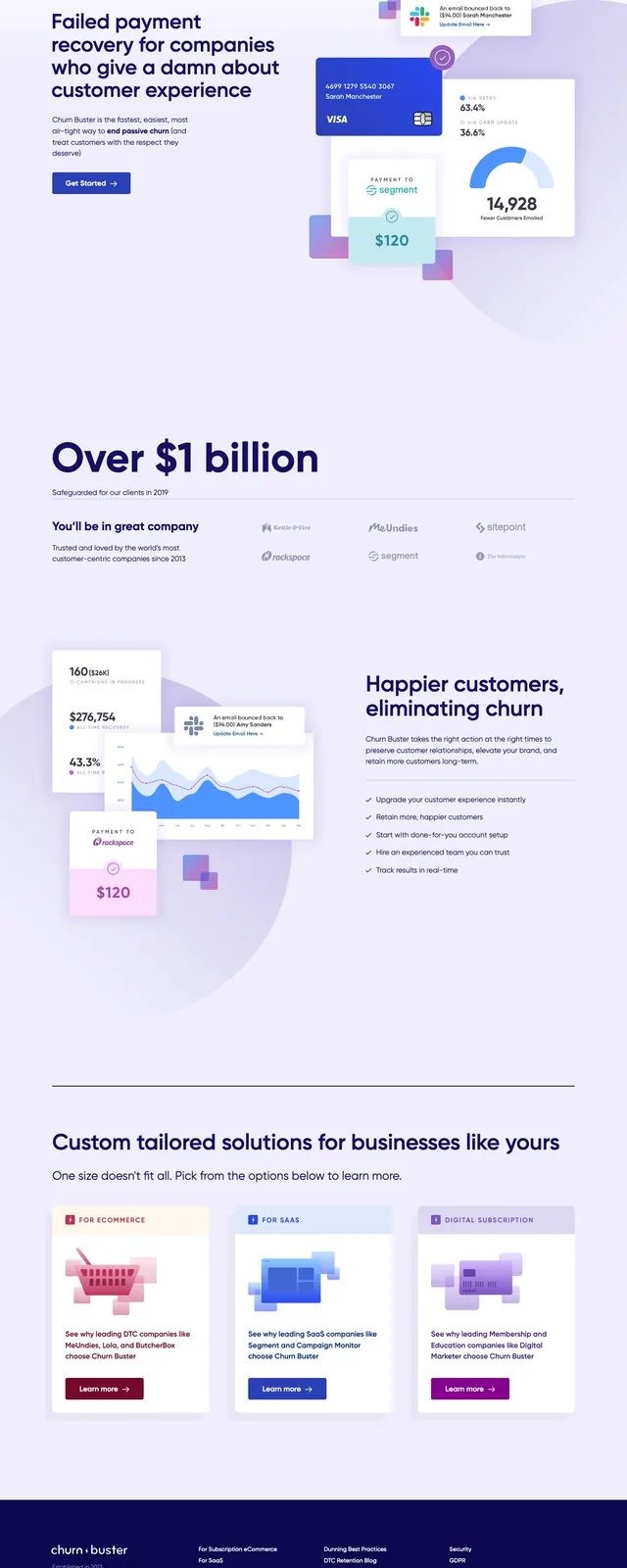
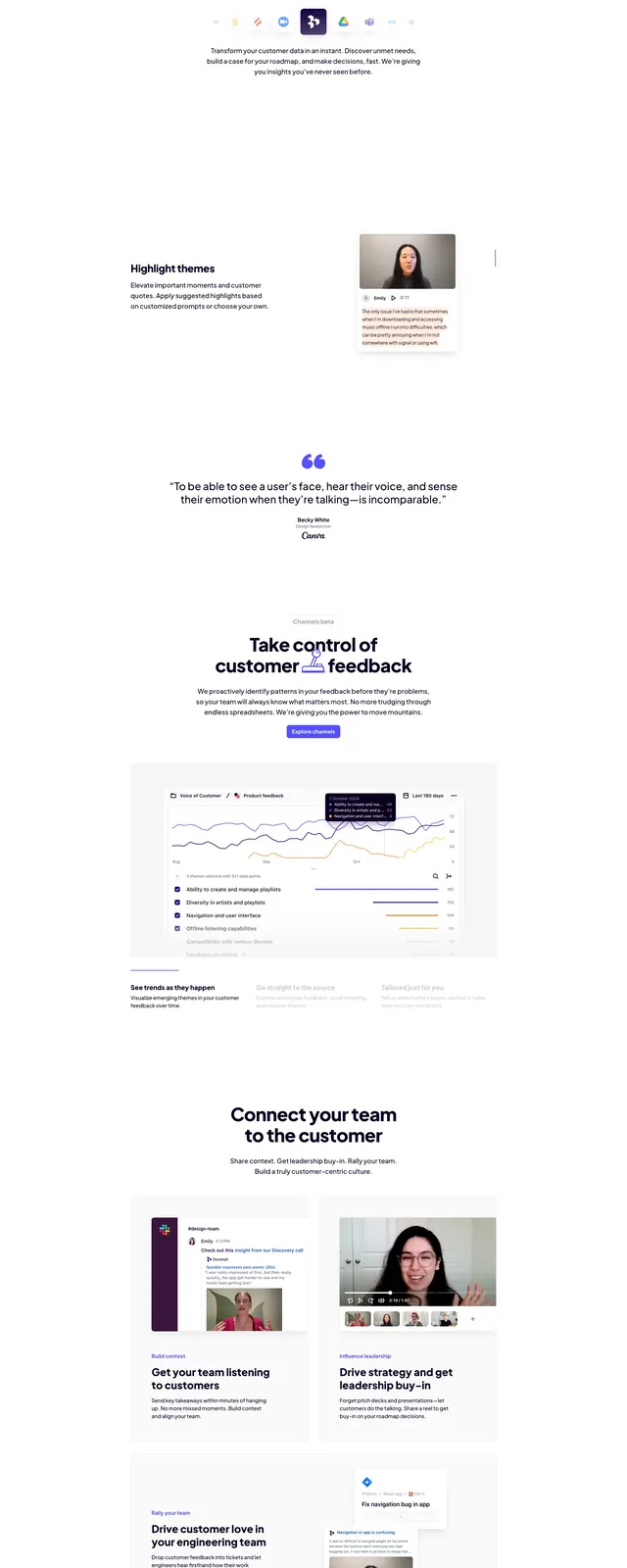
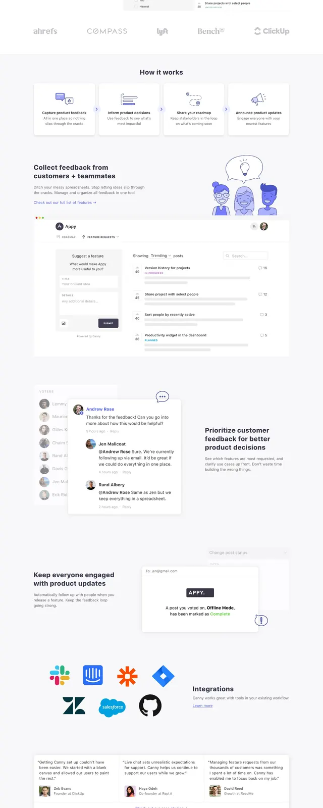
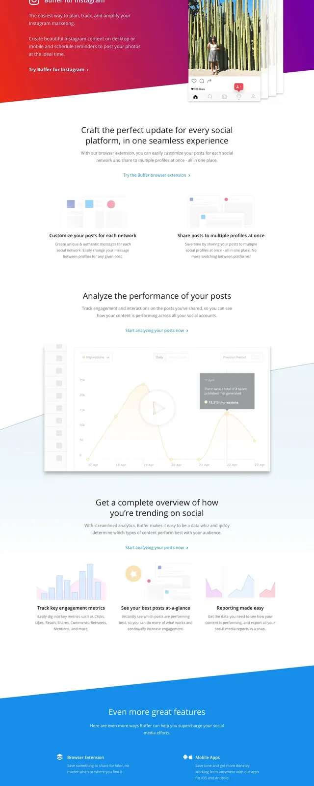
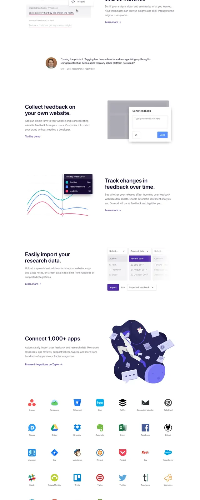
The page opens with a top navigation and a large split hero: bold headline and supporting copy on the left, with a colorful editorial illustration on the right. Below that is a horizontal logo strip, followed by a testimonial row and alternating feature sections that combine short text blocks with charts, interface mockups, and illustrations. The lower part of the page includes another CTA cluster, a second logo row, and a footer area with an email input, link columns, and a final illustration.
Key takeaway
The strongest reusable pattern is the airy, high-trust SaaS homepage: large headline, concise supporting copy, illustration on the right, then social proof and feature storytelling in a clean vertical flow. The design keeps everything light, spacious, and easy to scan.
Reuse notes
Use this structure for product-led SaaS sites that need credibility without feeling dense or salesy. It works best when paired with custom illustrations, customer logos, and a small number of clear conversion points.