Preview image. Unlock full-res
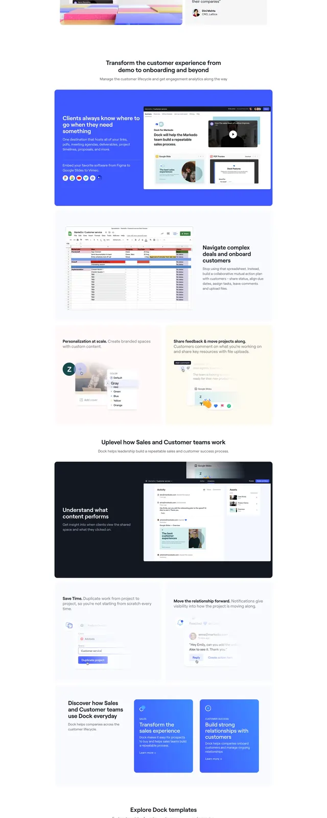
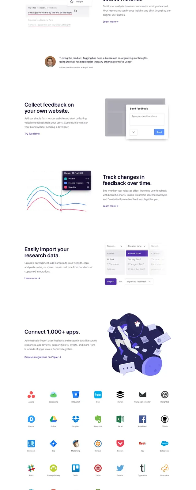
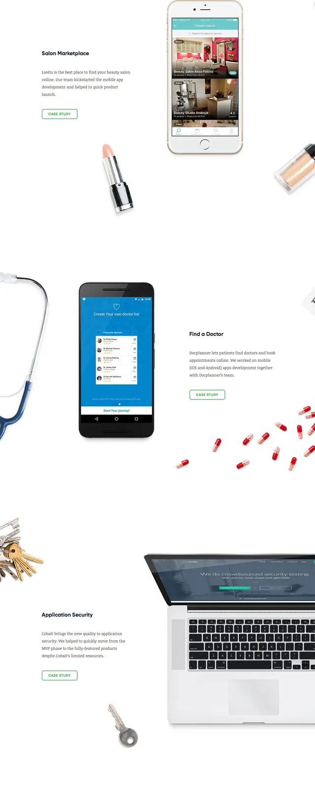
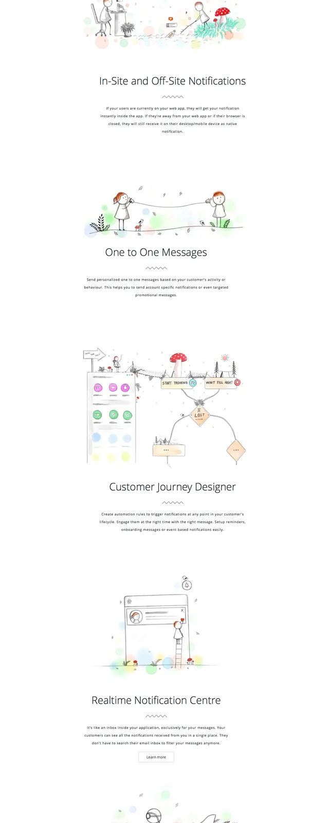
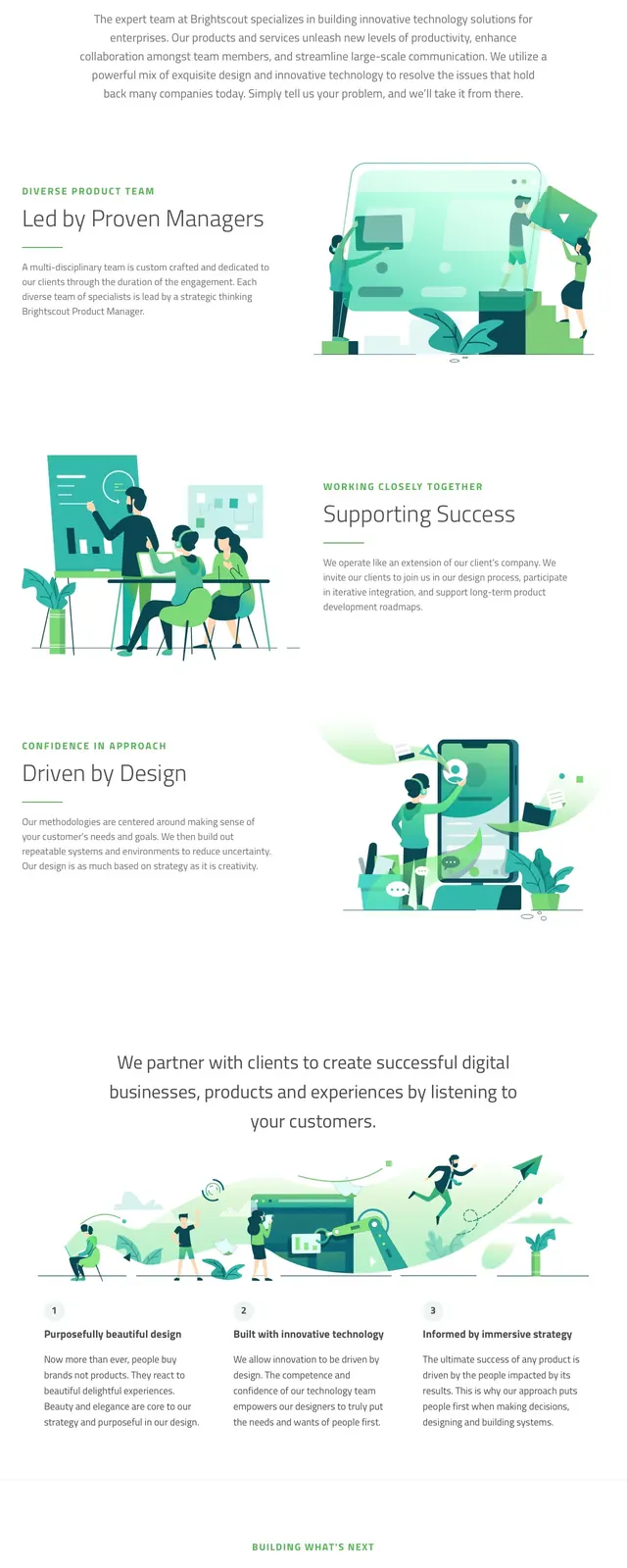
A bright, illustrated agency homepage with a split hero, service/value sections, and a green gradient call-to-action band.
Summary
A bright, illustrated agency homepage with a split hero, service/value sections, and a green gradient call-to-action band.
Visual description
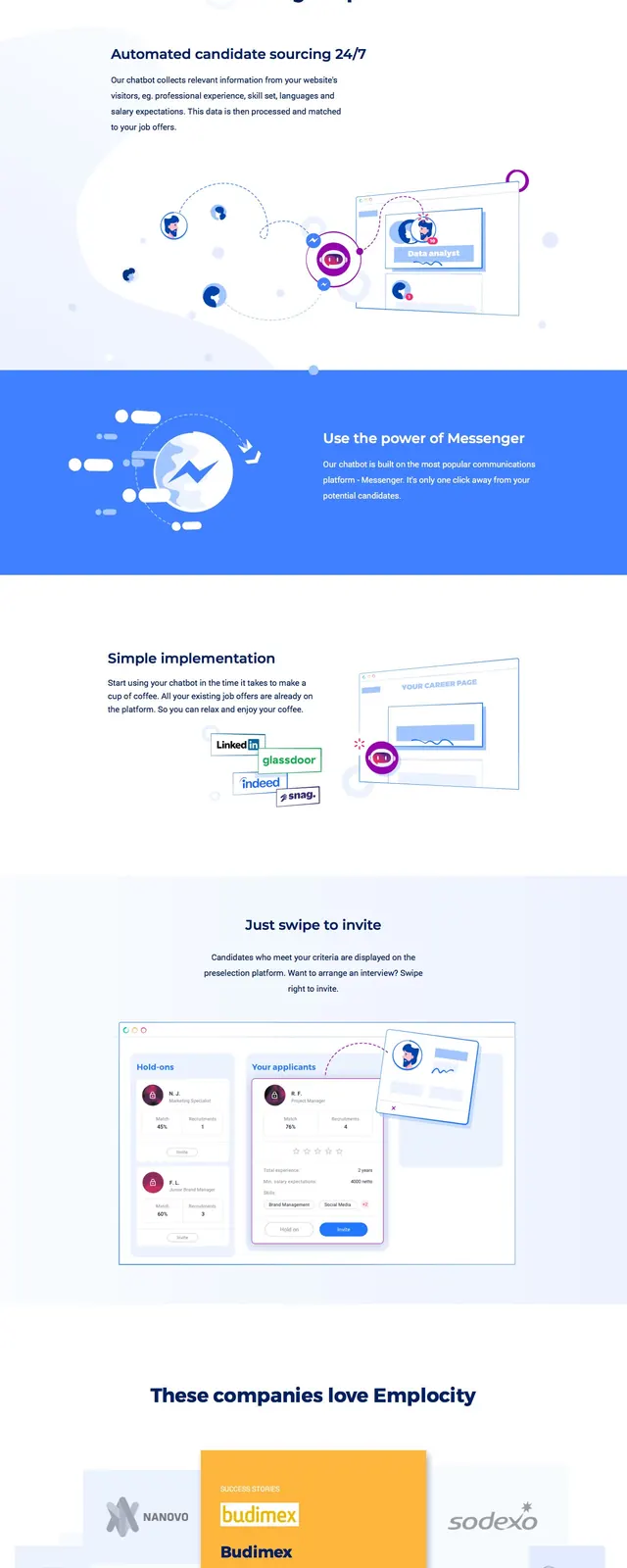
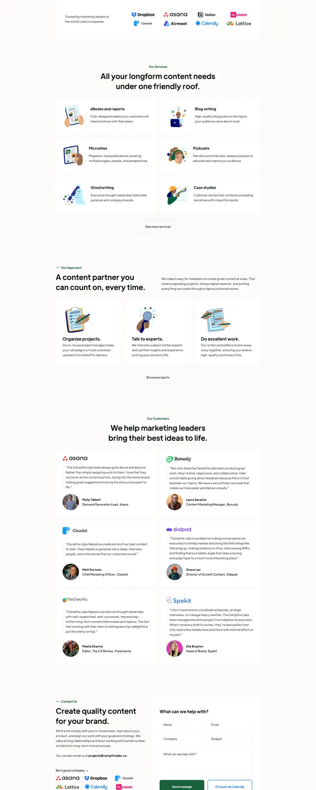
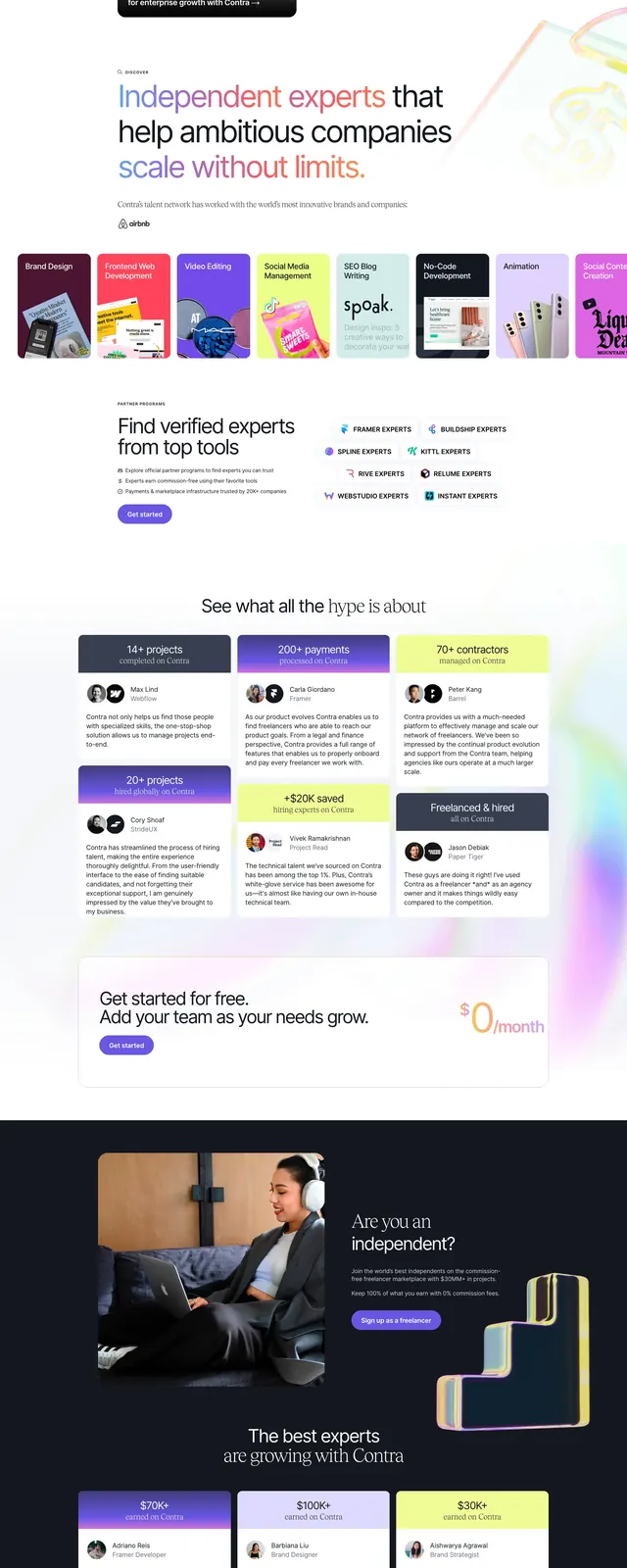
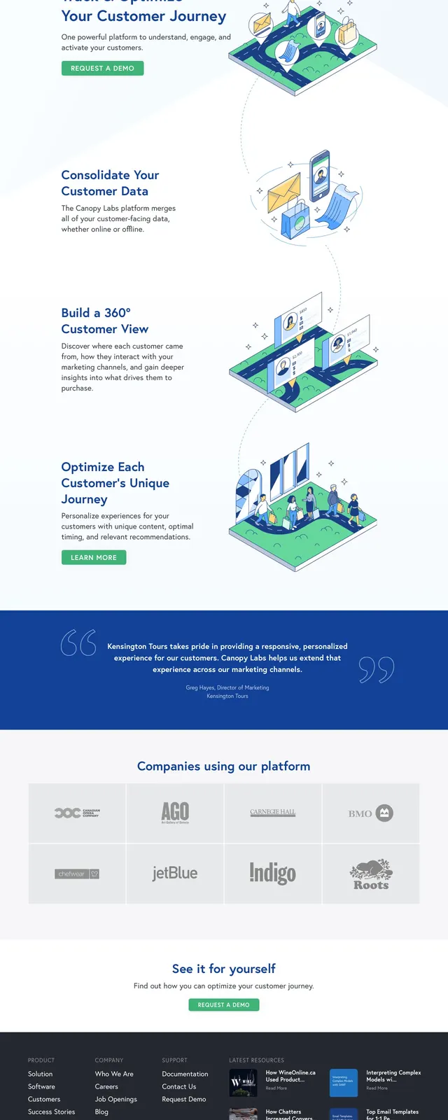
The page opens with a slim top navigation, a large left-aligned headline, supporting copy, and a rounded green primary button. A large isometric illustration fills the right side of the hero, using layered teal and green forms with small human figures and UI panels. Below, the page continues with alternating image-and-text content blocks, a centered call-to-action pair of buttons, and a full-width green gradient contact banner at the bottom.
Key takeaway
The strongest reusable idea is the combination of clean white space with playful isometric illustrations and restrained green gradients. It creates a polished agency feel without relying on heavy imagery or dense copy.
Reuse notes
Use this pattern for agency, consulting, or B2B services that want to feel approachable and design-led. It works best when paired with simple navigation, short explanatory sections, and one strong accent color.