Preview image. Unlock full-res
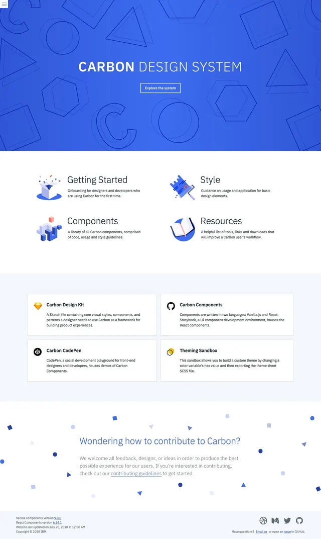
A clean documentation homepage with a bright blue hero, centered CTA, and modular feature and resource sections below.
Summary
A clean documentation homepage with a bright blue hero, centered CTA, and modular feature and resource sections below.
Visual description
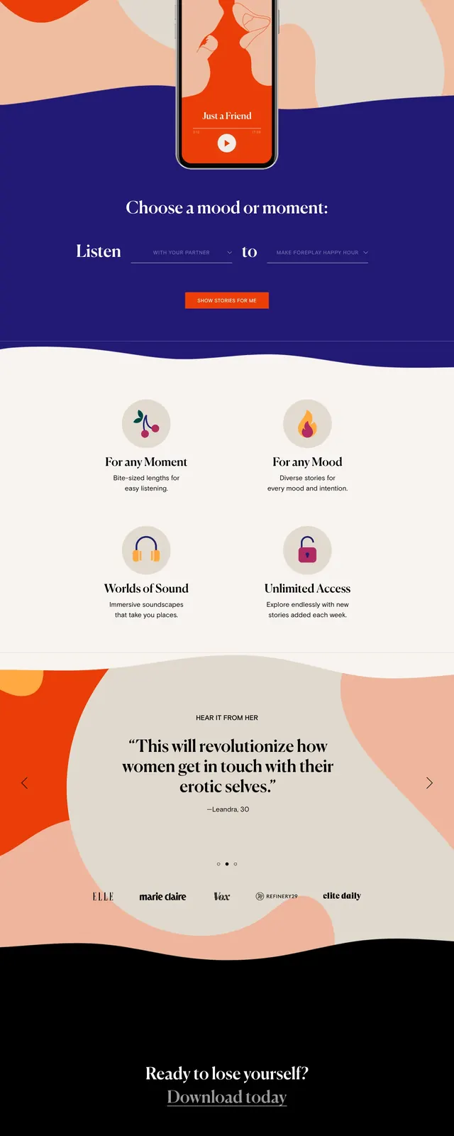
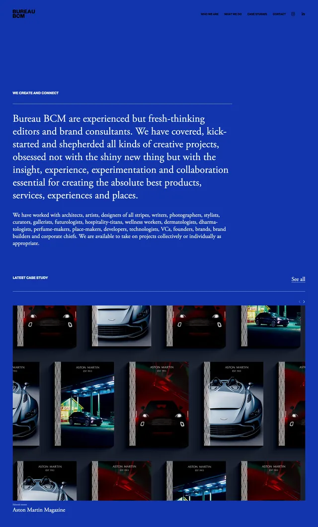
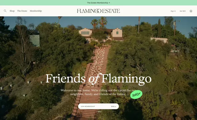
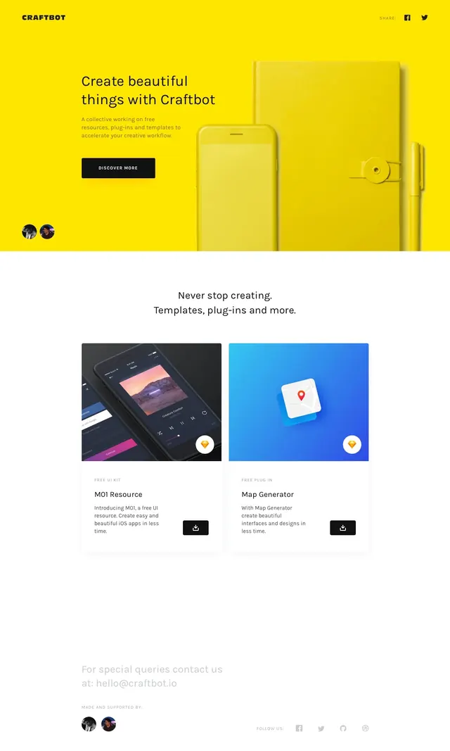
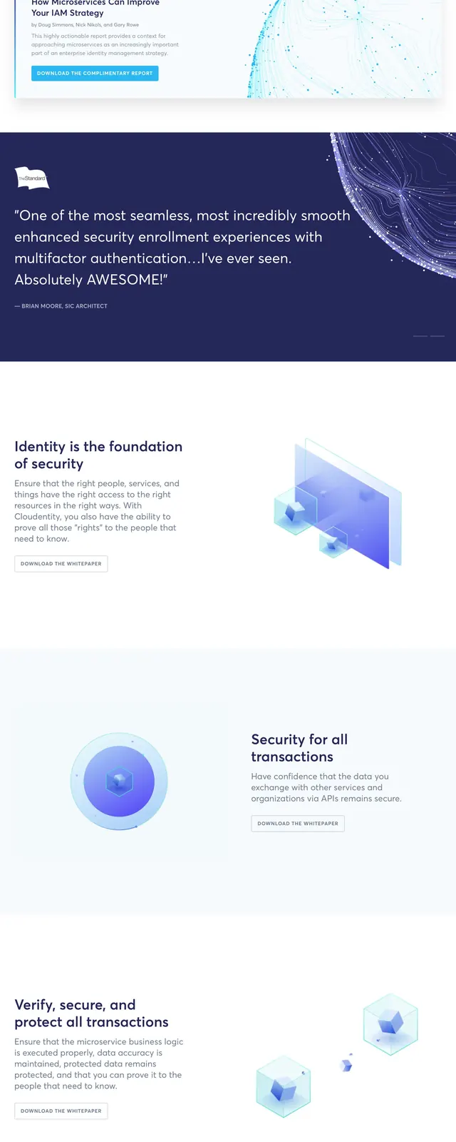
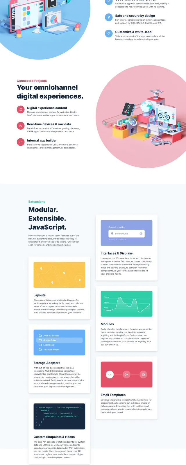
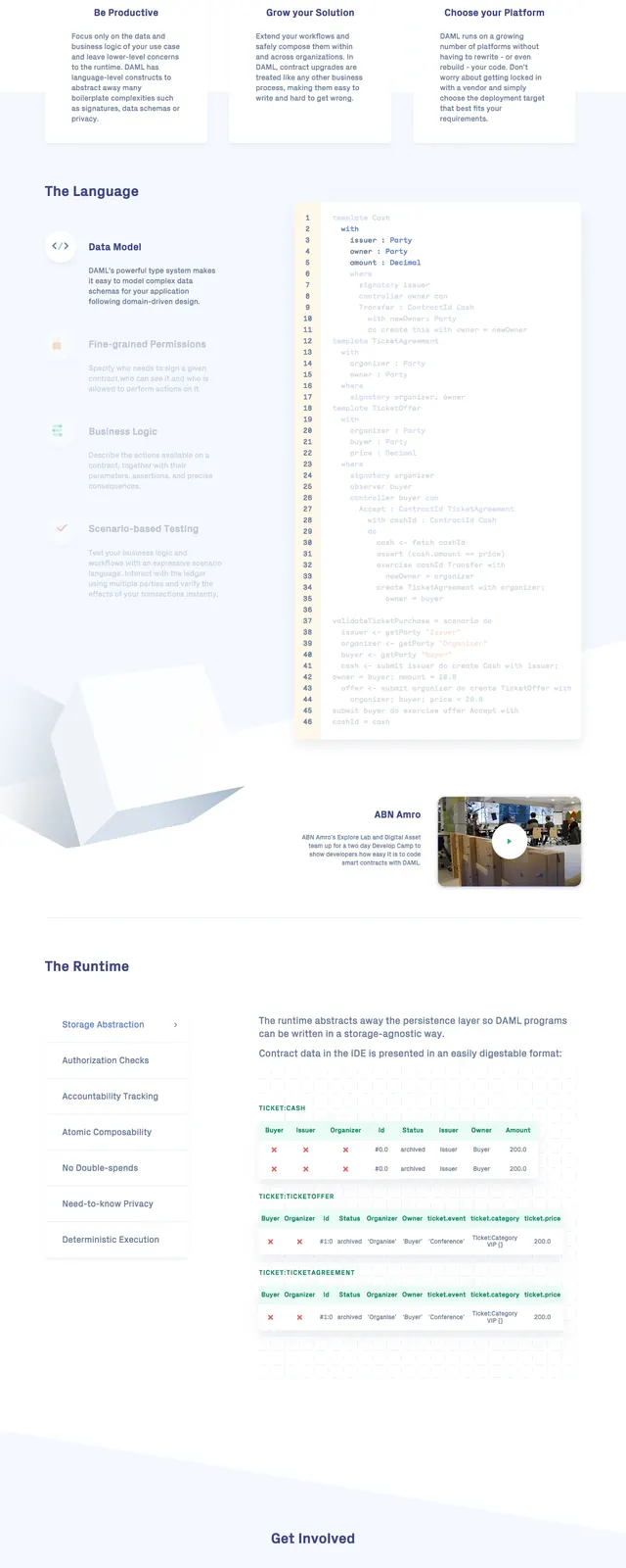
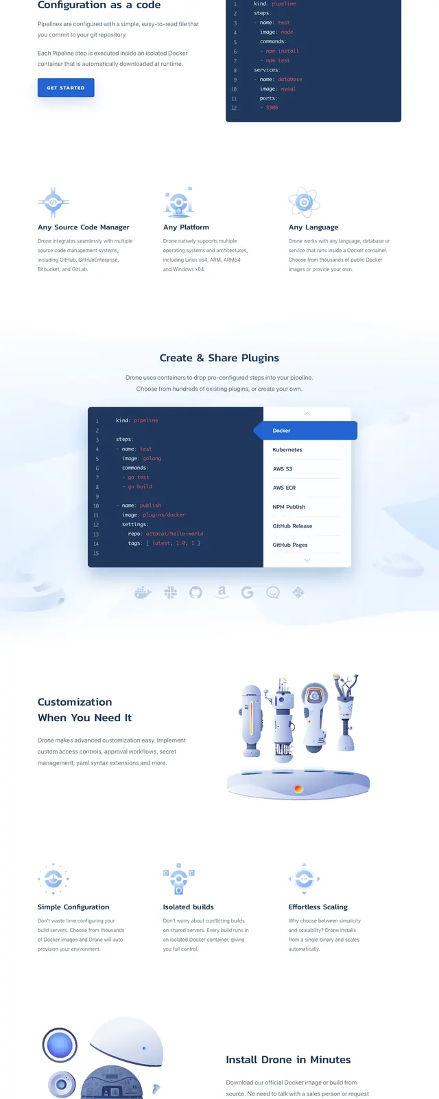
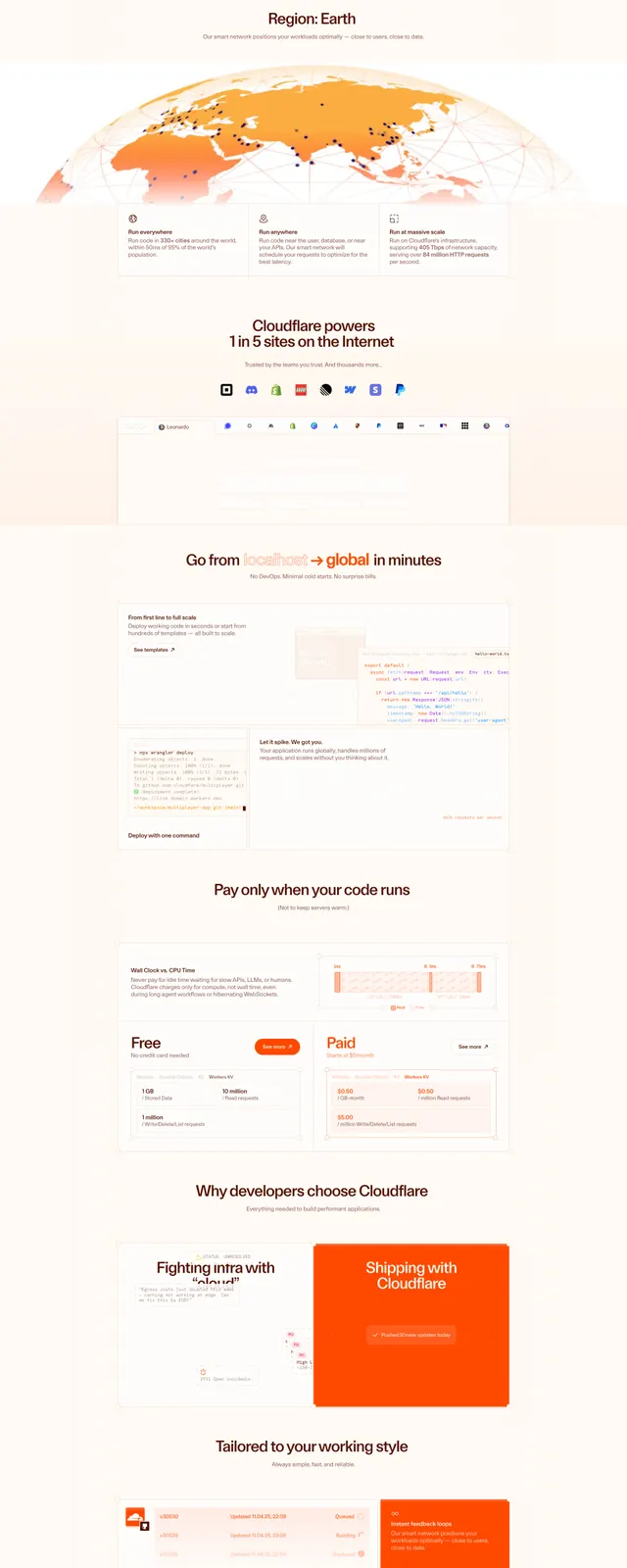
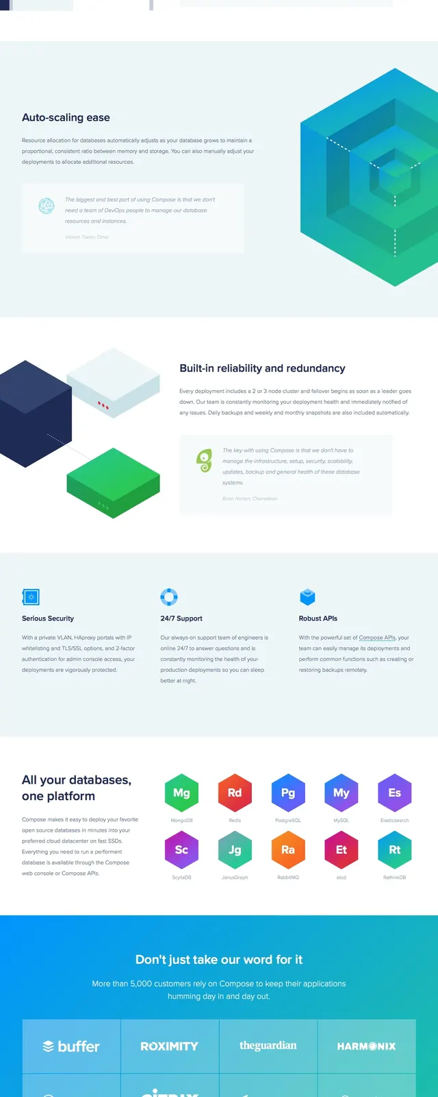
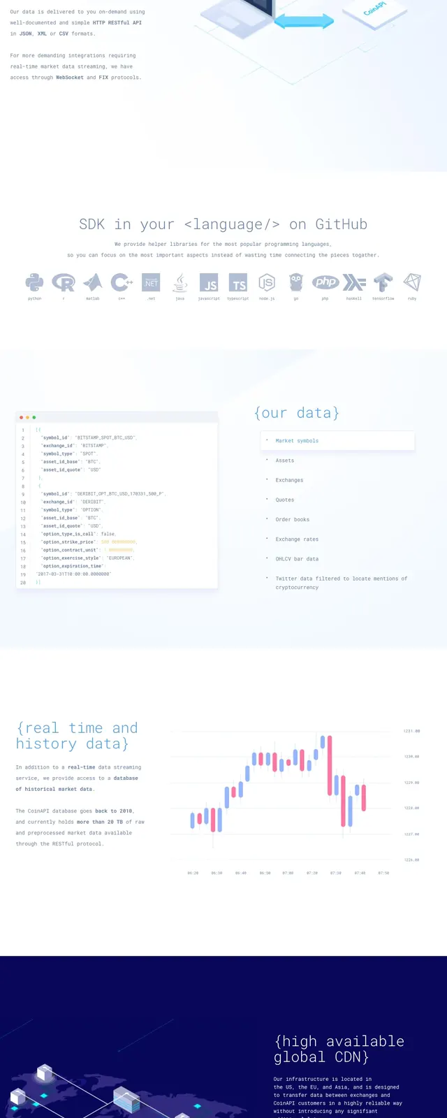
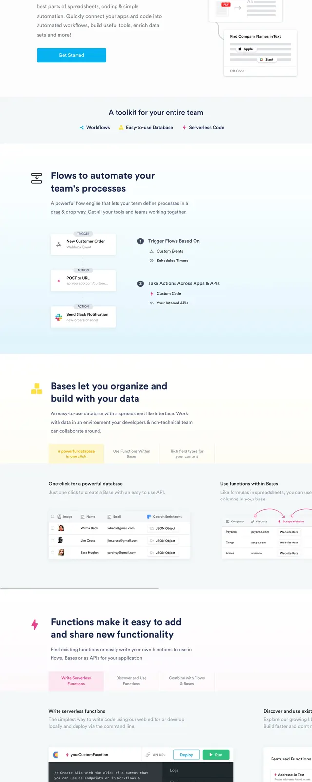
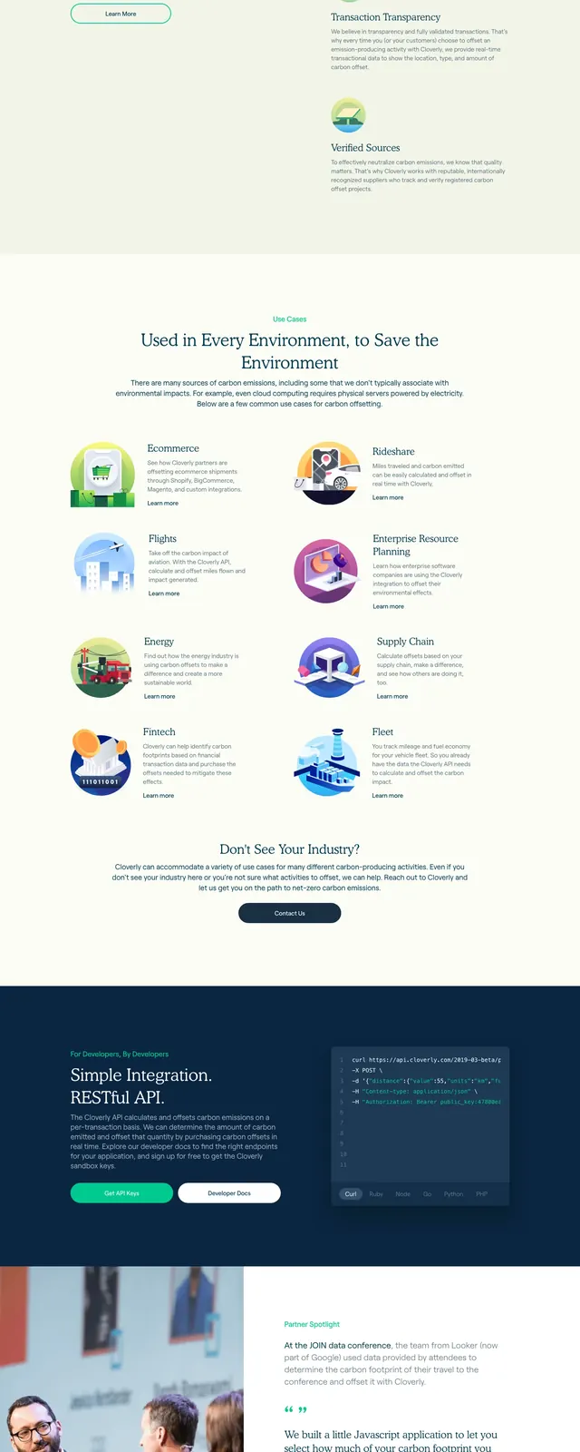
The page opens with a full-width blue hero using outlined geometric shapes in the background, a centered all-caps title, and a small outlined button beneath it. Below the fold is a clean white section with four illustrated feature blocks arranged in a two-column grid, followed by a light gray resource area with four bordered cards in a 2x2 grid. The rest of the visible page stays minimal and spacious, with thin dividers, small footer text, and a few small social icons at the bottom.
Key takeaway
The strongest move is the contrast between a bold branded hero and very restrained documentation-style content below it. The layout makes a design system feel approachable while still looking structured and technical.
Reuse notes
Useful for product documentation, design systems, developer portals, and support hubs that need a friendly but precise first impression. The illustrated cards and centered CTA are easy to adapt, while the geometry-heavy hero gives the page a distinct brand identity.