Preview image. Unlock full-res
A green, sustainability-focused SaaS landing page with a strong hero, product screenshots, use-case cards, blog previews, and a dense corporate footer.
Summary
A green, sustainability-focused SaaS landing page with a strong hero, product screenshots, use-case cards, blog previews, and a dense corporate footer.
Visual description
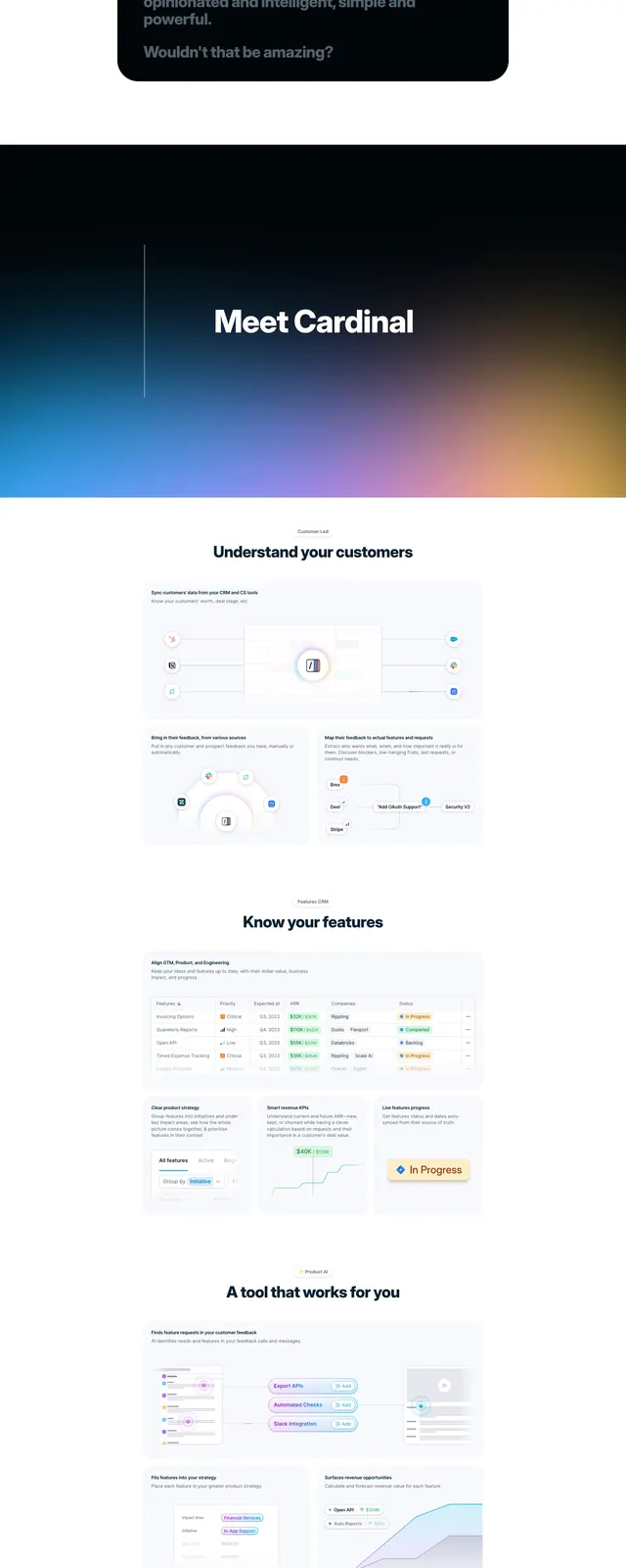
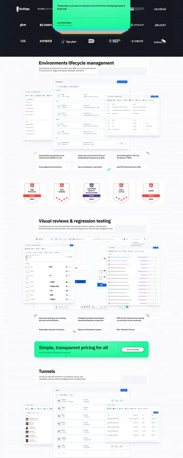
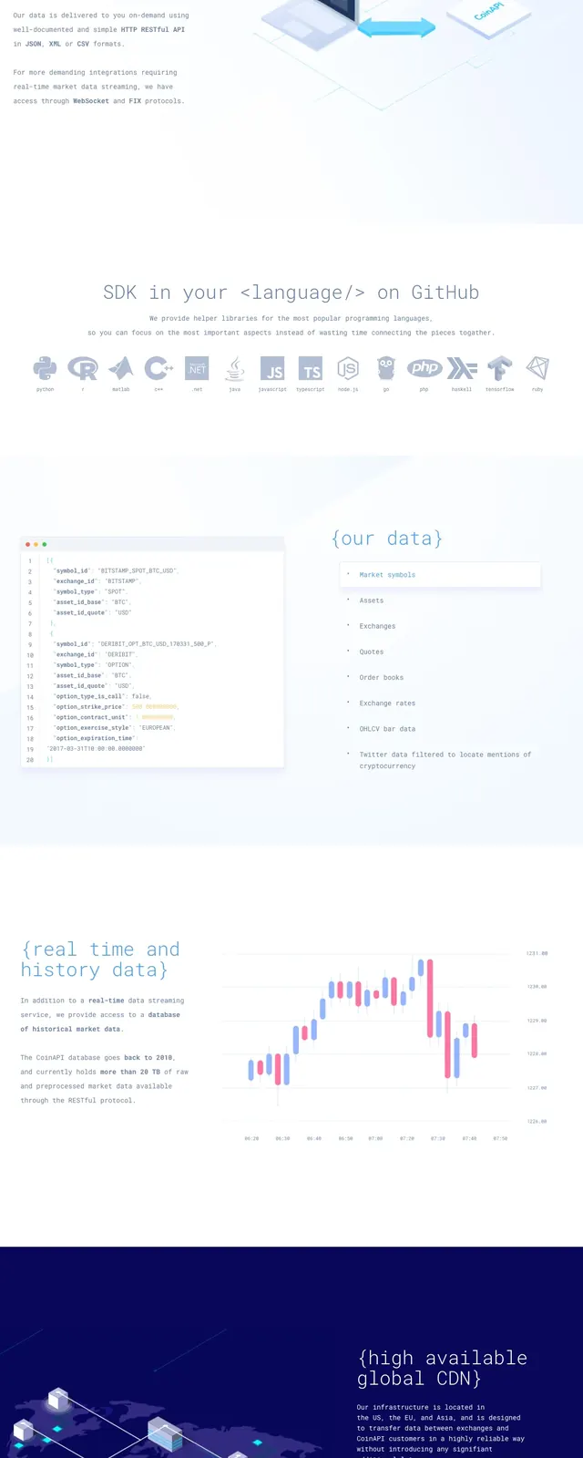
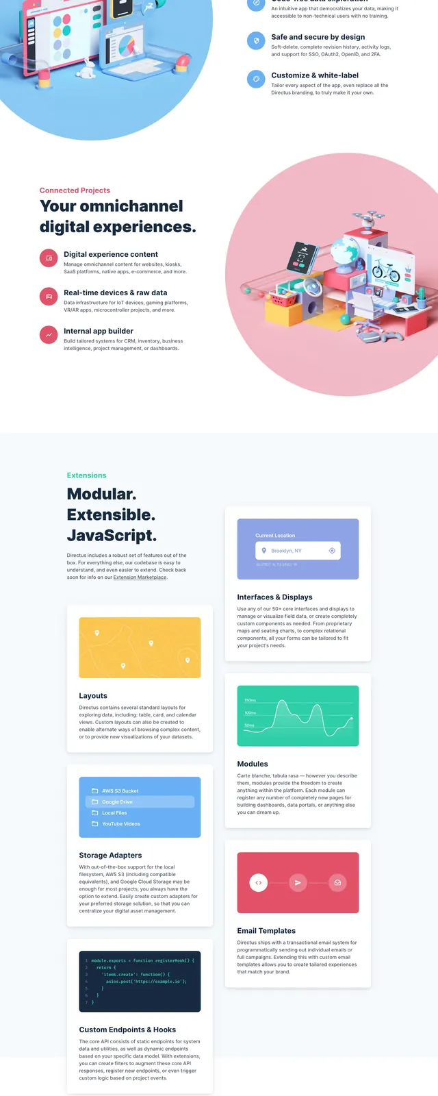
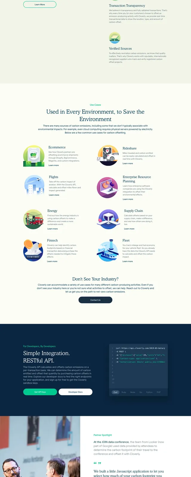
The page opens with a large hero on a bright green gradient background, pairing a headline and two CTA buttons on the left with layered mobile and dashboard product mockups on the right. Below the fold are partner logos, a grid of illustrated industry use cases, a centered CTA block, blog cards, and a dark multi-column footer. The overall composition is clean and structured, with lots of whitespace and soft organic imagery mixed with product UI screenshots.
Key takeaway
This layout works well for a sustainability or infrastructure SaaS brand that needs to communicate credibility, product value, and breadth of use cases quickly. The mix of gradients, mockups, and clean grid sections makes it easy to reuse for a modern B2B landing page.
Reuse notes
Reuse the split hero, logo strip, use-case grid, and footer structure for other trust-heavy SaaS sites. The visual system is especially effective when paired with product screenshots and illustrated category cards.