Preview image. Unlock full-res
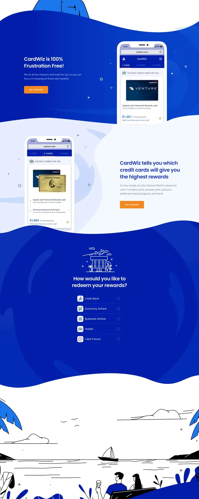
A bold fintech landing page with a blue illustrated hero, prominent CTA, and stacked content sections focused on credit card rewards discovery.
Summary
A bold fintech landing page with a blue illustrated hero, prominent CTA, and stacked content sections focused on credit card rewards discovery.
Visual description
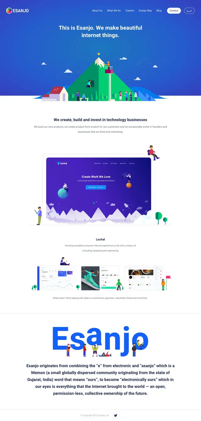
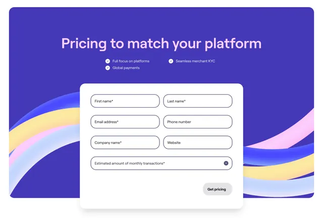
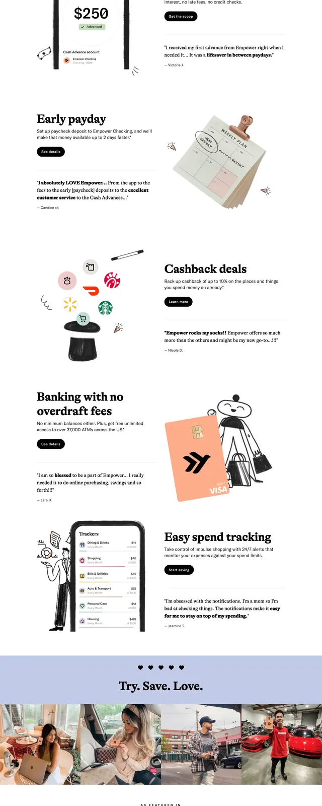
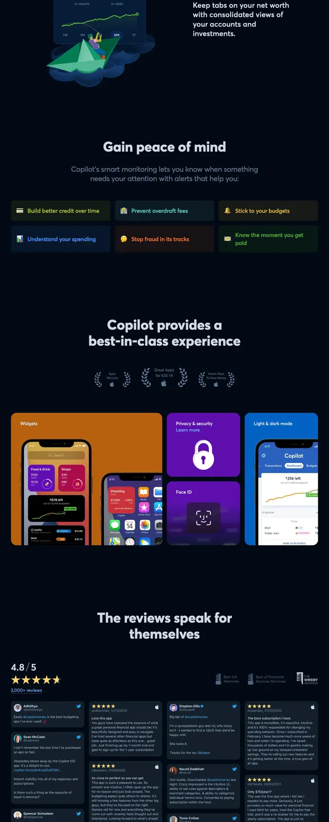
The page opens with a split hero on a deep blue gradient background, pairing a large headline and CTA on the left with an illustrated credit card scene on the right. Below, the design alternates between white and blue wave-shaped sections with large illustrated graphics, text blocks, and a quiz-style list of reward preferences. A mid-page CTA card sits over a decorative illustrated background, followed by a privacy/security section and a minimal footer. The overall look uses soft curves, floating card motifs, and high-contrast white text to keep the interface lively and approachable.
Key takeaway
This is a strong example of a fintech hero system built around illustration, clear value proposition, and repeated conversion prompts. The wave transitions and oversized visuals make the page feel memorable without losing clarity.
Reuse notes
Reuse the split hero structure for a product that needs fast explanation and immediate CTA focus. The illustrated cards, curved section dividers, and simple option list work well for consumer finance or recommendation-based onboarding flows.