Preview image. Unlock full-res
An editorial e-commerce homepage for fine jewelry with large lifestyle imagery, product photography, and a muted luxury palette.
Summary
An editorial e-commerce homepage for fine jewelry with large lifestyle imagery, product photography, and a muted luxury palette.
Visual description
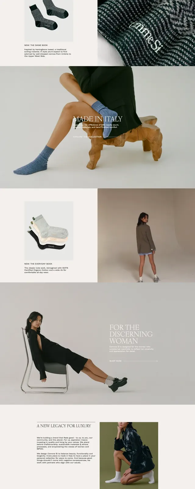
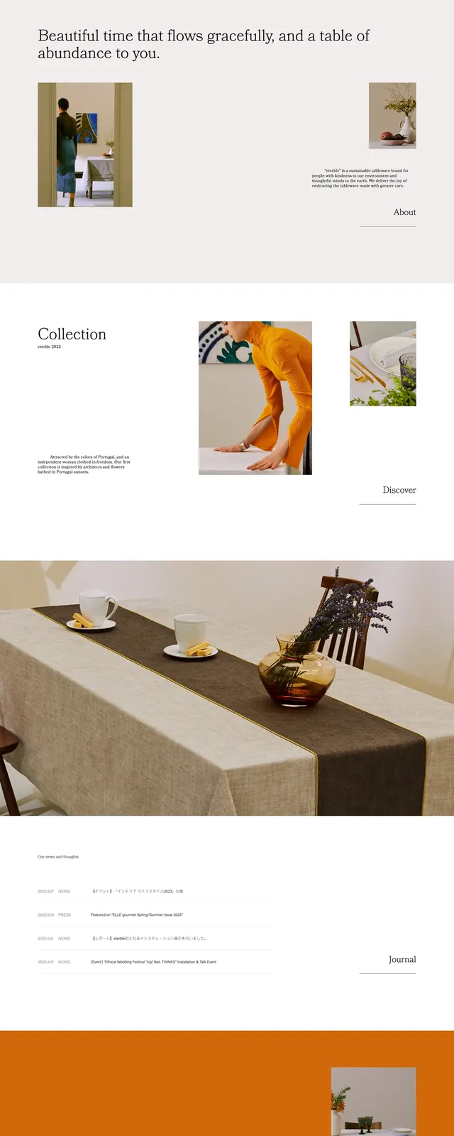
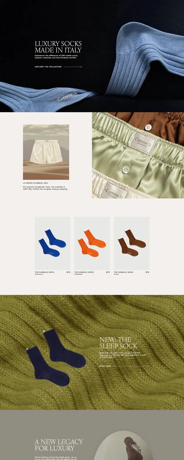
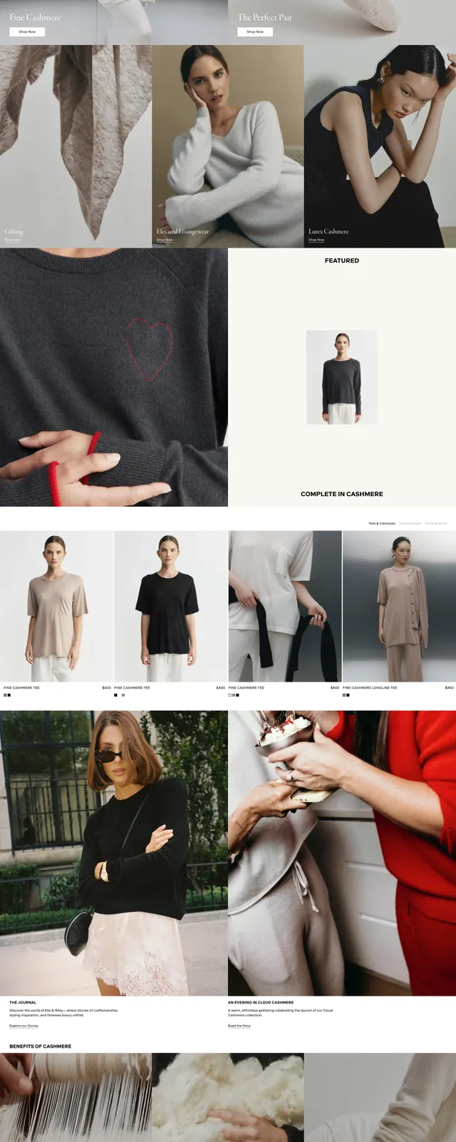
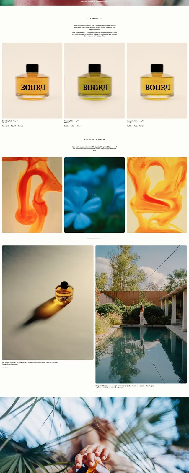
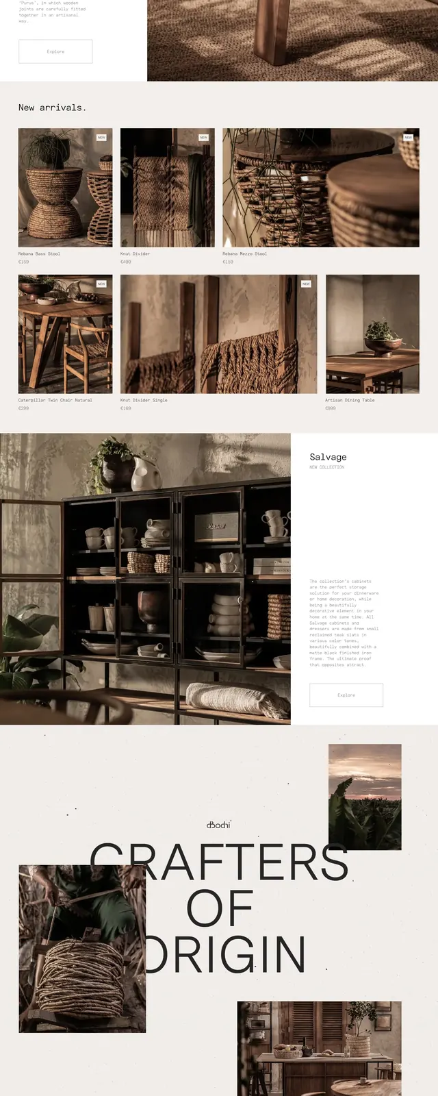
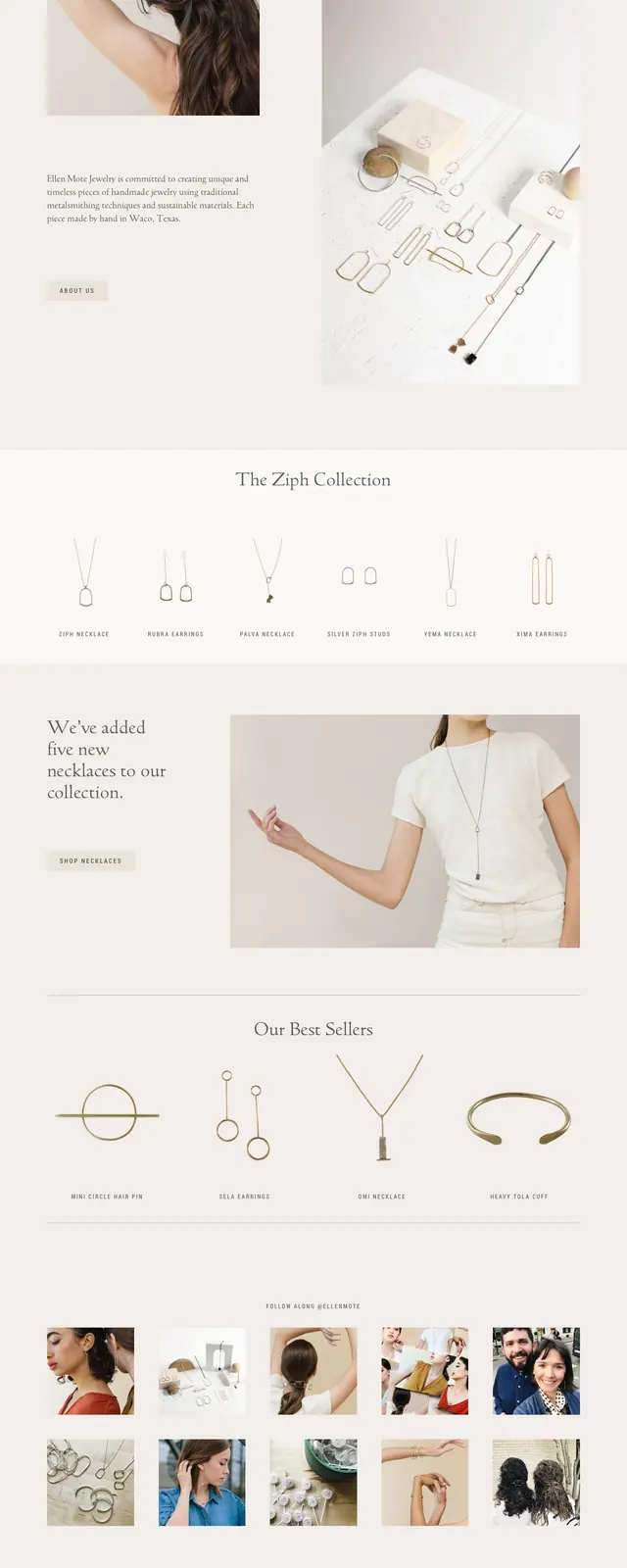
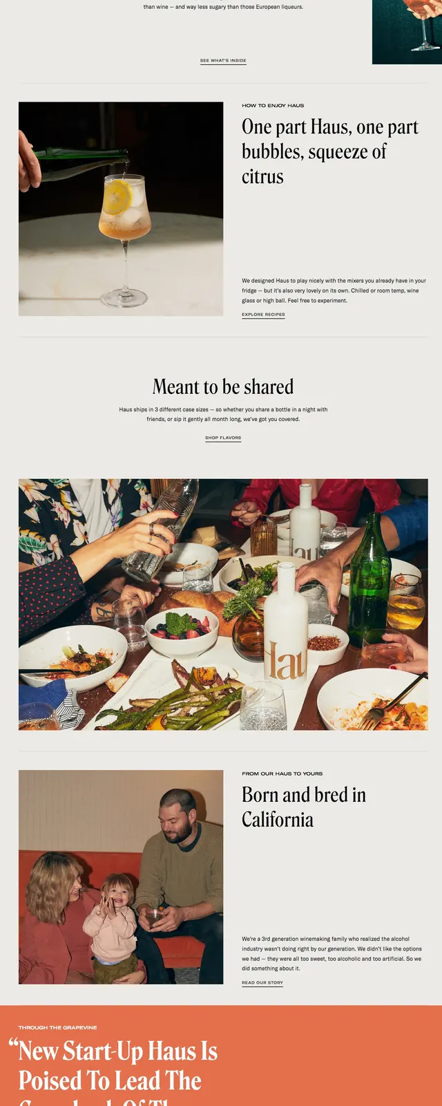
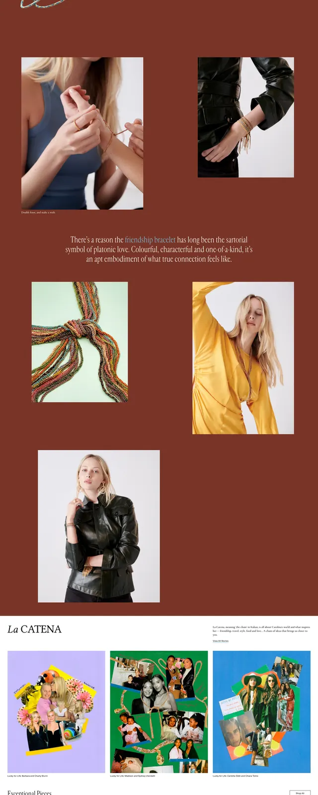
The page opens with a wide split hero: a model wearing jewelry on the left and a product still life on the right, with thin navigation across the top and a large serif headline overlaid near the lower left. Below, a featured product row presents three clean product cards in a light grid, followed by a full-width dark brown editorial band with a centered line of copy and a two-column image layout. The lower section switches to a social-style collage of jewelry and lifestyle photos, then ends with contact and newsletter blocks plus a small footer.
Key takeaway
The strongest pattern is the mix of high-end editorial photography with very restrained navigation and product framing. The alternating light and warm dark sections give the site a boutique, magazine-like rhythm.
Reuse notes
Reuse this structure for luxury commerce brands that need to feel aspirational rather than catalog-heavy. It works best when the product photography is strong enough to carry the page and when typography is kept sparse and elegant.