Preview image. Unlock full-res
A soft, minimalist jewelry homepage with a split hero, product imagery, and airy editorial sections in a muted neutral palette.
Summary
A soft, minimalist jewelry homepage with a split hero, product imagery, and airy editorial sections in a muted neutral palette.
Visual description
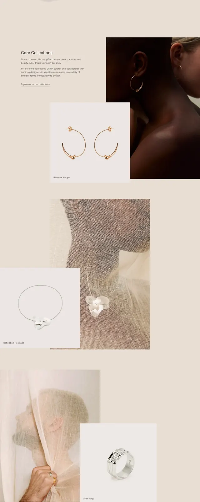
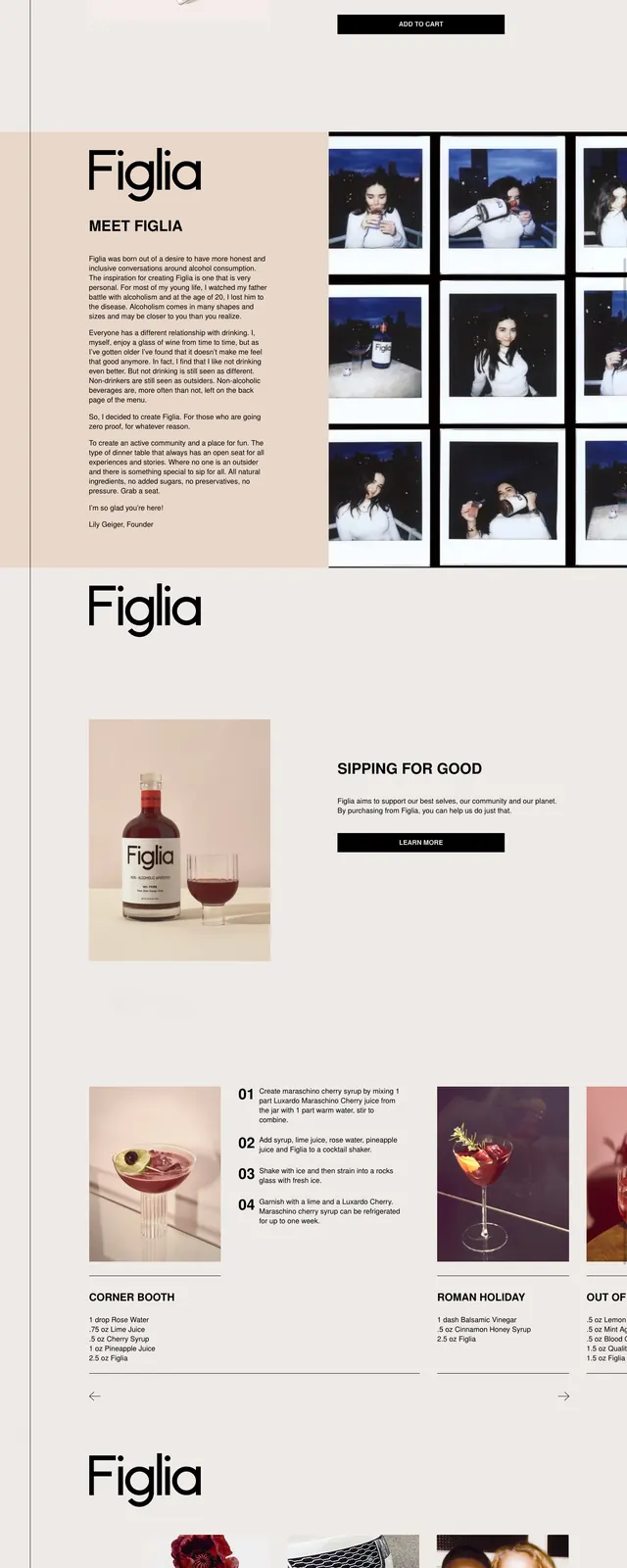
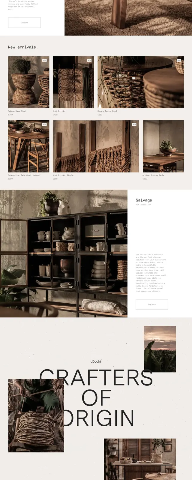
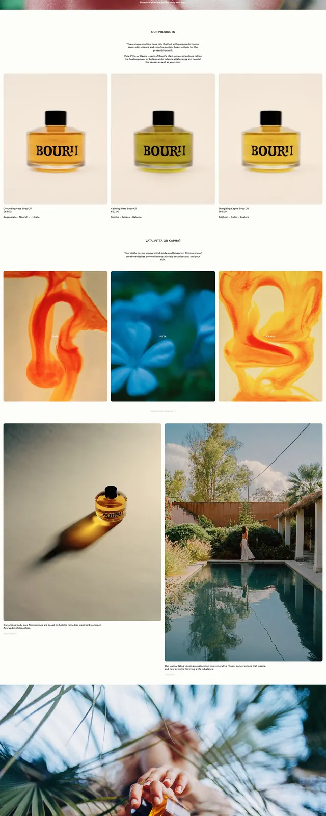
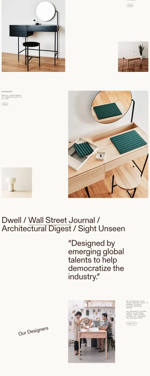
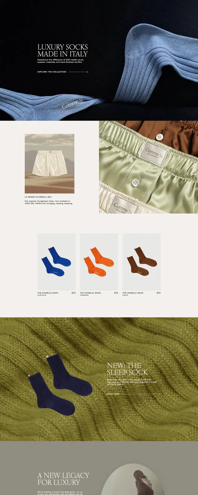
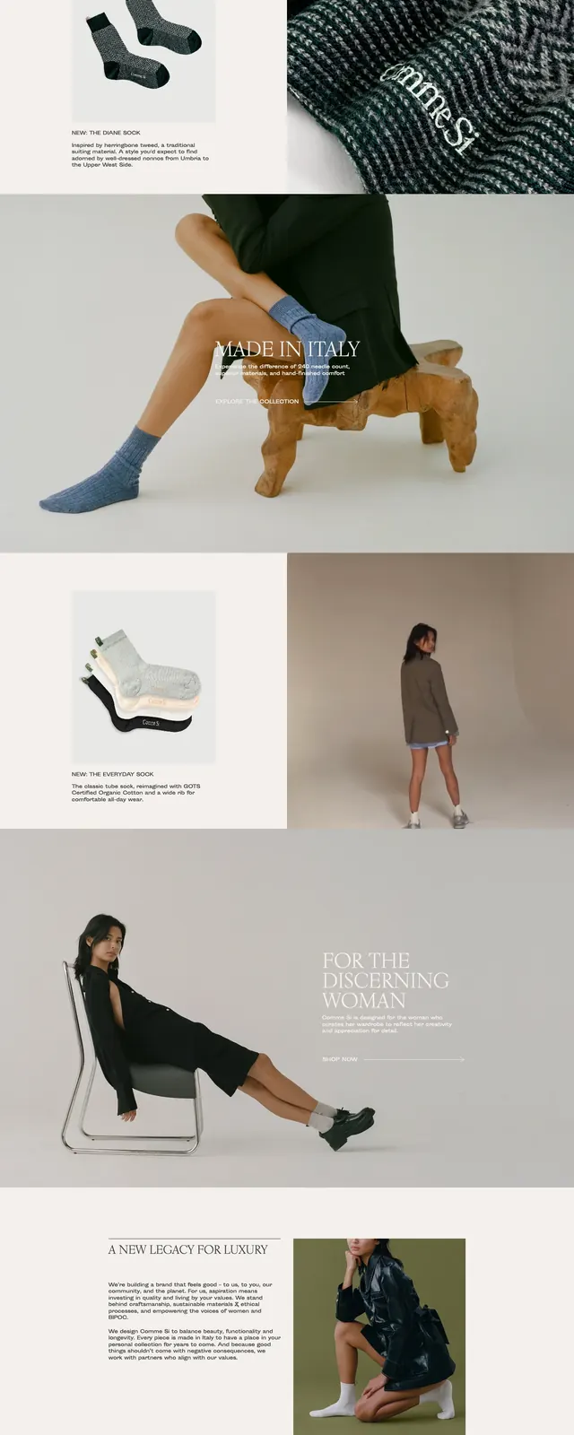
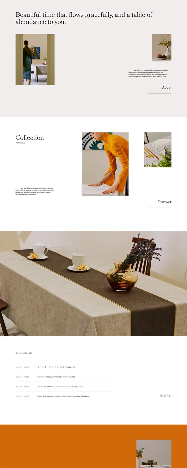
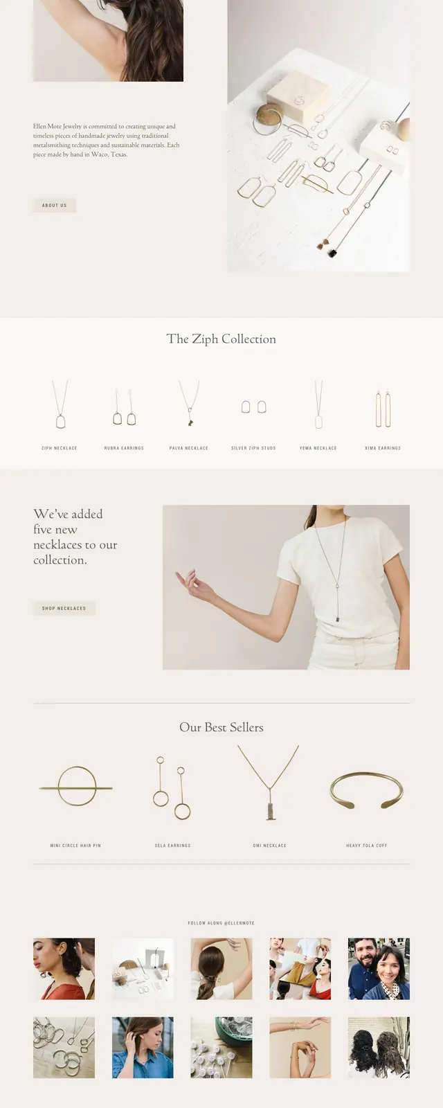
The page uses a pale beige and off-white background with lots of whitespace, thin navigation text, and a centered wordmark at the top. The first screen is an editorial split layout with a large model photo on the left and a serif headline block on the right, followed by a second product/lifestyle image below. Lower sections show a horizontal row of product thumbnails, a promotional callout with a small button, a best-sellers heading, a social-style image grid, and a muted footer with link columns and an email signup form.
Key takeaway
The strongest idea is the calm, luxury editorial treatment: large photography, restrained typography, and generous spacing make the product feel delicate and premium. The page also uses repeated split sections to keep the layout varied without breaking the soft visual system.
Reuse notes
Useful for jewelry, beauty, fashion, or other premium consumer brands that want a handcrafted and feminine editorial feel. Reuse the neutral palette, serif hero copy, and alternating image/text blocks when the goal is to feel refined rather than sales-heavy.