Preview image. Unlock full-res
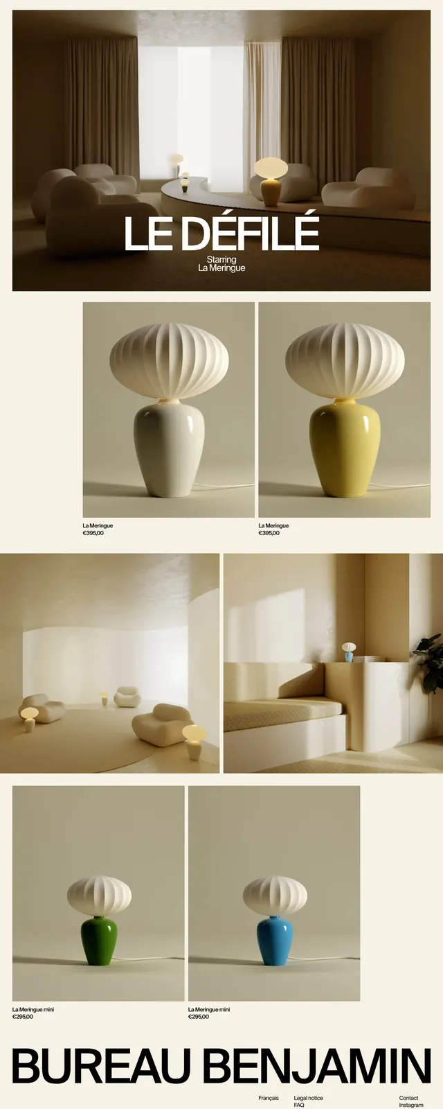
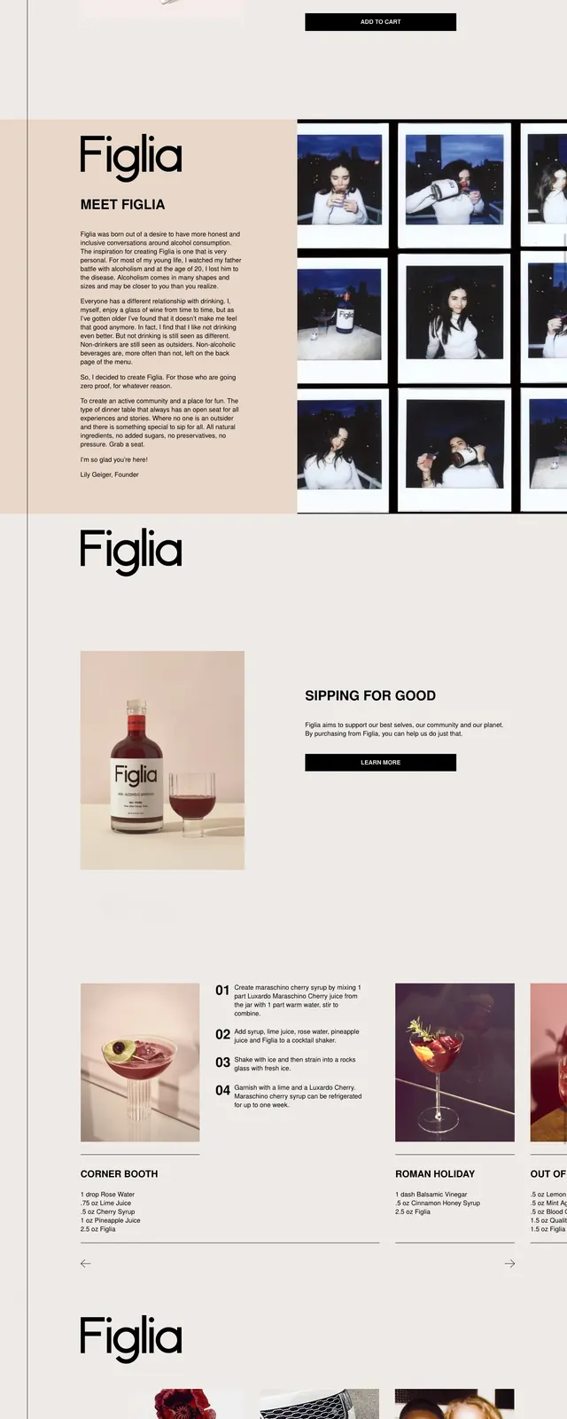
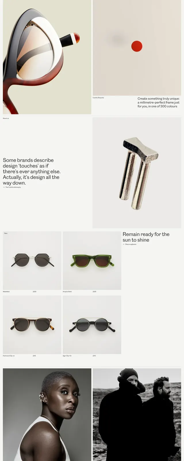
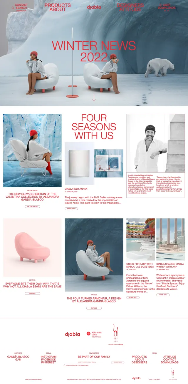
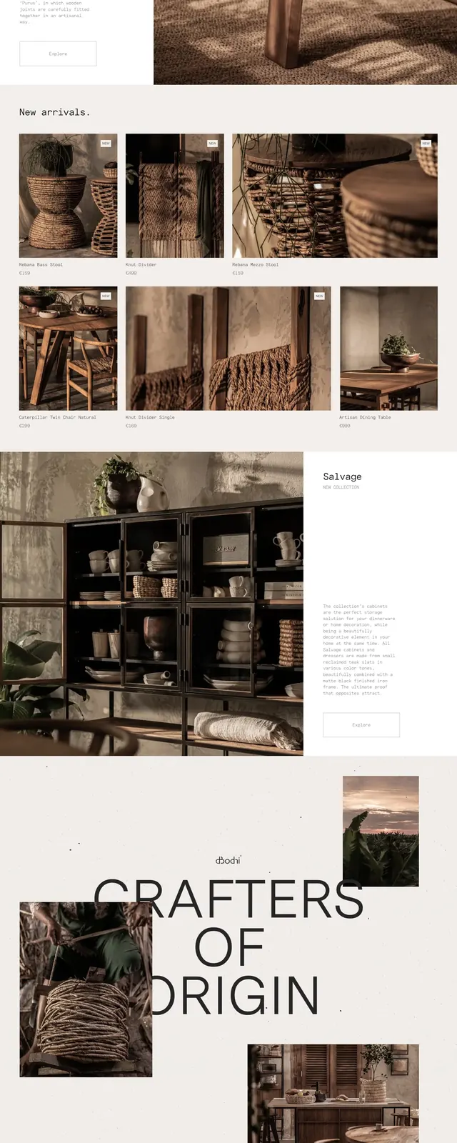
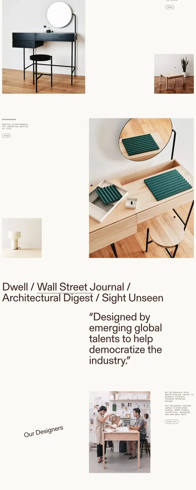
An airy furniture brand homepage with large product photography, oversized typography, and sparse editorial spacing.
Summary
An airy furniture brand homepage with large product photography, oversized typography, and sparse editorial spacing.
Visual description
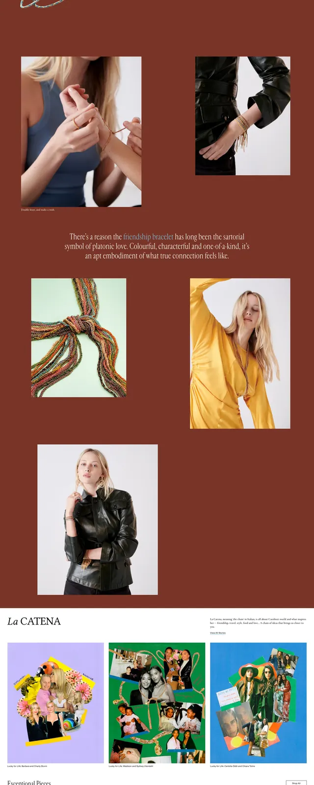
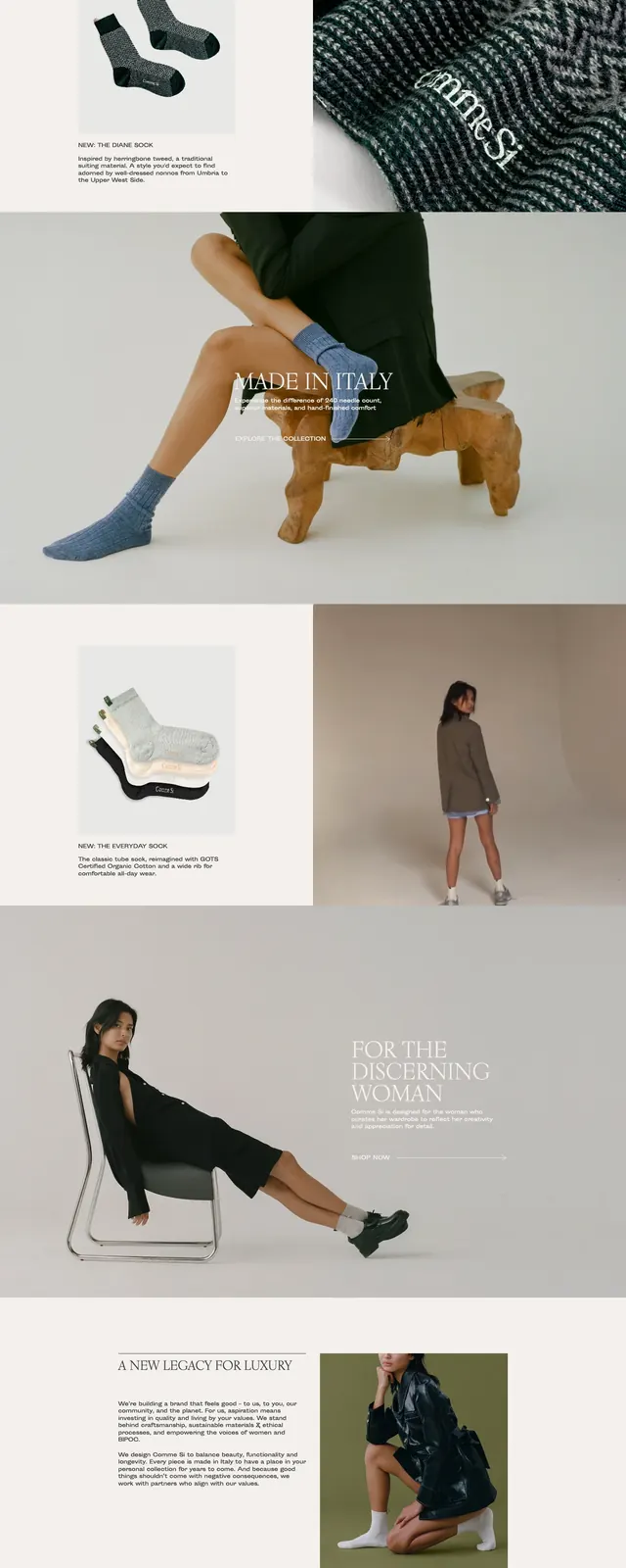
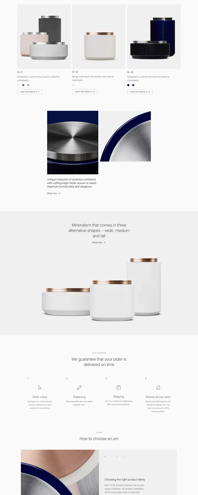
The page uses a pale cream background with a thin top announcement bar and a simple horizontal navigation. A large hero product image dominates the upper right, paired with a small wordmark and a short descriptive statement on the left. Lower sections continue the editorial feel with staggered image blocks, oversized typography, logo-like press mentions, a team/gallery row, and a wide newsletter signup field in the footer.
Key takeaway
The design relies on restraint: plenty of whitespace, large object photography, and understated typography to make the furniture feel curated and premium. Reuse this pattern for brands that need an editorial storefront with strong visual hierarchy and minimal UI chrome.
Reuse notes
Best adapted for high-end retail, design studios, or furniture brands that want a magazine-like landing page. Keep the layout asymmetric and the type scale dramatic, but preserve the minimal navigation and image-first storytelling.