Preview image. Unlock full-res
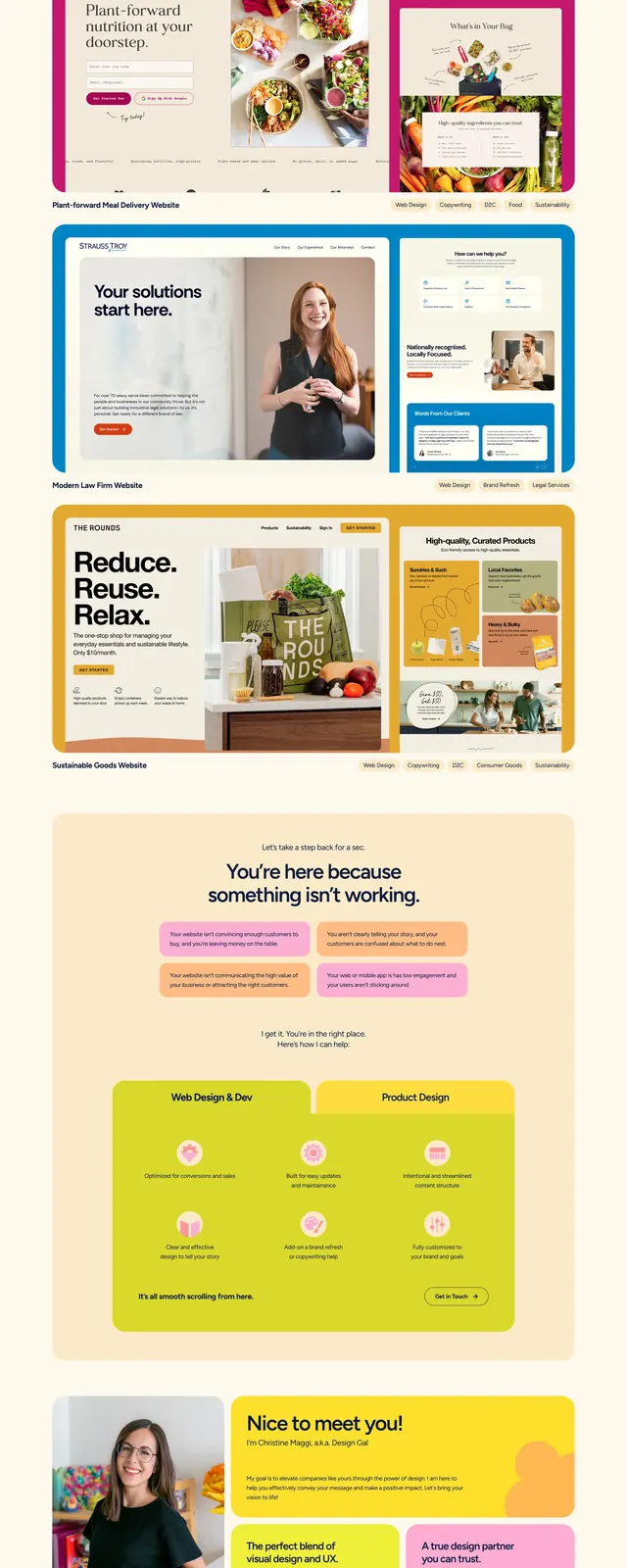
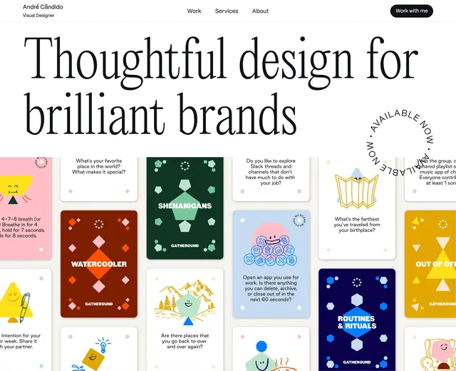
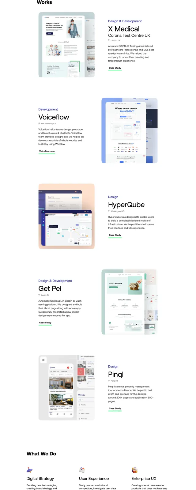
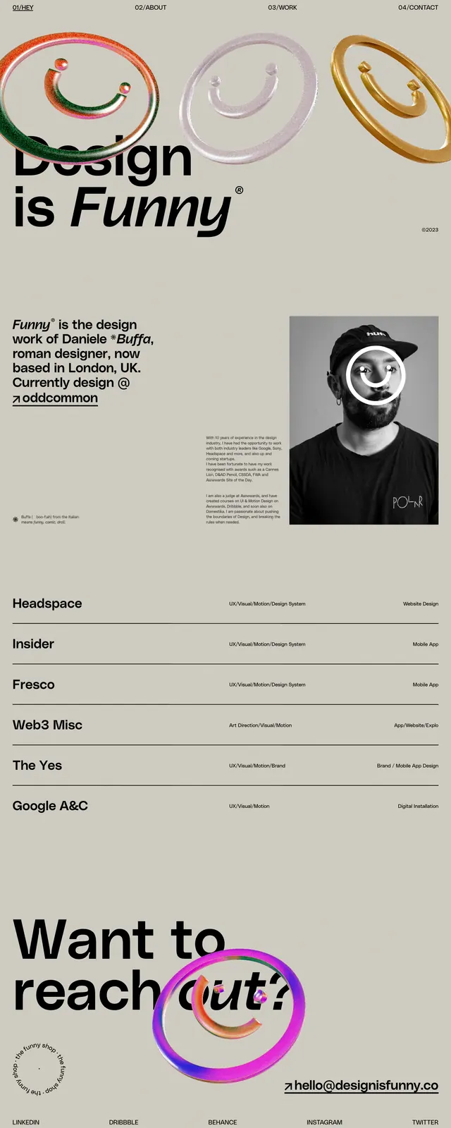
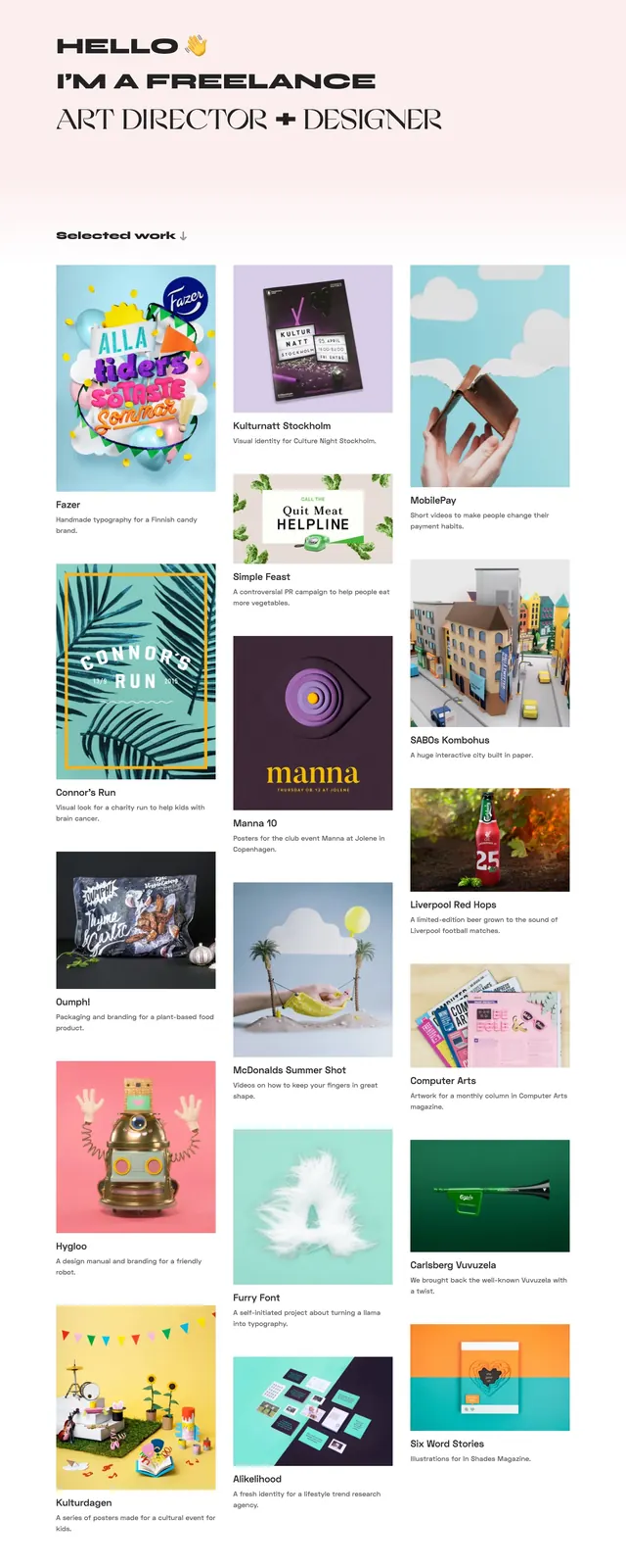
A light, editorial portfolio homepage with a bold typographic intro and a masonry-style grid of colorful project thumbnails.
Summary
A light, editorial portfolio homepage with a bold typographic intro and a masonry-style grid of colorful project thumbnails.
Visual description
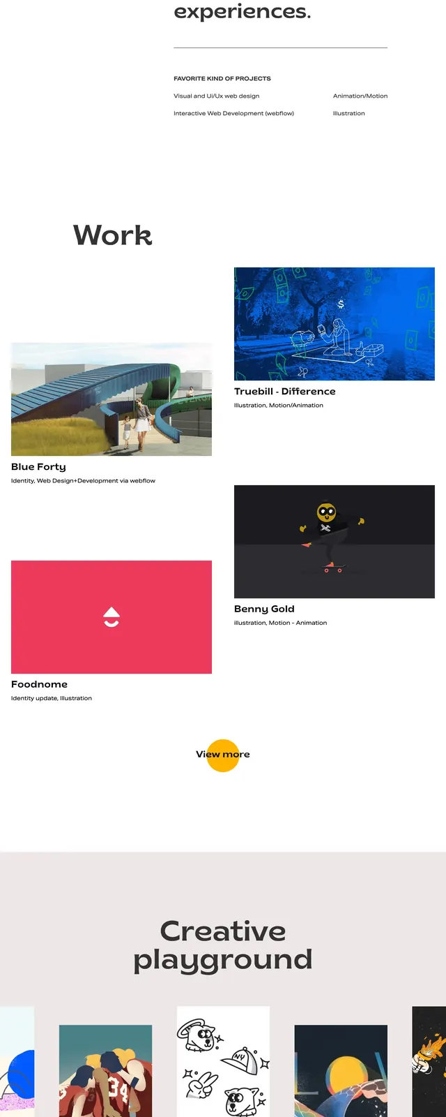
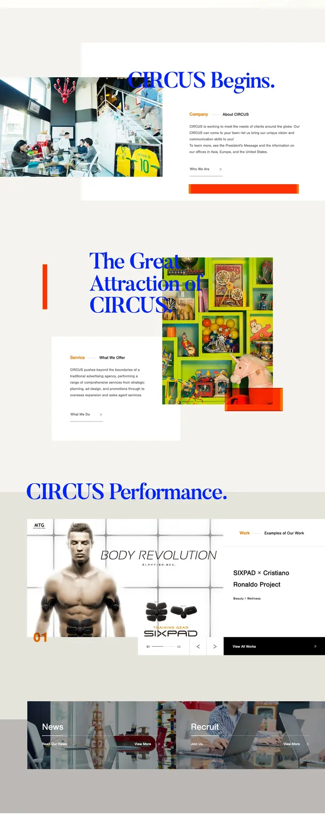
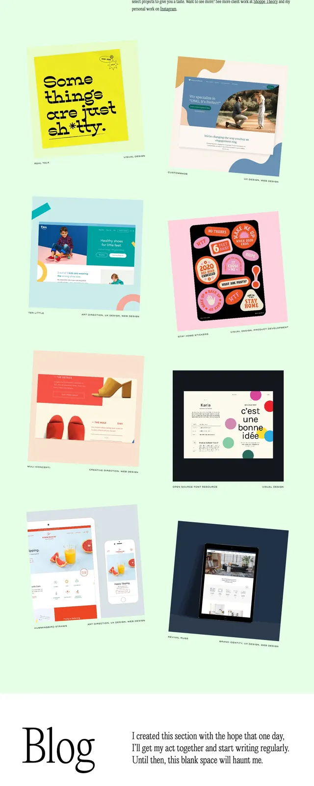
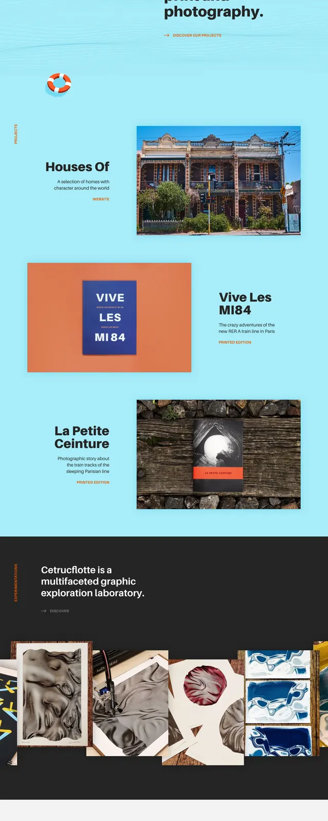
The page opens with a pale pink hero area and a large stacked introduction reading like a personal portfolio header. Below it, a "Selected work" heading introduces a three-column masonry grid of project cards with thumbnail images and short captions. The overall composition is airy, with lots of white space, small text labels, and brightly colored artwork and mockups providing most of the visual weight. A simple footer row of links sits at the bottom.
Key takeaway
The strongest move is the contrast between oversized custom typography and a dense, image-heavy project grid. It feels personal and curated without relying on complex UI components.
Reuse notes
Use this structure for creative portfolios, studios, or freelance art directors who need a strong first impression and a browsable work archive. It pairs well with bold display type, soft neutral backgrounds, and varied thumbnail imagery.