Preview image. Unlock full-res
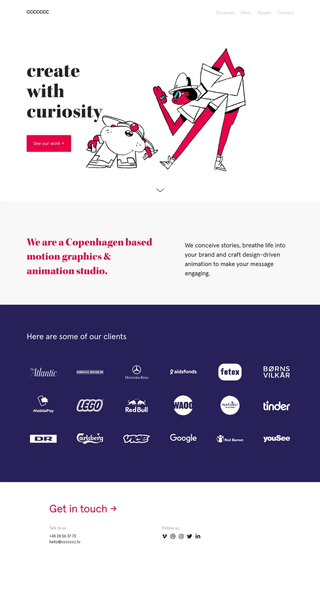
A playful portfolio homepage hero for a freelance marketing partner with oversized headline typography, an illustrated character, and a minimal contact section below.
Summary
A playful portfolio homepage hero for a freelance marketing partner with oversized headline typography, an illustrated character, and a minimal contact section below.
Visual description
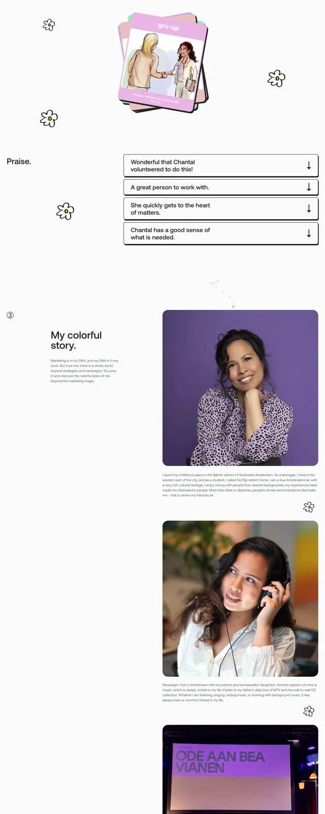
The page opens with a very large, all-caps headline that fills most of the top screen, partially overlapped by a hand-drawn illustrated figure in the foreground. The navigation is sparse and centered across the top, with a small brand name on the left and a contact link on the right. Lower on the page, the layout shifts into an about/story section with a large portrait card, followed by a contact area featuring a simple form and a footer bar.
Key takeaway
The strongest idea is the contrast between oversized editorial type and a loose illustrated persona, which gives the site a memorable personal brand feel. The design stays mostly white and minimal so the illustration and typography do the heavy lifting.
Reuse notes
Use this pattern for personal portfolios, freelance service pages, or creative consultants who want to feel approachable without losing polish. It works best when the brand can support a bold illustrated identity and a very simple contact path.