Preview image. Unlock full-res
A playful, pastel-heavy agency homepage with oversized typography, rounded cards, and a cheerful editorial layout.
Summary
A playful, pastel-heavy agency homepage with oversized typography, rounded cards, and a cheerful editorial layout.
Visual description
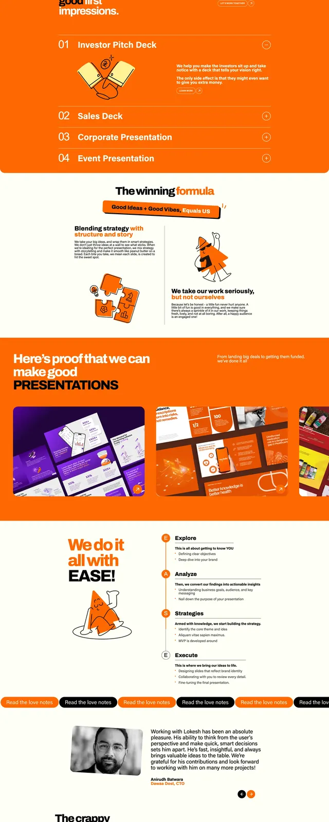
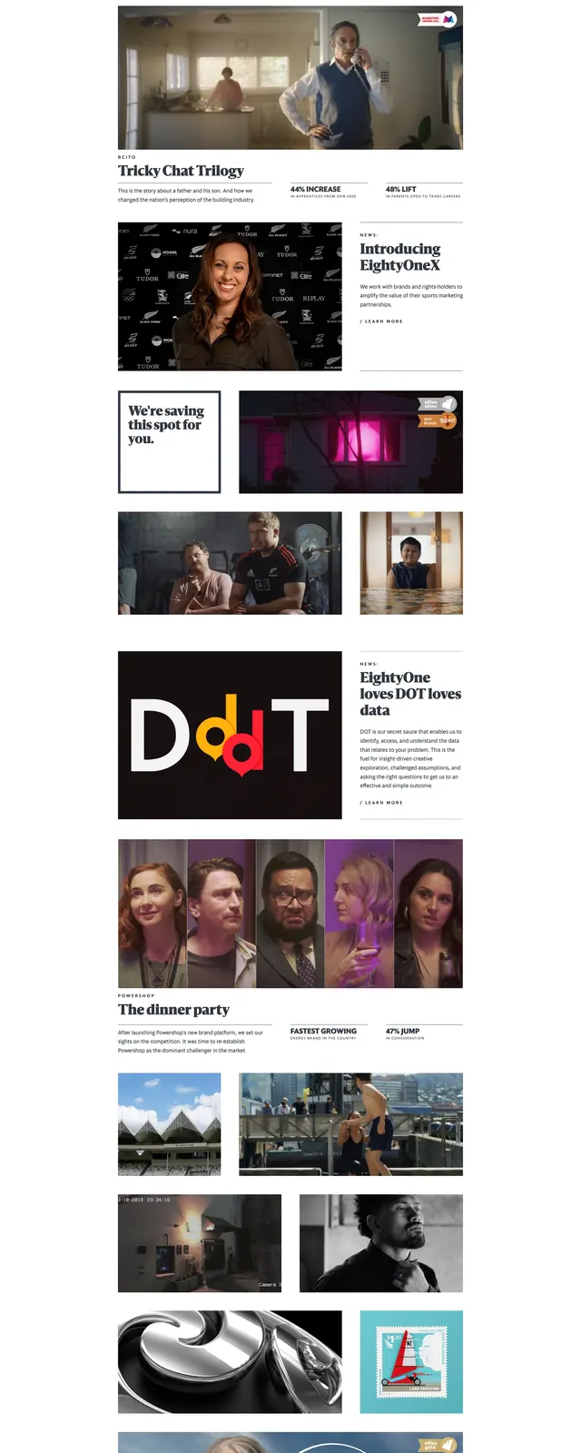
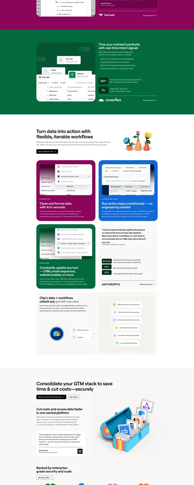
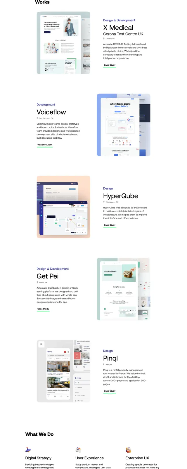
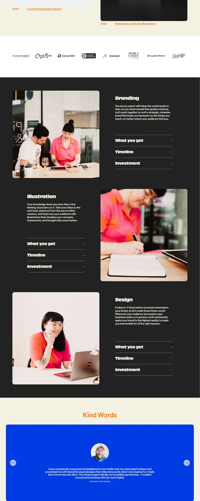
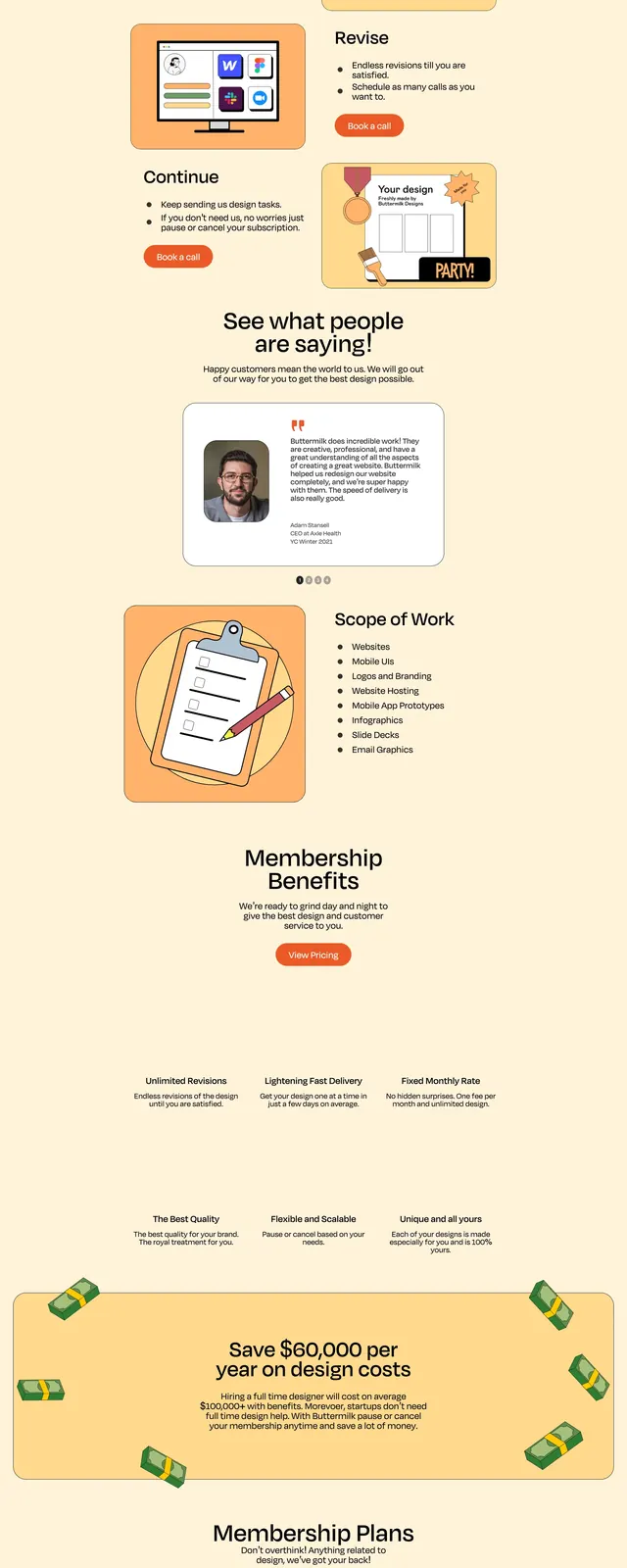
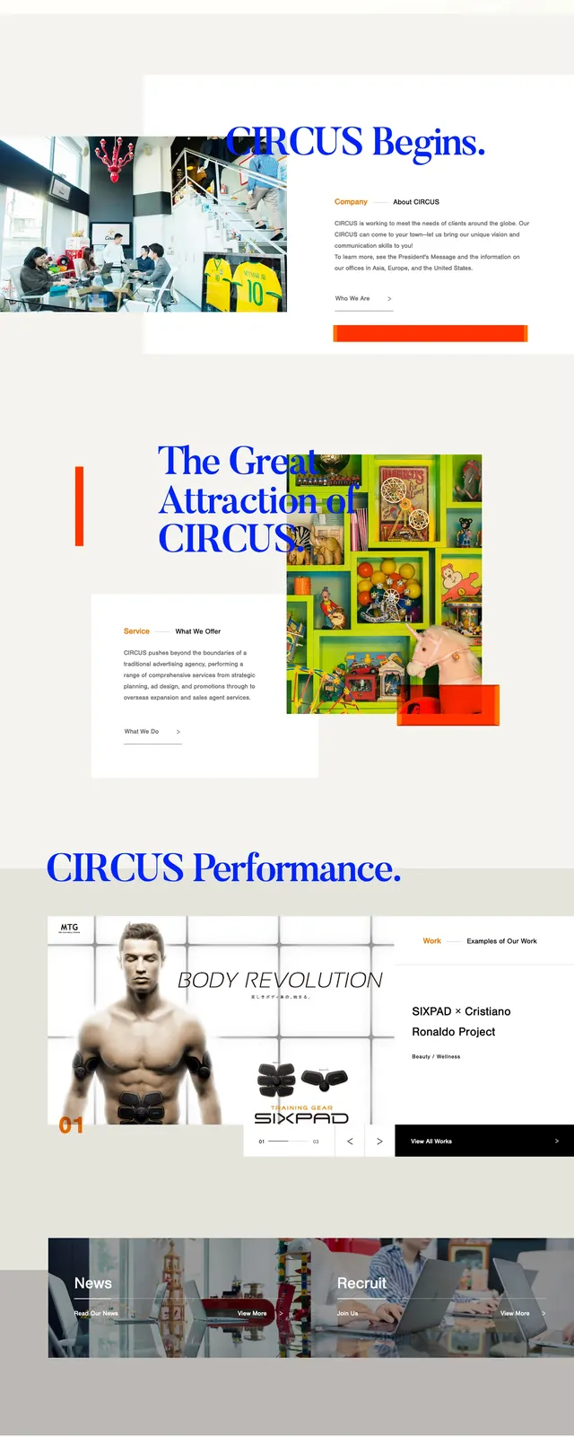
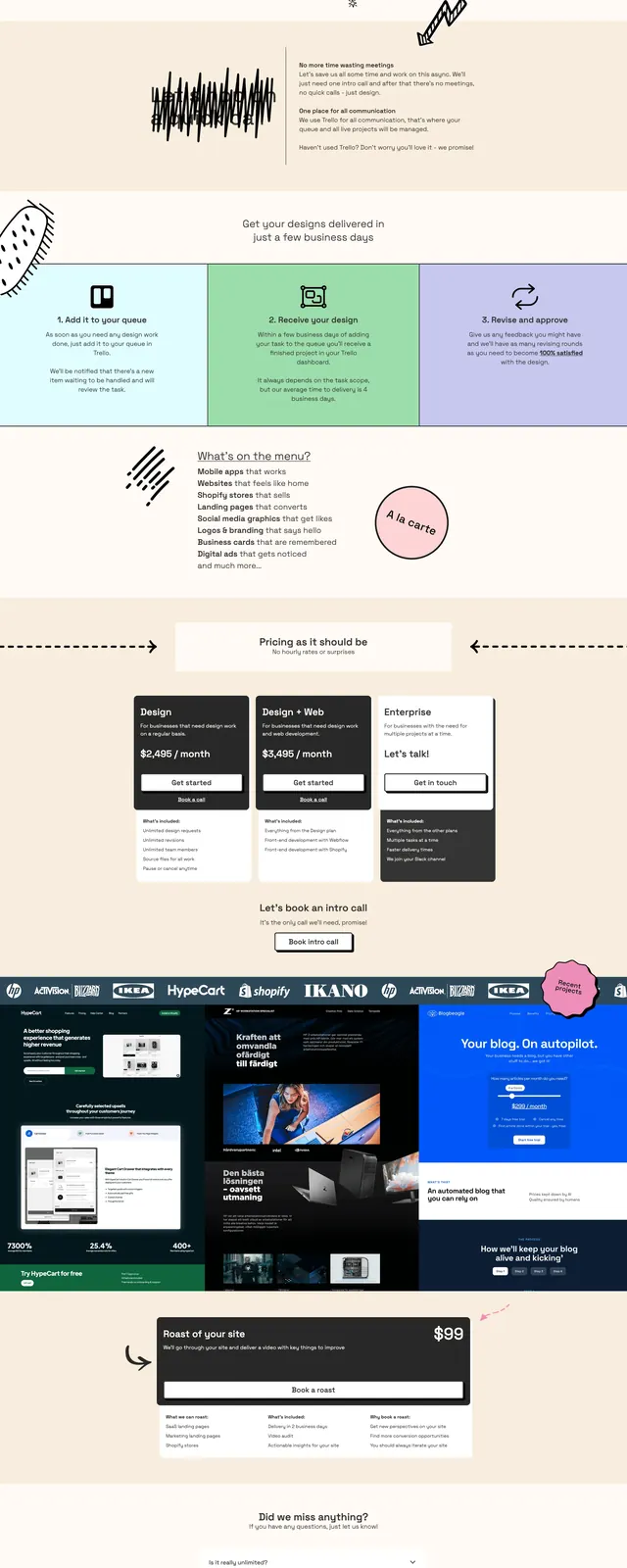
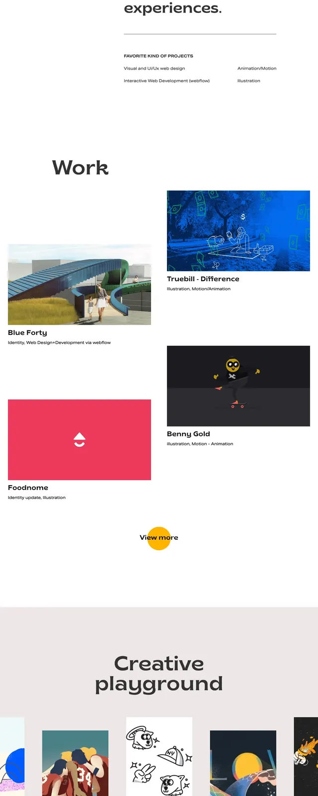
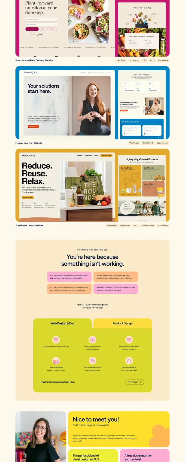
The page uses a warm cream background with a giant dark navy headline and small pill navigation centered above it. Below the hero is a large pink rounded callout card with a primary CTA, followed by a wide image block and a bright logo strip. The rest of the page stacks colorful rounded content cards, a large portfolio showcase, testimonial tiles, an FAQ accordion, and a bold orange contact footer.
Key takeaway
The design leans on oversized type, soft rounded geometry, and saturated pastel accents to make a creative studio feel approachable and memorable. It balances personality with clear service presentation through strong section separation and simple CTAs.
Reuse notes
Reuse this pattern for boutique agencies, studios, or personal brands that need a friendly but polished landing page. The most transferable elements are the centered nav, oversized hero headline, rounded promo card, and stacked case-study/testimonial sections.