Preview image. Unlock full-res
A grid-based web3 landing page with oversized futuristic typography, modular sections, and white space-heavy editorial styling.
Summary
A grid-based web3 landing page with oversized futuristic typography, modular sections, and white space-heavy editorial styling.
Visual description
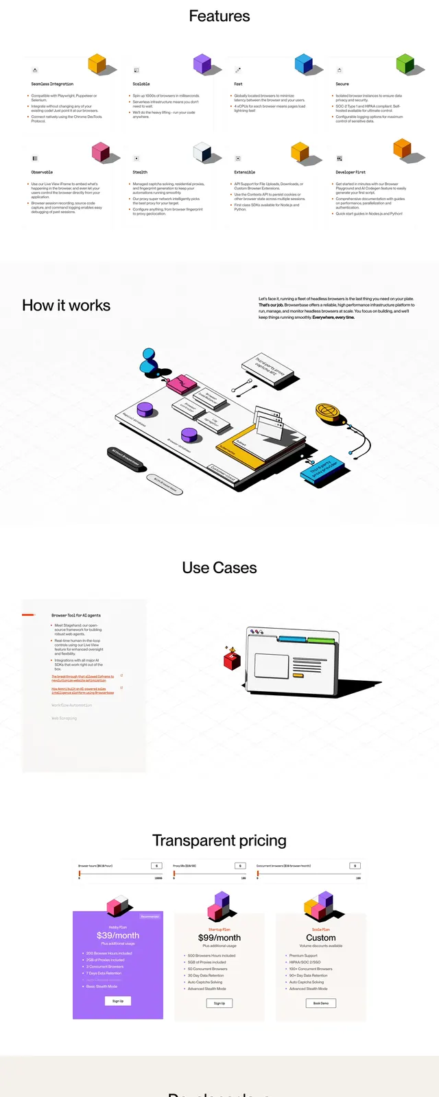
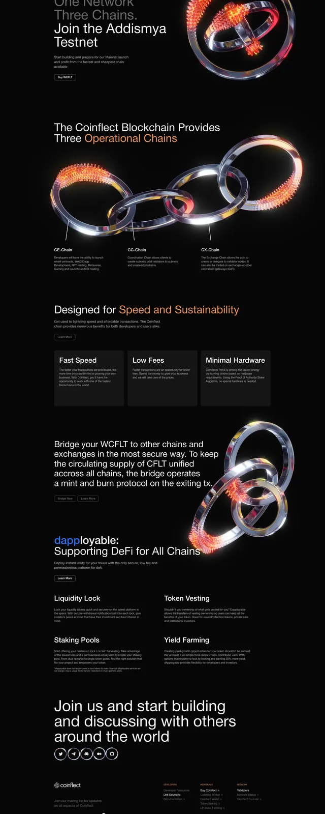
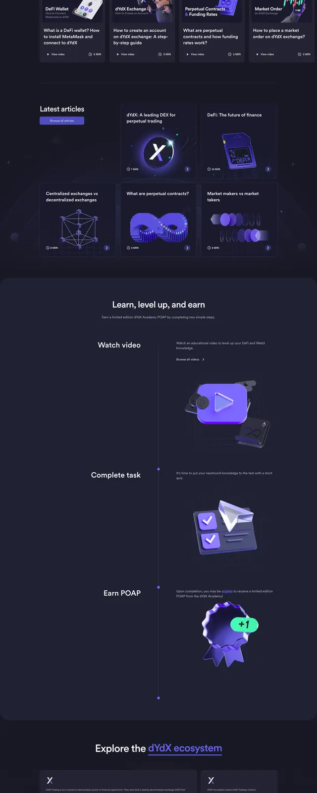
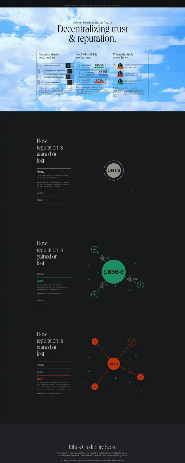
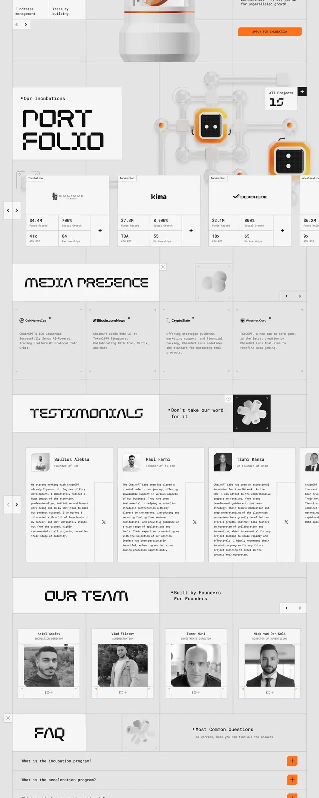
The page uses a pale background with thin grid lines and large black headline lettering that stretches edge to edge. The first screen combines a top navigation, a central 3D robot render, and compact supporting copy with strong orange call-to-action buttons. Lower sections continue in a modular grid with partner logos, media mentions, testimonial cards, and blog/article blocks. The entire composition feels like a structured editorial dashboard translated into a landing page.
Key takeaway
The strongest pattern here is the contrast between oversized expressive typography and tightly organized grid sections. It is a good reference for web3 or AI brands that want to feel futuristic without using dark neon visuals.
Reuse notes
Reuse the rigid grid, boxed section framing, and oversized display headers for a similar high-tech landing page. The orange accent buttons and 3D mascot render provide a simple formula for adding energy to an otherwise monochrome layout.