Preview image. Unlock full-res
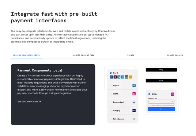
Tabbed section on pre-built payment interfaces with dark Payment Components card and right mockups of method list, Apple Pay, Google Pay, and iDEAL widget.
Summary
Pre-built interfaces feature with headline, four uppercase tabs (Payment Components beta active), dark left info card, and right UI mockups of payment method radios and wallet buttons.
Visual description
White page. Bold headline Integrate fast with pre-built payment interfaces and intro on hosted PCI-compliant interfaces. Tab row: PAYMENT COMPONENTS (BETA) with blue underline, HOSTED PAYMENT PAGE, IN-APP, FRAMES FOR WEB. Left dark charcoal card: Payment Components beta title, white body on modular customization, See documentation link. Right: gray PAYMENT panel with Card selected showing card brand icons, PayPal iDEAL Bancontact Giropay Multibanco rows; floating Apple Pay and Google Pay black buttons and iDEAL bank select with blue Pay button.
Key takeaway
Dark narrative card opposite light UI mockups creates clear product-story versus product-preview split. Tabs segment integration types without separate pages in one capture.
Reuse notes
Developer product page pattern for hosted versus embedded options. Beta tag on tab sets expectation for emerging features.
More feature detail sections
See all


More like this


Keep what you find
A free account saves references to boards and can send you a weekly email of picks based on what you save.
To see every result, go Pro.