Preview image. Unlock full-res
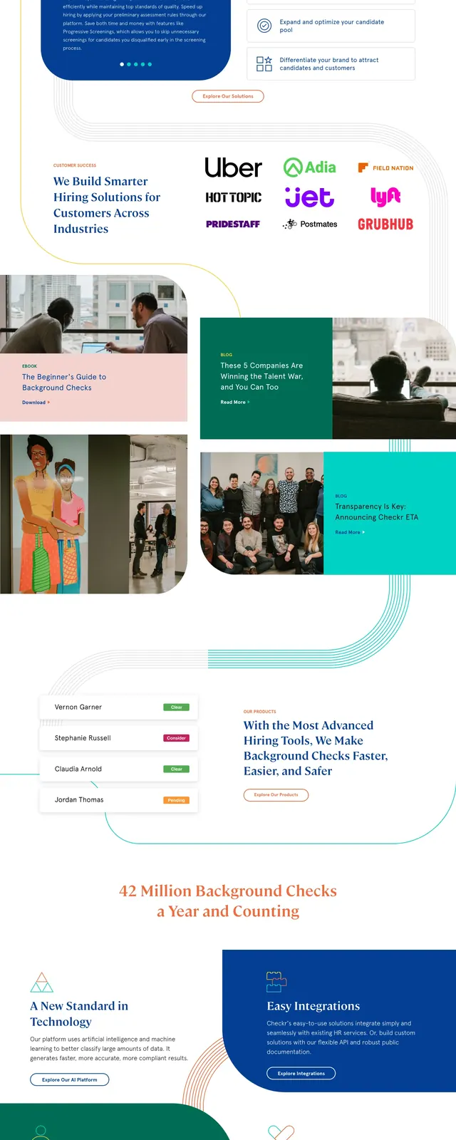
A clean SaaS landing page for Checkr with a split hero, strong serif headlines, and layered curved line graphics.
Summary
A clean SaaS landing page for Checkr with a split hero, strong serif headlines, and layered curved line graphics.
Visual description
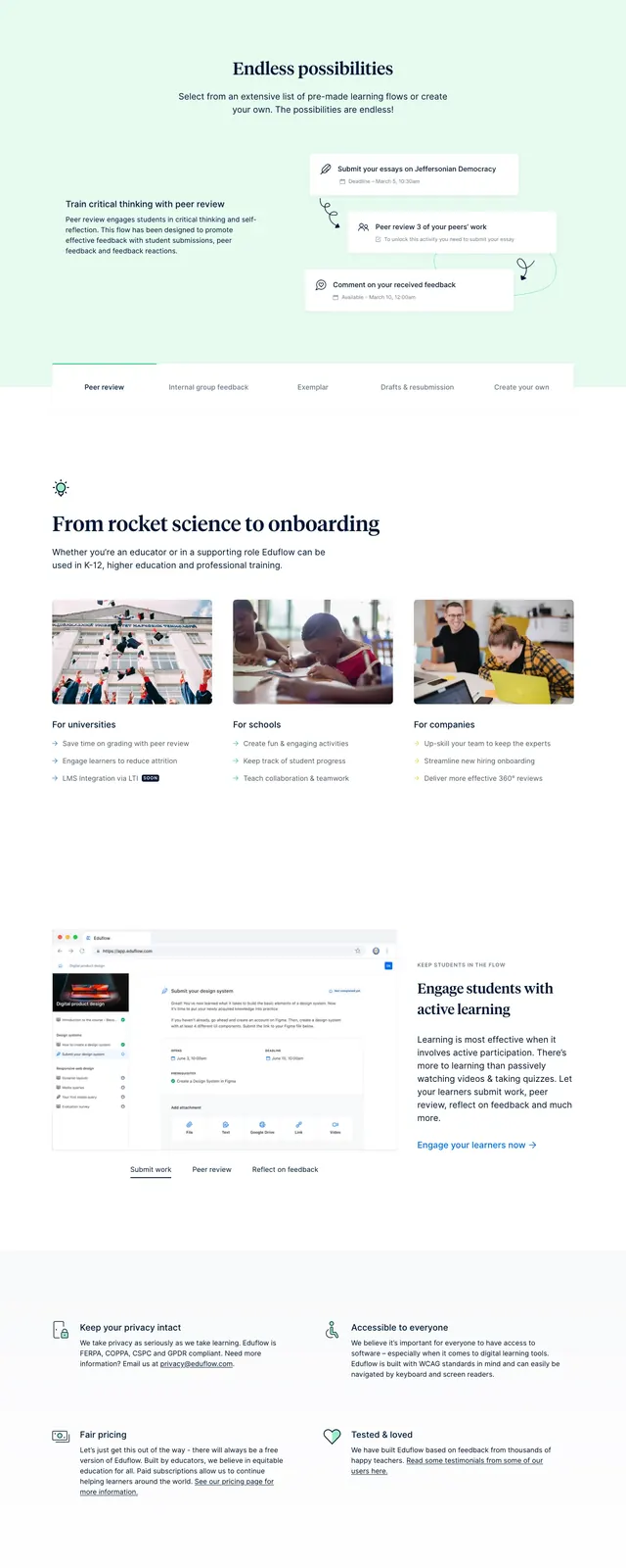
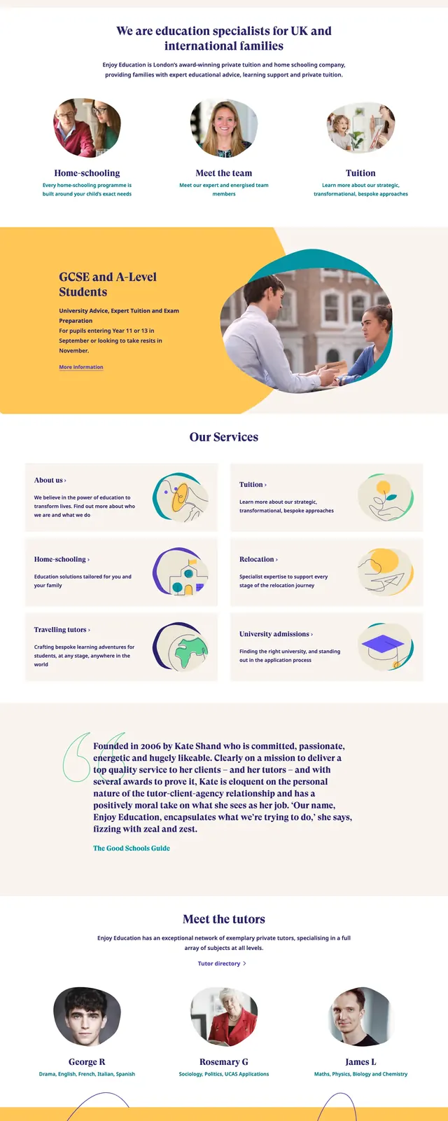
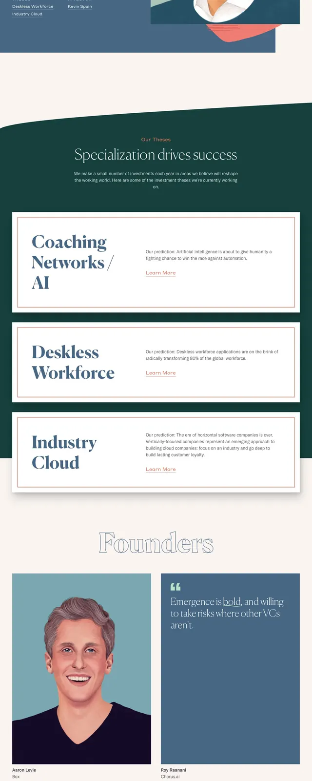
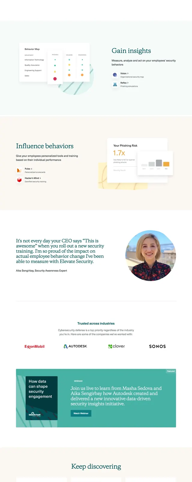
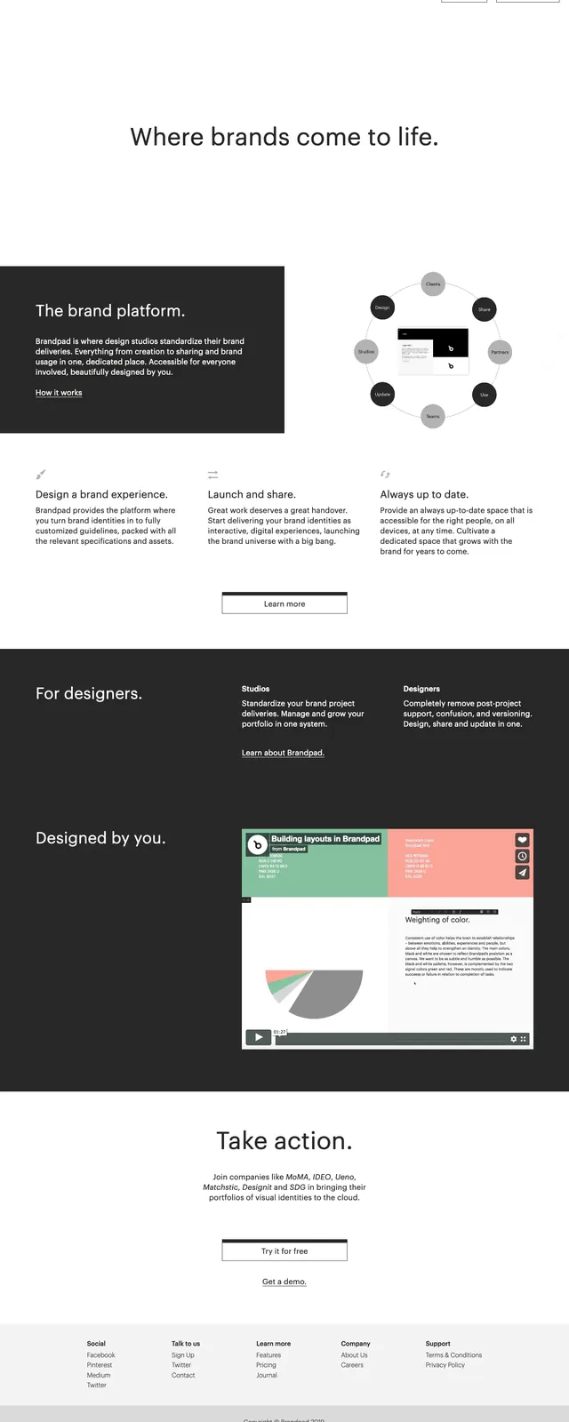
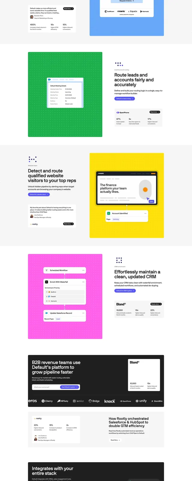
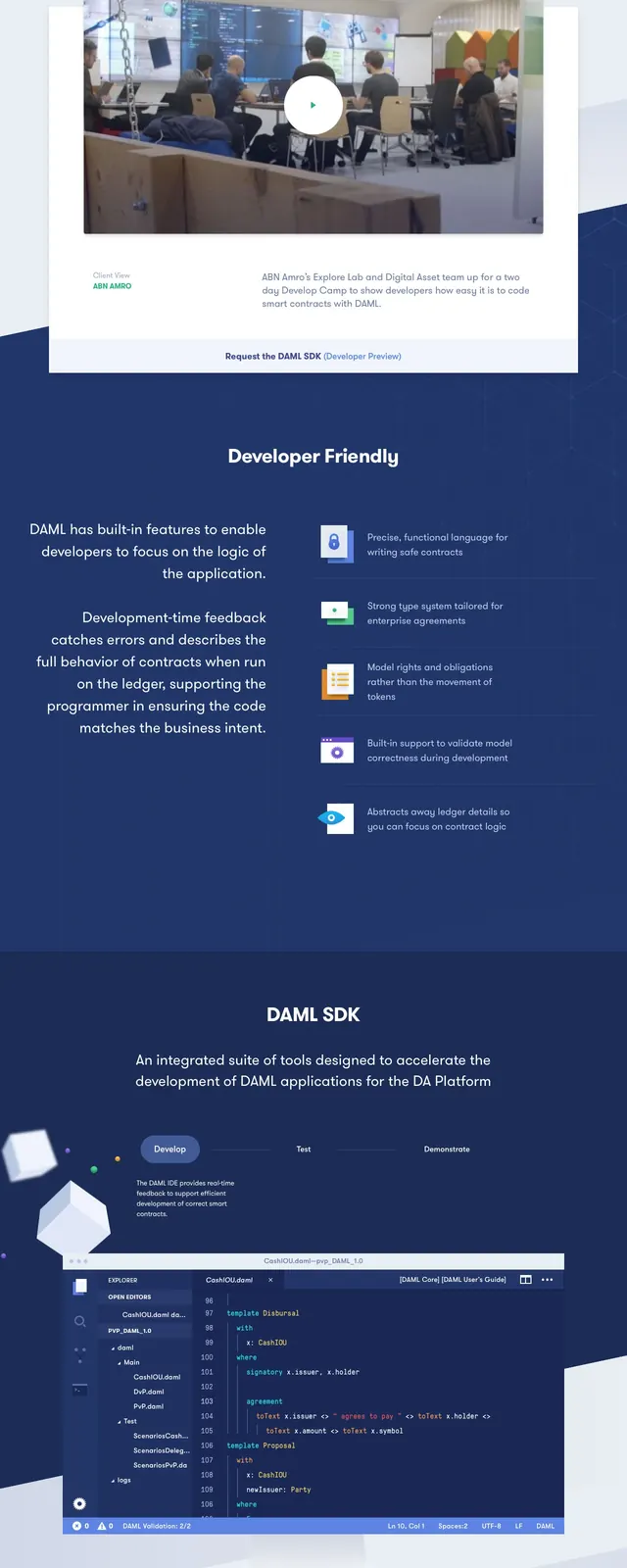
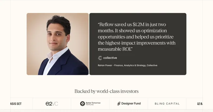
The page opens with a top navigation bar, a large left-aligned headline, supporting paragraph text, and a primary call-to-action button. On the right, a blue block contains a contact button and a photo of people in an office setting, with thin curved line accents flowing across the layout. Lower sections continue with large editorial headings, multi-card content blocks, image tiles, and another CTA band near the footer. The overall page uses generous white space, soft rounded corners, and a restrained blue, teal, and warm accent palette.
Key takeaway
The strongest reusable idea is the mix of corporate trust signals with editorial spacing and decorative linework. The layout feels structured and polished without becoming rigid.
Reuse notes
Use this pattern for HR, compliance, or B2B SaaS sites that need credibility and approachability. The split hero, rounded image treatment, and modular content blocks would translate well to product marketing or services pages.