Preview image. Unlock full-res
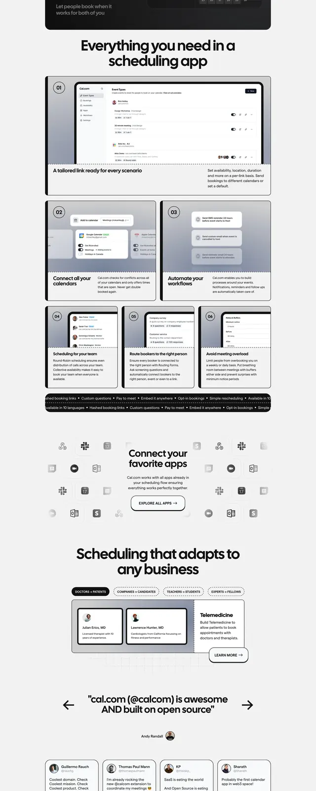
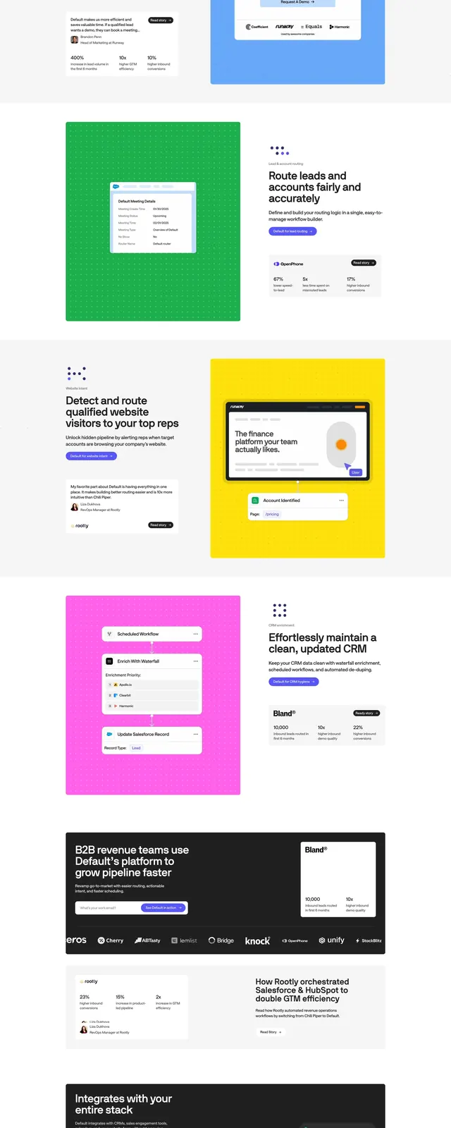
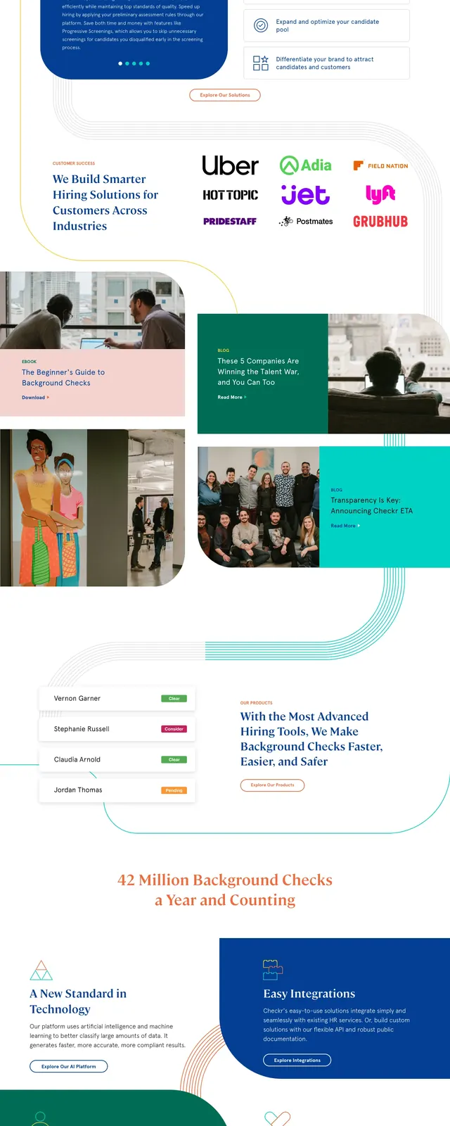
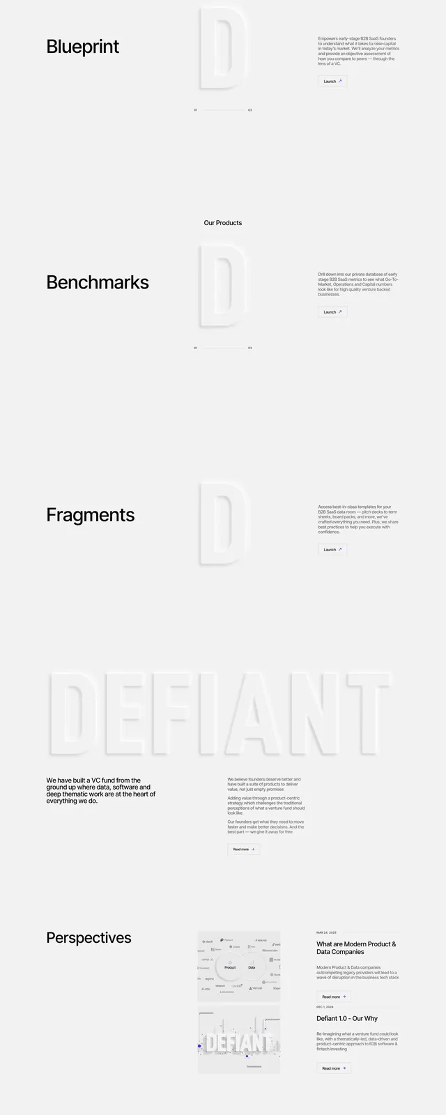
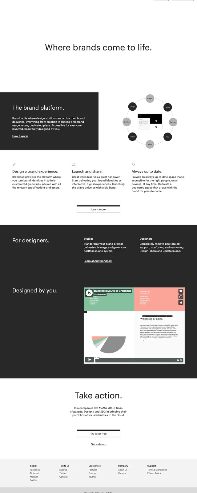
A clean, editorial-style SaaS landing page for brand management with large whitespace, restrained typography, and dark content blocks.
Summary
A clean, editorial-style SaaS landing page for brand management with large whitespace, restrained typography, and dark content blocks.
Visual description
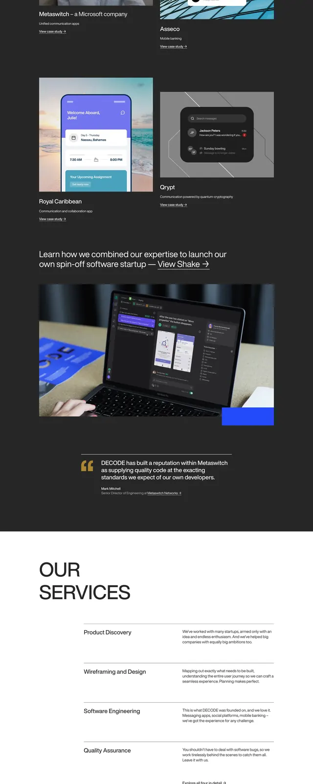
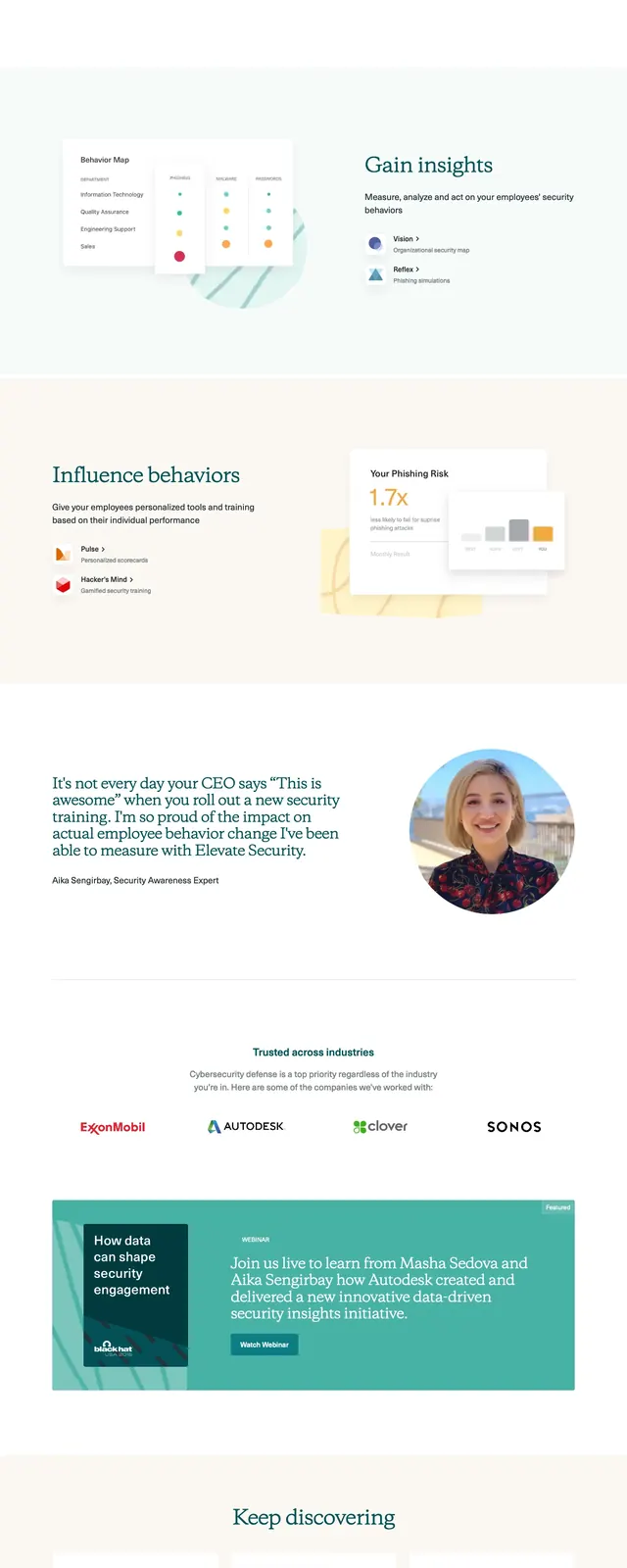
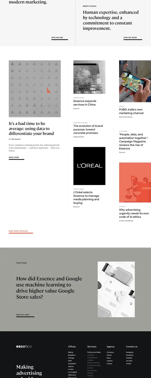
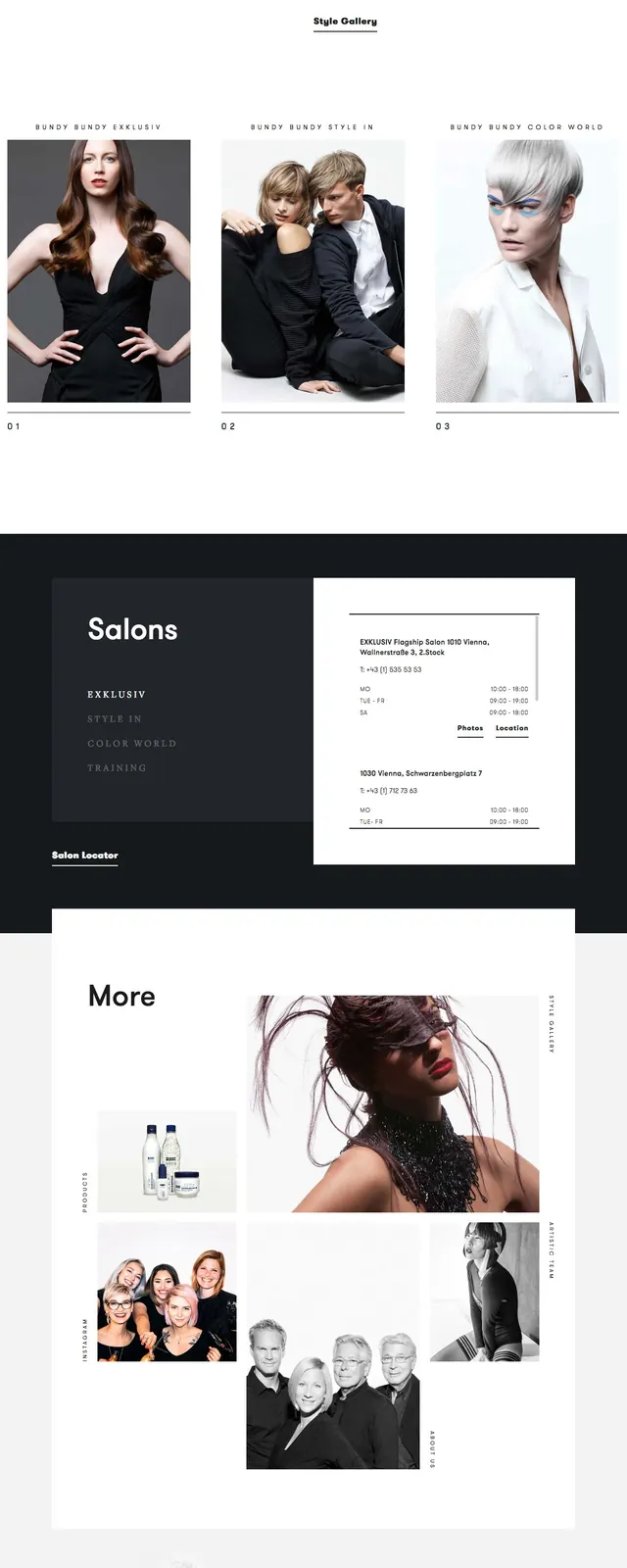
The page opens with a minimal white hero, a small top navigation, and a centered headline above generous empty space. Below, a dark feature card is paired with a circular brand diagram, followed by three-column feature text and a centered secondary button. Further down, large dark split sections mix short copy with a product screenshot/video preview, ending with a simple CTA and a compact multi-column footer.
Key takeaway
The design relies on strong contrast, spacious composition, and concise messaging to make a brand-platform product feel calm and premium. It is reusable for B2B SaaS landing pages that need an editorial but corporate presentation.
Reuse notes
Borrow the large whitespace, simple top nav, and alternating light/dark section rhythm for a polished SaaS homepage. The circular diagram and product preview block work well for explaining workflows or platform ecosystems.