Preview image. Unlock full-res
An editorial venture-capital landing page with a centered serif hero, a split feature story, and stacked thesis cards on a warm cream-and-blue palette.
Summary
An editorial venture-capital landing page with a centered serif hero, a split feature story, and stacked thesis cards on a warm cream-and-blue palette.
Visual description
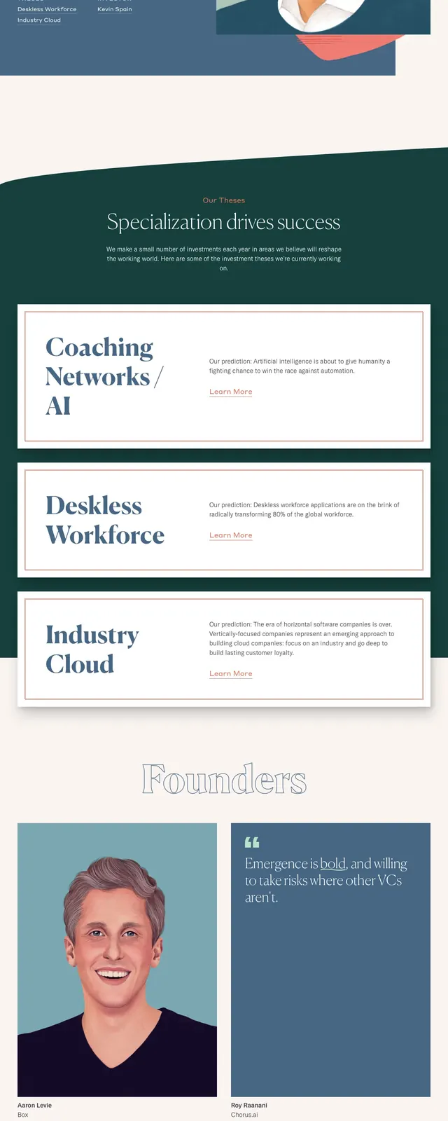
The page opens with a minimal top navigation, a small logo at left, and compact menu links at right. A centered serif headline sits on a warm off-white background above a two-column hero: a large illustrated portrait on the left and a short investment story with a bordered button on the right. Below, several wide boxed cards stack vertically with oversized serif titles, short explanatory text, and subtle links, followed by a newsletter signup band and a multi-column footer with contact details.
Key takeaway
The design pairs editorial typography with restrained corporate structure, using boxed modules to make a finance site feel curated rather than generic. The contrast between the soft neutral canvas and the deep blue footer gives the page a memorable rhythm.
Reuse notes
Useful for investor, studio, or advisory sites that need to communicate point of view and credibility without looking overly dense. The split hero and stacked thesis cards can be reused for thought-leadership or portfolio-led landing pages.