Preview image. Unlock full-res
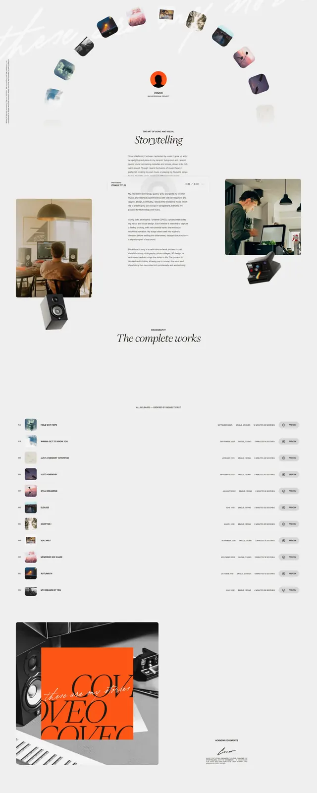
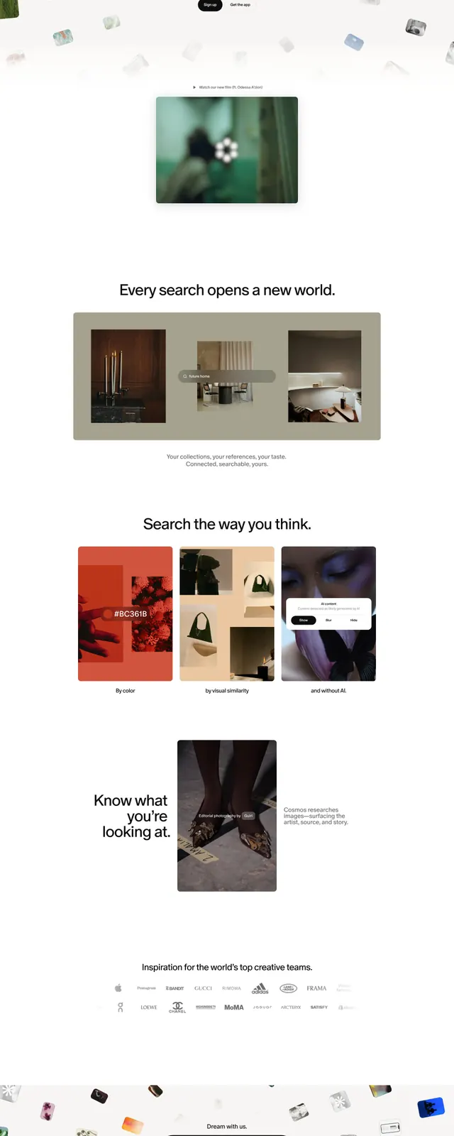
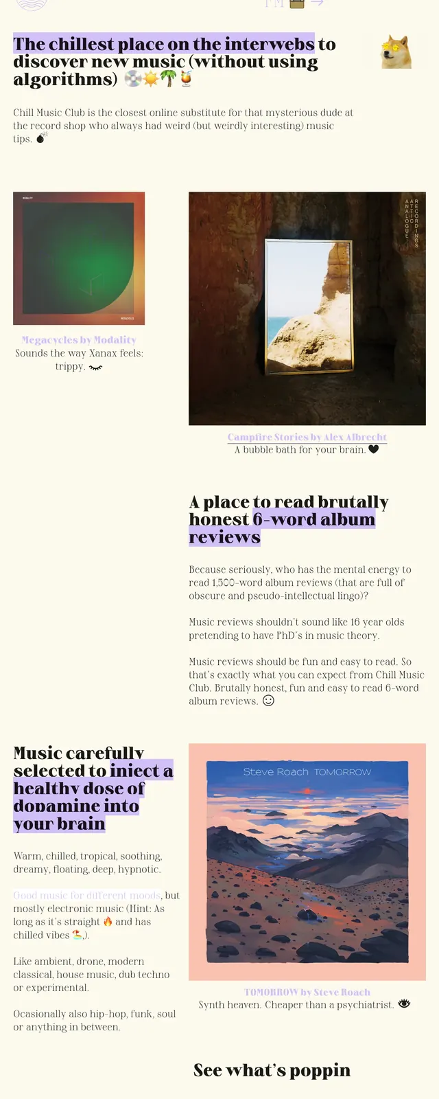
A soft, editorial music discovery landing page with oversized serif headlines, pale cream backgrounds, and scattered image-led storytelling blocks.
Summary
A soft, editorial music discovery landing page with oversized serif headlines, pale cream backgrounds, and scattered image-led storytelling blocks.
Visual description
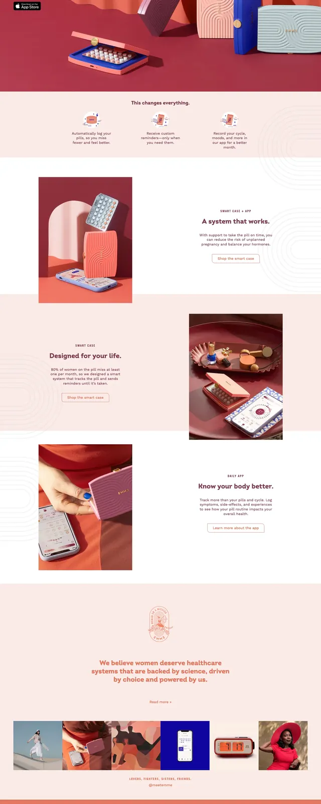
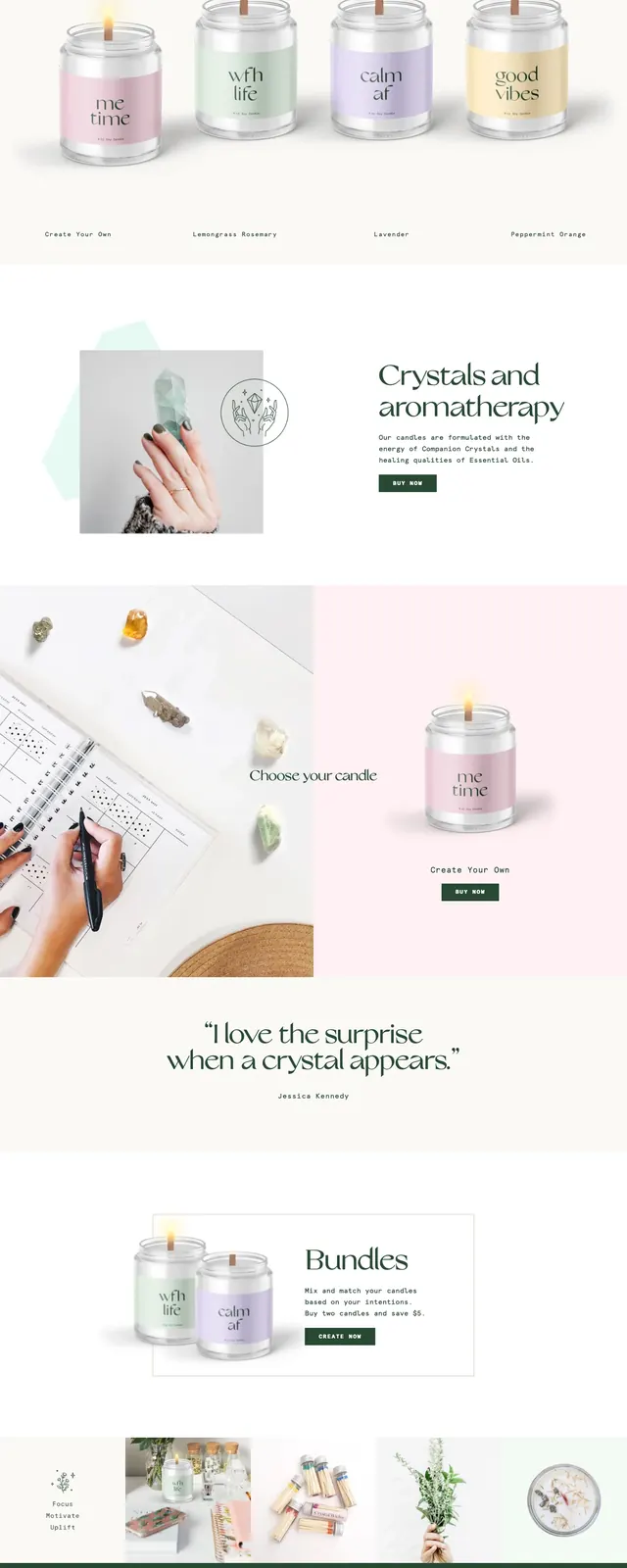
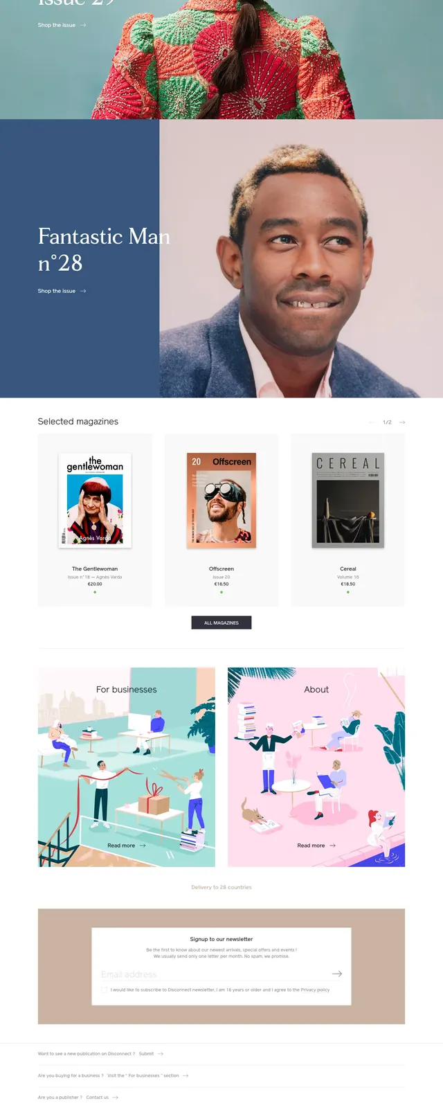
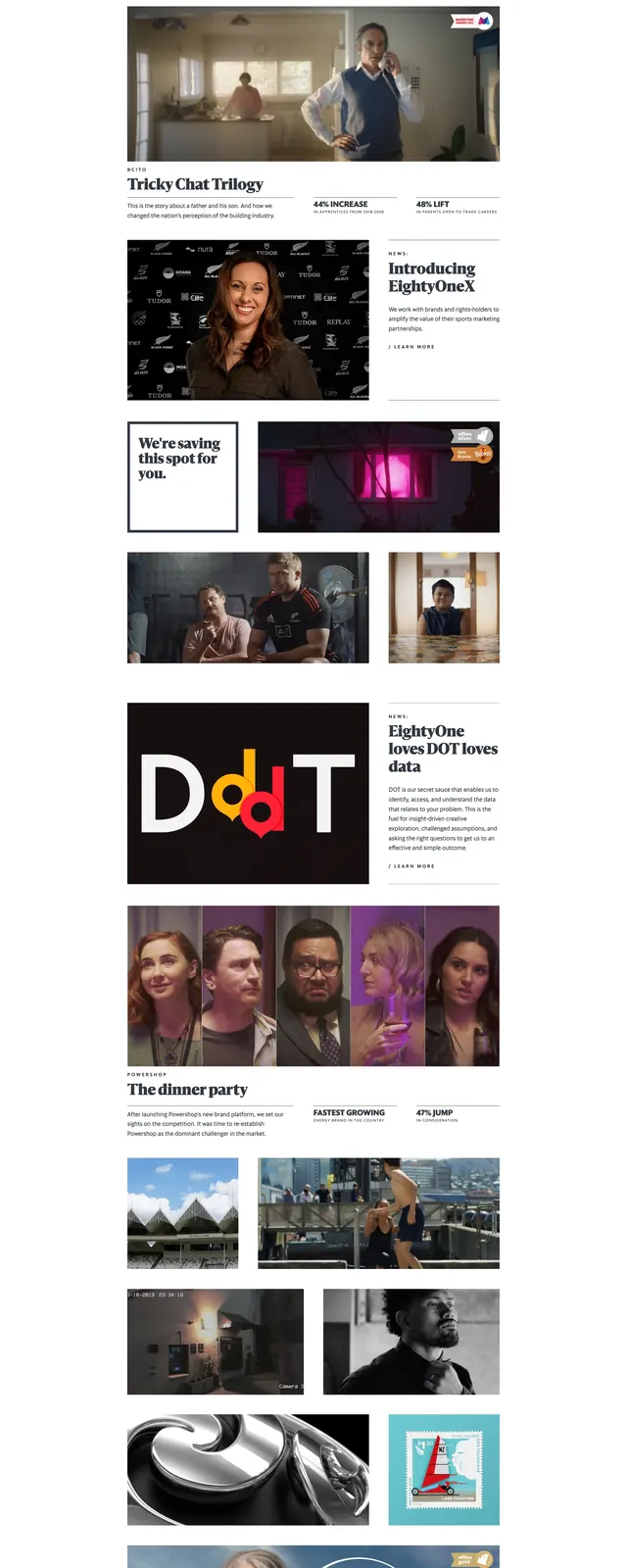
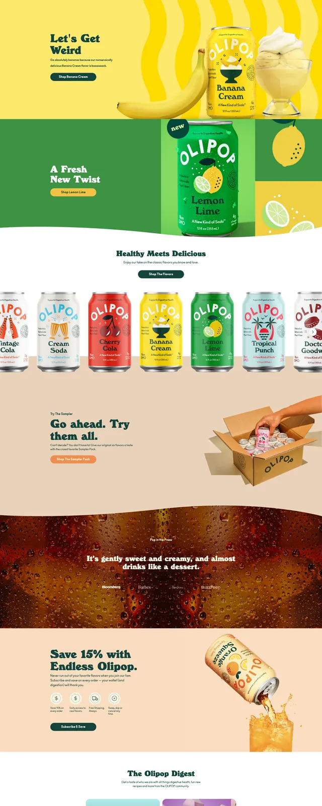
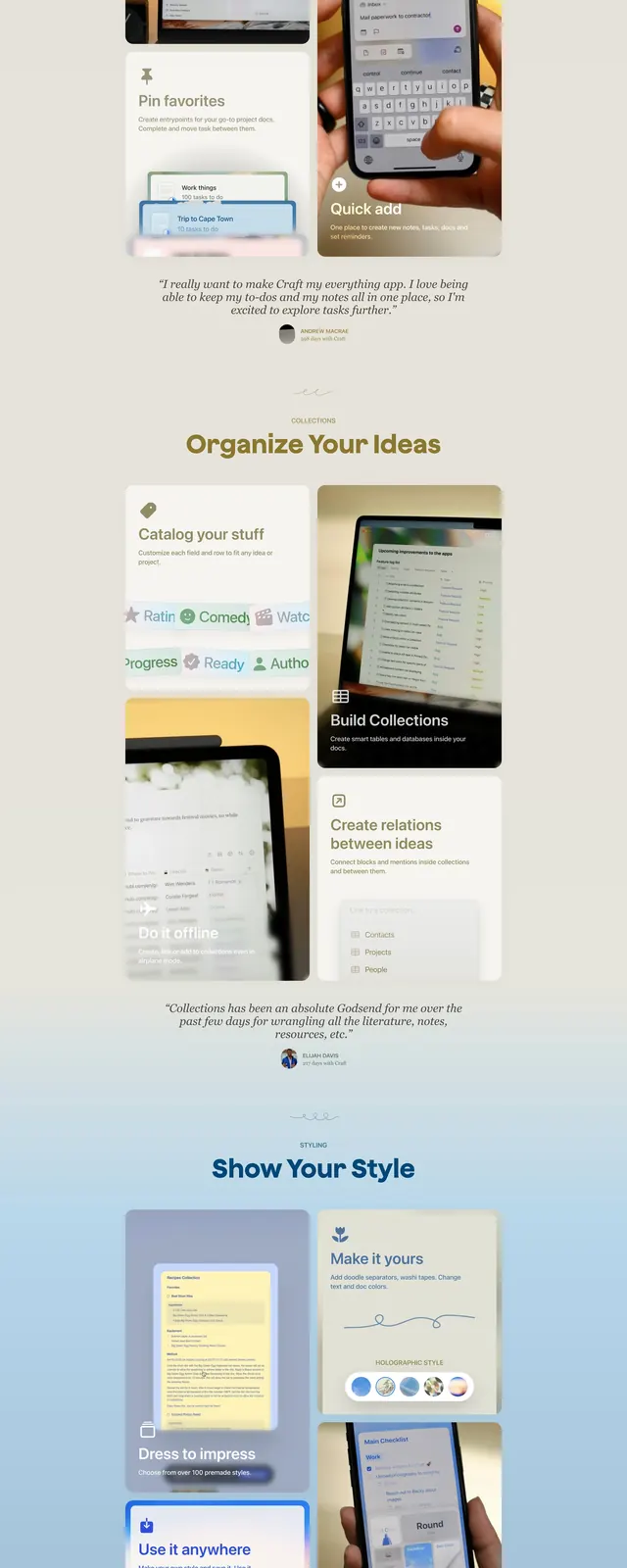
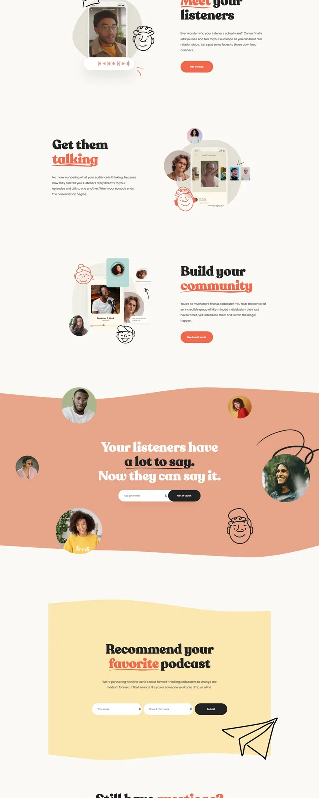
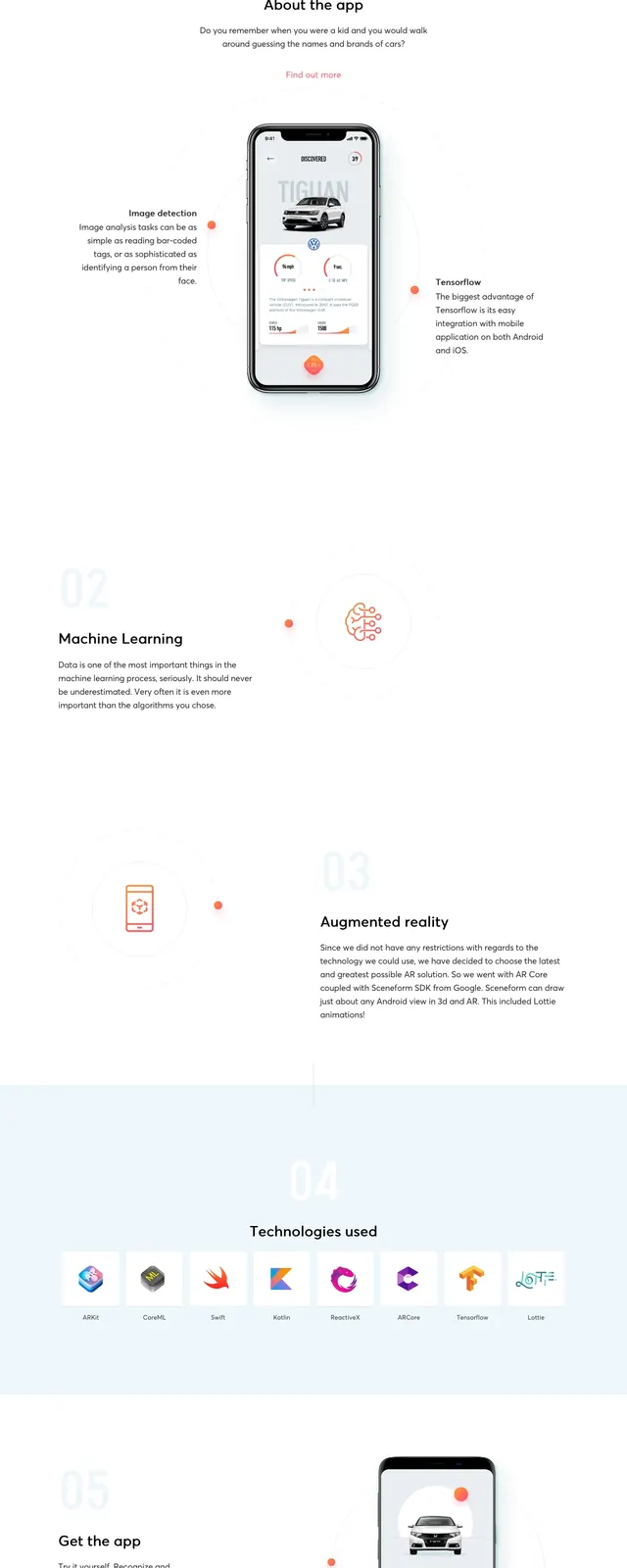
The page uses a creamy off-white background with lavender highlight blocks behind bold serif headlines. Content is arranged in an airy asymmetric grid with large album-art images, short descriptive copy, and small decorative icons and logos. The design alternates between text-heavy editorial sections and image-led feature cards, creating a curated magazine feel. Navigation and calls to action are subtle and low-contrast, keeping attention on the music recommendations.
Key takeaway
This layout feels like an indie editorial homepage for music discovery, prioritizing taste, mood, and personality over dense product messaging. The strongest reusable pattern is a soft hero followed by alternating feature stories with large imagery and punchy section headlines.
Reuse notes
Reuse the pastel highlight treatment, oversized serif headings, and scattered image-card storytelling for lifestyle or culture brands. The structure works well for products that need to feel curated, human, and anti-algorithmic.