Preview image. Unlock full-res
A soft pink, editorial-style agency landing page with oversized typography, filmic imagery, and modular content blocks.
Summary
A soft pink, editorial-style agency landing page with oversized typography, filmic imagery, and modular content blocks.
Visual description
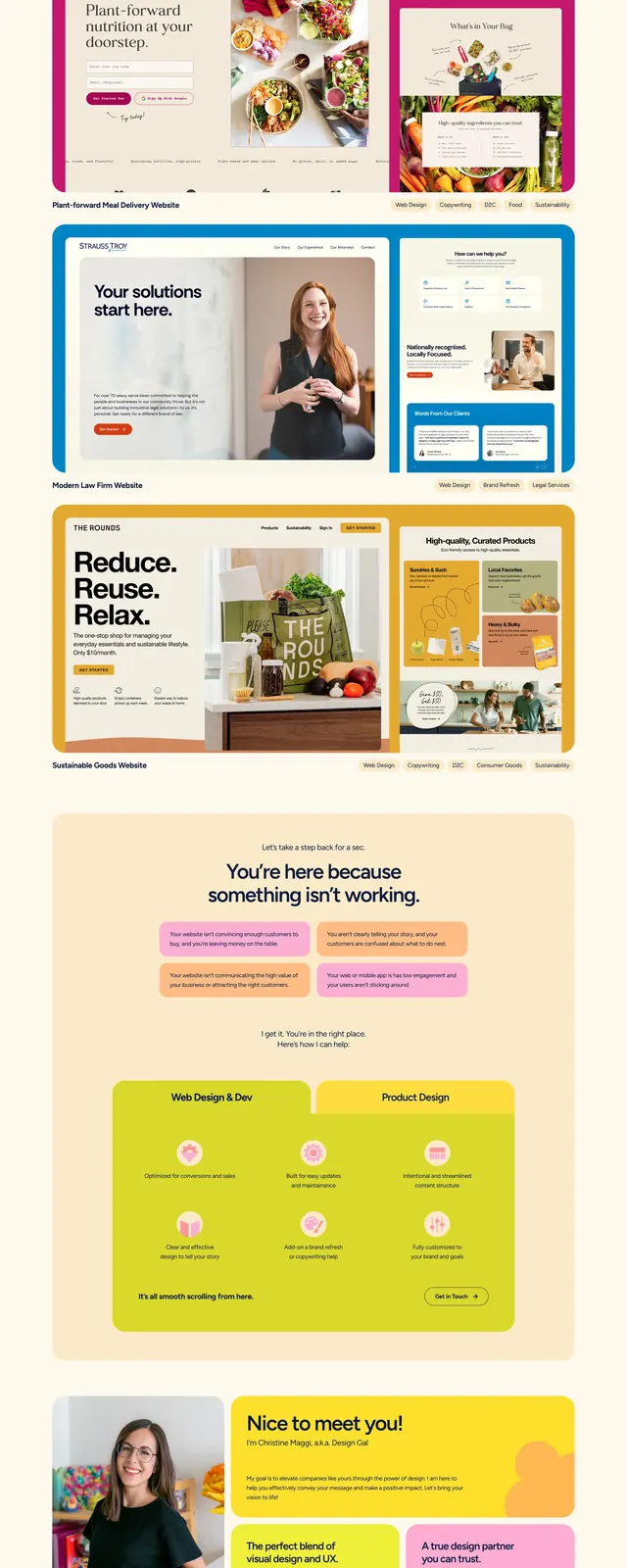
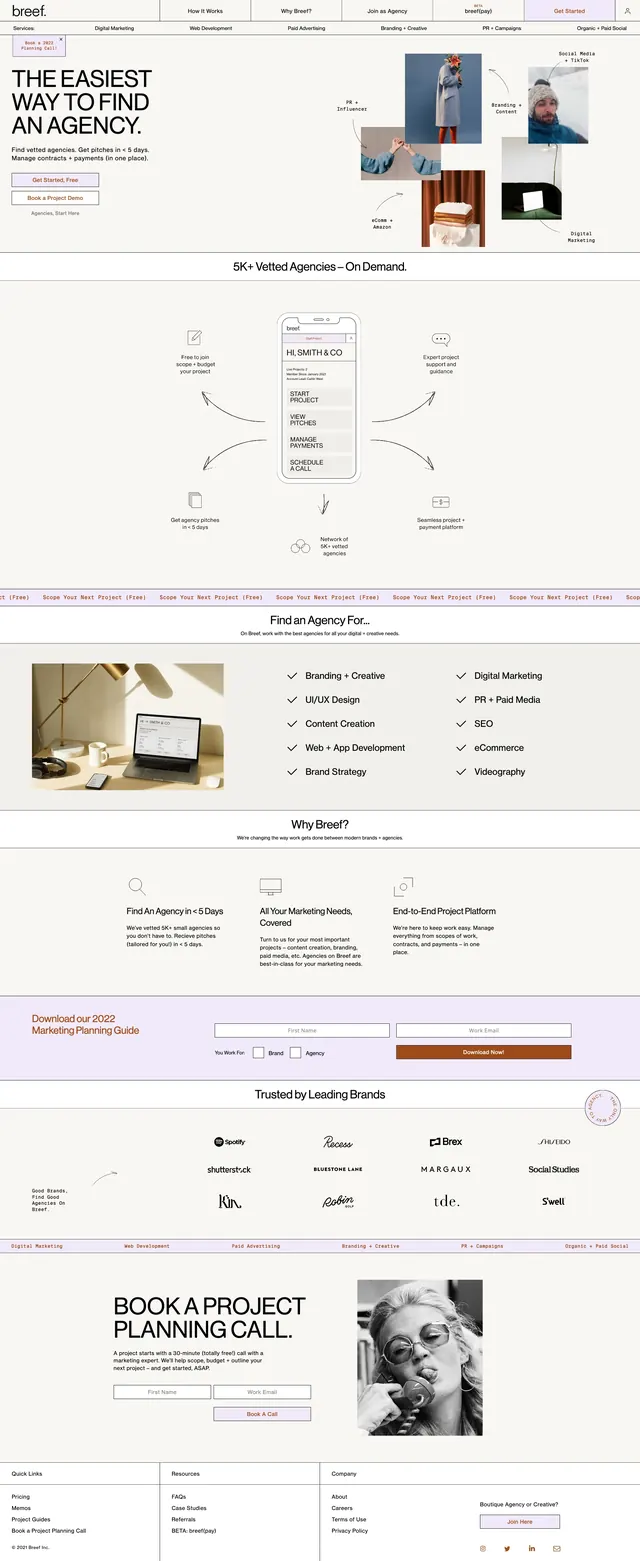
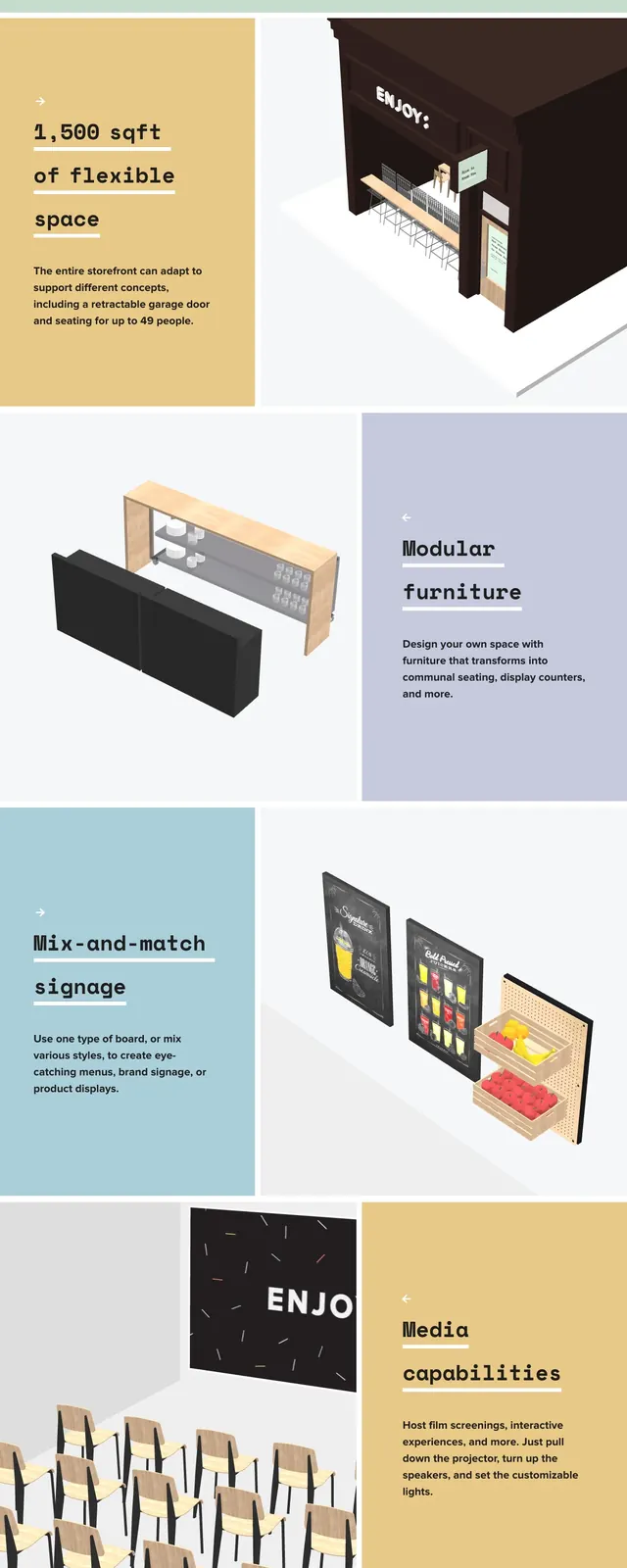
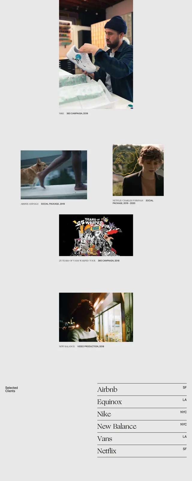
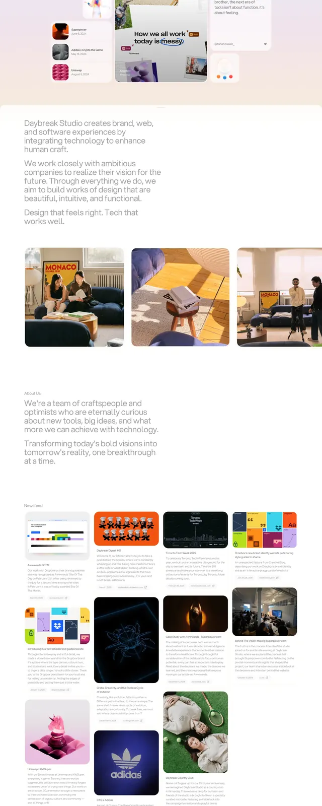
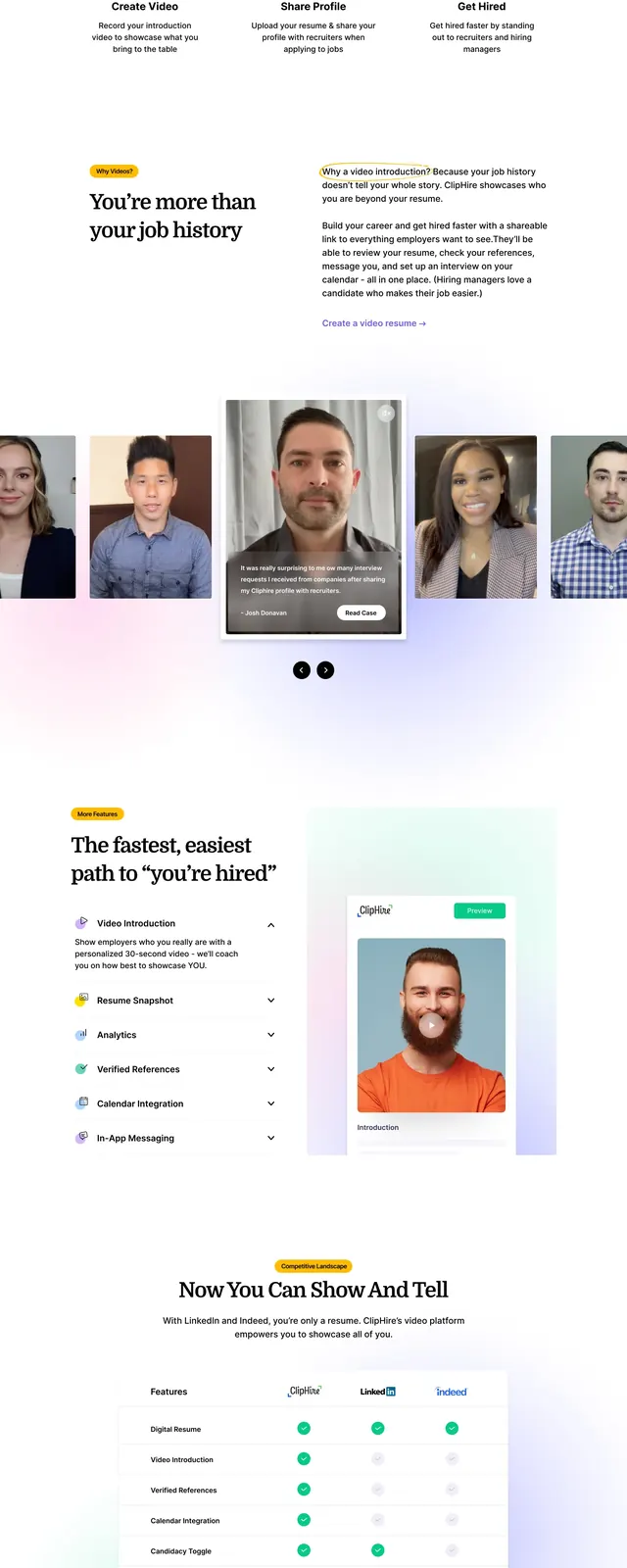
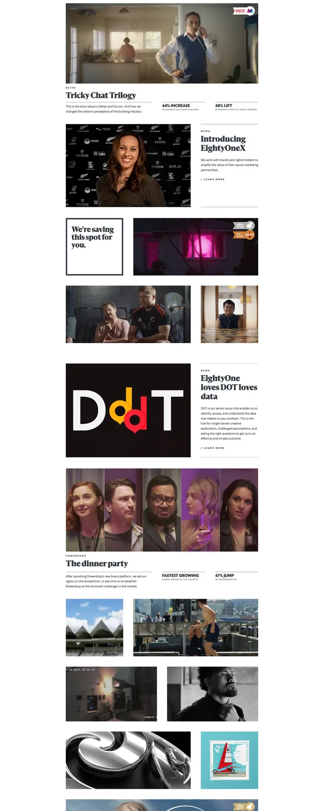
The page opens with a large centered wordmark-style hero on a pale pink background, using tall condensed lettering with a photo cut into the text. Below it, the layout shifts into a clean white editorial grid with a slim navbar, bold serif headline, supporting paragraph, and multiple image-driven content blocks. Further down, there are large story panels, a black featured card, a row of portrait thumbnails, and a muted contact/footer area with address and email details. The overall composition feels magazine-like, with strong spacing and frequent use of photography.
Key takeaway
The strongest idea here is the contrast between oversized expressive hero typography and disciplined editorial grid sections. It is a good reference for agency or creative studio sites that want to feel polished but still visually distinctive.
Reuse notes
Reuse the hero treatment for a high-impact landing page intro, then follow with modular story blocks and image-led case study cards. The pink background, oversized type, and restrained navigation are easy to adapt for a premium creative brand.