Preview image. Unlock full-res
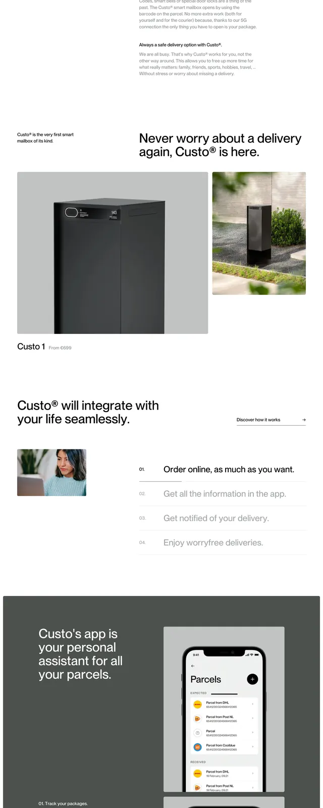
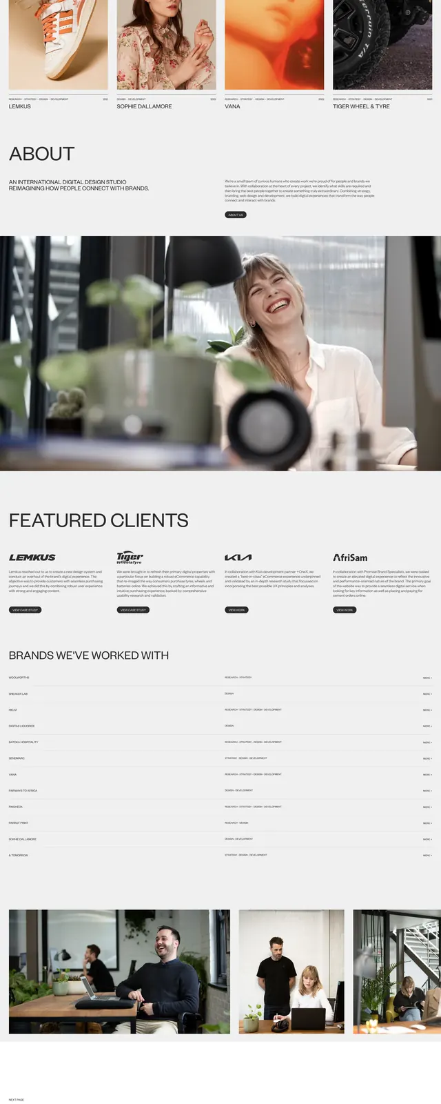
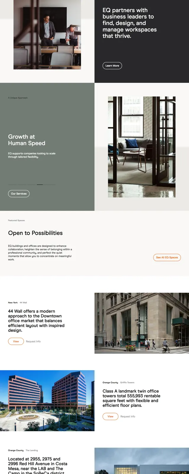
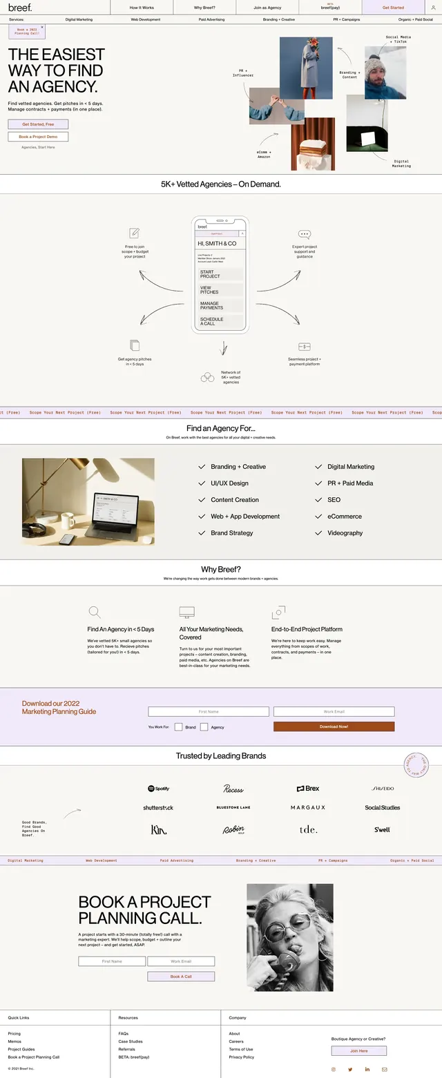
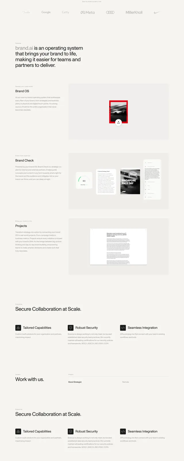
A minimal, high-end agency homepage with oversized typography, soft neutral space, and stacked product and testimonial visuals.
Summary
A minimal, high-end agency homepage with oversized typography, soft neutral space, and stacked product and testimonial visuals.
Visual description
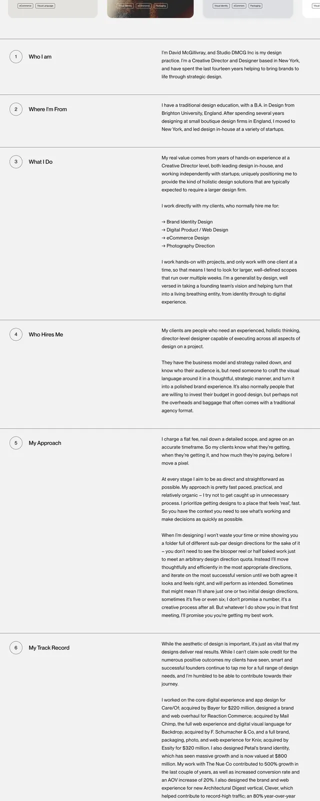
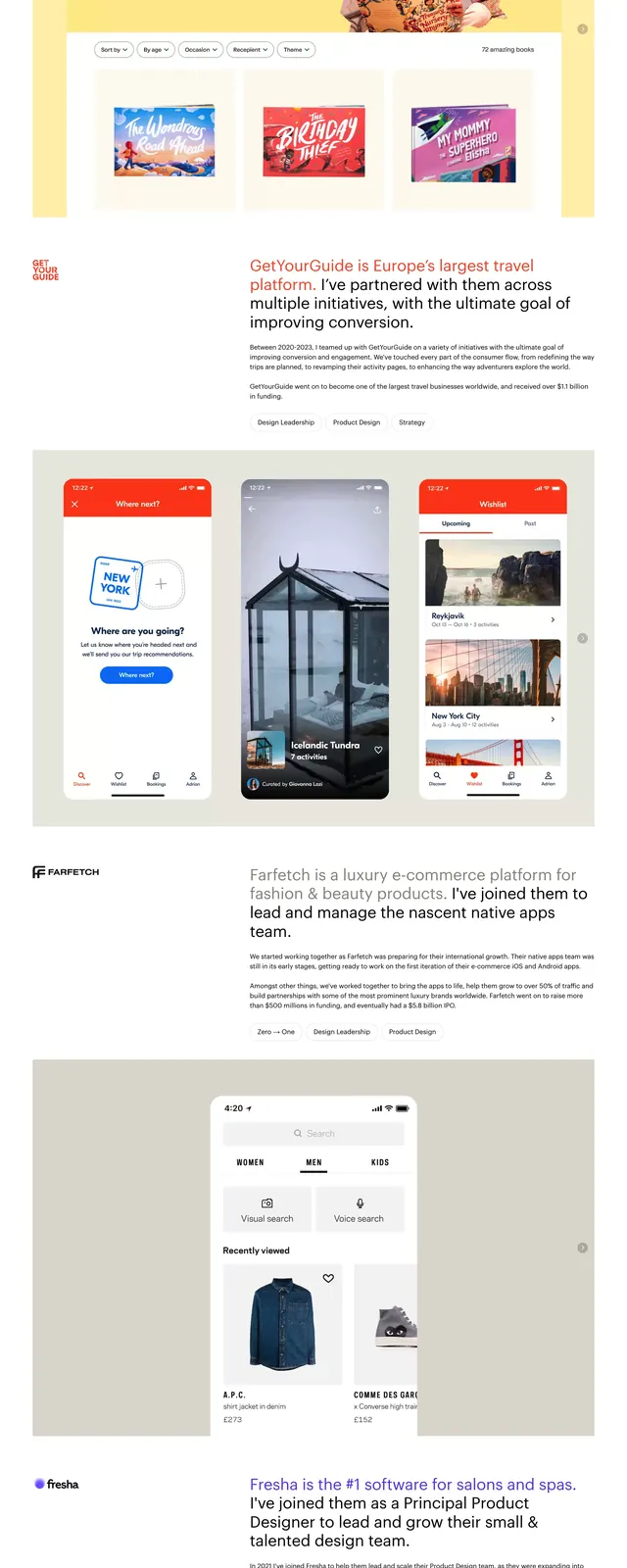
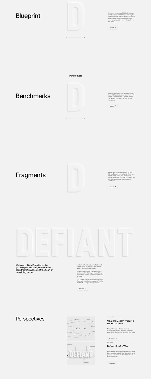
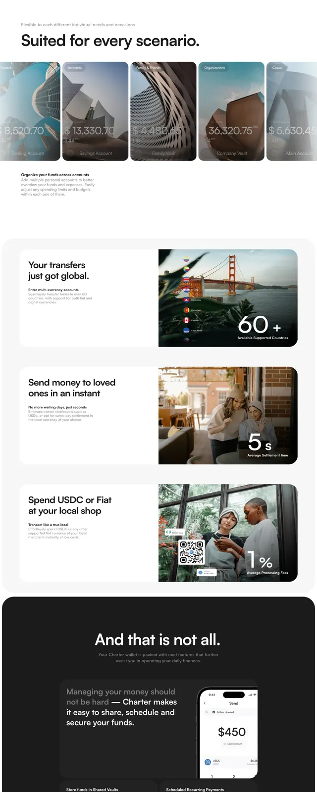
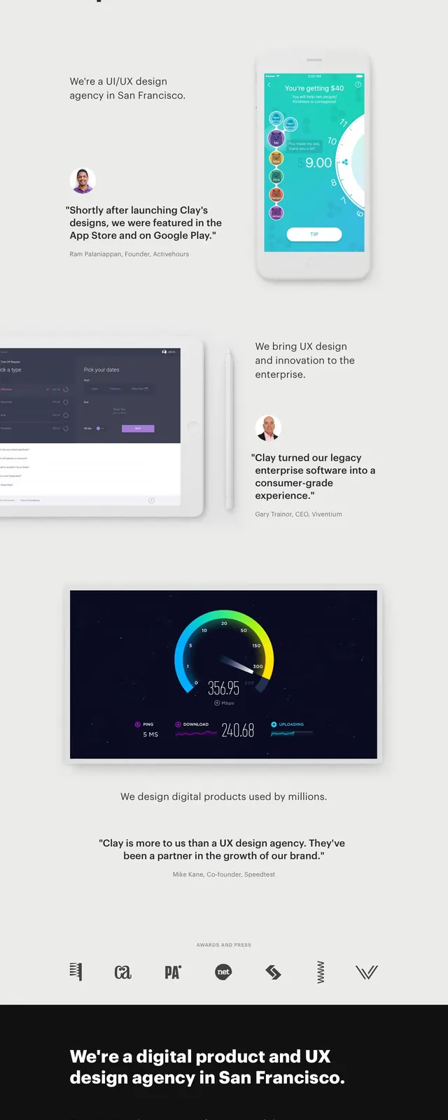
The page opens with a stark, airy hero featuring a bold left-aligned headline and a small supporting line of copy. Multiple large product mockups and testimonial quotes are layered vertically as the page scrolls, creating a case-study feel. The palette stays mostly light and neutral, then transitions into a dark section with a short agency positioning statement and client logos. The overall composition relies on strong spacing, oversized type, and editorial image placement.
Key takeaway
This design uses restraint to make the work feel premium: very little color, very large typography, and carefully staged proof points. The stacked screenshots and quotes turn the homepage into a scrollable portfolio narrative rather than a standard marketing page.
Reuse notes
Reuse this pattern for agencies or studios that want to signal craft and credibility fast. The layout works well when you have strong product visuals, testimonials, and recognizable client logos to support the headline.