Preview image. Unlock full-res
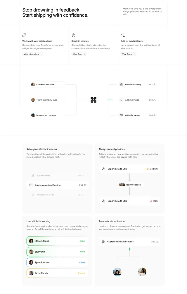
Audyr product section with icon trio, feedback-to-action diagram, and a 2x2 bento grid of capability cards with UI snippets.
Summary
A dense Audyr feature section that walks from headline through three quick benefits, a feedback-flow diagram, into four bordered cards each pairing copy with a product micro-screenshot.
Visual description
White page with split headline: bold left ("Stop drowning in feedback. Start shipping with confidence.") and gray right subcopy. Three icon columns follow (integrations, setup speed, product-team focus) each with text links. Center shows a workflow graphic: user feedback bubbles on the left, Audyr logo hub, ranked action items with counts on the right. Below, a 2x2 grid of light gray bordered cards covers auto-generated action items, live priority updates, user attribute tracking, and automatic deduplication, each with a small UI vignette using faded list rows, priority badges, and avatar stacks.
Key takeaway
The central before/after diagram bridges marketing copy and feature detail in one scroll. Bento cards that show real UI states (priority shifting, duplicate merging) make abstract claims tangible.
Reuse notes
Ideal for complex B2B tools that need both narrative and proof. Requires polished product screenshots for each card; without them the grid feels empty.