Preview image. Unlock full-res
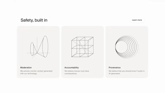
Light three-column feature section with wireframe illustrations explaining moderation, accountability, and provenance under a "Safety, built in" headline.
Summary
A restrained safety messaging block for an AI audio brand: one headline row with a secondary CTA, then three equal cards each pairing a technical wireframe graphic with a pillar title and short explanation.
Visual description
White page background with generous horizontal padding. Top row is split: left holds the bold black headline "Safety, built in" in large sans-serif; right holds a small pill-shaped "Learn more" button with a thin gray border and subtle shadow. Below, three light-gray rounded cards sit in a single row with even gutters. Each card centers a black line-art illustration at the top (cones on axes, subdivided cube, concentric circles), then a bold card title ("Moderation", "Accountability", "Provenance"), then two lines of smaller gray body copy. Illustrations use thin strokes and dotted construction lines for a blueprint feel.
Key takeaway
The trio-of-pillars card grid with abstract engineering diagrams instead of icons: it makes policy topics feel designed and credible without stock imagery. The header row keeps one quiet CTA beside the section title so the cards carry the detail.
Reuse notes
Strong pattern for trust, compliance, or platform-safety sections on AI or developer products. Works best when each pillar can be explained in one sentence. Needs consistent illustration style across cards; busy photography would break the monochrome system.