Preview image. Unlock full-res
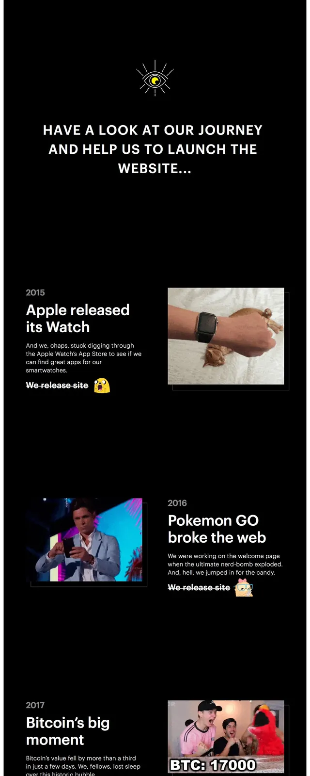
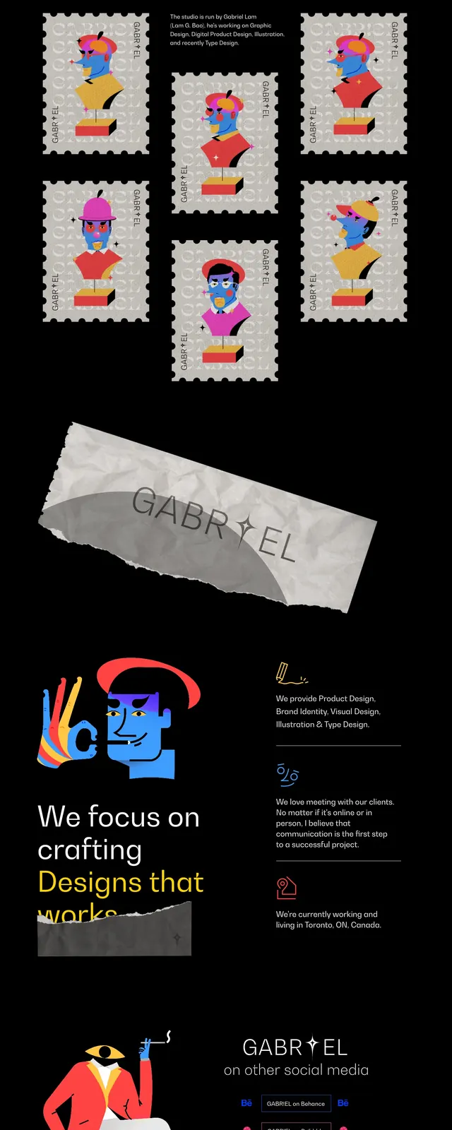
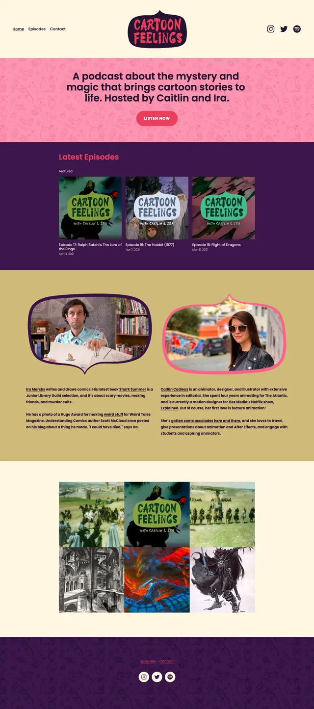
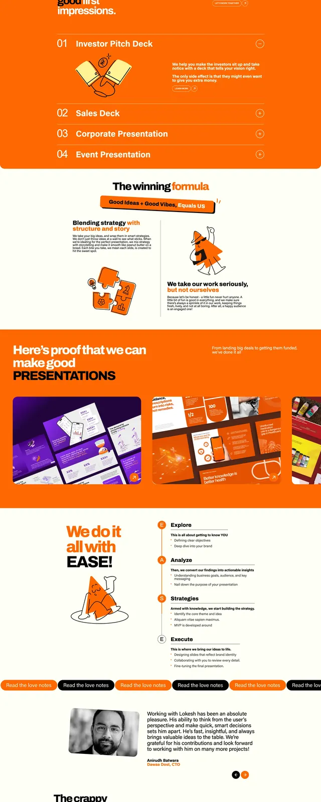
Playful agency website with oversized editorial headlines, hand-drawn sticker illustrations, and bold dark-and-pastel section breaks.
Summary
Playful agency website with oversized editorial headlines, hand-drawn sticker illustrations, and bold dark-and-pastel section breaks.
Visual description
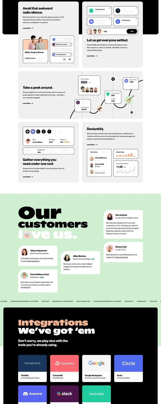
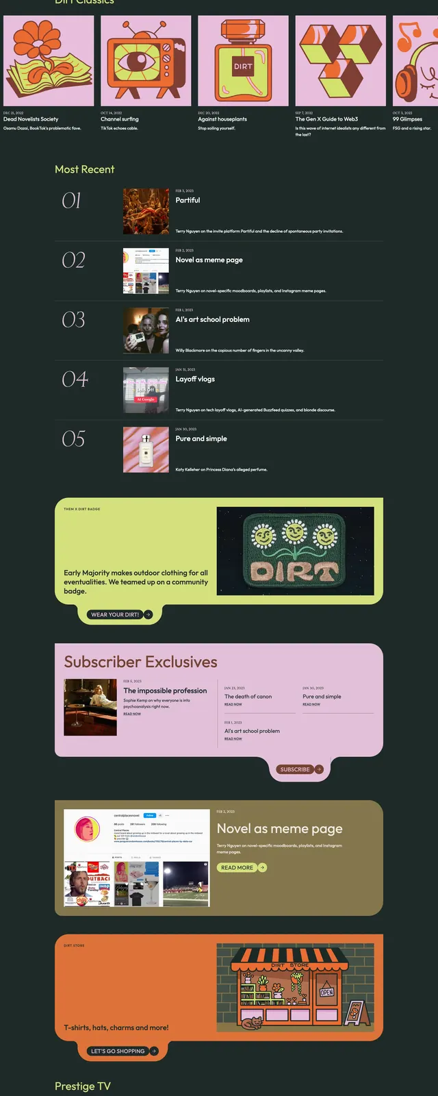
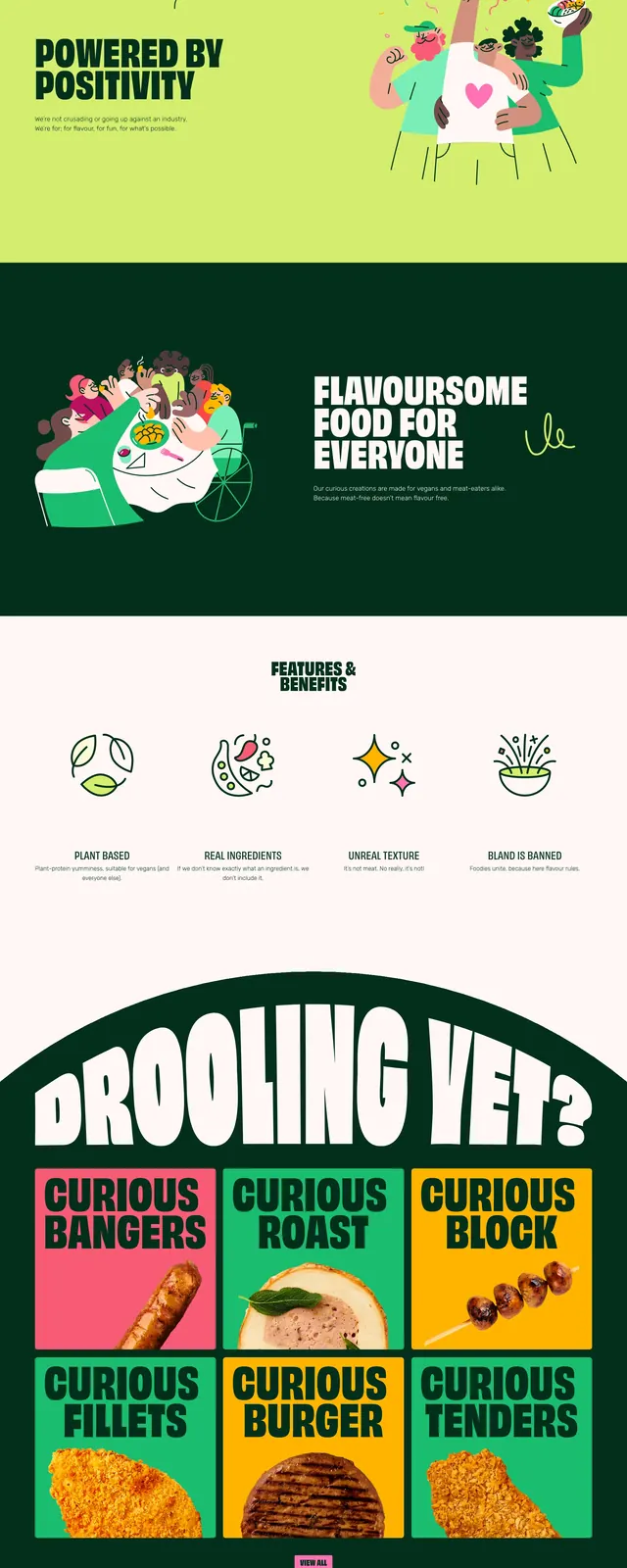
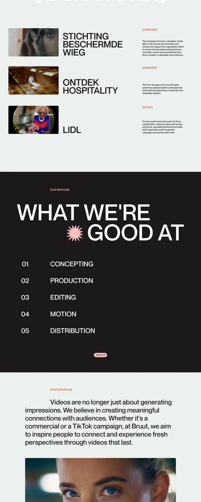
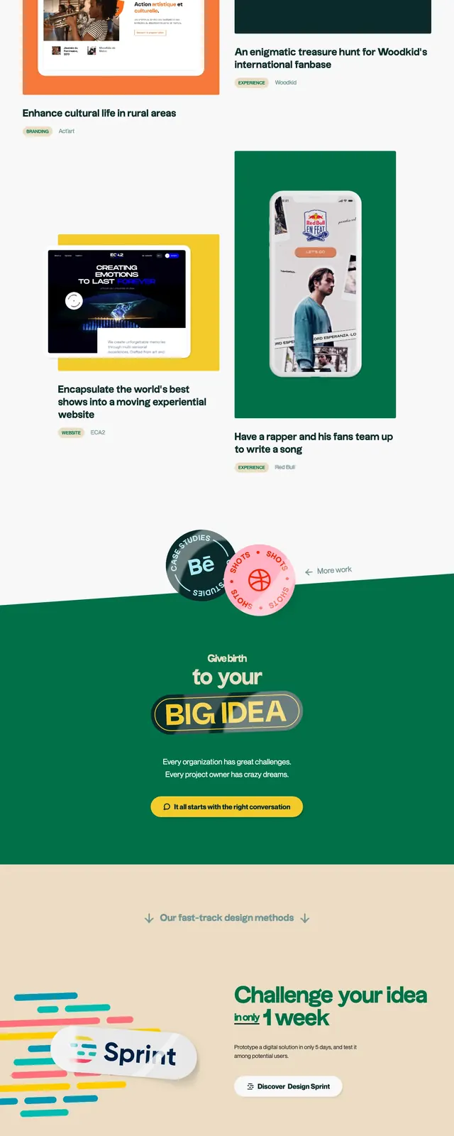
The page opens with a light beige hero featuring a top navigation, a large left-aligned headline, a rounded CTA, and colorful sticker-like illustrations on the right. Below, the layout alternates into a dark teal editorial section with a large photo on the left and pink headline text on the right, followed by a white two-column work grid with project cards and small category pills. Farther down, a slanted green banner centers a bold slogan, and the page ends with a dark contact/footer area that includes email and phone blocks plus floating social and newsletter stickers.
Key takeaway
The main reusable idea is the contrast between clean editorial structure and loud handmade illustration accents. Large type, rounded pills, and angled section transitions give the page a memorable agency personality.
Reuse notes
Use this pattern for creative agencies, studios, or brand sites that need to feel expressive without losing structure. It works best when paired with strong photography, playful custom illustration, and a limited but high-contrast color palette.