Preview image. Unlock full-res
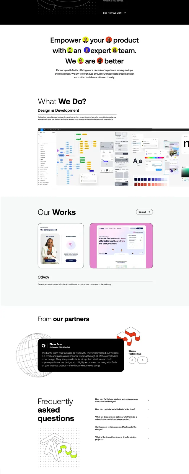
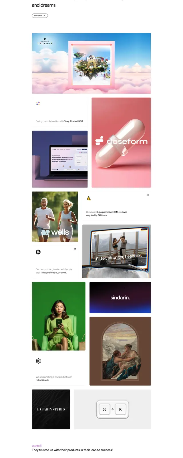
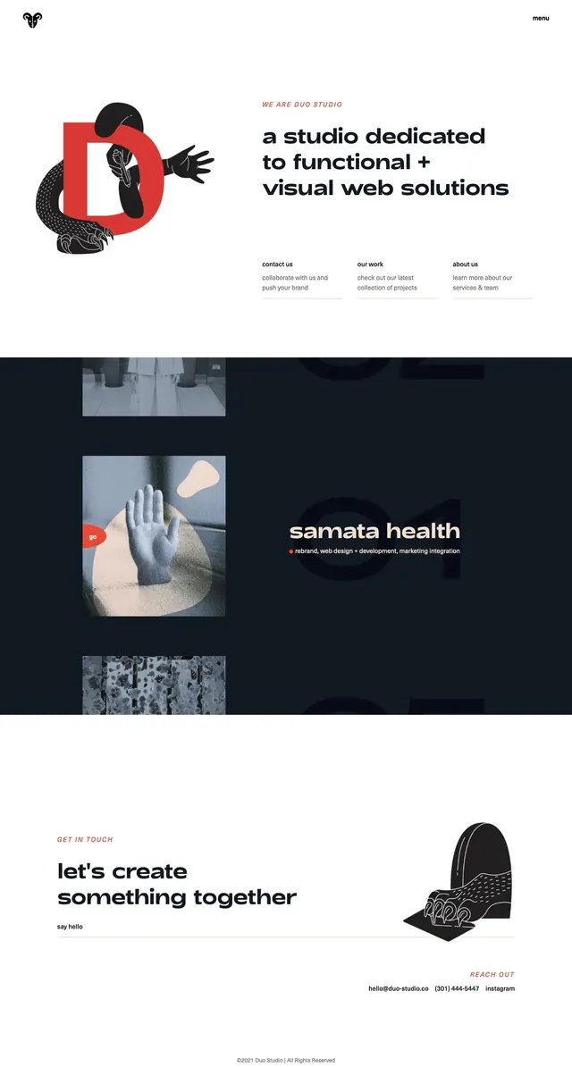
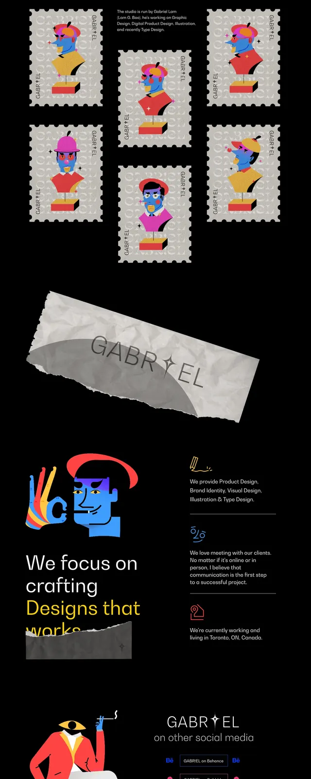
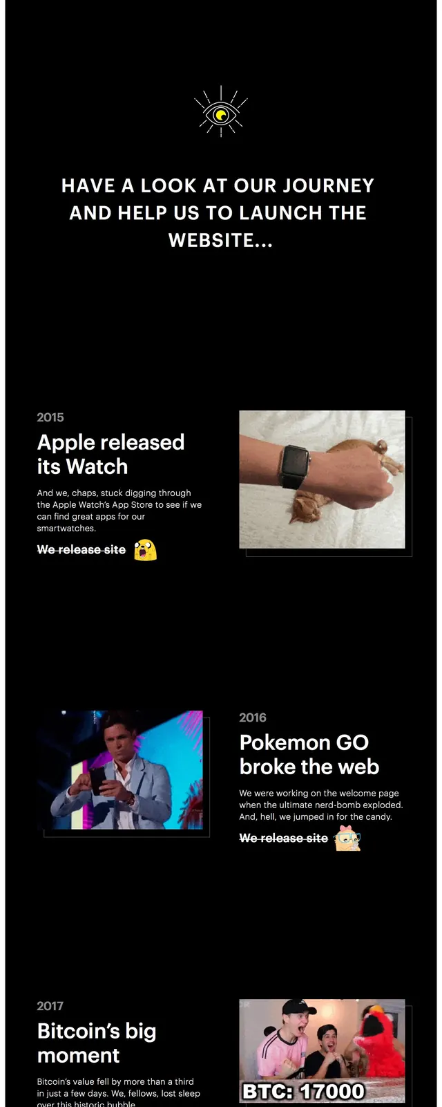
A dark, high-contrast landing page uses bold editorial typography, neon yellow accents, and playful illustrations to tell a long website-launch story across stacked sections.
Summary
A dark, high-contrast landing page uses bold editorial typography, neon yellow accents, and playful illustrations to tell a long website-launch story across stacked sections.
Visual description
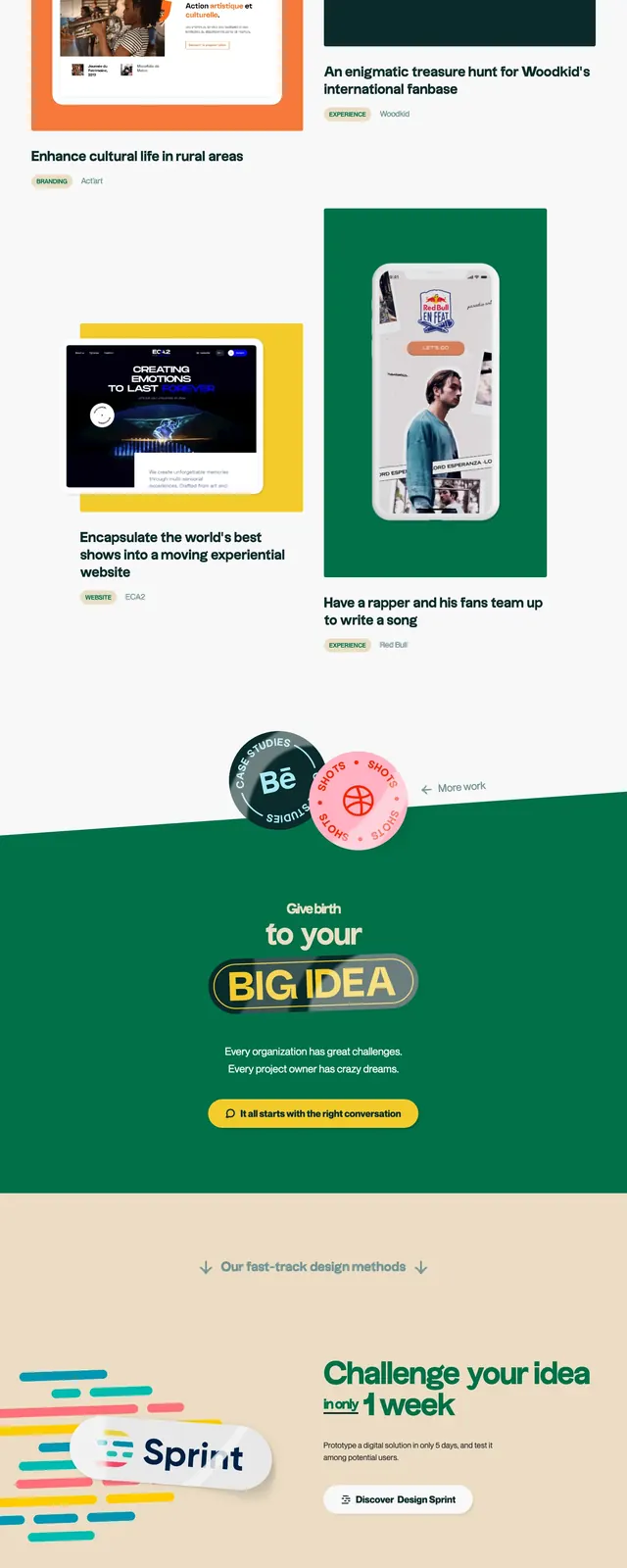
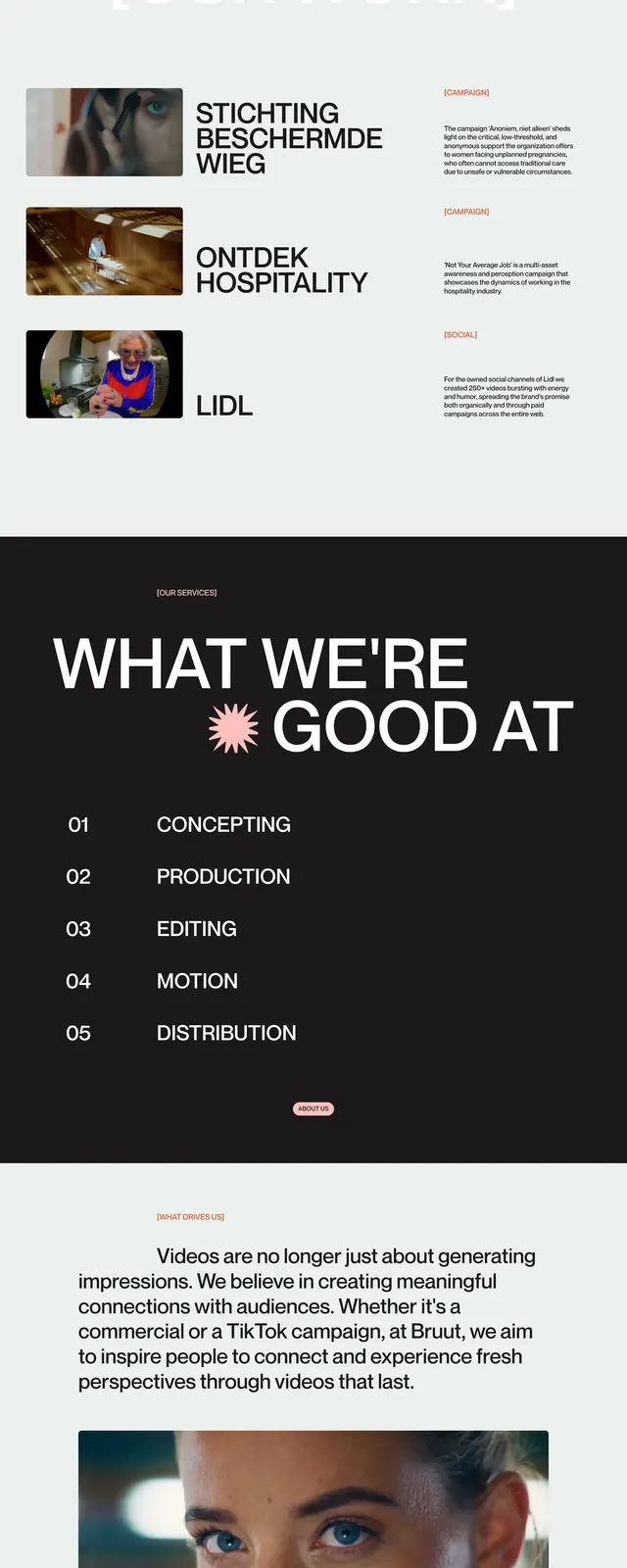
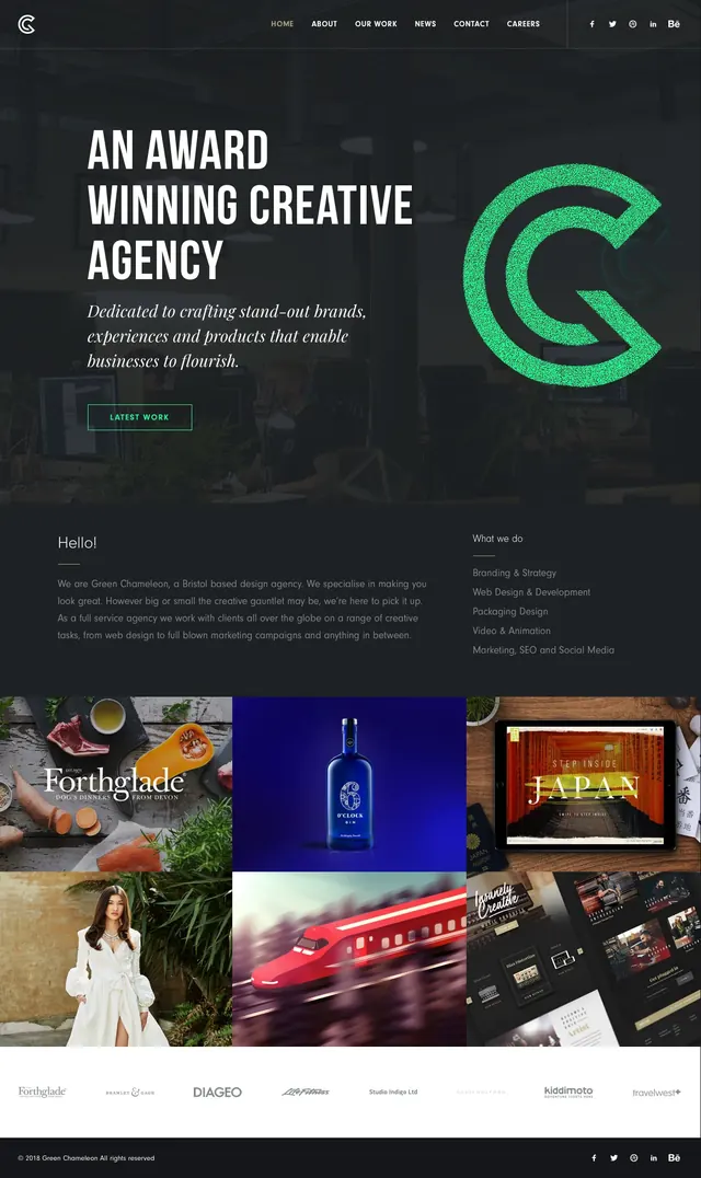
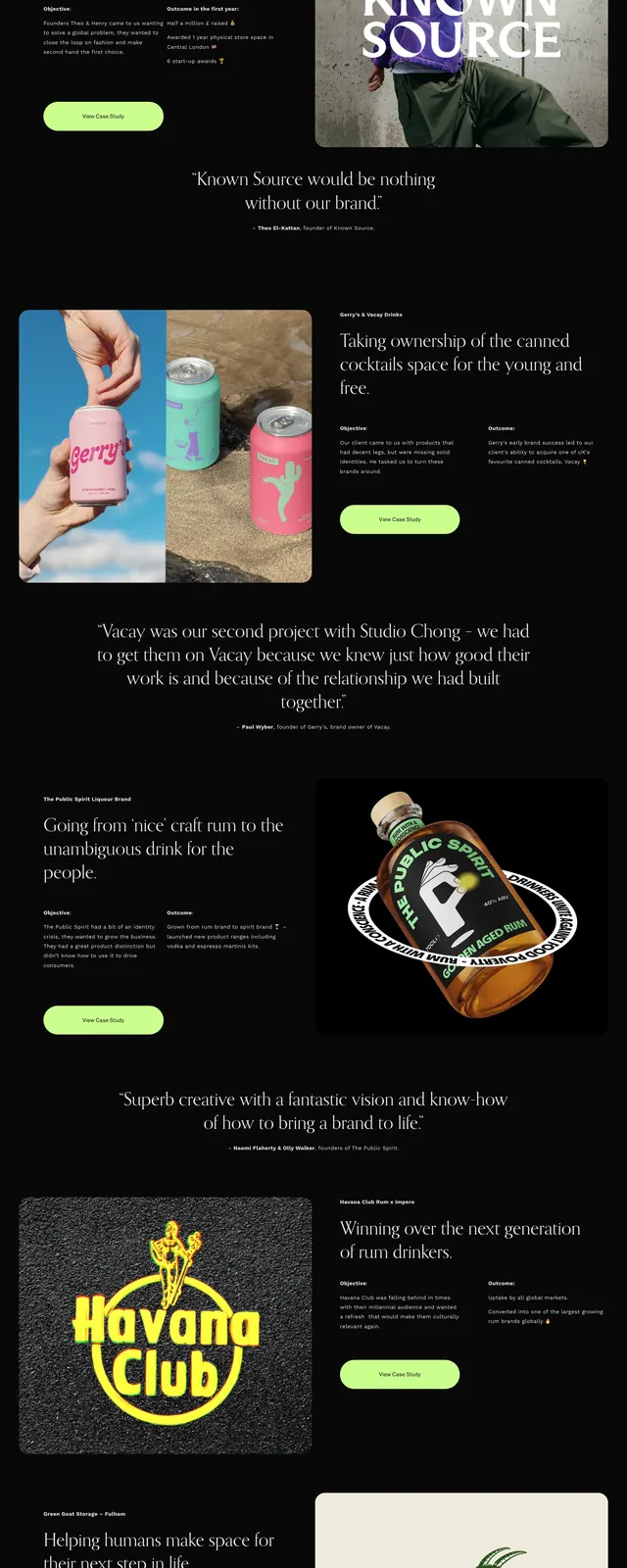
The page opens on a black background with a large white headline and bright yellow emphasis, paired with a hand-drawn line illustration on the right. Scrolling reveals stacked timeline-style content blocks with oversized date labels, short copy, and photo cards arranged in an asymmetric two-column rhythm. Lower sections include large solid-color promotional panels in yellow and purple with email capture and social sharing prompts. The overall composition stays minimal but highly contrastive, with the Eleken logo and small footer links anchoring the page.
Key takeaway
Strong editorial storytelling can make a simple launch message feel memorable. The mix of dark canvas, neon accent, and illustration creates clear hierarchy without adding visual clutter.
Reuse notes
Reuse this pattern for agency or product launch pages that need a narrative structure, especially when you want to show milestones or past years. The layout works best with one accent color, bold typography, and a limited set of illustrations or images.