Preview image. Unlock full-res
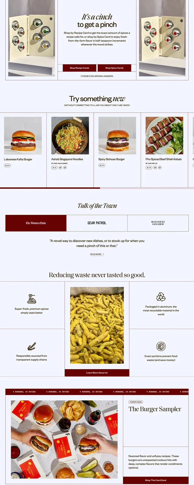
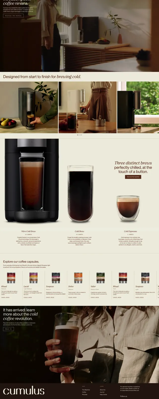
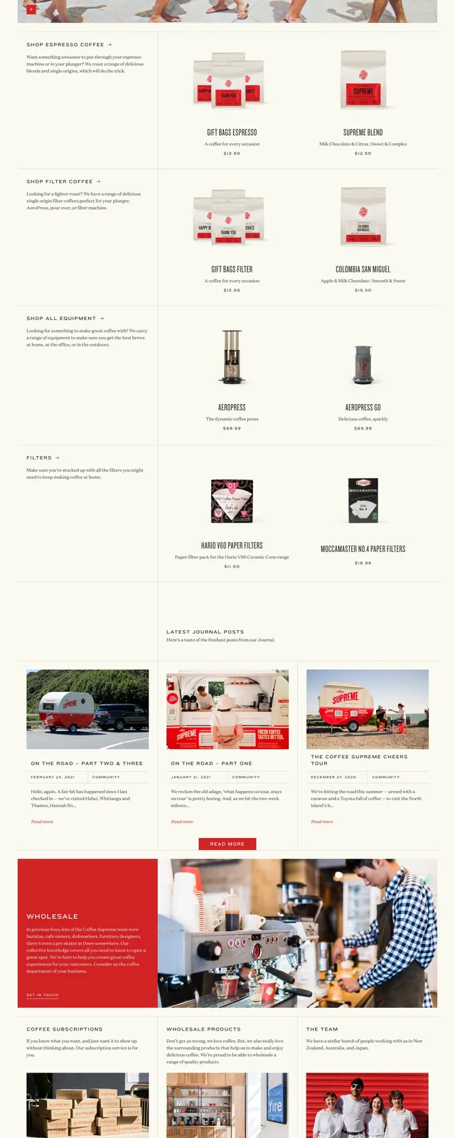
A warm, editorial ecommerce homepage for a coffee brand with oversized photography, restrained navigation, and product and content sections arranged in a clean grid.
Summary
A warm, editorial ecommerce homepage for a coffee brand with oversized photography, restrained navigation, and product and content sections arranged in a clean grid.
Visual description
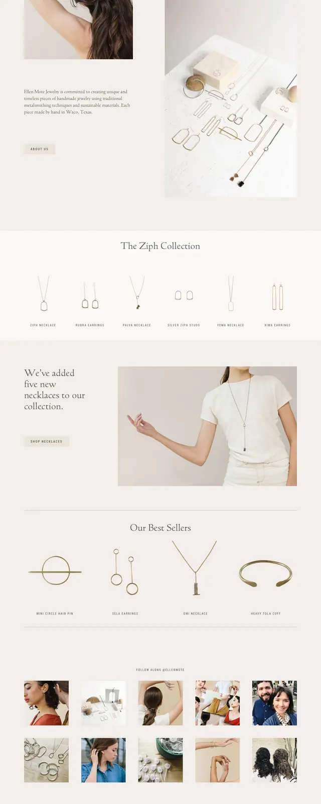
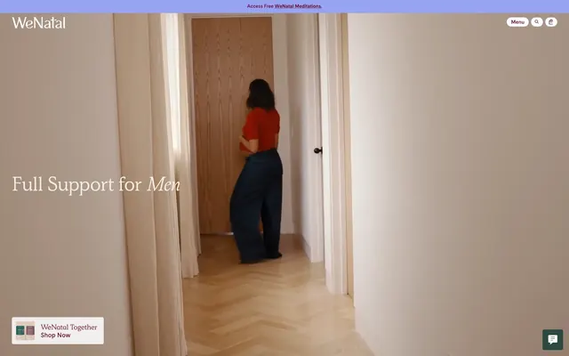
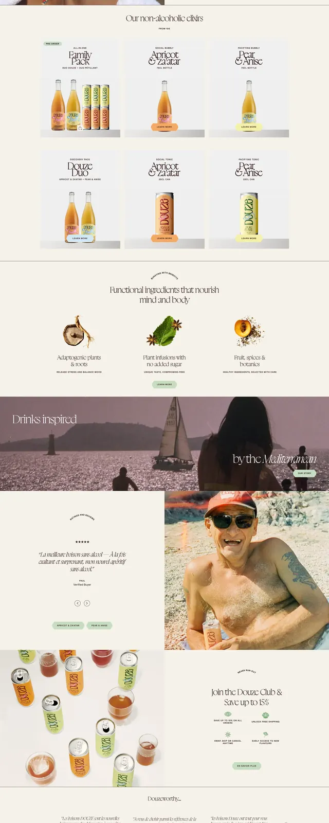
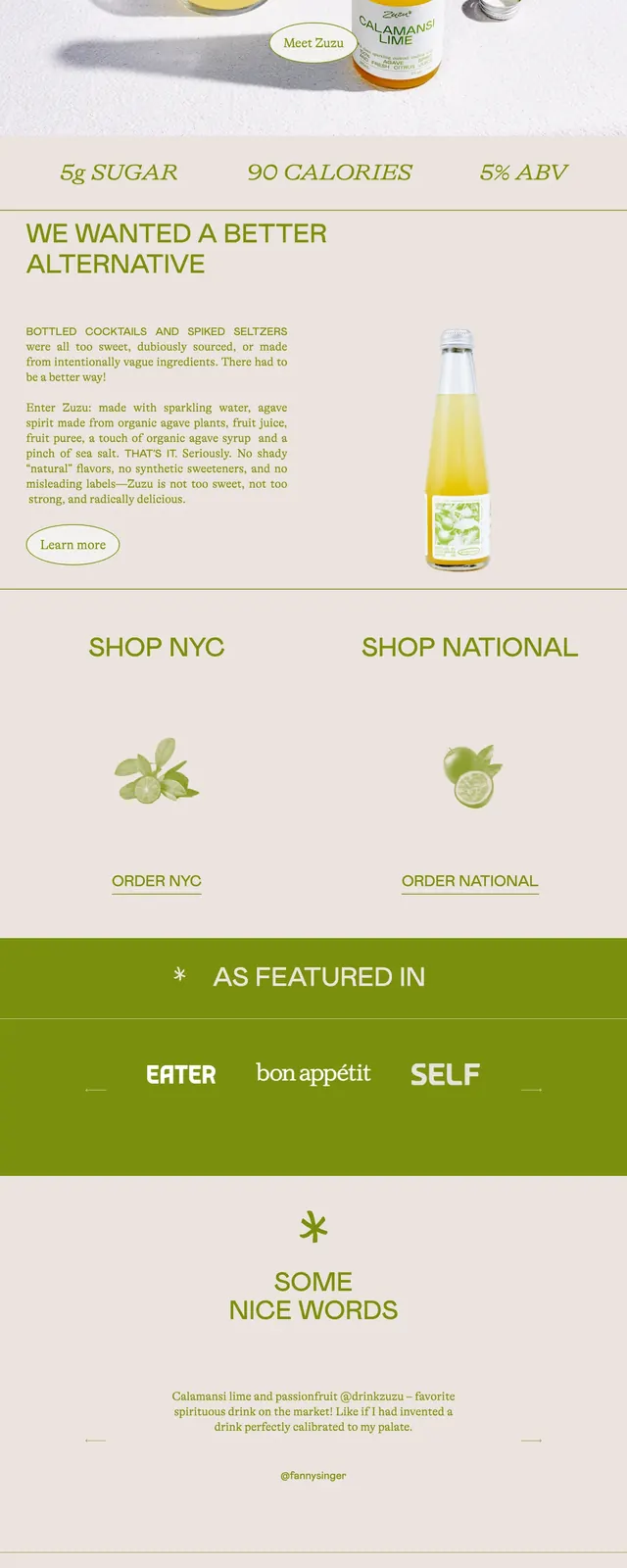
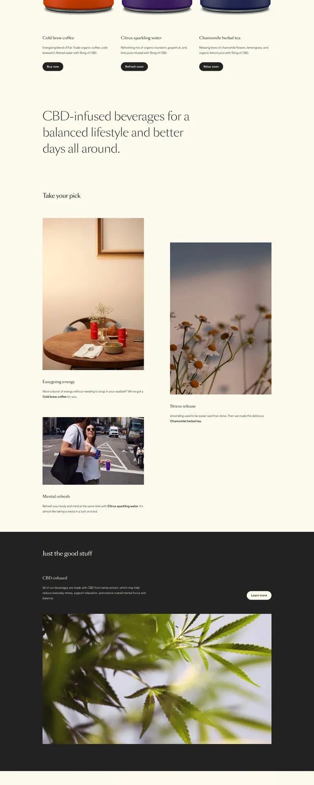
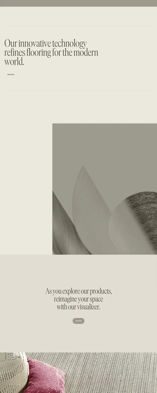
The page uses a pale cream background with thin grid lines, small all-caps navigation, and a red logo accent. A large full-width hero photo dominates the top of the page, followed by neatly spaced product cards, journal posts, promotional blocks, and a multi-column footer. Content is organized in stacked sections with generous whitespace and a strong editorial rhythm. Photography is central throughout, with product imagery and lifestyle shots used as the primary visual language.
Key takeaway
This design pairs boutique coffee branding with an understated editorial ecommerce structure. The result feels premium and approachable without relying on heavy UI chrome.
Reuse notes
Reuse the thin-lined grid, muted palette, and all-caps navigation for brands that want a refined storefront with magazine influence. The section pattern also works well for product-led sites that mix commerce, story content, and brand messaging.