Preview image. Unlock full-res
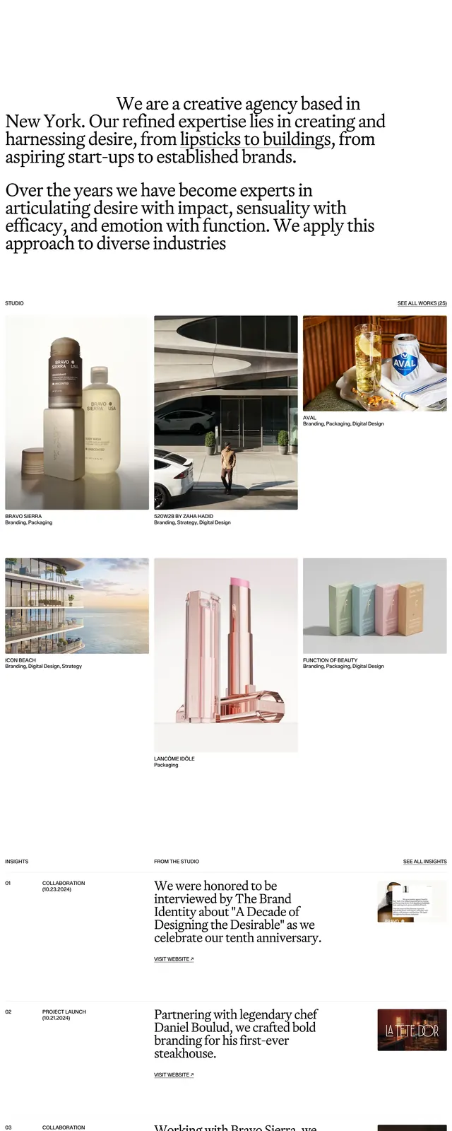
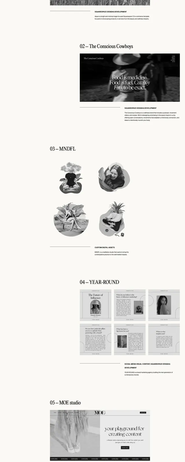
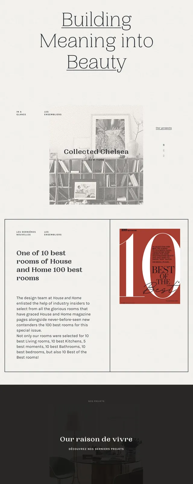
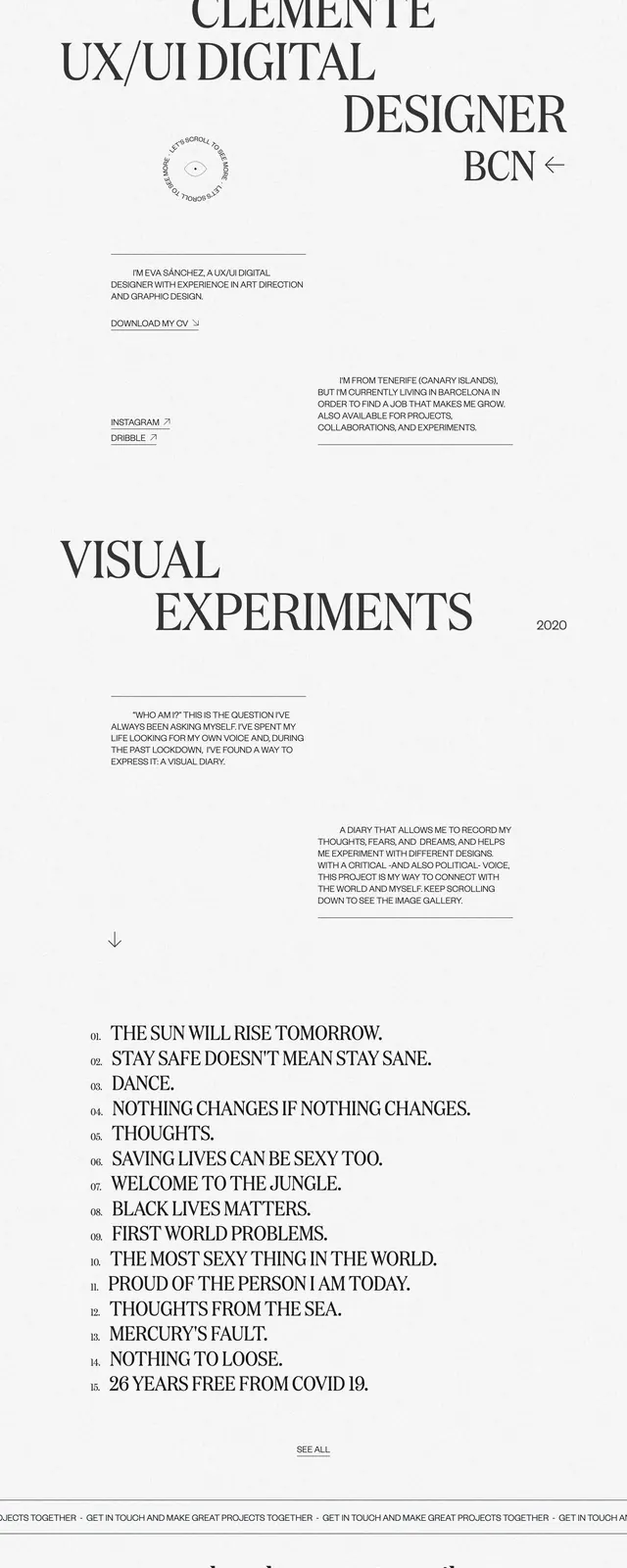
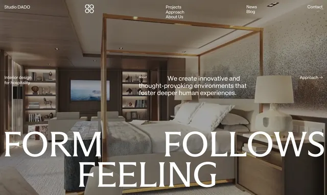
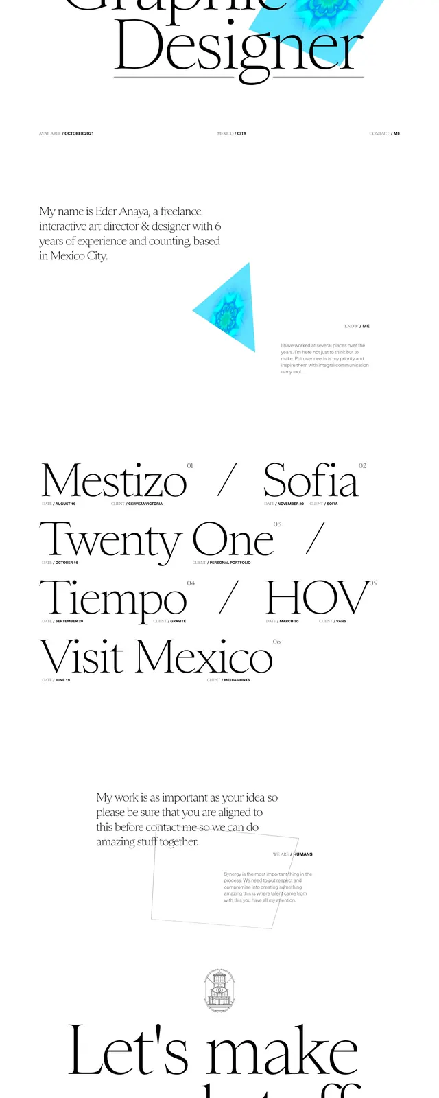
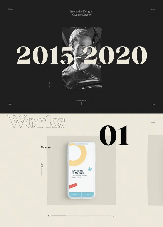
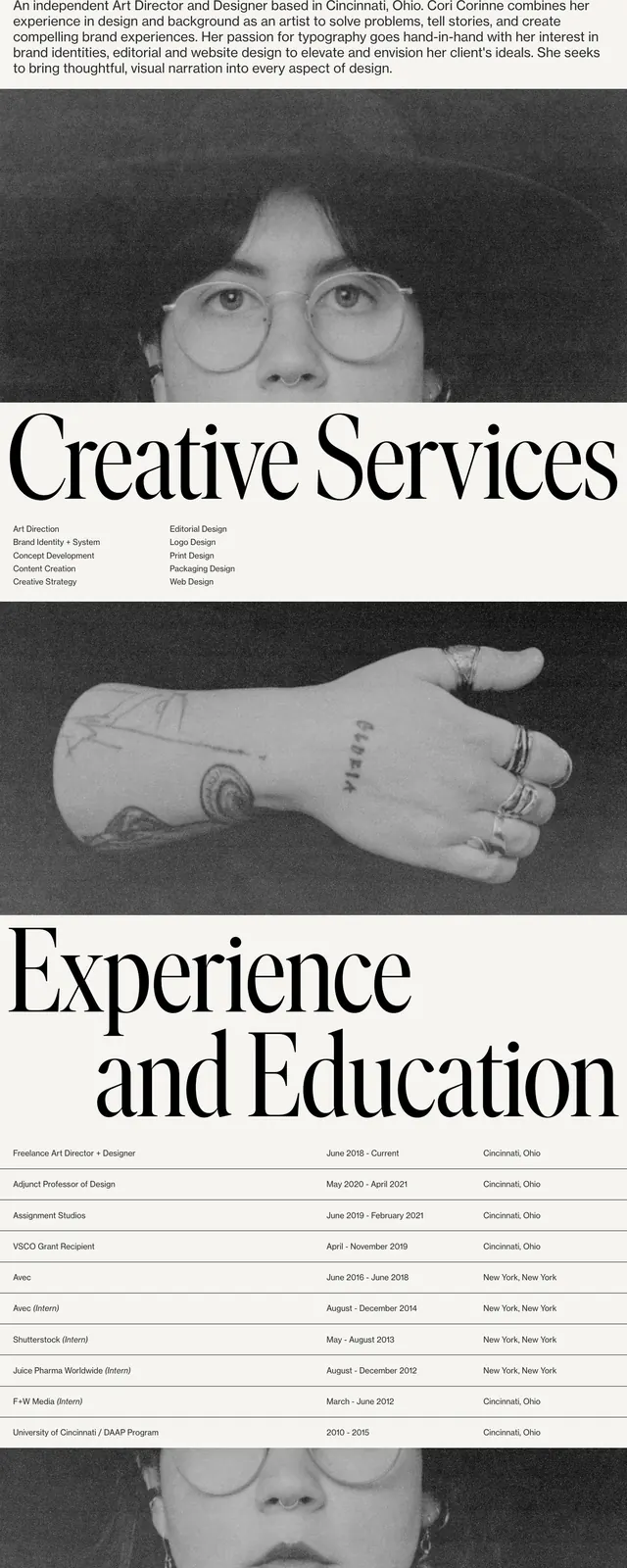
An editorial portfolio homepage with oversized serif typography, a sparse top navigation, and monochrome photography layered into long scrolling sections.
Summary
An editorial portfolio homepage with oversized serif typography, a sparse top navigation, and monochrome photography layered into long scrolling sections.
Visual description
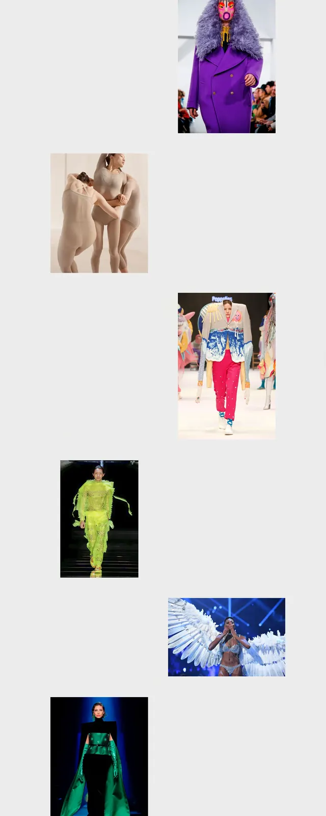
The page opens on a light cream background with a minimal top navigation, a small wordmark at the left, and evenly spaced text links across the top. A very large serif name dominates the hero area, followed by a short bio paragraph in smaller sans-serif text. Below the hero, full-width black-and-white portrait imagery and a centered skills strip create a magazine-like scrolling layout, with a later experience section using oversized serif heading text and a simple table-like list of roles, dates, and locations.
Key takeaway
The strongest move is the contrast between giant refined serif headlines and restrained sans-serif supporting copy. The page uses monochrome photography and large breathing room to make a personal portfolio feel editorial and high-end.
Reuse notes
Use this pattern for designer portfolios, creative directors, and agency personal sites that need a sophisticated, art-directed feel. It works best when the content is few and deliberate, because the oversized type and full-bleed imagery do most of the visual work.