Preview image. Unlock full-res
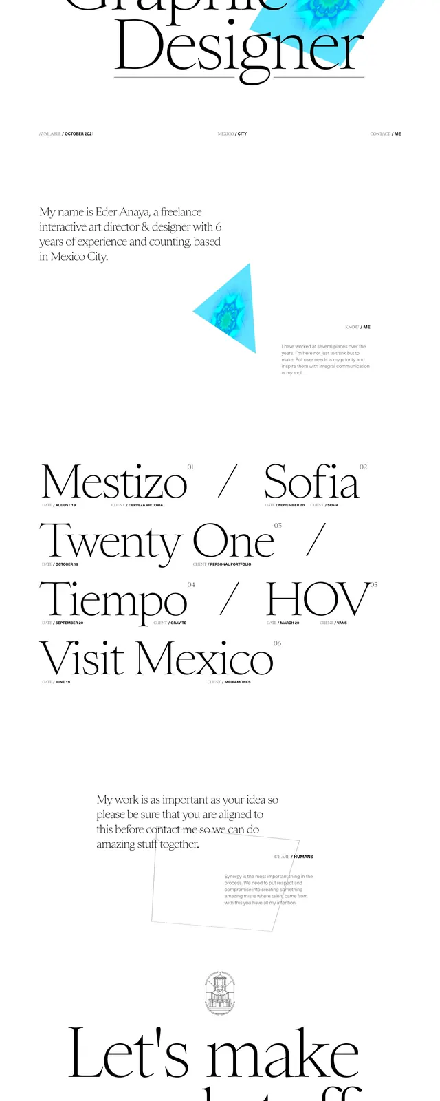
A minimal, high-contrast personal portfolio page with oversized serif typography, sparse spacing, and a single vivid geometric accent.
Summary
A minimal, high-contrast personal portfolio page with oversized serif typography, sparse spacing, and a single vivid geometric accent.
Visual description
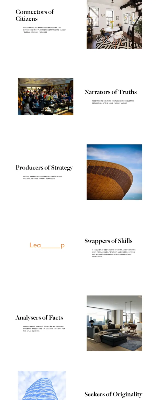
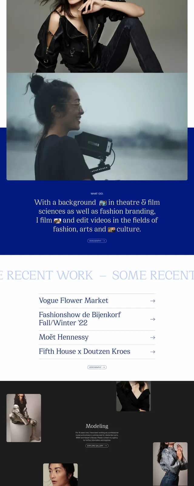
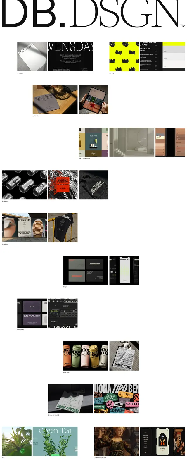
The page uses a bright white background with very large serif headlines and extremely generous whitespace. A cyan-blue rotated square with a glowing abstract center sits near the main title as the only strong color accent. Below the hero, the page continues with sparse text blocks and a list of projects set in the same elegant editorial type treatment. Small footer-style details and labels are distributed across the page with a restrained, magazine-like hierarchy.
Key takeaway
The design is driven by typography and spacing rather than interface chrome, creating a refined portfolio feel. A single saturated geometric accent adds personality without breaking the minimal composition.
Reuse notes
Reuse this for creative portfolio heroes, especially where the goal is to feel artful and premium. The pattern works best with a strong serif headline, minimal navigation, and one memorable abstract visual element.