Preview image. Unlock full-res
Dark centered value-proposition section pairing intro copy with a bento grid of result metrics and a floating product-chart tile.
Summary
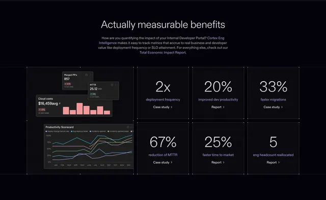
A dark value-proposition section that proves its claim with a bento grid of six big result metrics anchored by a tall product-chart tile. The defining feature is mixing a real product-data tile in with the headline stat cells.
Visual description
On a near-black background, a centered white headline "Actually measurable benefits" sits above three lines of grey copy with violet inline links (Cortex Eng Intelligence, Total Economic Impact Report). Below, a faintly outlined bento grid: a tall left tile stacks floating product cards (Merged PR's 857, MTTR 25.12 min, Cloud costs $16,459avg with a pink bar chart, and a Productivity Scorecard line chart). To its right, six metric cells in a two-row by three-column block each show an oversized number (2x, 20%, 33%, 67%, 25%, 5), a violet label (deployment frequency, improved dev productivity, faster migrations, reduction of MTTR, faster time to market, eng headcount reallocated), and a "Case study" or "Report" link with a chevron.
Key takeaway
Anchoring a wall of stat cells with one tall, busy product-data tile grounds the abstract numbers in the actual product. Turning each metric into a clickable case study or report link gives the proof a path to deeper evidence. The faint faceted grid lines organize the bento without heavy borders on a dark field.
Reuse notes
Strong for a results or ROI section on a developer-tool or analytics SaaS with credible metrics and supporting case studies. Needs real numbers and links behind each cell; placeholder stats would feel hollow. The bento mix of a product tile plus stat cells reads best on dark with one accent color tying the labels and links together.
More value proposition sections
See all



More like this


Keep what you find
A free account saves references to boards and can send you a weekly email of picks based on what you save.
To see every result, go Pro.