Preview image. Unlock full-res
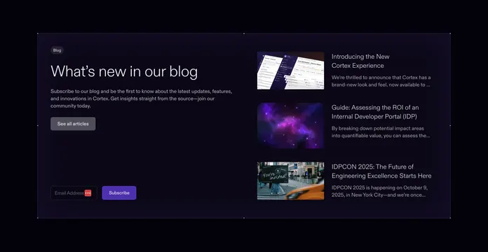
Dark boxed resources section with a left blog intro and email signup beside a right stacked list of three article rows.
Summary
A dark, contained resources section split into a left blog intro with newsletter signup and a right stacked list of three article rows with thumbnails. The defining move is pairing a subscribe form with a compact latest-posts list in one boxed panel.
Visual description
Inside a large rounded panel on a near-black background, faint corner guide lines frame the area. The left column holds a small "Blog" pill badge, an oversized headline "What's new in our blog", a few lines of muted body copy, a grey "See all articles" button, and at the bottom an email-address input next to a filled violet "Subscribe" button. The right column lists three article rows, each a wide thumbnail (a dark product UI, a purple nebula, an "you're invited" street photo) beside a two-line white title and two lines of muted excerpt.
Key takeaway
Combining a newsletter signup and a latest-articles list in one section captures subscribers while still surfacing fresh content. The horizontal thumbnail-plus-title row format keeps three posts compact on the right without a heavy card grid. The faint corner guides give the dark panel a subtle technical frame.
Reuse notes
Fits a blog or resources block on a dark developer-tool or B2B SaaS site that wants email capture alongside content. Works best on dark with one saturated accent for the subscribe button and badge. The right list needs consistent thumbnail crops to stay tidy; mismatched image shapes would break the rhythm.
More resources sections
See all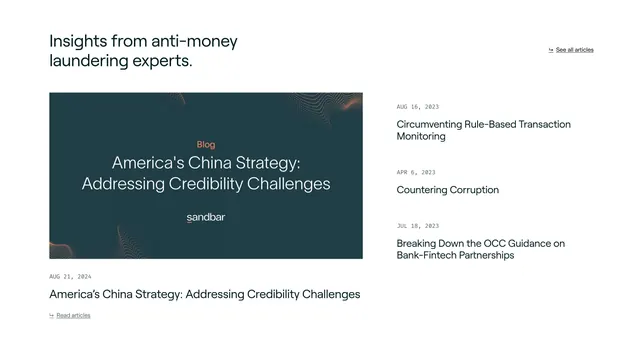
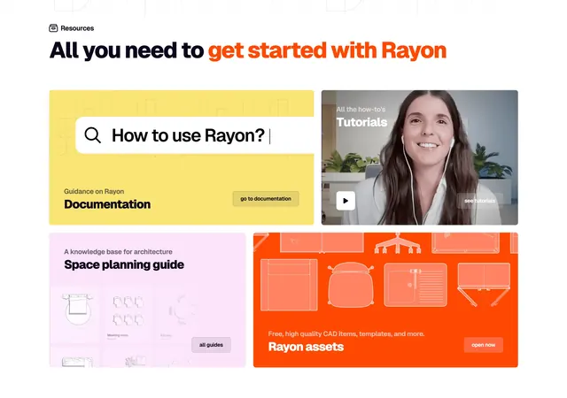
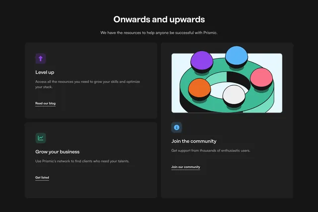
More like this

Keep what you find
A free account saves references to boards and can send you a weekly email of picks based on what you save.
To see every result, go Pro.