Preview image. Unlock full-res
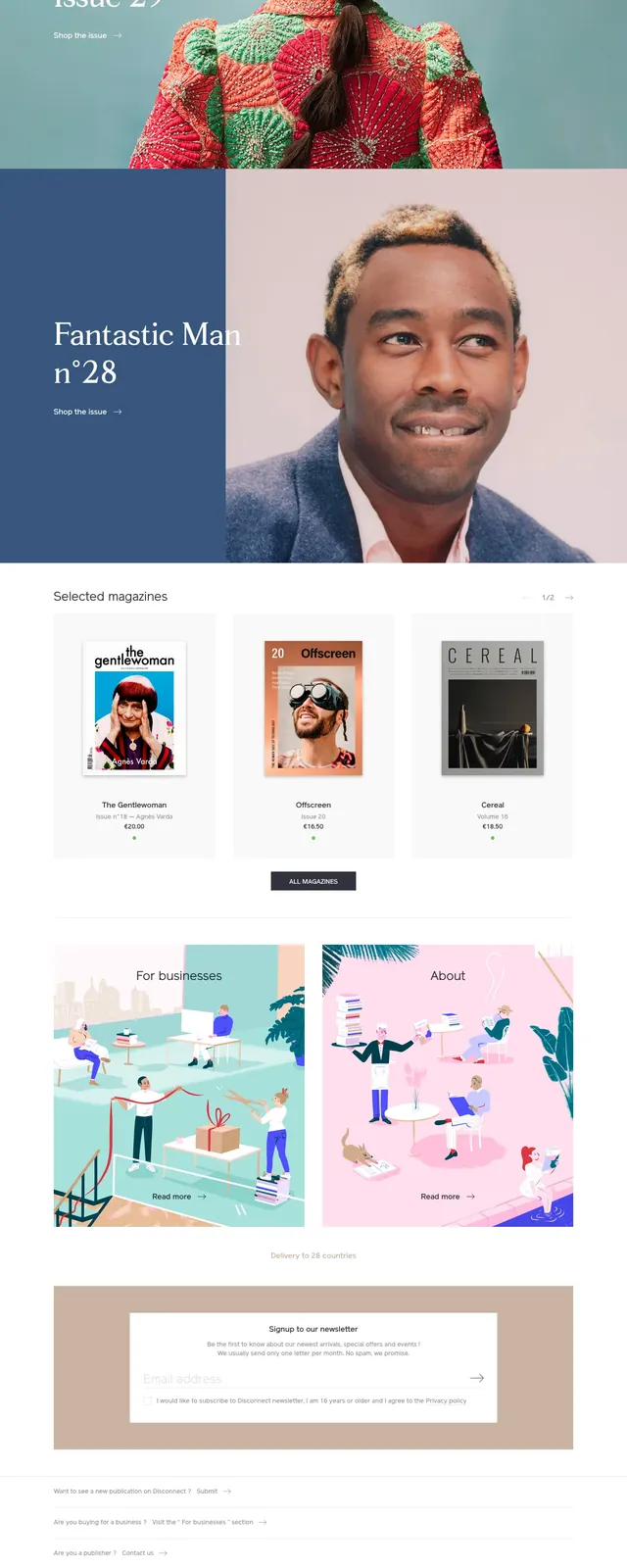
A bold, image-led bookstore and print shop homepage with large editorial hero imagery, grid-based product sections, and clean catalog navigation.
Summary
A bold, image-led bookstore and print shop homepage with large editorial hero imagery, grid-based product sections, and clean catalog navigation.
Visual description
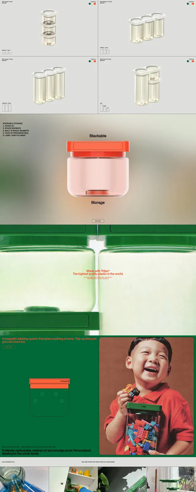
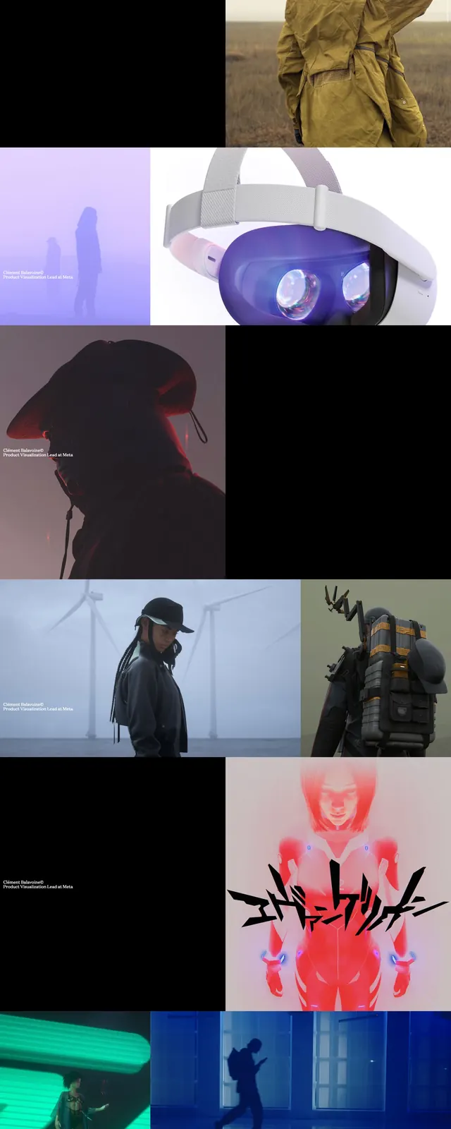
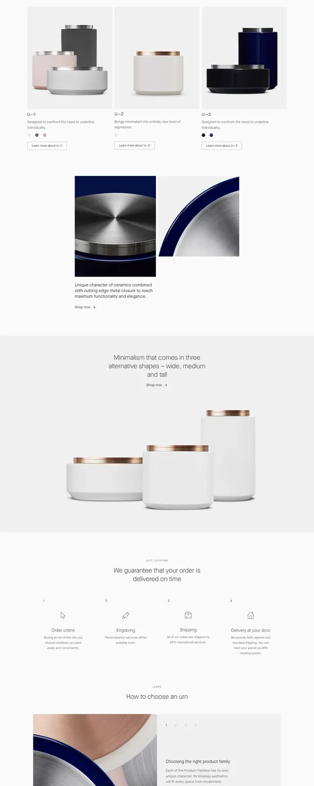
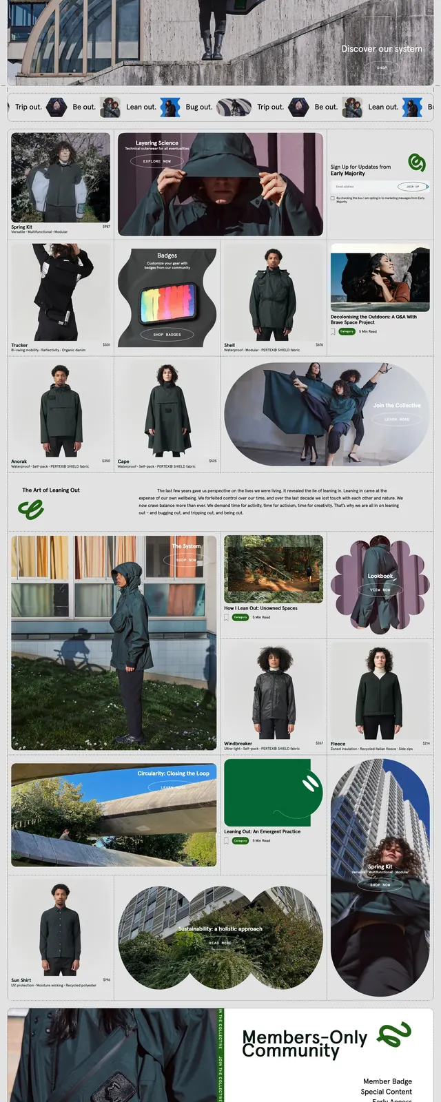
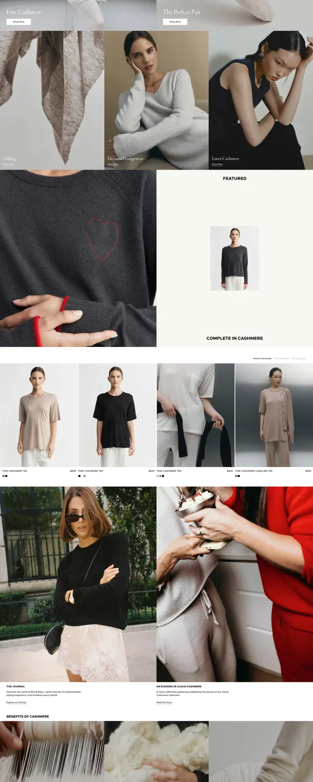
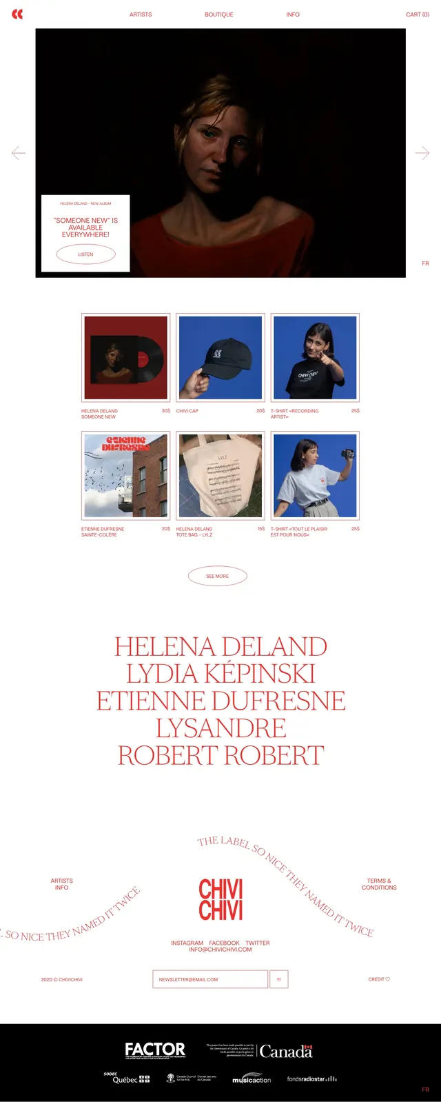
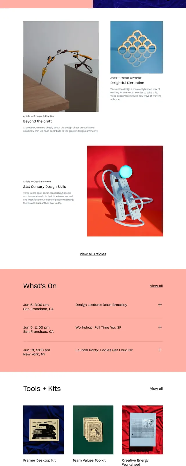
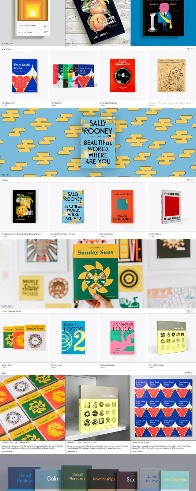
The page opens with a centered wordmark in a slim top navigation bar, flanked by menu, search, and cart controls. Below, oversized photography blocks and book-cover tiles are arranged in a strict grid with strong horizontal section breaks and small category labels. The lower slices continue with product rows, editorial callouts, and newsletter/footer content, all presented in a restrained catalog style. White space, thin dividers, and simple typography keep the focus on the merchandise imagery.
Key takeaway
This layout works well for brands that want a curated, editorial retail feel with strong visual merchandising. The mix of large feature images and smaller product grids makes it easy to spotlight collections while still supporting browsing.
Reuse notes
Reuse the high-contrast editorial grid, small uppercase category labels, and image-first product cards for a boutique commerce homepage. Keep the navigation minimal and let cover art or product photography carry most of the visual weight.