Preview image. Unlock full-res
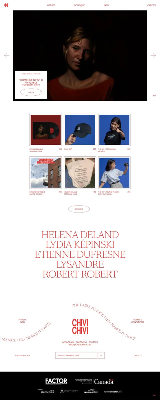
A minimal white e-commerce homepage that mixes a dark, cinematic hero with a tidy product grid and oversized serif artist names.
Summary
A minimal white e-commerce homepage that mixes a dark, cinematic hero with a tidy product grid and oversized serif artist names.
Visual description
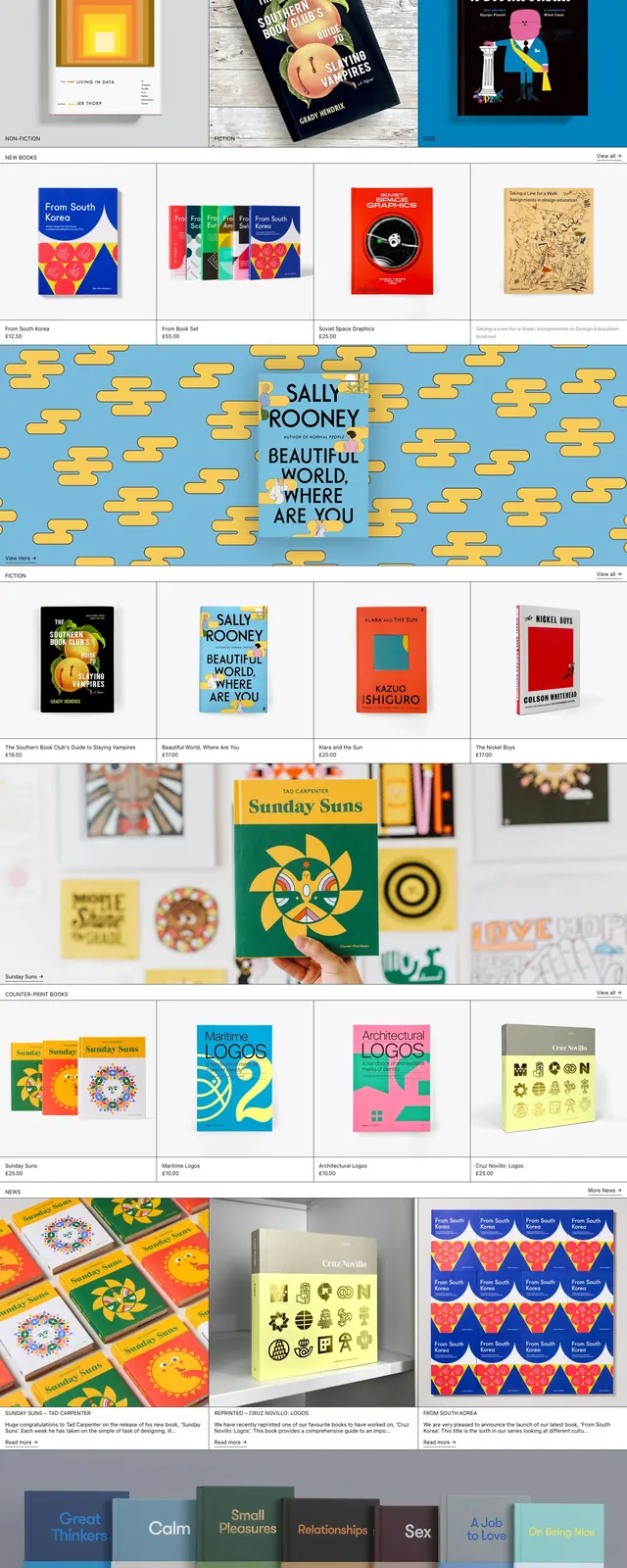
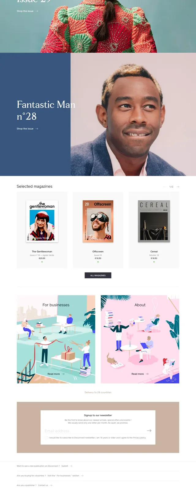
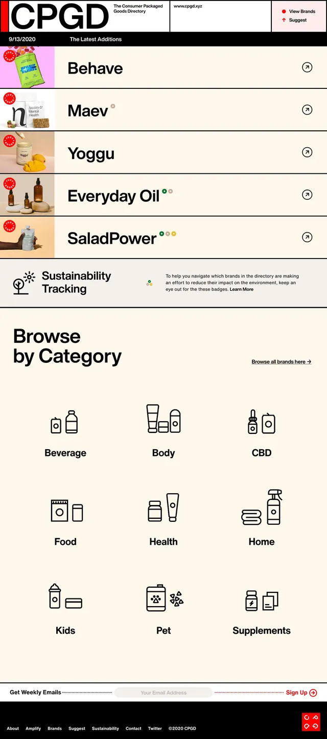
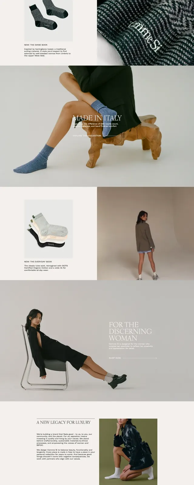
The page uses a white background with thin pink-red typography and a small centered top navigation. The hero is a wide, dark photograph of a woman, with left and right arrow controls and a small inset promo card in the lower-left corner. Below it sits a neat grid of product tiles with repeat imagery, product names, and prices, followed by a large centered list of artist names in an elegant serif. The footer area is sparse and brand-led, with the Chivichivi wordmark, curved slogan text, newsletter field, social links, and partner logos on a black strip.
Key takeaway
The strongest move is the contrast between restrained white-space-heavy structure and the dramatic, low-light hero image. The oversized serif typography gives the page a fashion-editorial feel while still supporting a commerce workflow.
Reuse notes
Use this pattern for boutique brands, music merch stores, or editorial e-commerce sites that need a premium but understated presentation. It works best when the imagery is strong and the catalog is small enough to support a curated grid.