Preview image. Unlock full-res
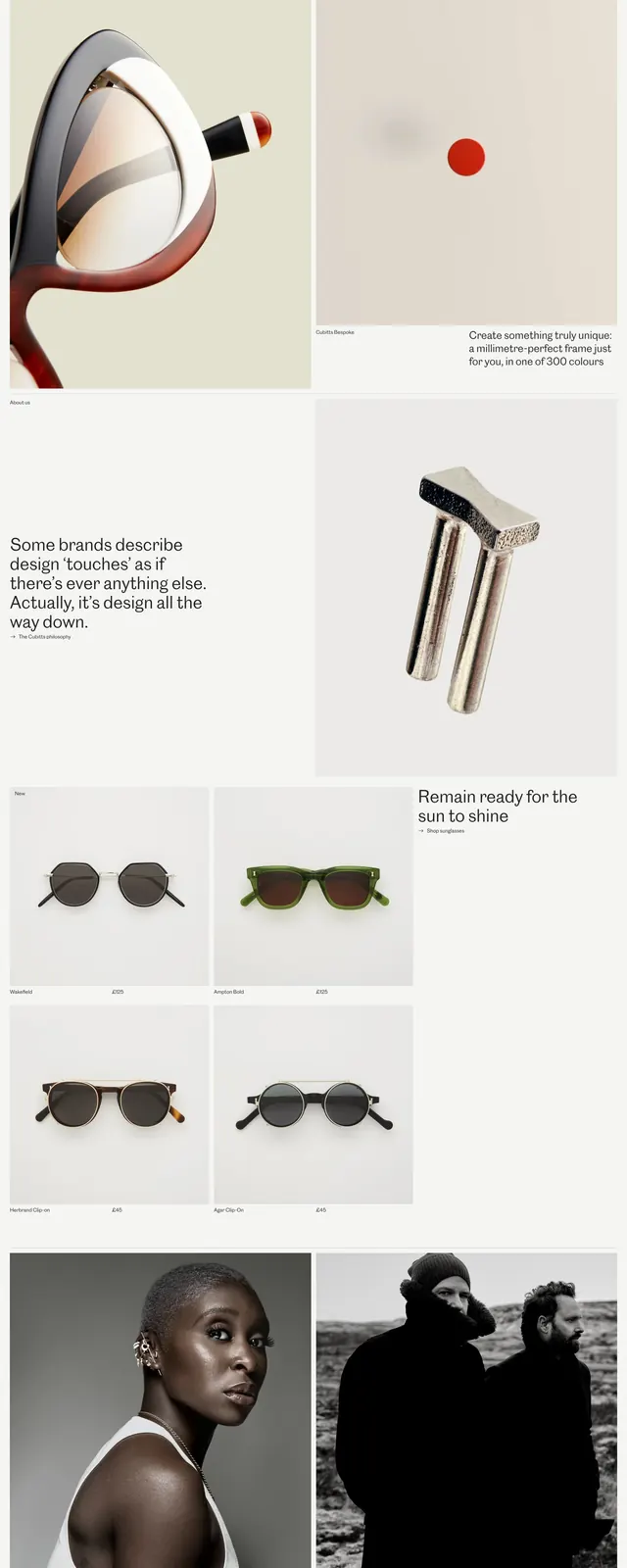
An editorial luxury eyewear homepage with oversized product photography, minimal navigation, and spacious storytelling sections.
Summary
An editorial luxury eyewear homepage with oversized product photography, minimal navigation, and spacious storytelling sections.
Visual description
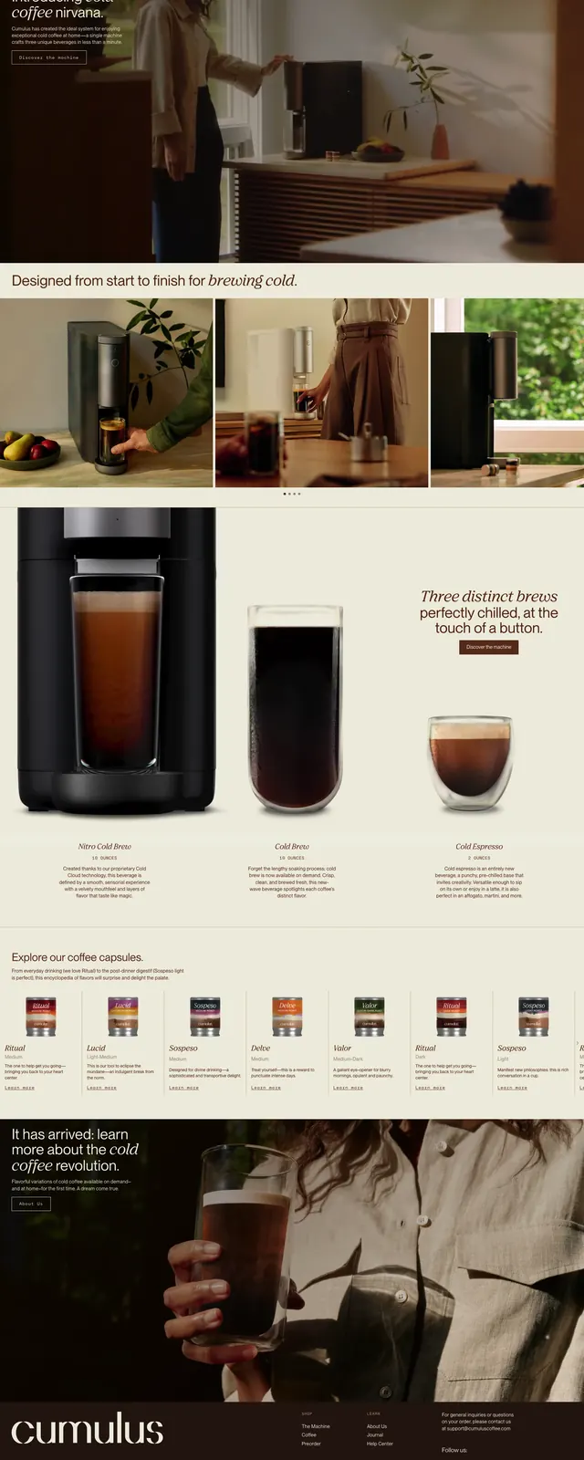
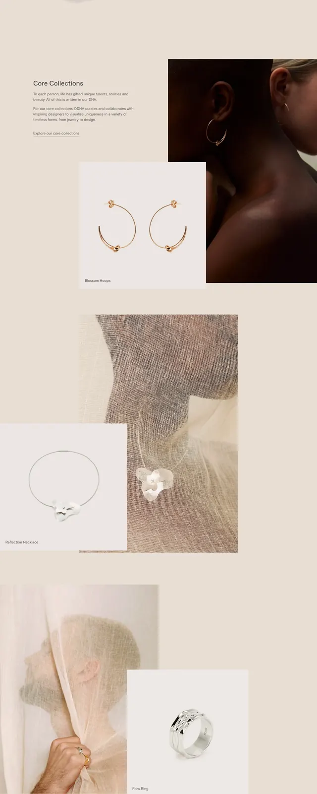
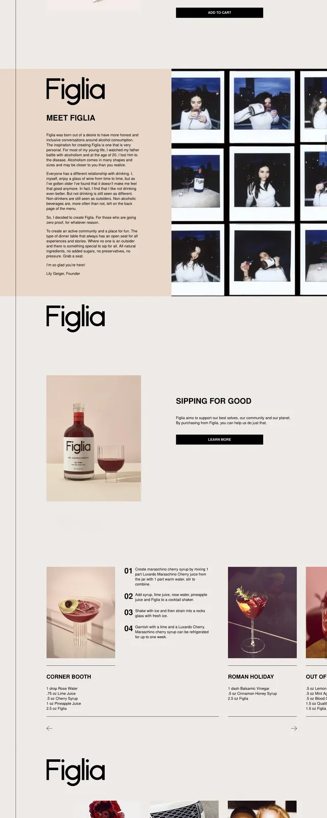
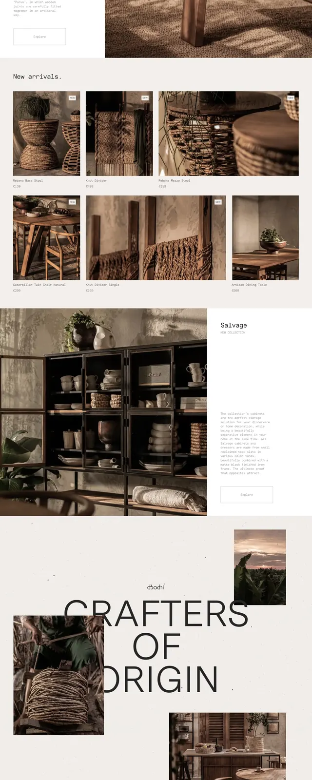
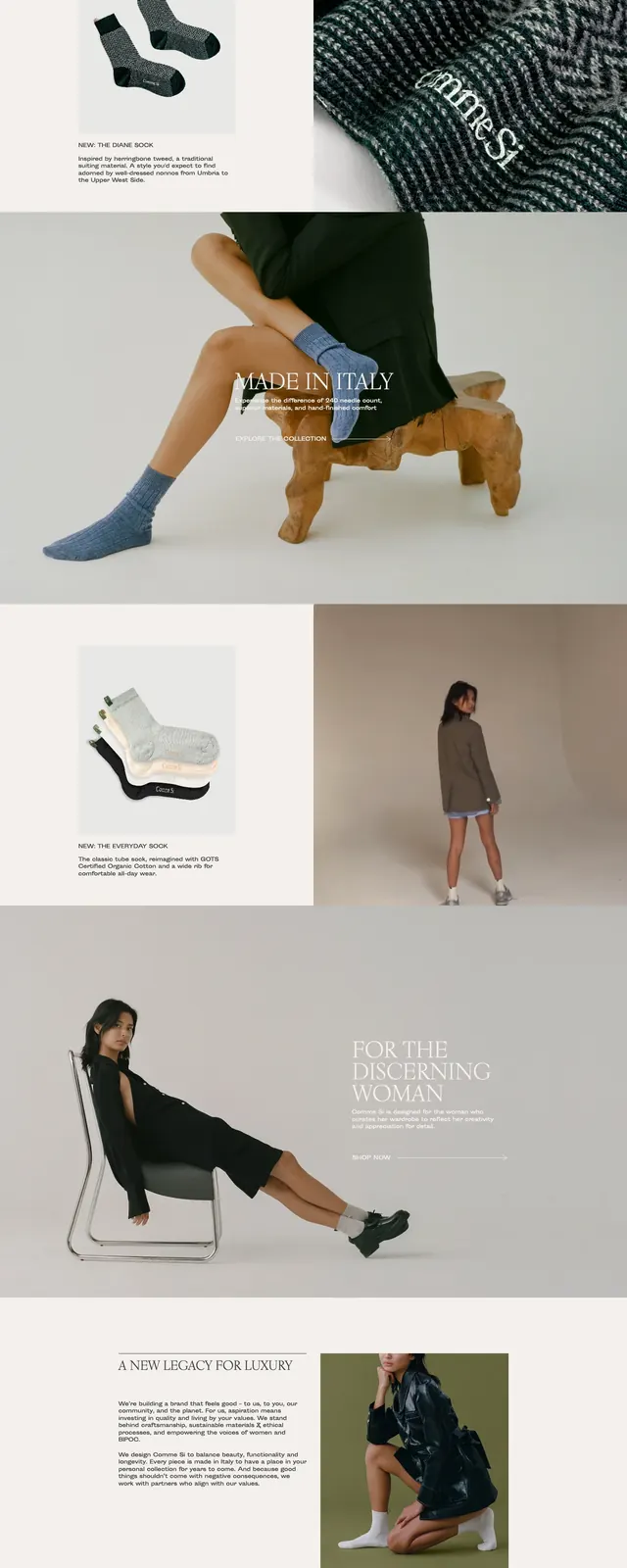
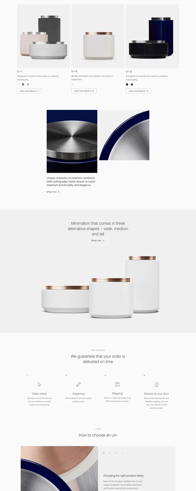
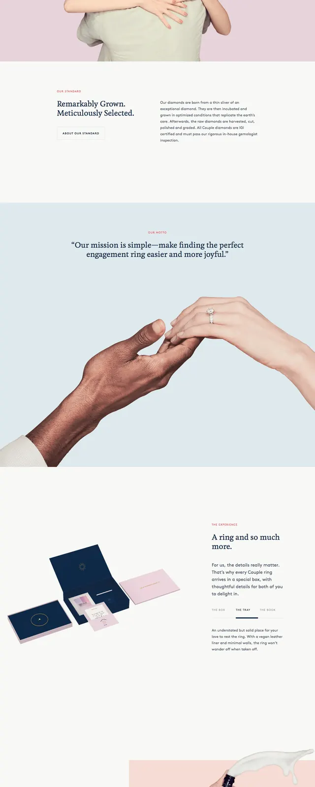
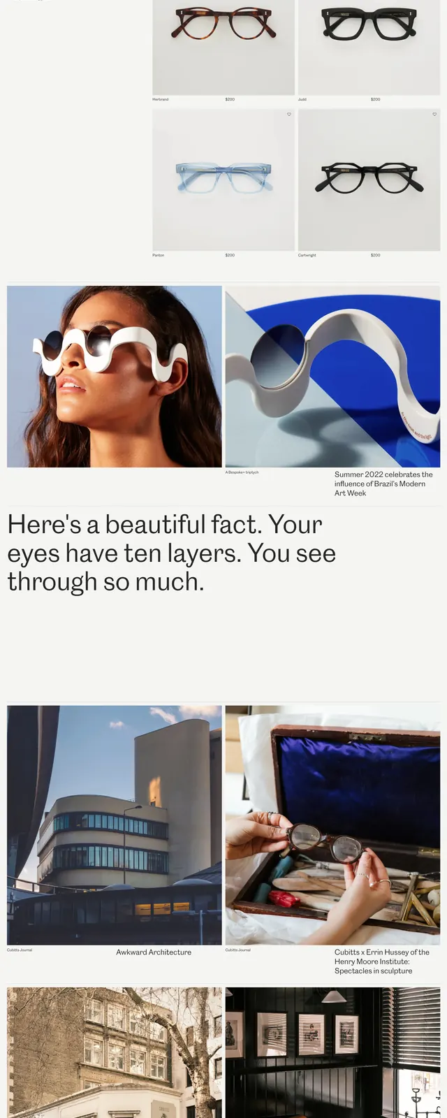
The page uses a pale neutral background with a thin top navigation bar and very large photographic tiles arranged in an airy editorial grid. The first screen combines close-up eyewear imagery, short text blocks, and small product cards with prices, while later slices introduce store photography and a wide statement headline. Spacing is generous throughout, with very little UI chrome beyond navigation, image captions, and subtle product labels.
Key takeaway
The main idea is to let photography do most of the selling, using a restrained layout and large whitespace to make the brand feel premium. Strong contrast comes from pairing close-up product detail shots with simple text and light framing.
Reuse notes
Use this pattern for premium retail or fashion brands that need an editorial feel without heavy interface complexity. It works best when you have strong imagery and short copy; it would feel sparse with weak visuals or dense feature lists.