Preview image. Unlock full-res
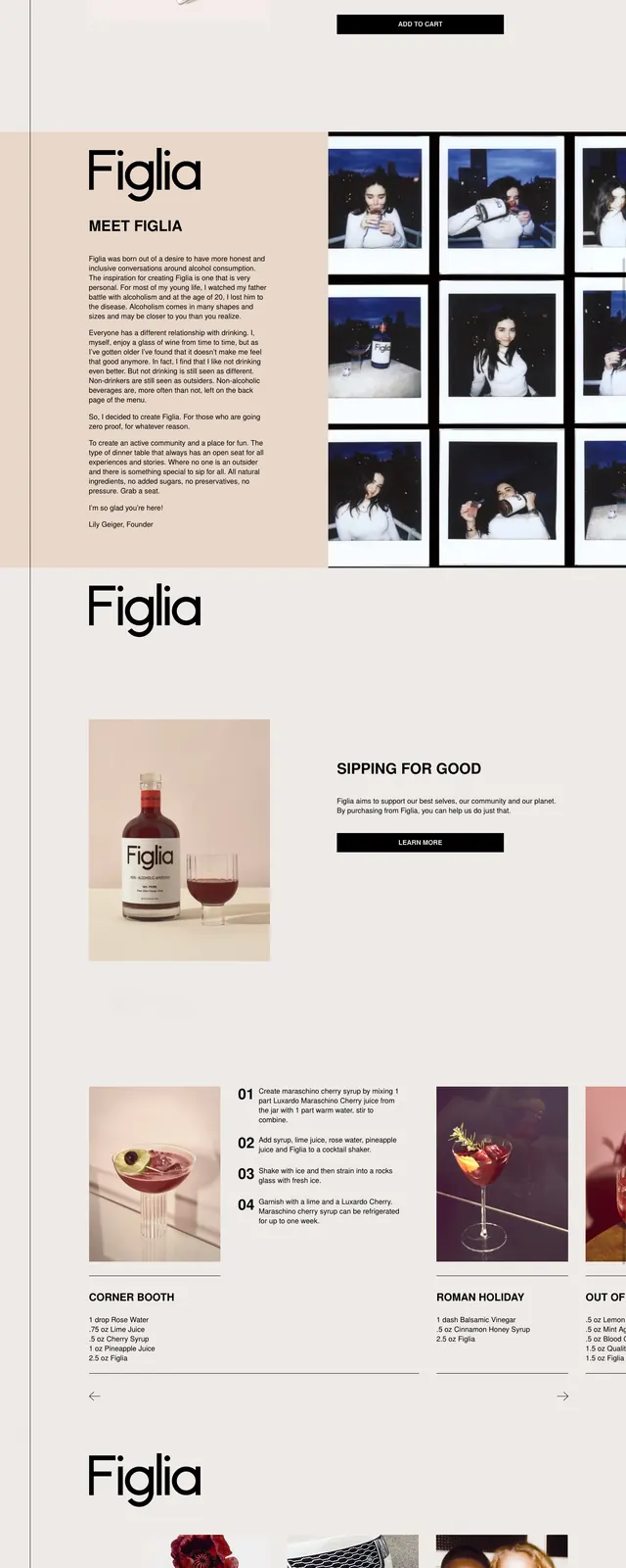
A minimalist, editorial landing page for Figlia with large product photography, strong typography, and bold red brand blocks.
Summary
A minimalist, editorial landing page for Figlia with large product photography, strong typography, and bold red brand blocks.
Visual description
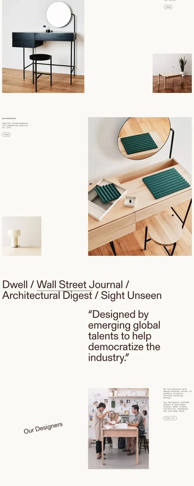
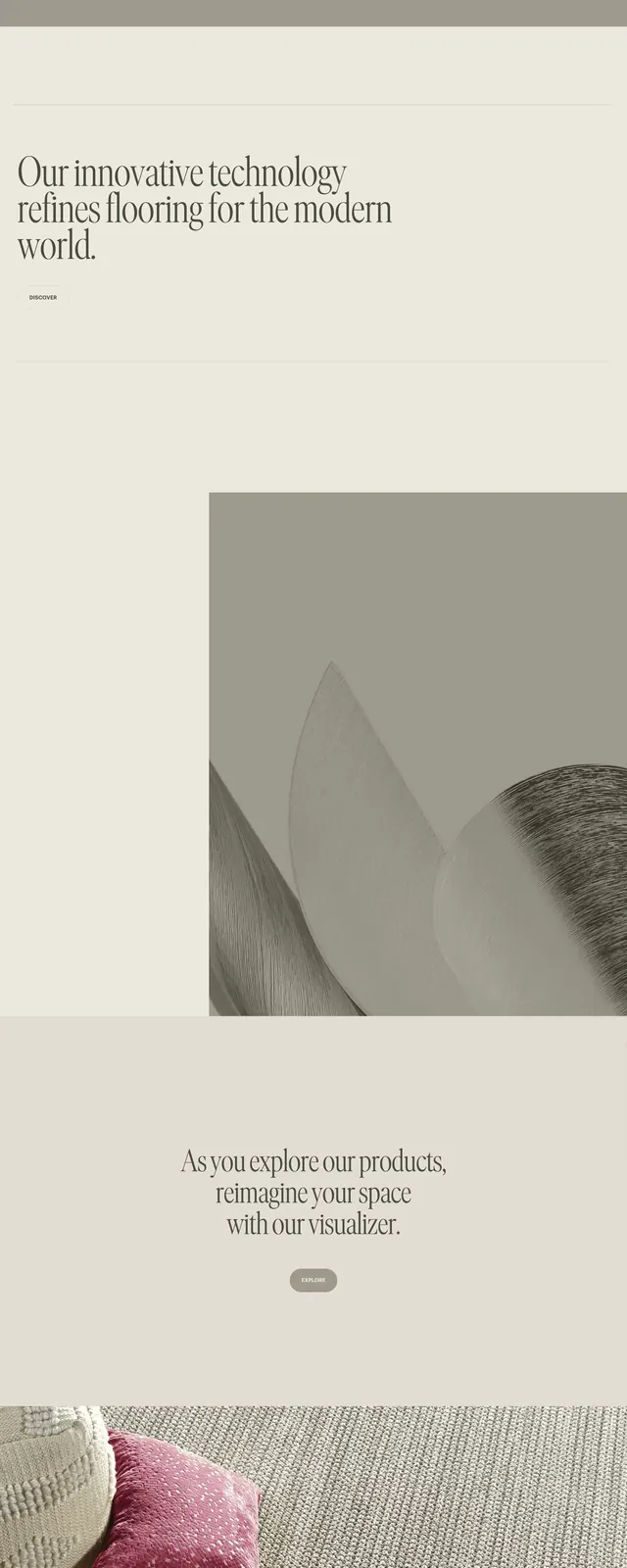
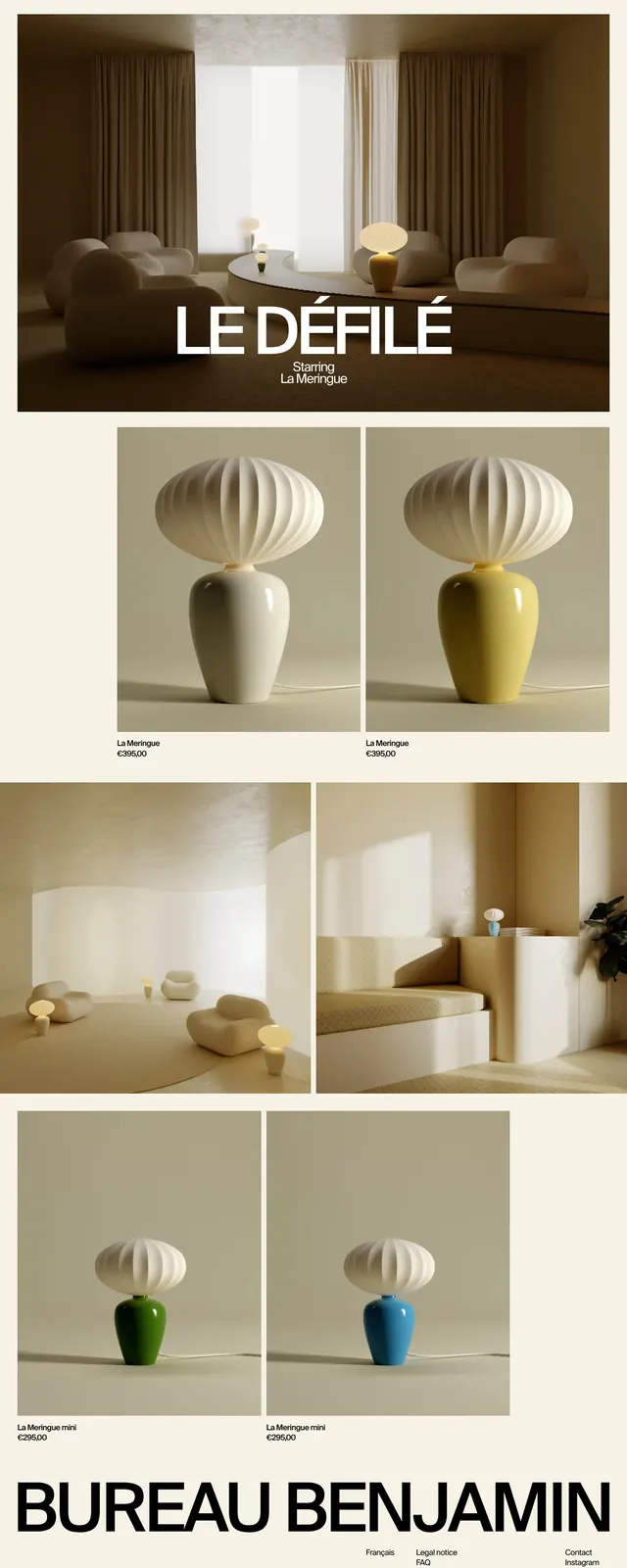
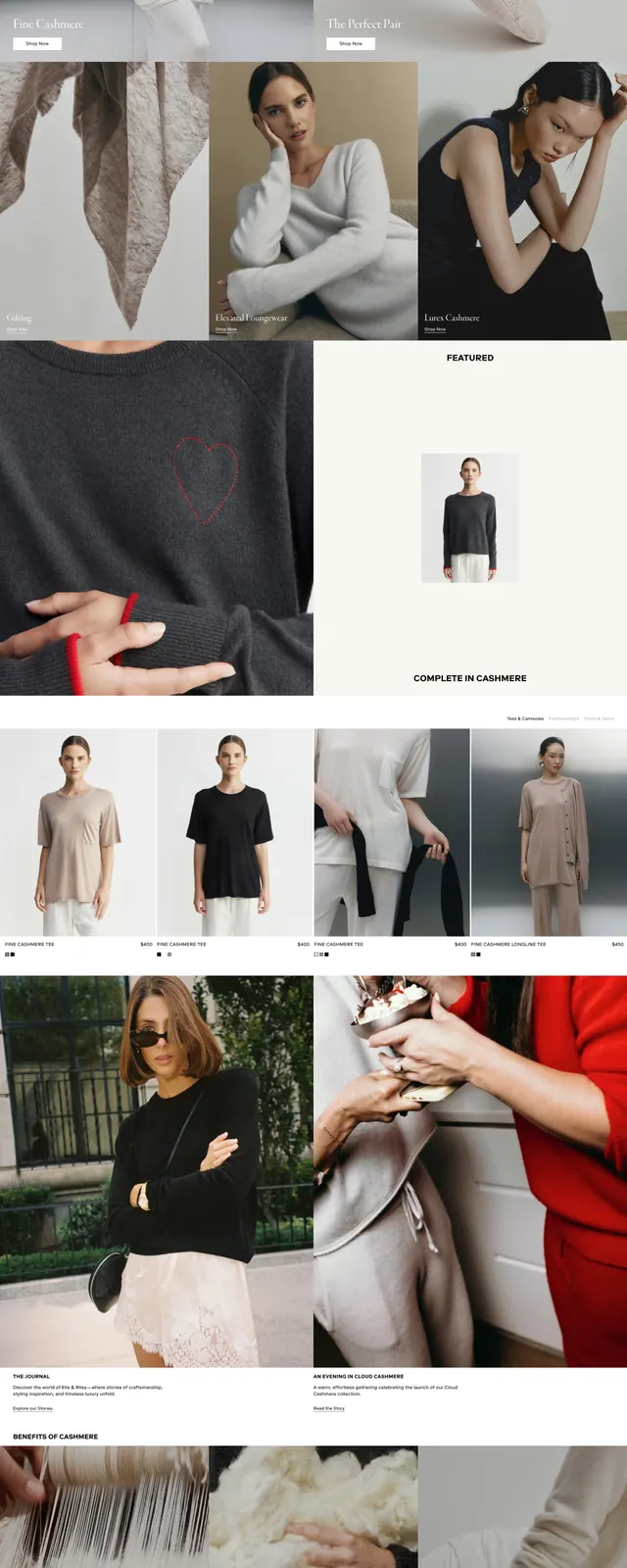
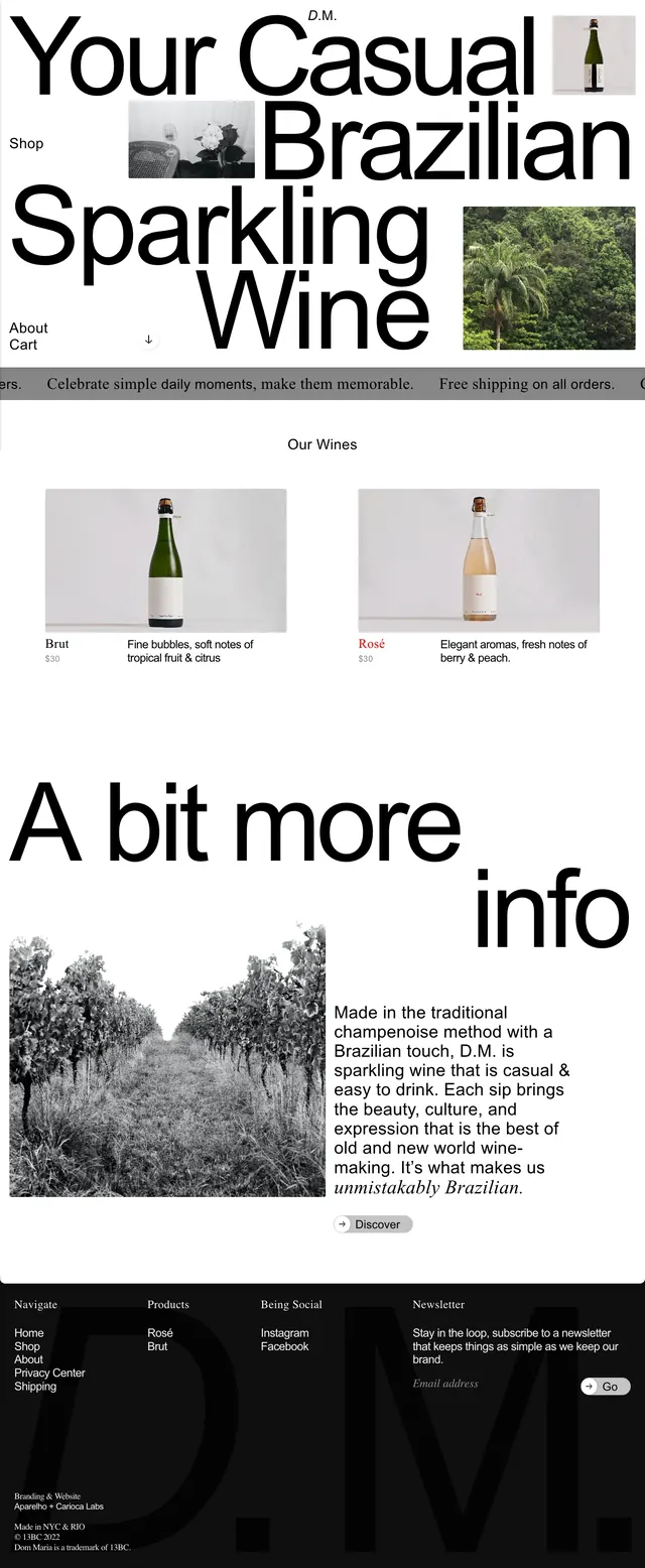
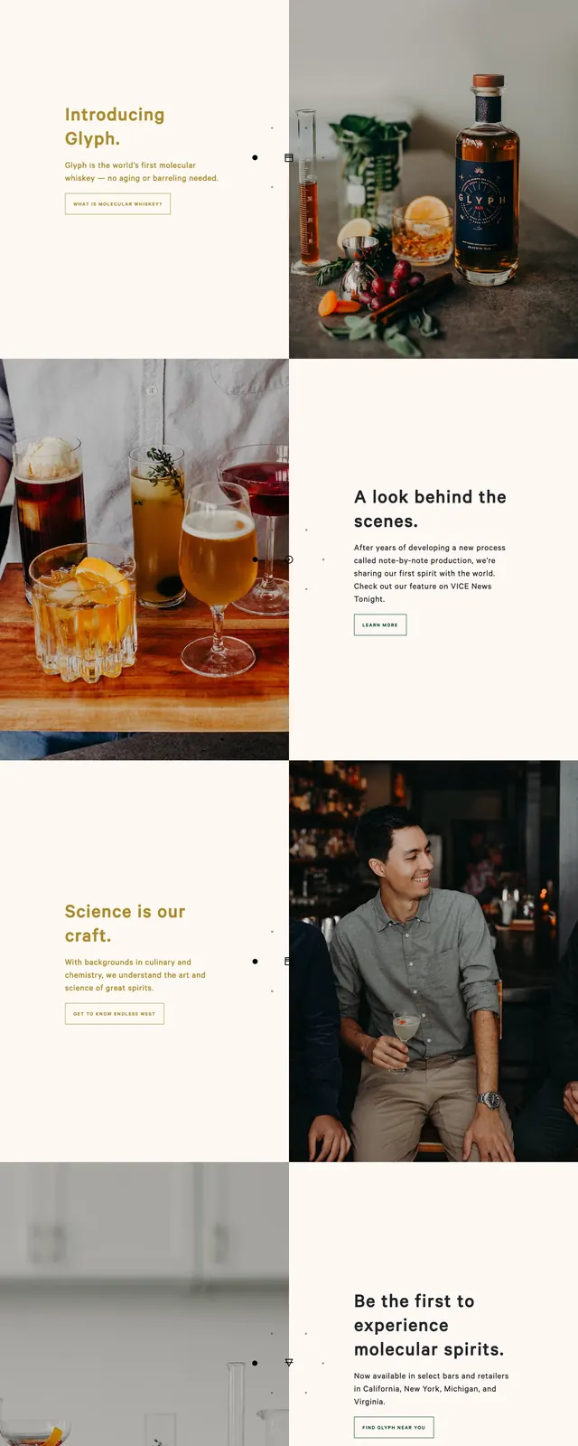
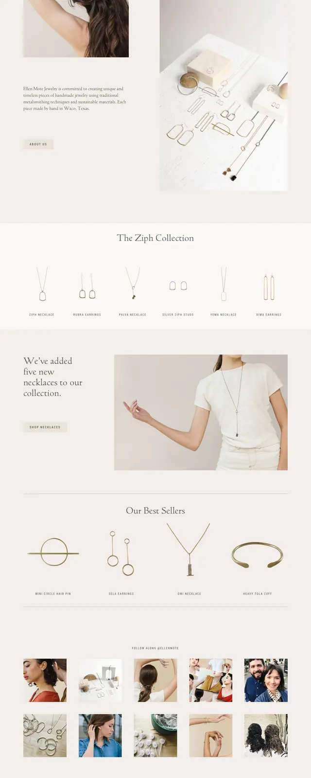
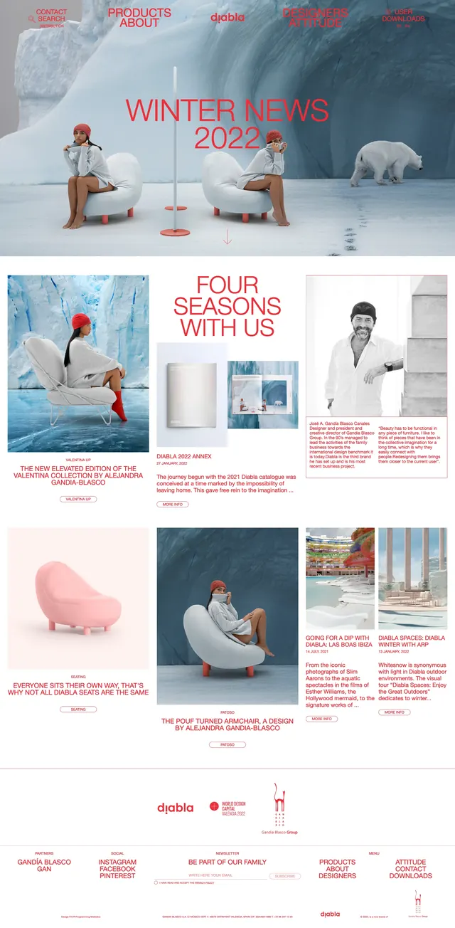
The page uses a soft cream base with a saturated red accent panel and oversized black wordmark styling. The first screen is split between a tabletop product still life on the left and a bottle photo on the right, with slim vertical navigation labels along the edge. Lower sections stack large brand headings, product imagery, short descriptive copy, a simple call-to-action button, and a newsletter sign-up area. The overall composition feels airy, image-led, and highly curated.
Key takeaway
Use restrained layouts, strong negative space, and oversized type to make a small number of product images feel premium. A single vivid brand color can anchor the entire page without overwhelming the minimal structure.
Reuse notes
Works well for beverage, food, or lifestyle brands that want an editorial commerce feel. Reuse the split hero, vertical side navigation, and sparse CTA blocks for a refined launch page or product story page.