Preview image. Unlock full-res
A bold SaaS landing page with a neon hero, dark feature sections, and product storytelling built around team visibility and weekly summaries.
Summary
A bold SaaS landing page with a neon hero, dark feature sections, and product storytelling built around team visibility and weekly summaries.
Visual description
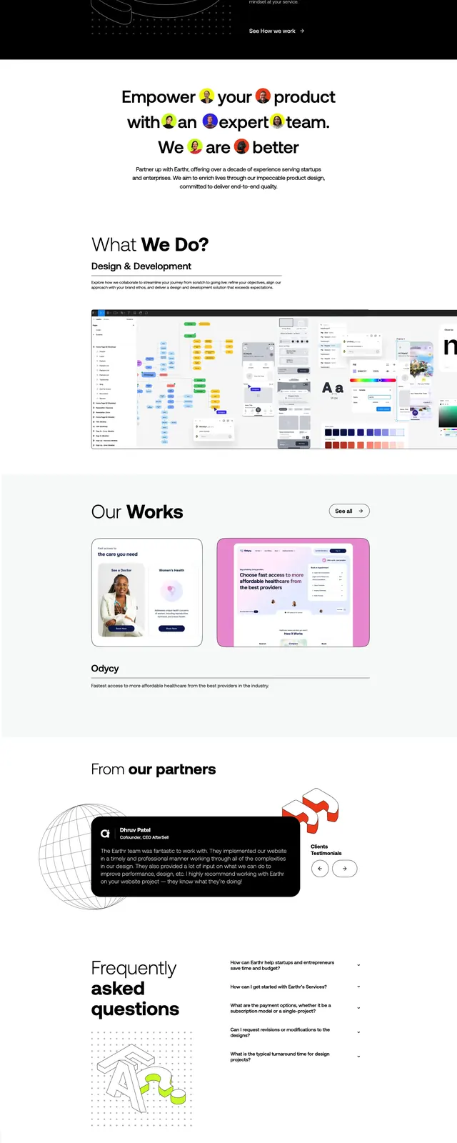
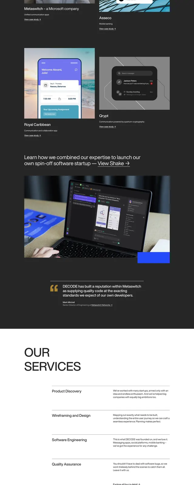
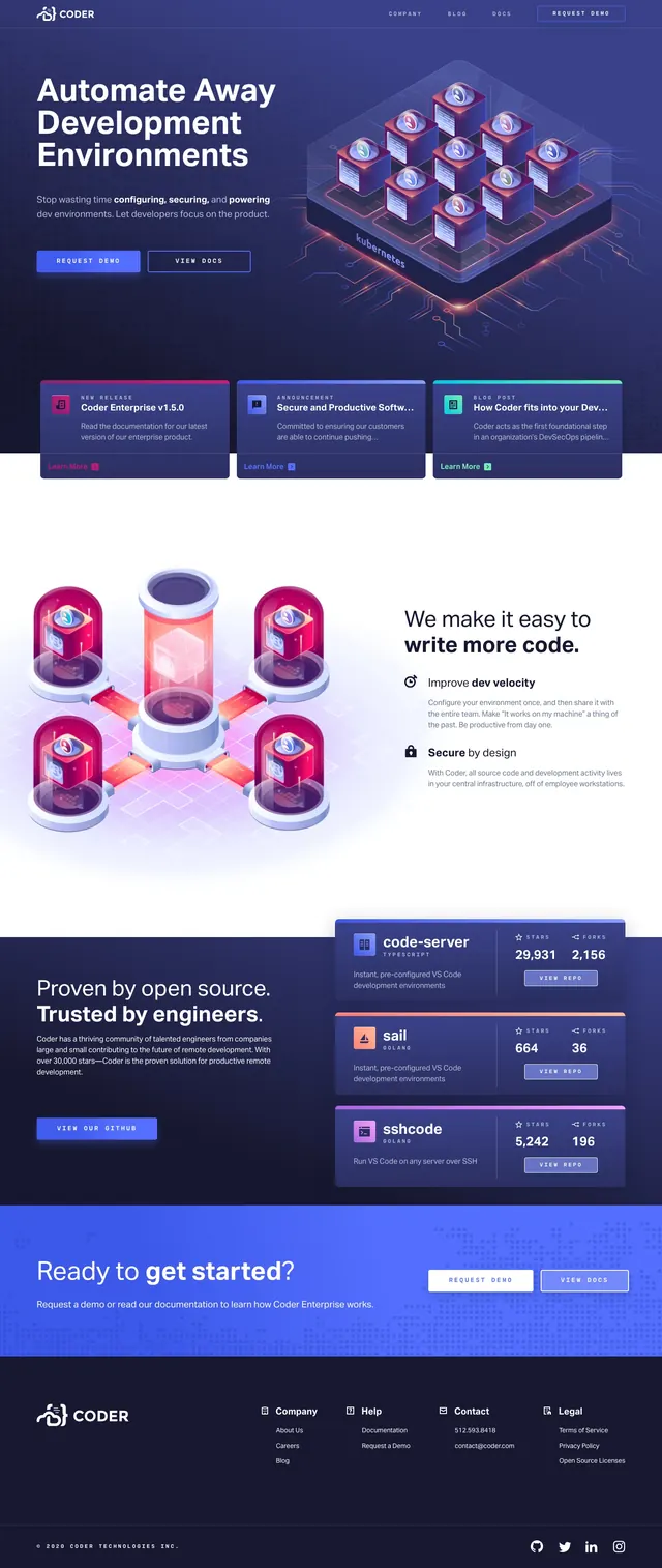
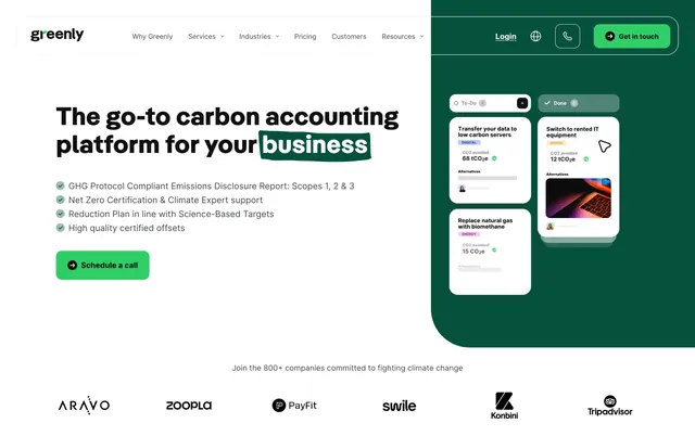
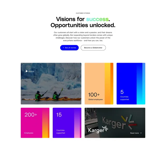
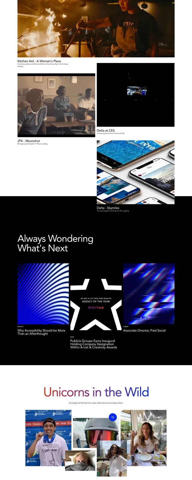
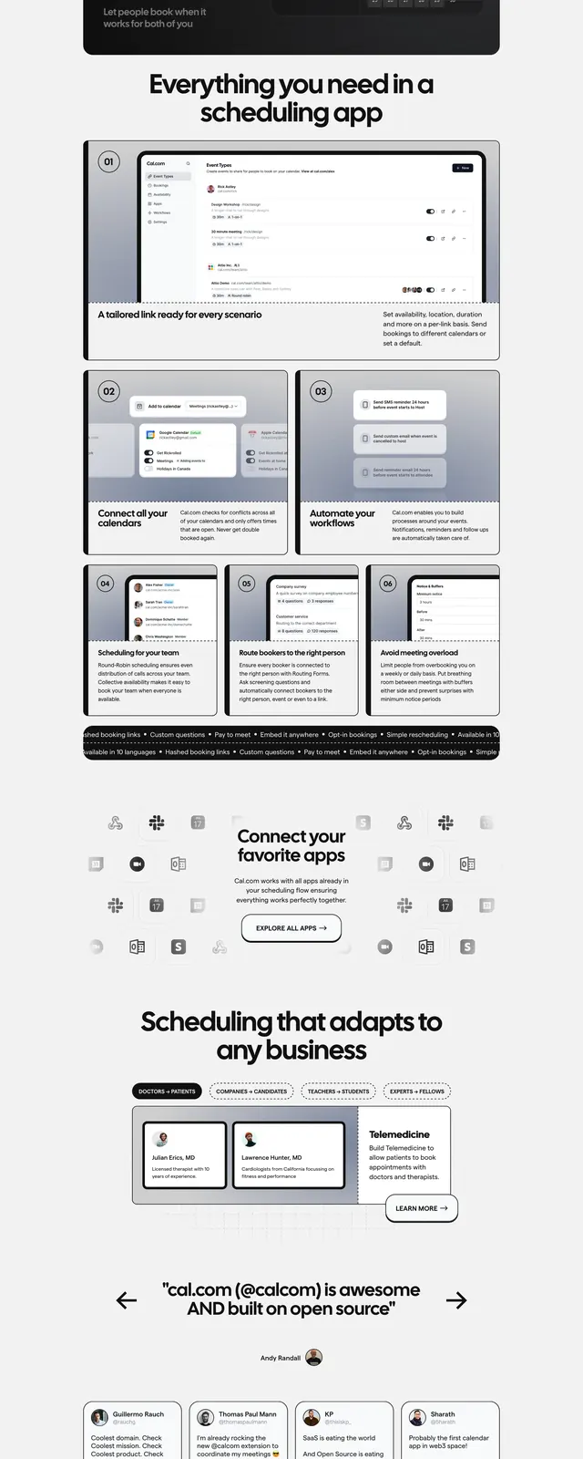
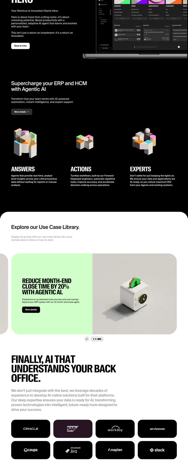
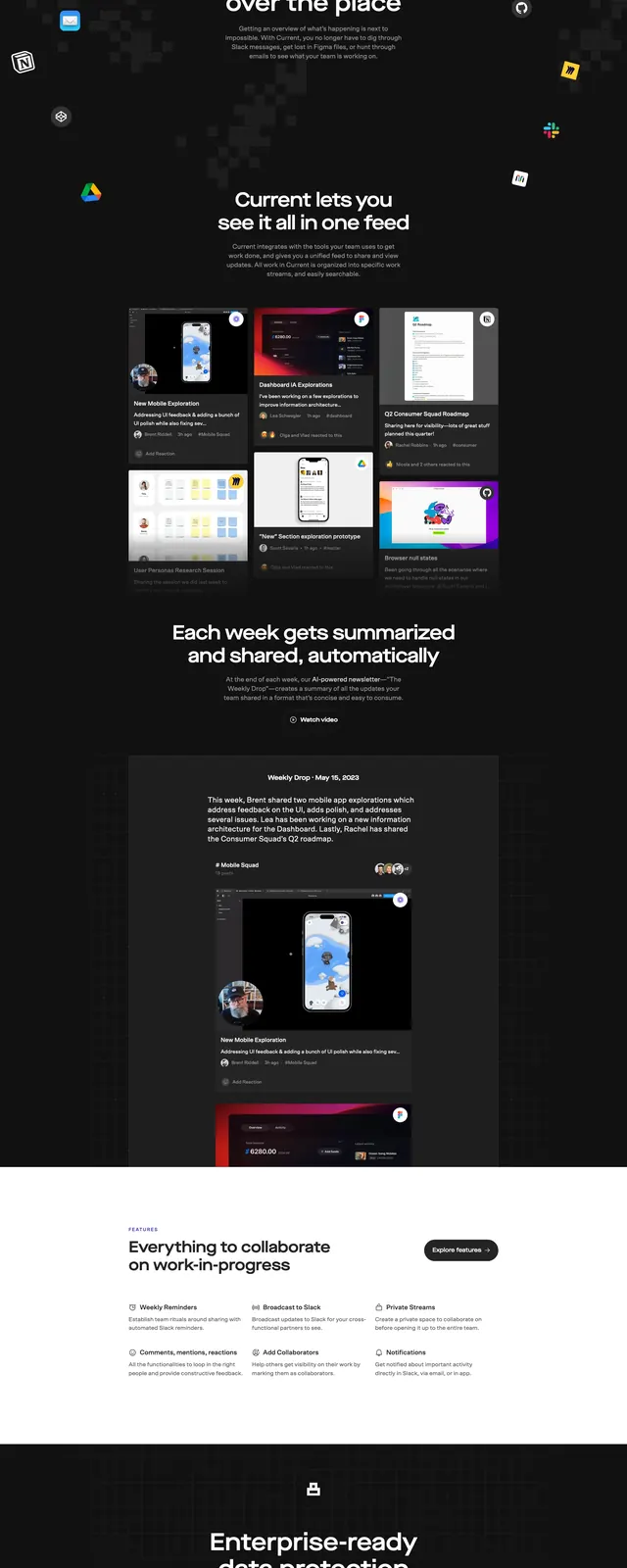
The page opens with a bright neon-lime hero area, a compact top navigation, a large centered headline, and two prominent call-to-action buttons. Below the fold, the layout shifts into a dark mode product narrative with card-based previews, a testimonial band, and a large closing CTA. The design uses oversized typography, rounded buttons, and screenshot-heavy product mockups to communicate the app experience. Visual rhythm comes from alternating light and dark sections with strong contrast and spacious composition.
Key takeaway
This layout is effective for SaaS products that need to communicate both clarity and momentum. The contrast between the neon hero and dark supporting sections creates strong visual hierarchy and keeps the page feeling memorable.
Reuse notes
Reuse the bright hero color for immediate attention, then switch to dark panels for feature storytelling. The card grid, testimonial strip, and oversized CTA are all easy to adapt for other productivity or B2B products.