Preview image. Unlock full-res
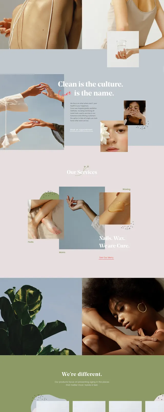
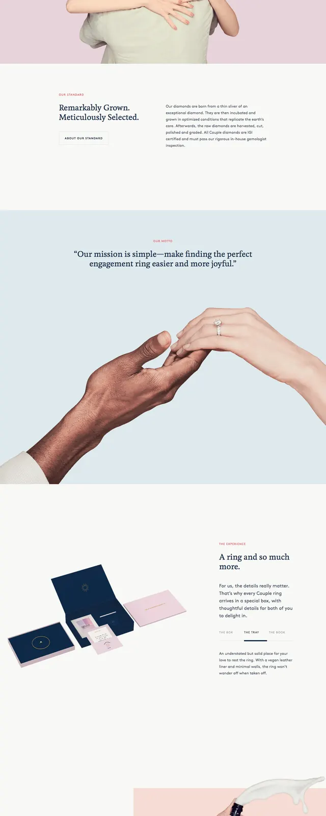
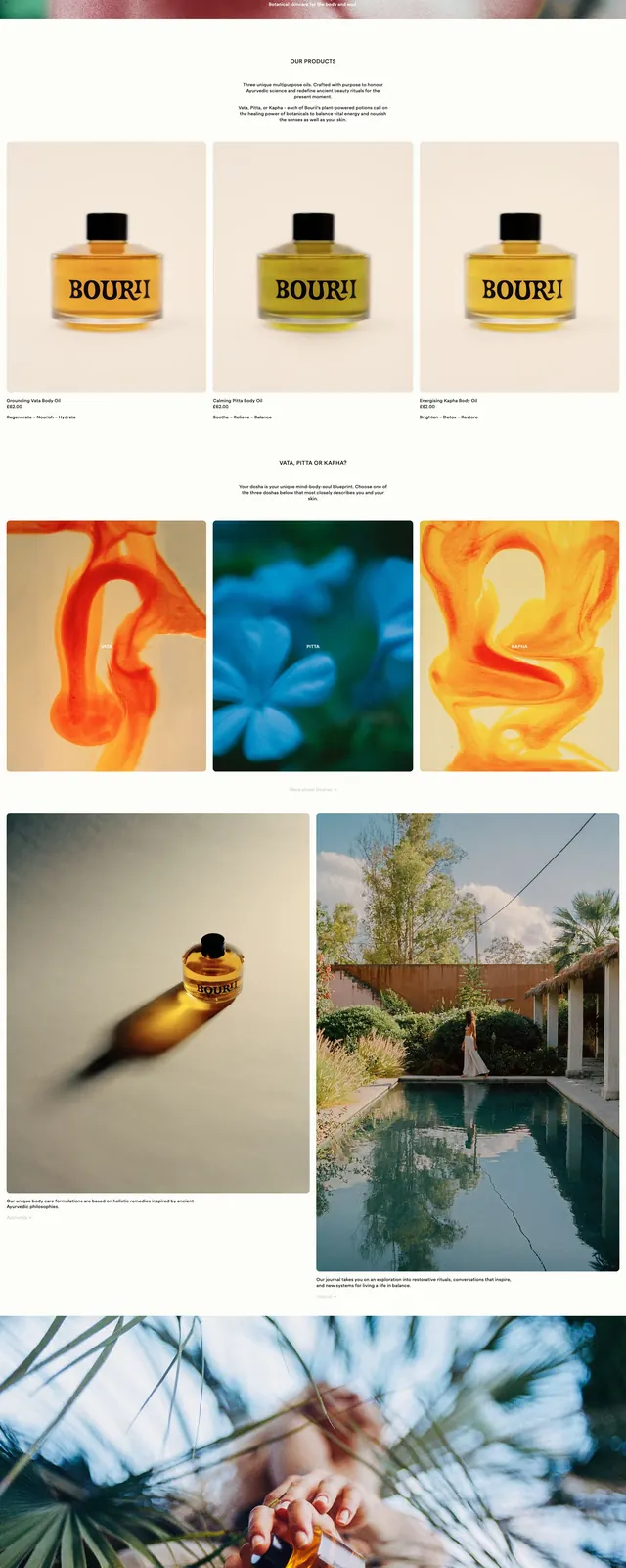
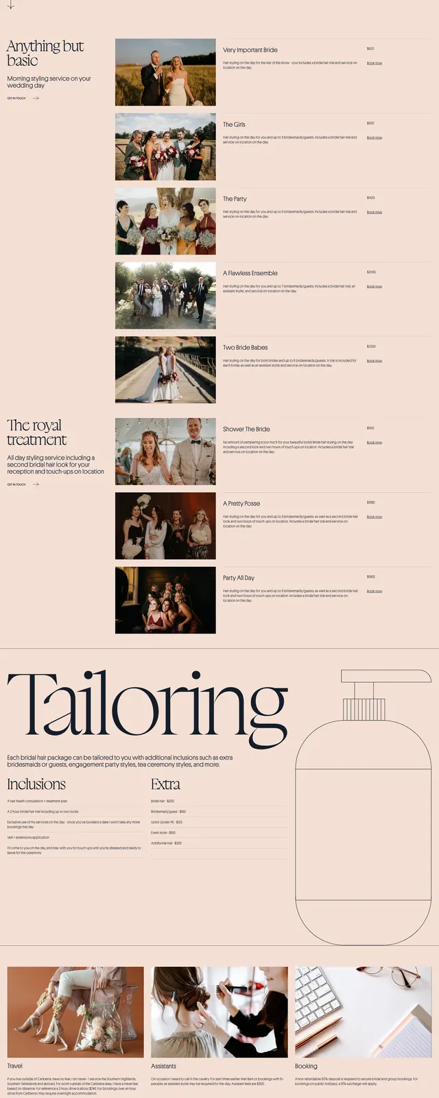
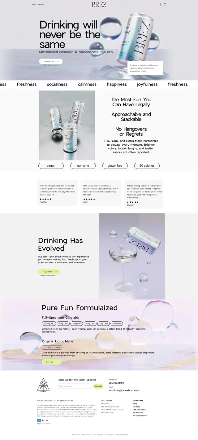
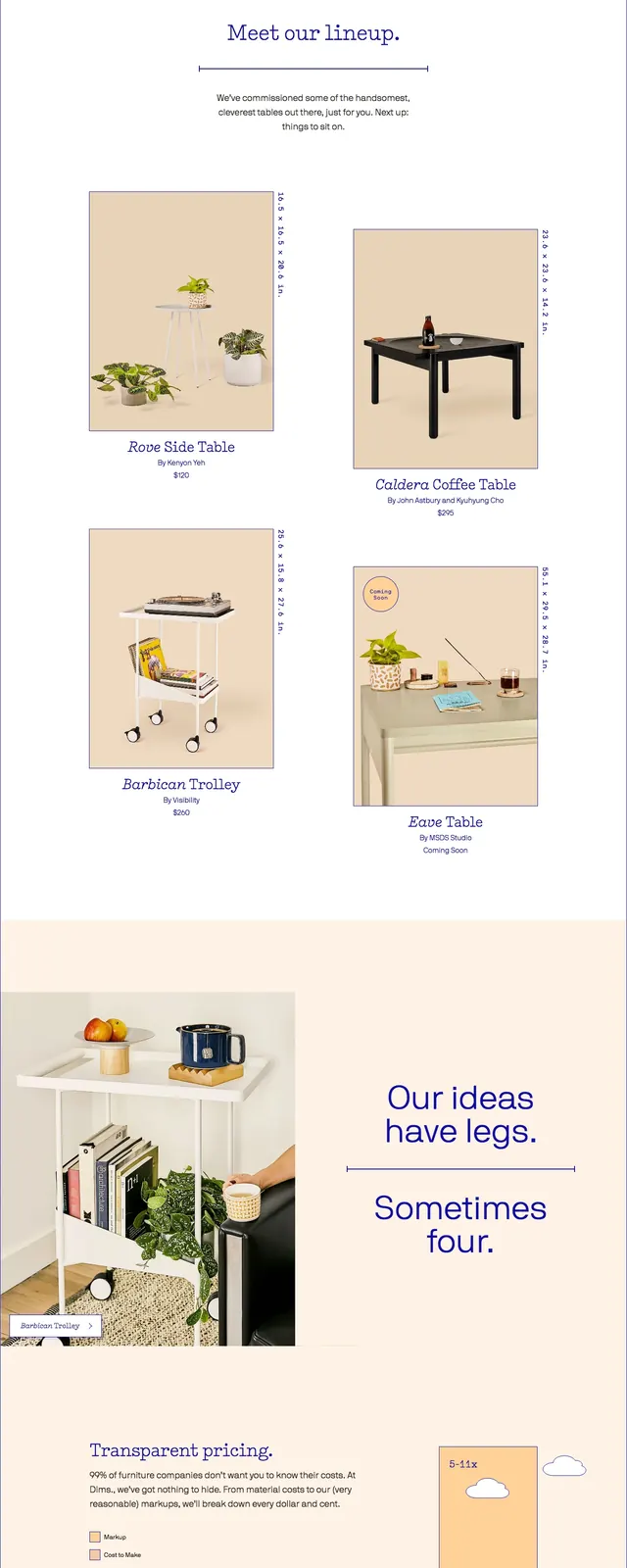
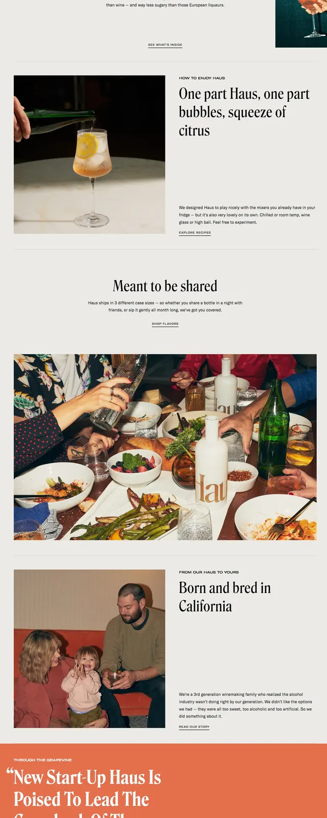
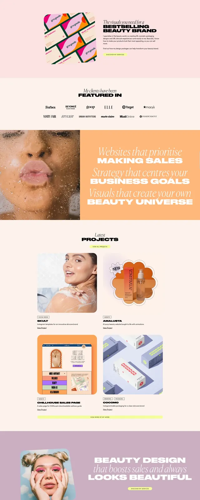
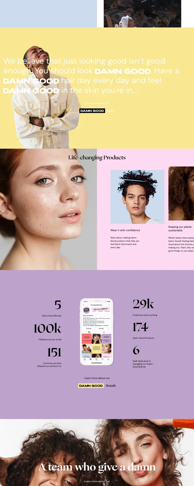
A fashion-forward beauty landing page with a split hero, oversized serif headlines, pastel color blocking, and image-led storytelling.
Summary
A fashion-forward beauty landing page with a split hero, oversized serif headlines, pastel color blocking, and image-led storytelling.
Visual description
The page opens with a split hero: a pale blue text panel on the left and a product/lifestyle image column on the right with top navigation. Below, stacked sections alternate between a wide yellow banner, a pink product-feature area, a lavender stats strip, and a full-bleed team image. The design uses large serif headlines, small supporting sans-serif copy, and strong editorial photography throughout. Brand identity is reinforced with repeated DAMN GOOD Beauty logo treatments and product-focused visuals.
Key takeaway
This layout combines editorial luxury with approachable beauty branding through soft pastels, oversized type, and spaced-out section rhythms. It is especially effective for brands that want to feel premium while still energetic and relatable.
Reuse notes
Reuse the split hero and alternating color-block sections for beauty, wellness, or lifestyle brands that rely on strong photography. The formula works well when you need a page that feels curated, modern, and brand-forward without heavy UI complexity.