Preview image. Unlock full-res
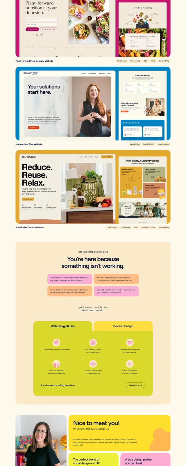
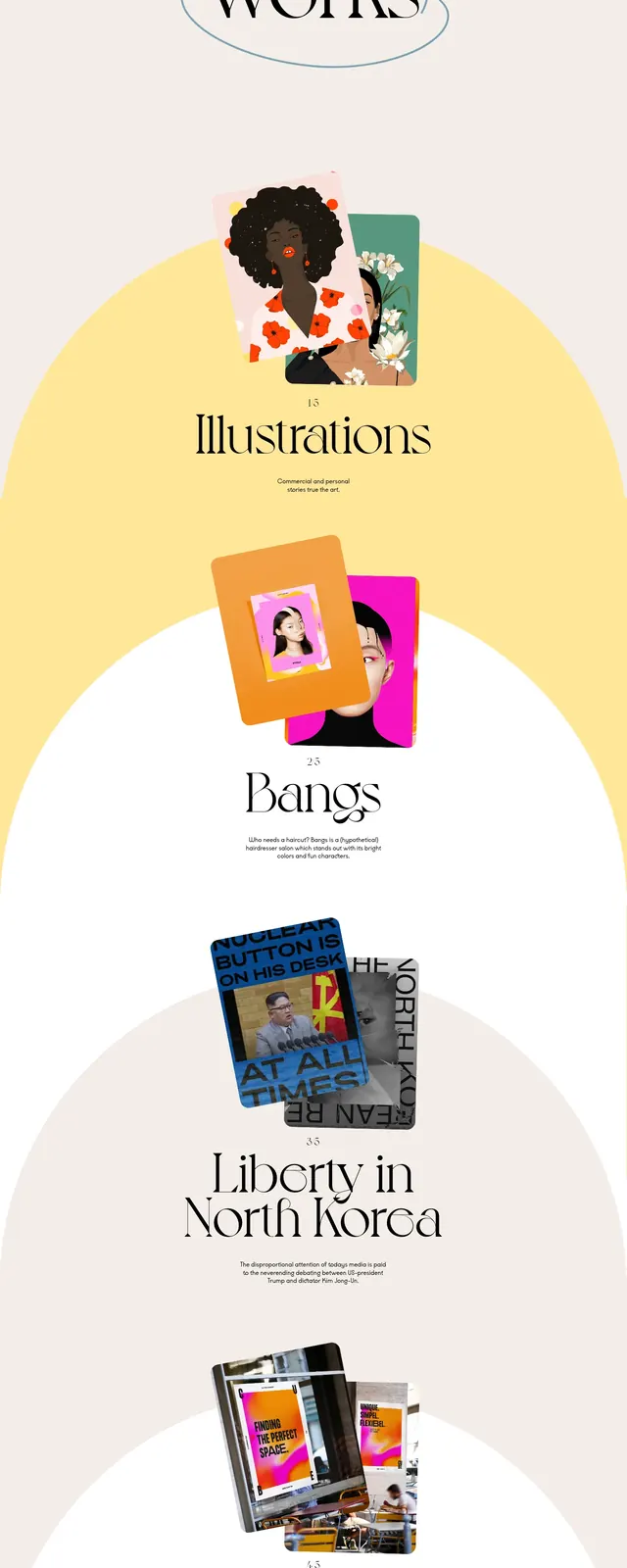
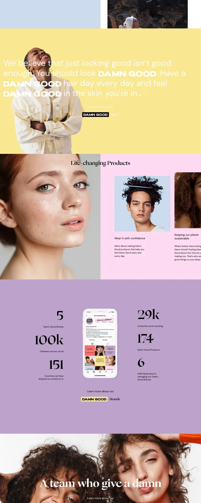
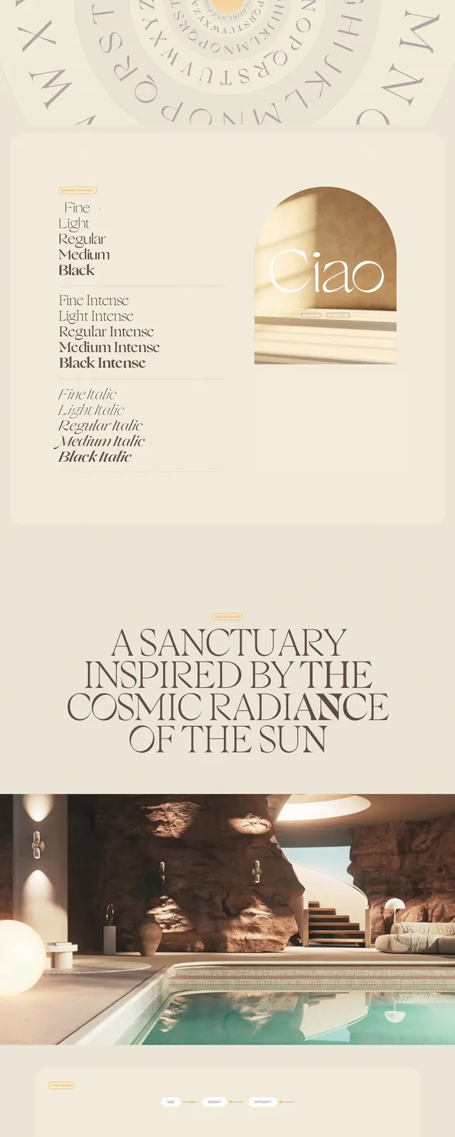
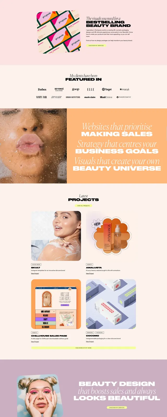
A soft pastel personal-agency homepage for beauty and skincare branding with oversized editorial type, split layouts, and playful product imagery.
Summary
A soft pastel personal-agency homepage for beauty and skincare branding with oversized editorial type, split layouts, and playful product imagery.
Visual description
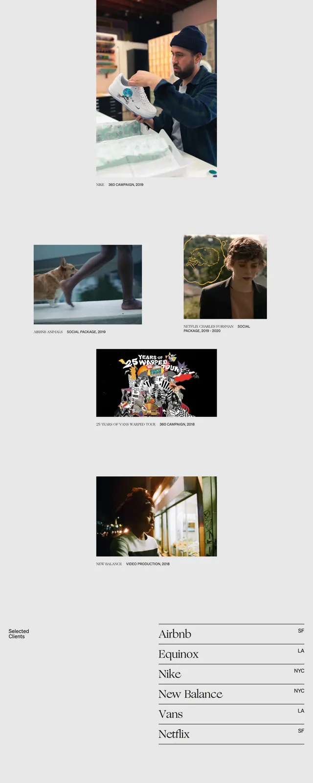
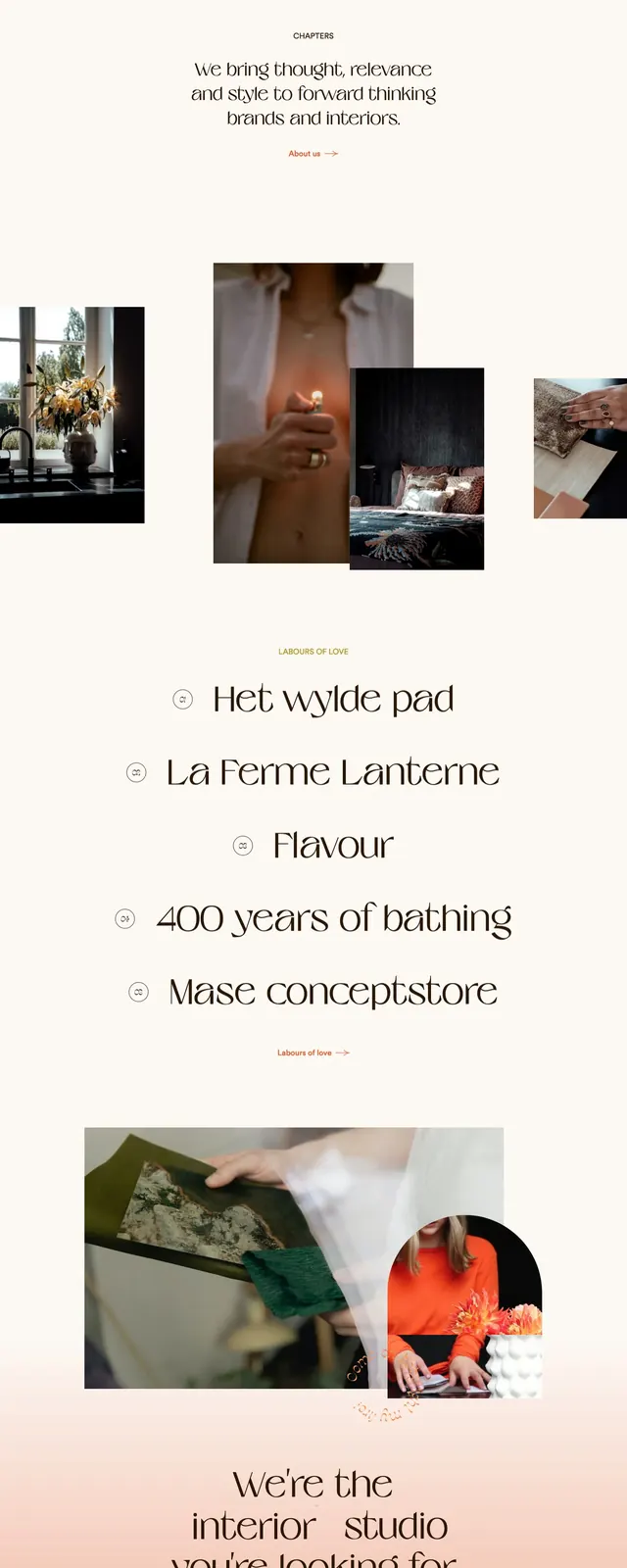
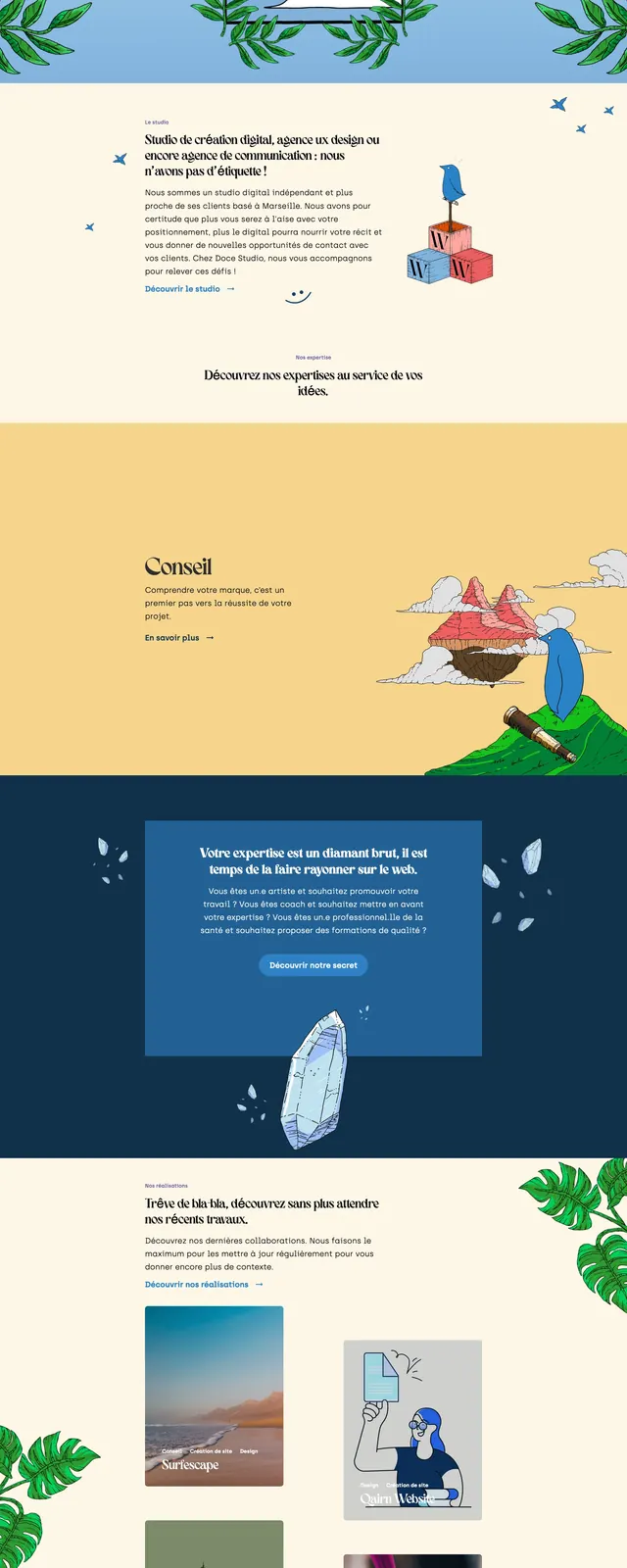
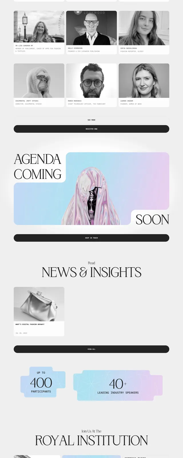
The page opens with a wide lavender hero featuring a compact top navigation, a large editorial headline, and a rounded portrait image on the right. Below it are alternating pastel sections with split image-and-copy layouts, bold promotional statements, project cards, and a wide banner combining close-up beauty photography with oversized typography. The lower area includes a centered Instagram strip with small square thumbnails and a minimal footer lockup. The overall design relies on soft pink and purple backgrounds, cream whitespace, and high-contrast black display type.
Key takeaway
This layout combines luxury beauty branding with a playful, highly visual editorial rhythm. It works well for personal studios or boutique agencies that want to feel stylish, feminine, and conversion-focused.
Reuse notes
Reuse the oversized serif/sans pairing, rounded image treatments, and alternating pastel section blocks for a similar brand feel. The structure is especially effective for showcasing services, featured projects, and social proof in a visually light portfolio format.