Preview image. Unlock full-res
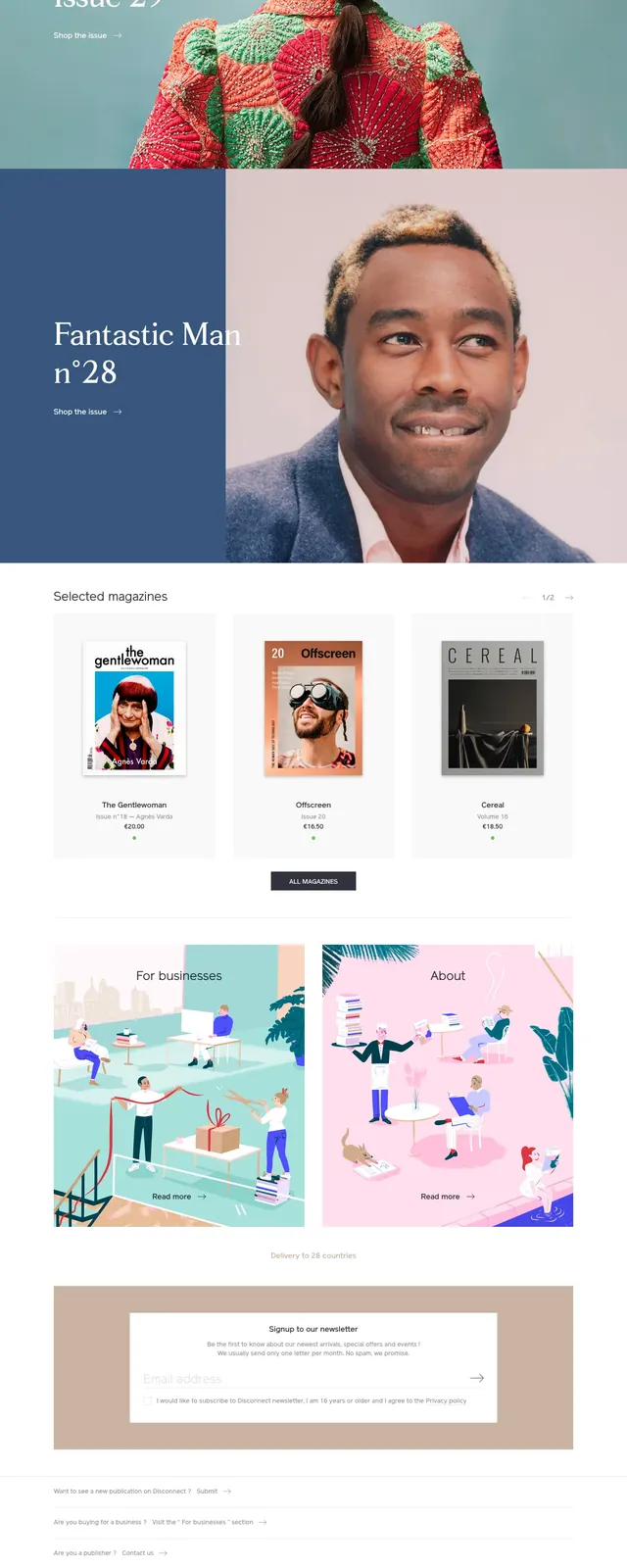
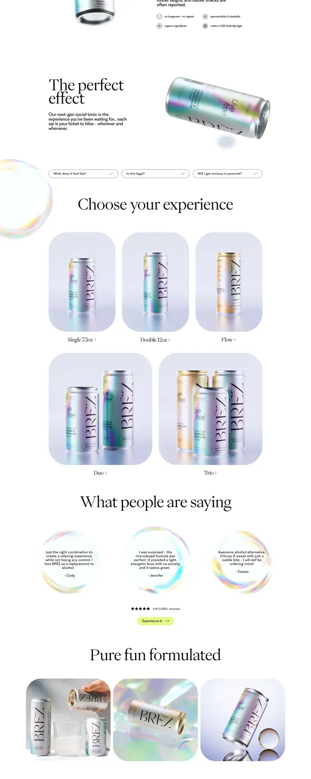
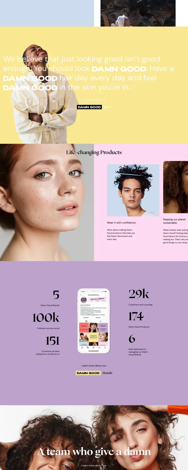
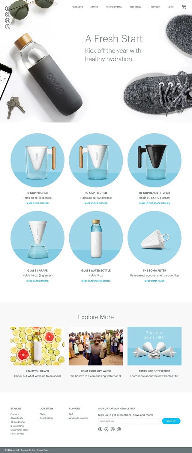
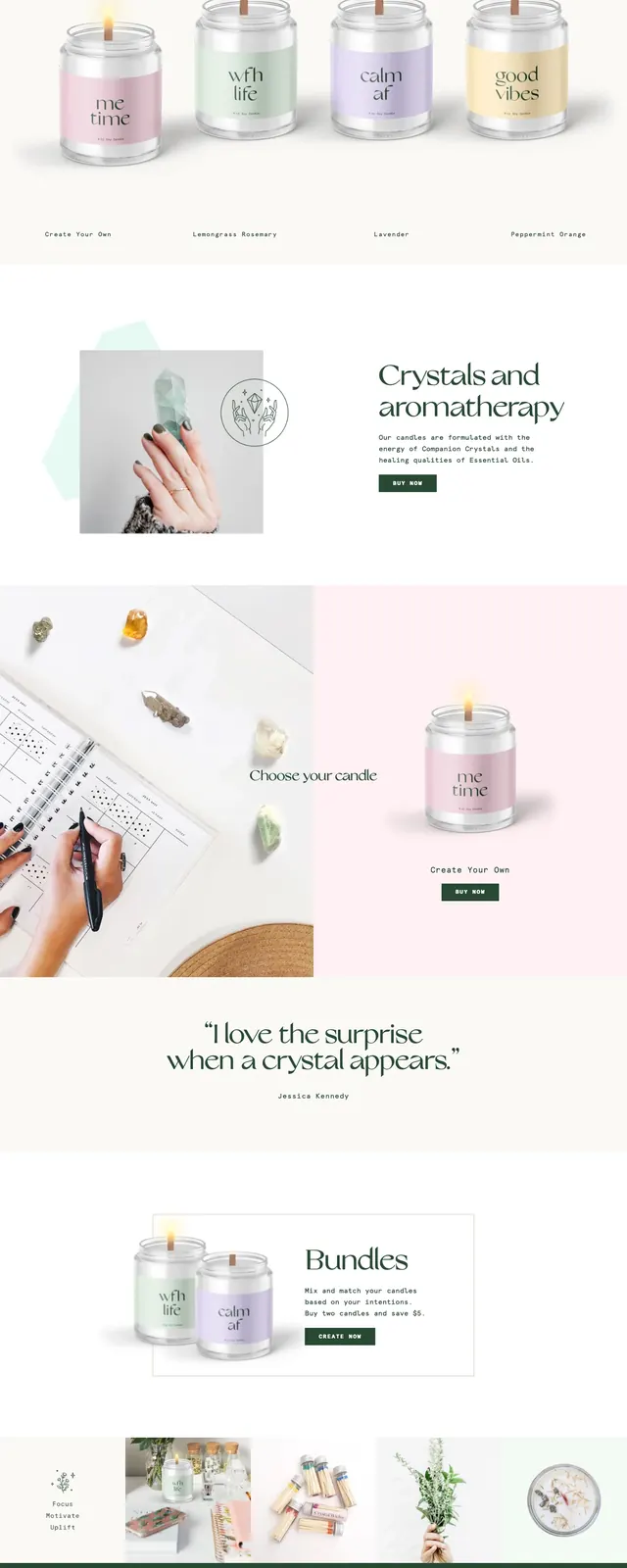
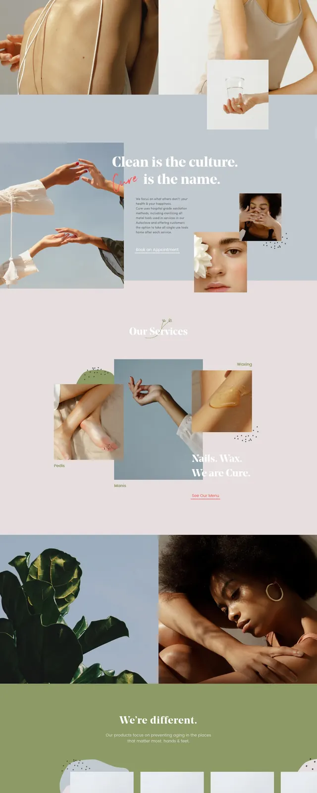
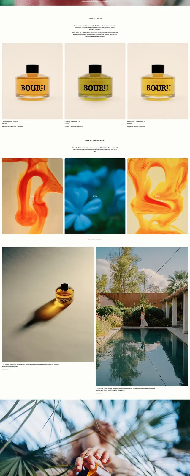
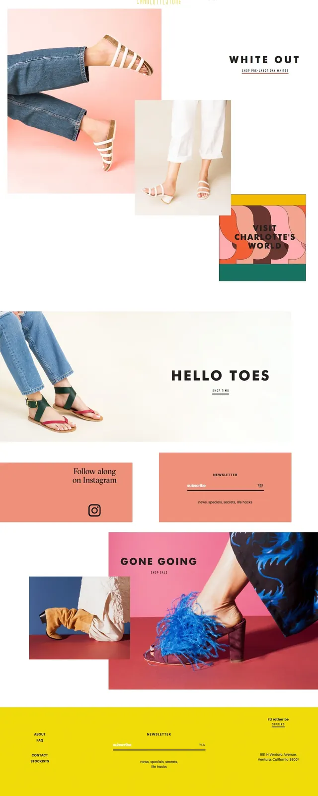
A pastel-toned ecommerce homepage for Dims with a split hero, editorial serif typography, and product-focused sections below.
Summary
A pastel-toned ecommerce homepage for Dims with a split hero, editorial serif typography, and product-focused sections below.
Visual description
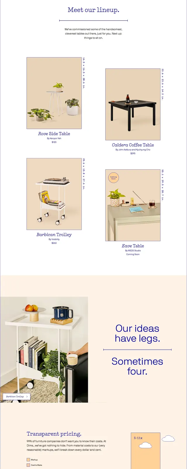
The page opens with a slim top navigation bar, then a large split hero: a home scene photo on the left and a peach-colored text panel on the right with a stacked serif headline and a dark blue primary button. Below the hero is an intro strip with short brand copy and a line illustration, followed by a two-column product showcase with framed product images, captions, and pricing or availability text. Farther down, there is a horizontal banner, a newsletter signup row with an email field and sign-up action, and a deep blue footer with multiple link columns and the Dims logo.
Key takeaway
The strongest reusable move is the soft, editorial ecommerce composition: warm photography, generous white space, and a muted pastel palette contrasted with one saturated call-to-action color. The layout balances brand storytelling and product merchandising without feeling dense.
Reuse notes
Use this pattern for furniture, home decor, or lifestyle retail pages that need a premium but approachable feel. It works best when product photography is strong and the UI can stay simple, with a single dominant CTA and light section dividers.