Preview image. Unlock full-res
A warm editorial landing page for a wine newsletter with oversized serif headlines, minimal navigation, and stacked feature sections.
Summary
A warm editorial landing page for a wine newsletter with oversized serif headlines, minimal navigation, and stacked feature sections.
Visual description
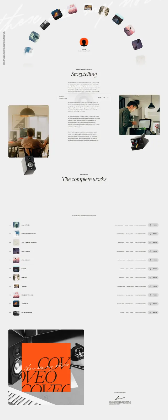
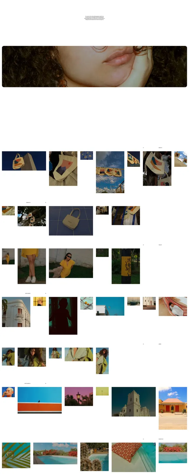
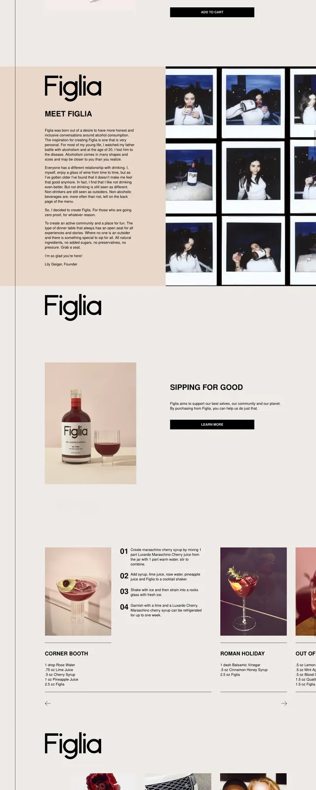
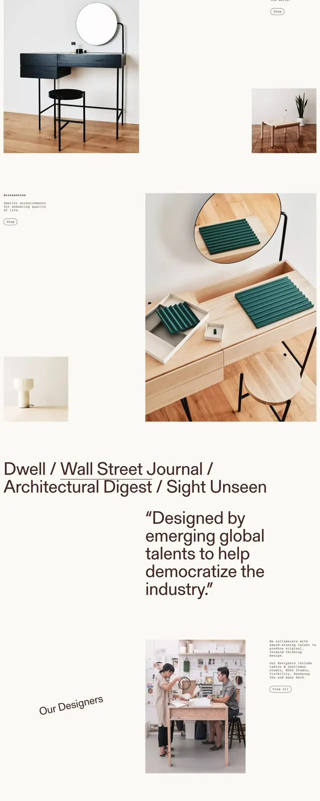
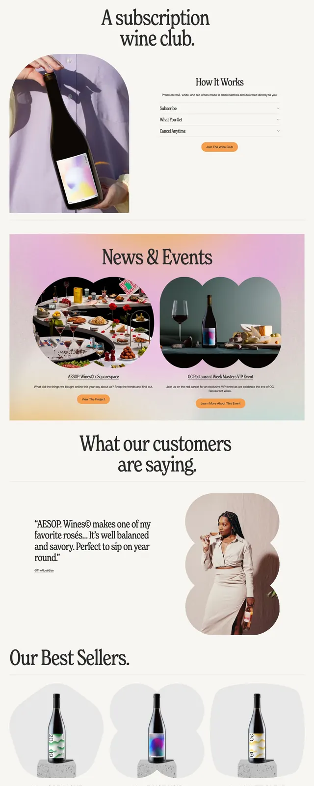
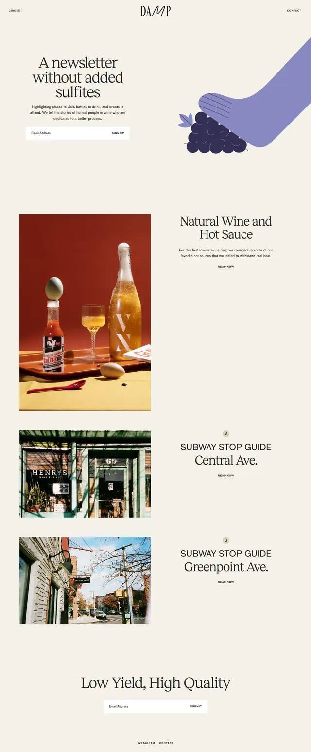
The page uses a soft cream background with a centered logo, small utility navigation, and a large hero headline on the left. A stylized grape-and-hand illustration anchors the right side, while a compact email signup form sits beneath the intro copy. Below the hero, tall editorial content blocks alternate between large photography on the left and centered article titles, creating a magazine-like scroll. The overall composition stays airy and minimal, with generous whitespace and restrained accents.
Key takeaway
The strongest pattern is an editorial newsletter homepage that blends storytelling and sign-up conversion without feeling commercial. It works well for brands that want a refined, content-first aesthetic with understated visual personality.
Reuse notes
Reuse the split hero with a short value proposition, compact email capture, and one bold illustrative motif. The stacked feature sections can be adapted for articles, guides, or curated content feeds in lifestyle and food brands.