Preview image. Unlock full-res
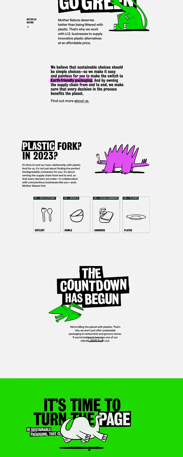
A high-contrast, poster-like landing page for De Extinction with oversized typography, neon accents, and hand-drawn illustrated creatures.
Summary
A high-contrast, poster-like landing page for De Extinction with oversized typography, neon accents, and hand-drawn illustrated creatures.
Visual description
The page uses a stark white background with black slab-like text blocks and large, stacked headlines that feel like cut-out posters. Bright green and purple cartoon-style creature illustrations break up the monochrome layout and add a playful, activist tone. Midpage sections mix short explanatory copy with a small grid of simple category cards and icon-like sketches. The final screen turns into a full-bleed neon green closing panel with another oversized headline and a centered illustration.
Key takeaway
The design relies on extreme contrast, playful illustration, and aggressive typography to make an eco message feel loud and memorable. It is reusable for brand campaigns that need a bold editorial voice.
Reuse notes
Borrow the stacked headline treatment, black-on-white structure, and neon accent color for sections that need immediate impact. The illustrated mascot-like characters and sparse navigation make it feel custom and campaign-led rather than corporate.