Preview image. Unlock full-res
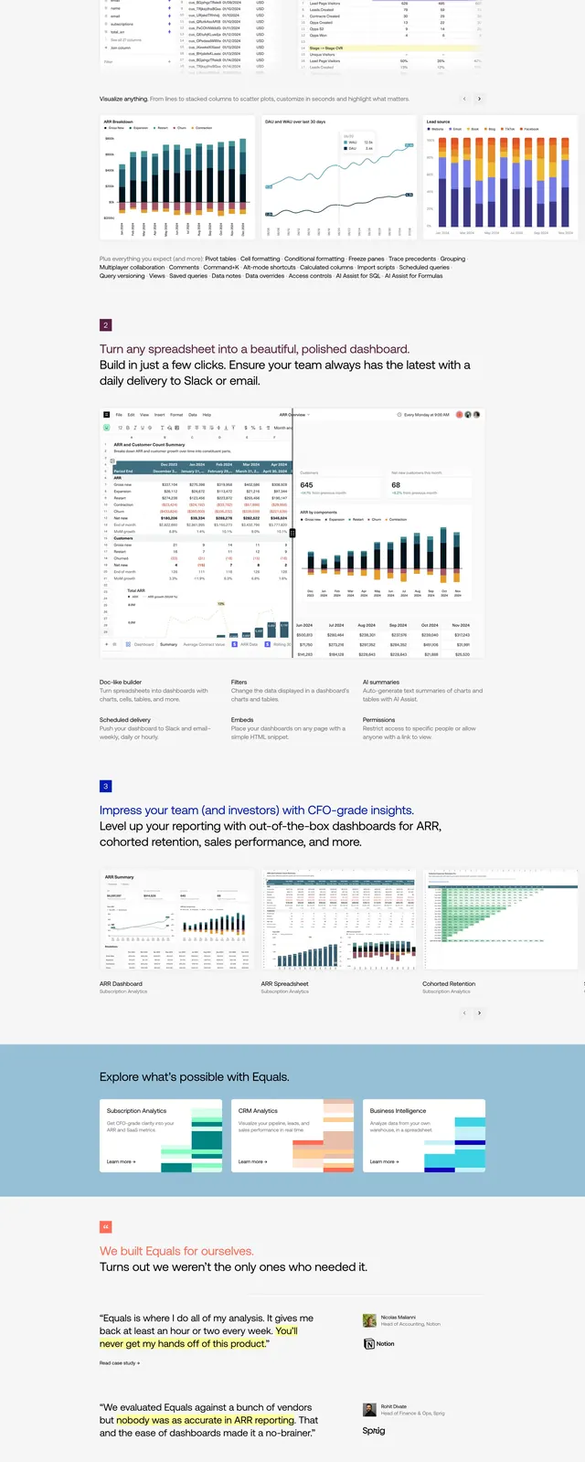
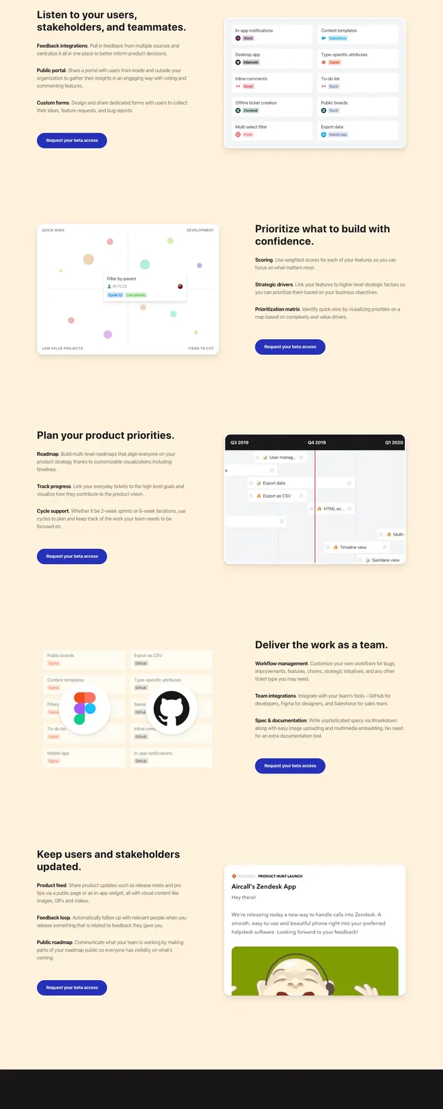
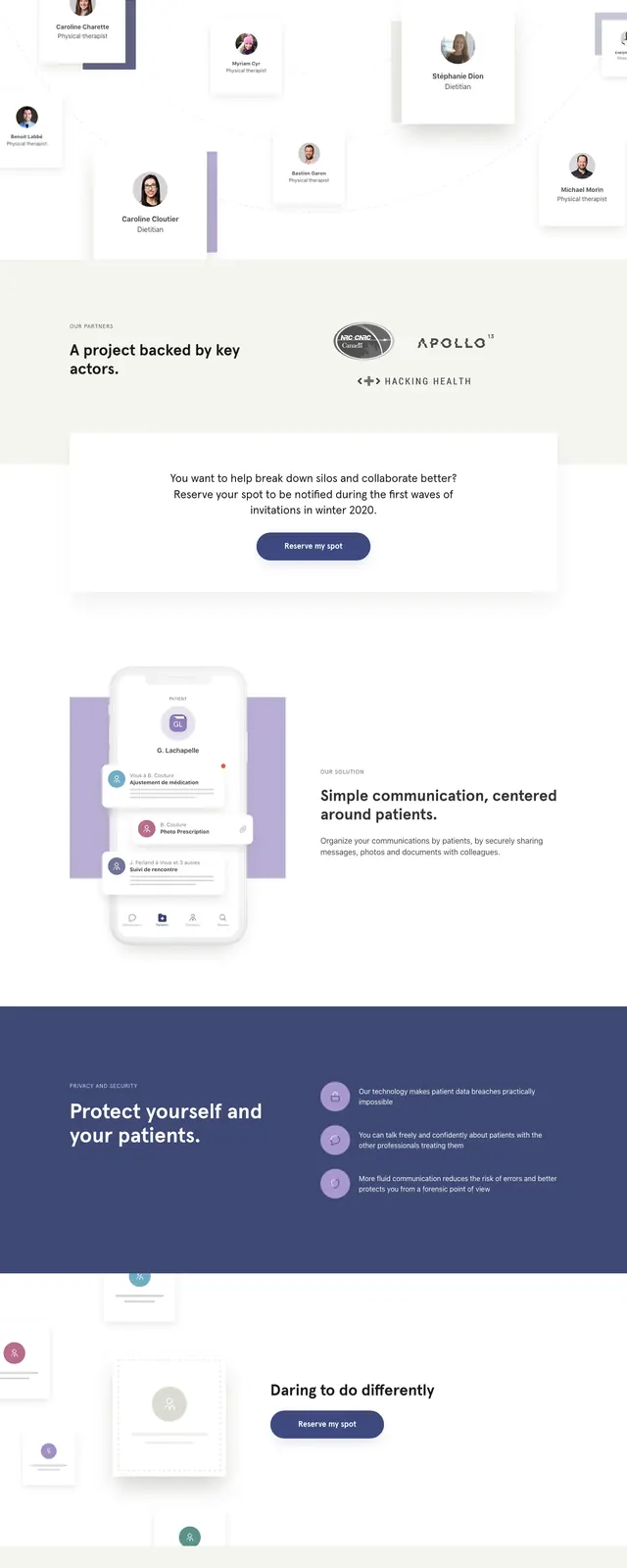
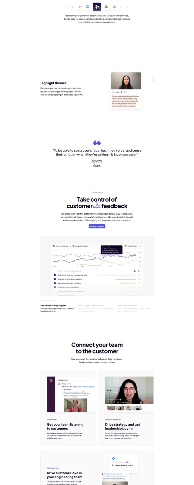
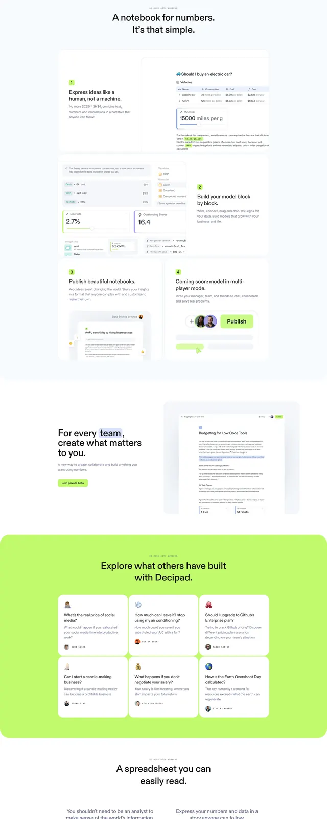
A clean SaaS landing page for a data notebook product, using soft white space, neon lime accents, and screenshot-style product previews.
Summary
A clean SaaS landing page for a data notebook product, using soft white space, neon lime accents, and screenshot-style product previews.
Visual description
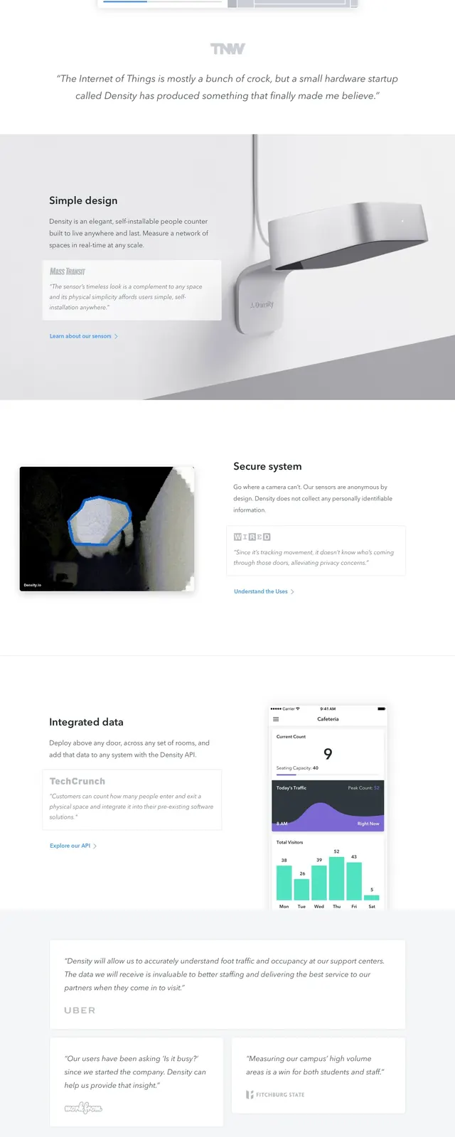
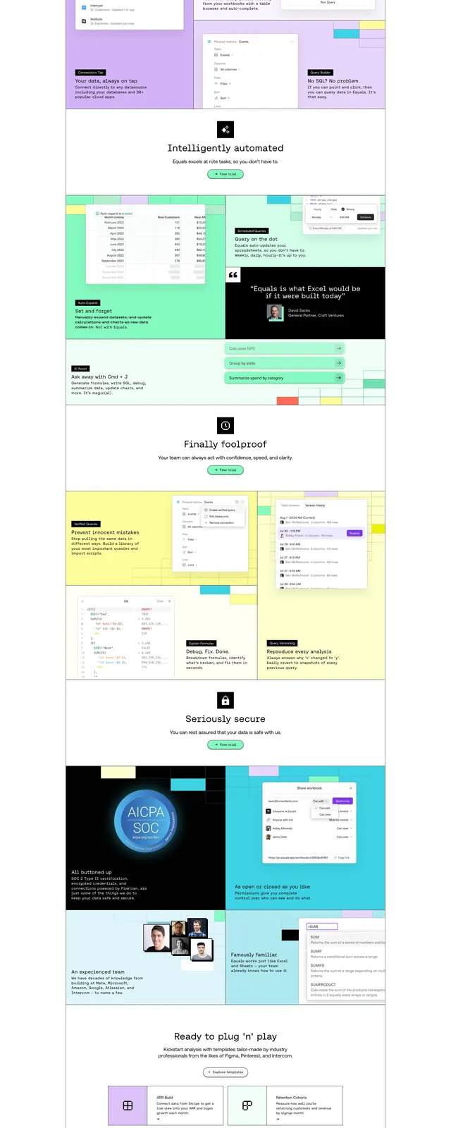
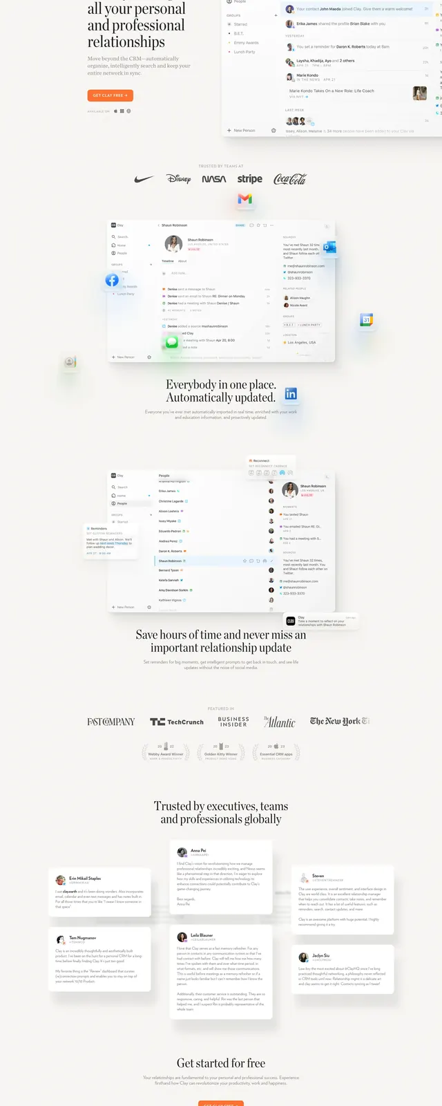
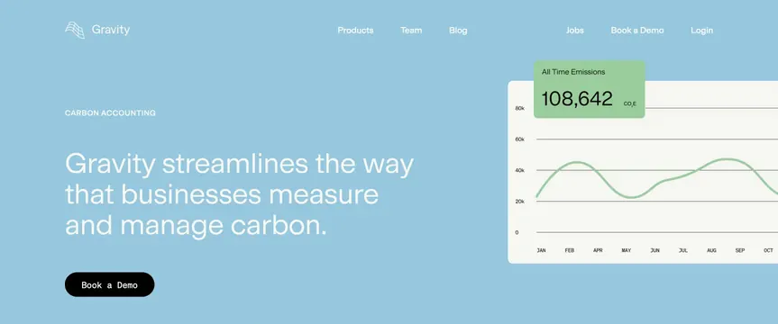
The page opens with a centered hero headline, small top navigation, and a bright lime primary CTA on a very light background. Below, the layout alternates between split sections and card grids that showcase notebook-like product screenshots, tables, and simple feature explanations. The design uses soft shadows, generous whitespace, and repeated neon green highlights to guide attention. A large lime footer CTA closes the page with a minimal brand mark and compact links.
Key takeaway
The strongest pattern is a polished light-mode SaaS layout that combines editorial spacing with data-product previews. The lime accent acts as the main conversion color across hero, feature cards, and final CTA.
Reuse notes
Reuse the centered hero with compact nav, oversized headline, and one dominant lime CTA. The same visual system can support other analytics or productivity products by swapping in different dashboard screenshots and feature copy.