Preview image. Unlock full-res
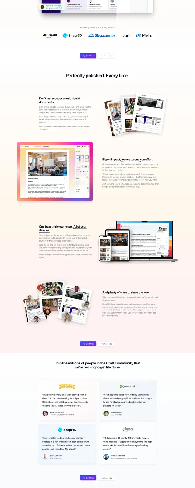
A clean SaaS landing page for Cycle App with a centered hero, product screenshots, and alternating feature sections.
Summary
A clean SaaS landing page for Cycle App with a centered hero, product screenshots, and alternating feature sections.
Visual description
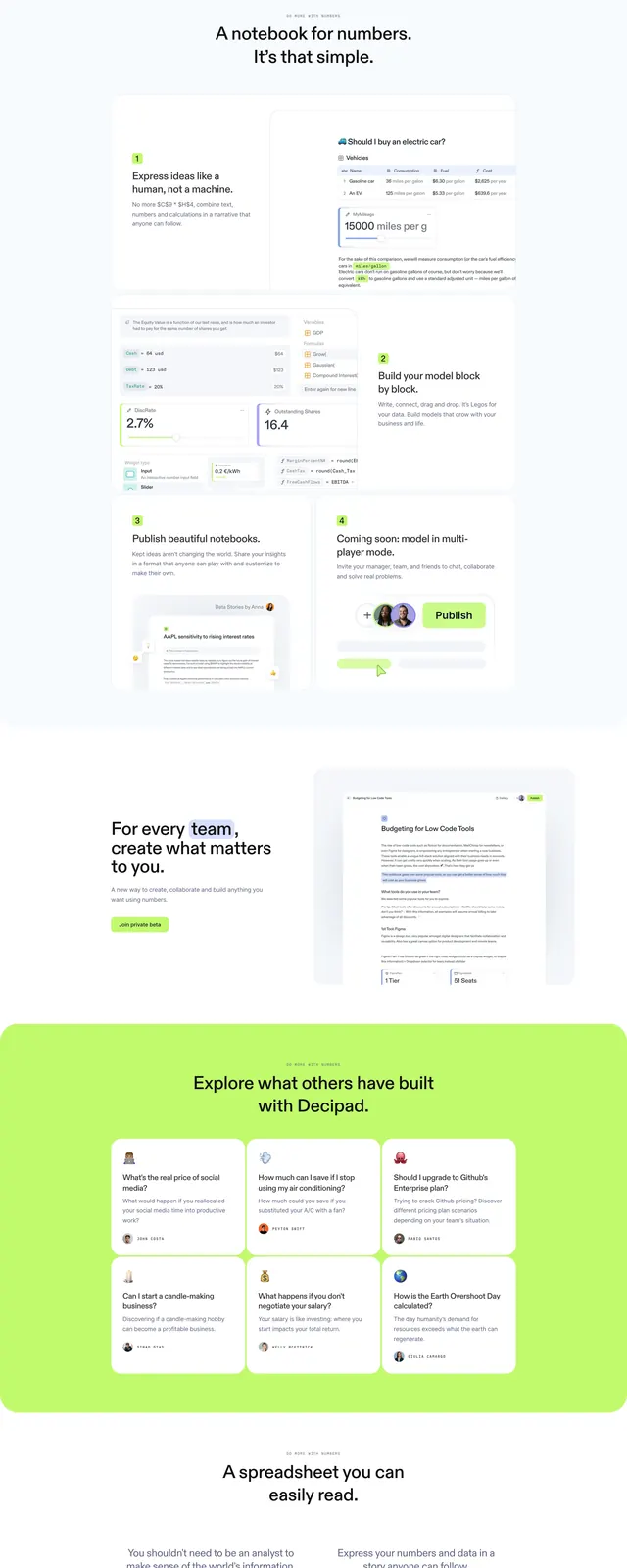
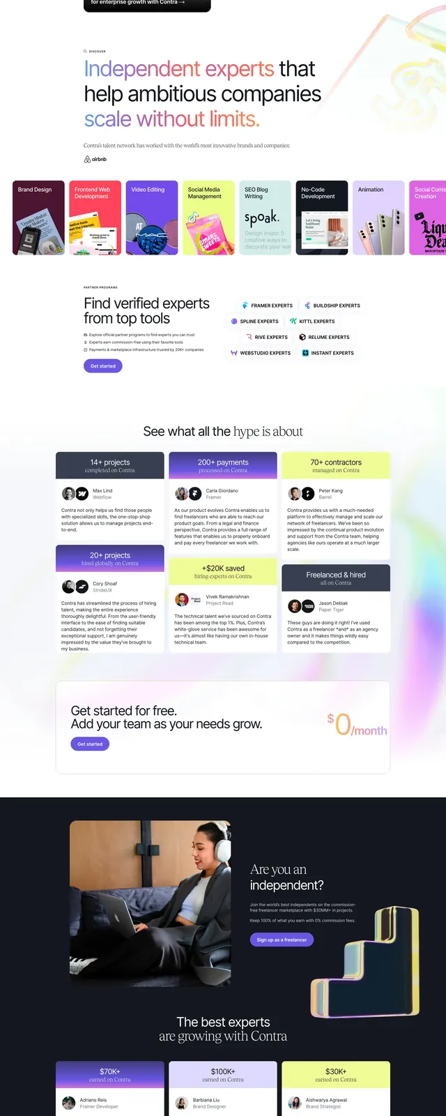
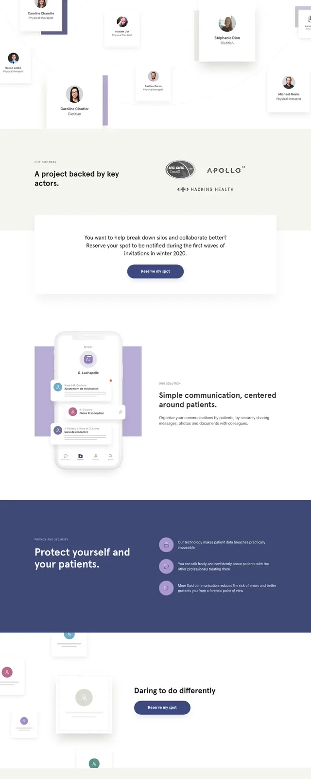
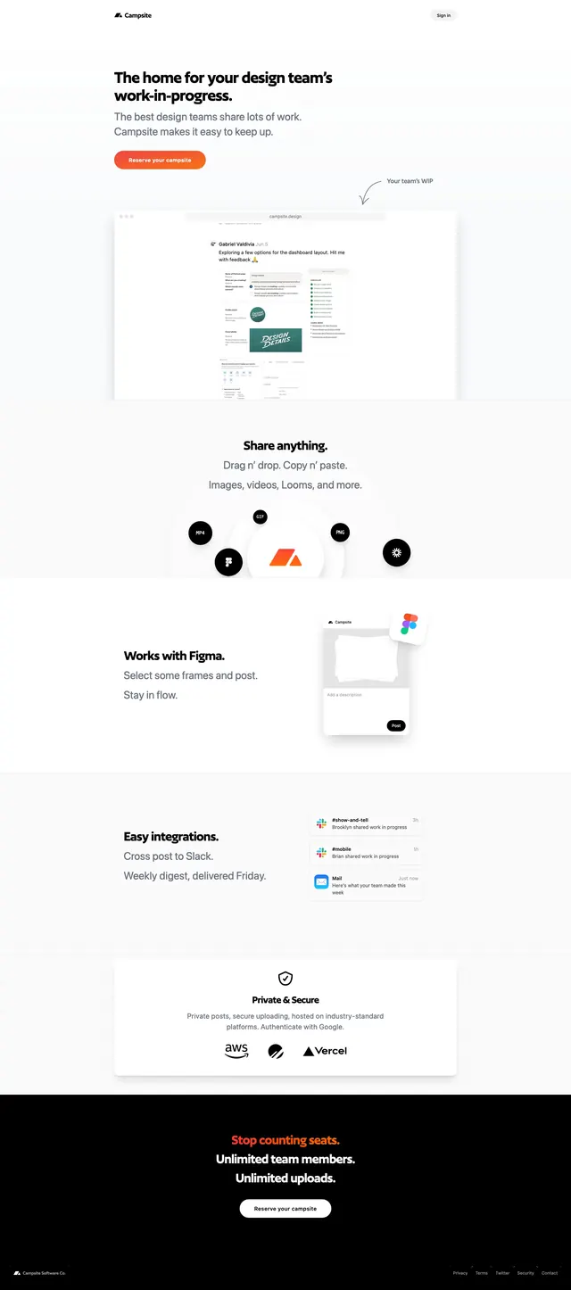
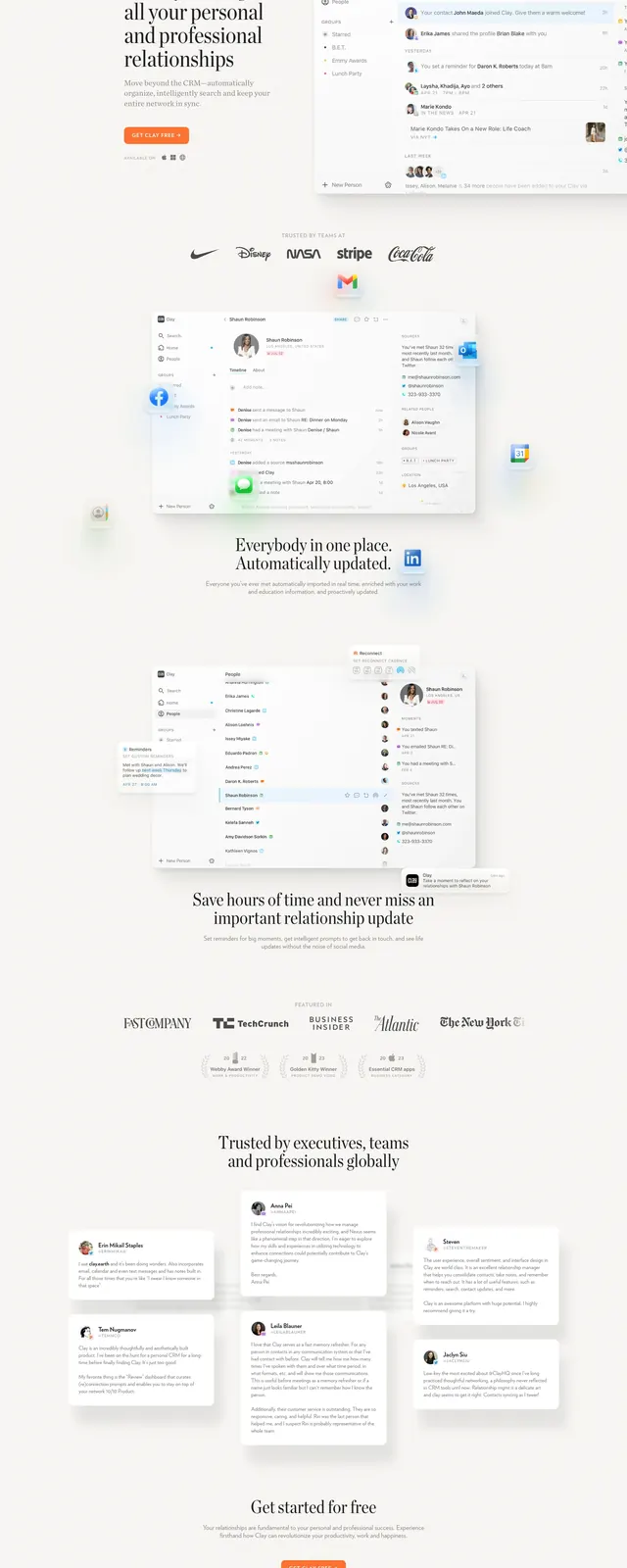
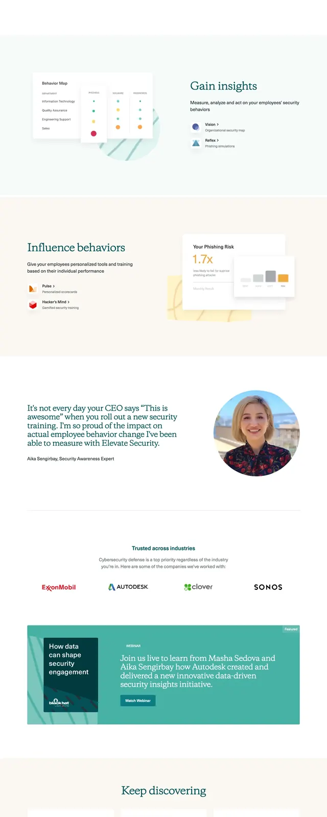
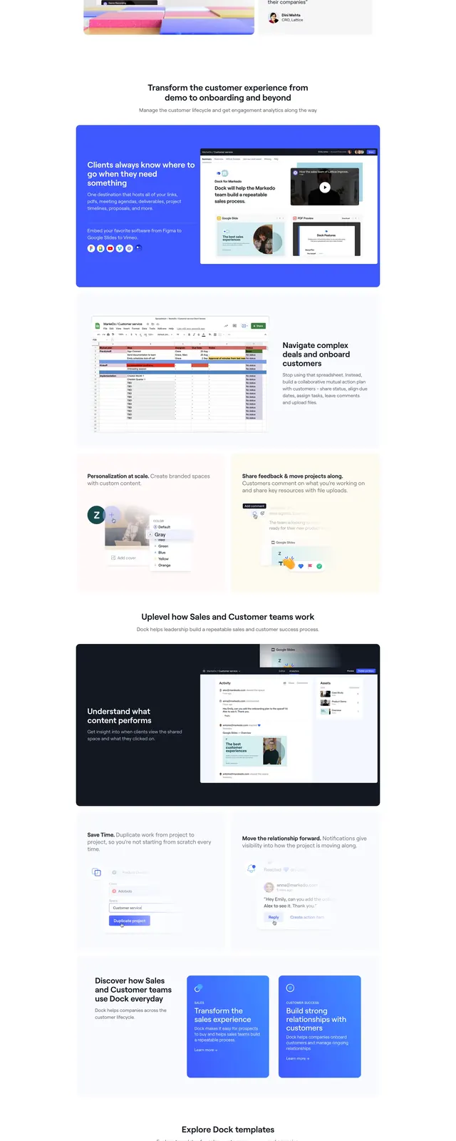
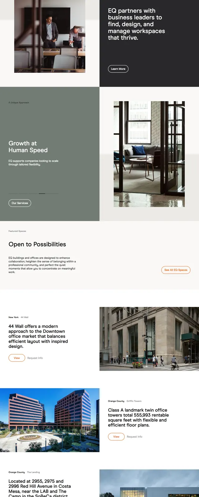
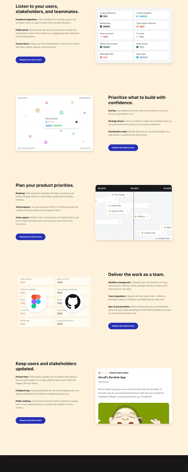
The page opens with a centered hero on a white background, using a short headline, supporting copy, an email input, and a primary request-access button. Below, large embedded product screenshots show the app interface in a dashboard-style layout with a dark sidebar and light content area. The rest of the page alternates between split feature sections, a blue-to-purple feature band with icon-led benefits, and a final call-to-action footer. The design uses generous spacing, soft shadows, and subtle gradients to keep the layout polished and approachable.
Key takeaway
The strongest pattern is a straightforward SaaS landing page built around a centered conversion hero and large proof-heavy product visuals. It is easy to reuse for product marketing pages that need a clear value proposition and multiple feature callouts.
Reuse notes
Reuse the centered hero formula for early conversion, then follow with alternating image-and-copy feature blocks to maintain momentum. The colored feature band and closing CTA work well as a reusable structure for differentiating benefits and ending with a signup prompt.